Posts tagged portrait

How To Fly Part 1

0

I’ve had many people ask me how I make my quilts, and the answer is — one piece at a time. You break everything down into workable areas — or really into color families.

The piece that I’m currently working on is Amelia Earhart. When I was designing the piece, I didn’t like the picture of the plane in the background — so I took a different picture of her plane and put it in the background — moving it so that it accentuated her silhouette.

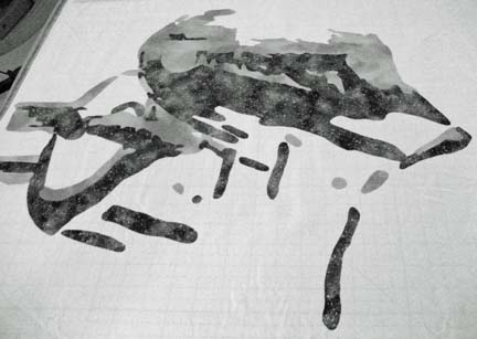
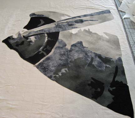
I decided to start with the plane. The plane itself is gray — but gray is a spectrum from white to black. I chose fabrics in a range of values in that color range. I used the actual foundation fabric as the white and started building from there. With the first layer of gray, it’s difficult to see the left wing and engine.

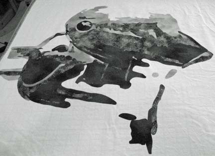
The next value give more definition to the object.

And as I add the layers of values, the image begins to emerge.

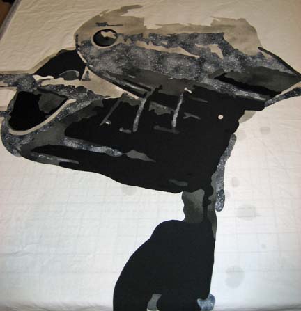
The final layer shows all of the details. (Keep in mind that this lays flat on a table. If I don’t stand on my tip toes when I take the picture, the camera adds a shade to the picture. I don’t always remember to make myself tall when I take the picture. Because It’s on a table, there is also some distortion in the shapes that you’ll see when I finally hang the piece vertically.)

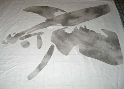
Amelia stands in the middle — with the engine & wings on either side of her. This is the beginning of the right side.

And this is what it looks like completed.

It still looks unfinished — but most of that blank space is where Amelia will go.

I’m actually done except for her bomber jacket and the sky in the background but I decided that I would show you this in pieces — by color family — to show you how I work it out in my head. The next part will be about her face — and then her hair — and then her scarf — and hopefully by then, her jacket.

Jack

4

The Story of Jack

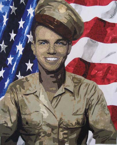
Jack is the nickname of my father-in-law. I still don’t know why someone would use a nickname for John, but it used to be a very popular thing to do. So even though his name was John, he grew up using the name Jack, and when World War II started, he continued on as usual — as Jack.

But one day, Uncle Sam called him in and accused him of trying to impersonate someone else. They made him change all of his paperwork to John — and from then on, everyone called him John.

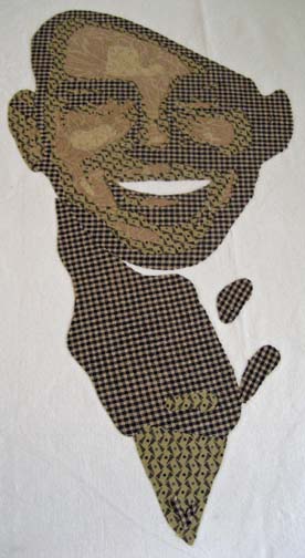
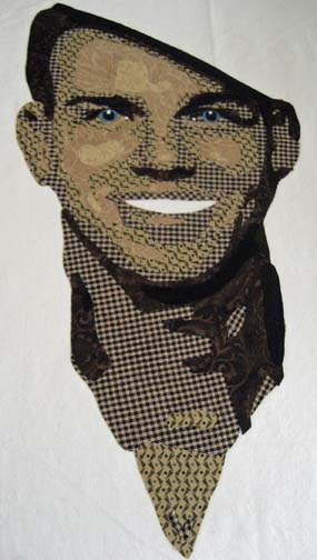
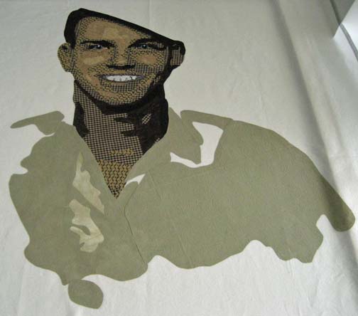
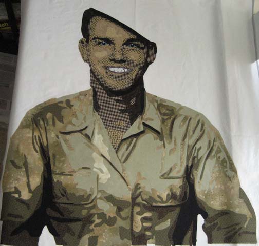
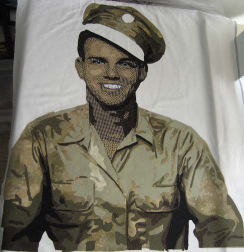
My husband found a picture of his father recently. It looks like an enlistment photo, taken at the very beginning, when he was eighteen. His hat is propped lightly on his head, askew, and his grin reflects the personality within.

The Face

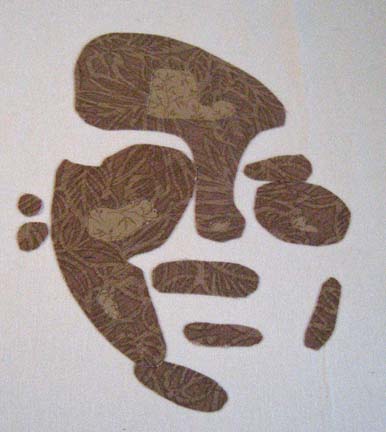
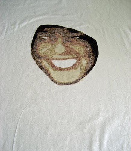
When I start a face, I always start with the lightest values and work up to the darkest (with the exception of the teeth). It’s always hard to see where I’m going when there are only two values to see.

But when I get to the third and fourth value, the face starts to take shape.

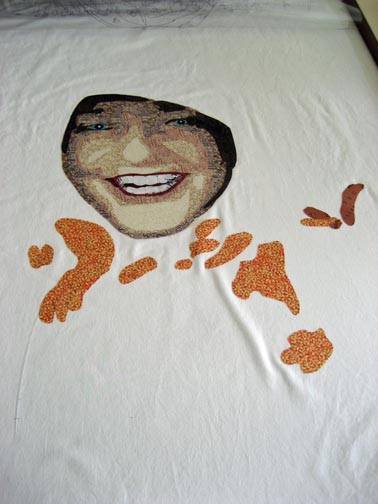
At this point, I realized that I couldn’t do the next value until I went back to do the neck — which I had forgotten.

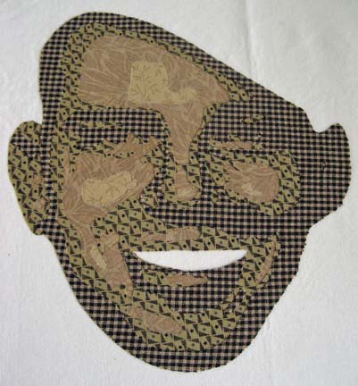
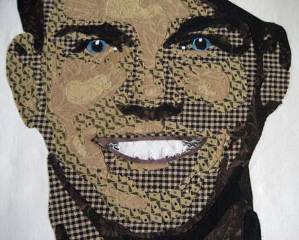
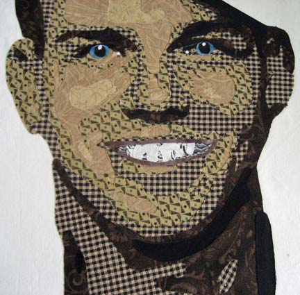
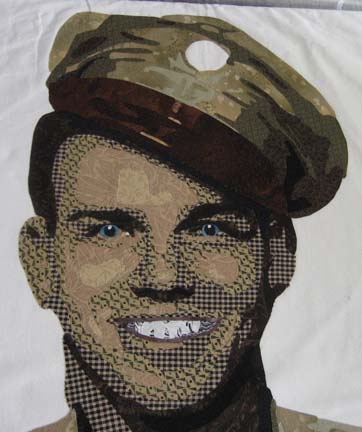
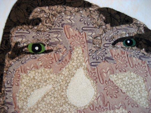
Once you put on the eyes, you can really start to see handsome shining through.

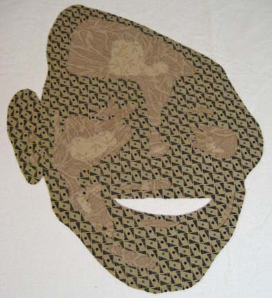
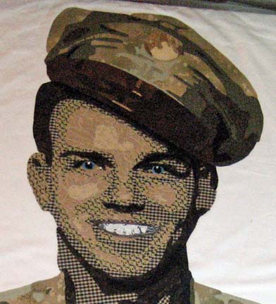
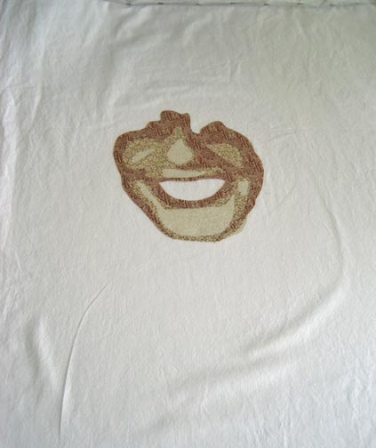
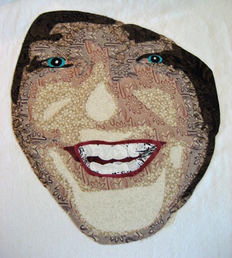
When I started the teeth, I started with the lightest value and worked my way up to the darkest. I completely forgot that this doesn’t work on the teeth — but it gave me a chance to snap a picture of the teeth done this way so you can see why it doesn’t work. When you’re working with the large shapes of the face, you worry about shadowing of one fabric under another — but the pieces of the teeth are so small & everything is in shades of white, shadowing isn’t really an issue. And worse, if you make the teeth this way, they look harsh — not rounded.
These look much better — and will pop even more when I quilt in the individual teeth.

The Shirt

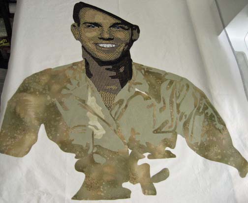
Although the picture I had was sepia toned, I was fairly certain that the shirt was khaki — which I couldn’t do since I used khaki colors in his face — so I leaned more towards a light military green. The main color, the 2nd value, is one that I had dyed years ago & tossed aside, thinking I would never use it — but it was perfect for this.

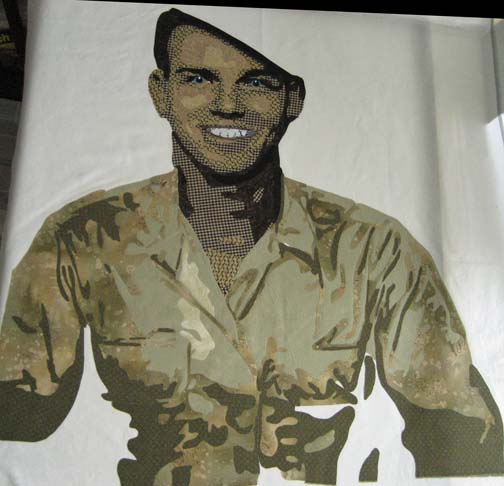
The next value outlines the wrinkles in the shirt and shows how the shirt fits him.

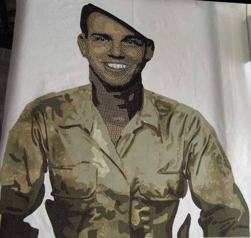
The darker values always seem to make it come to life.

The Hat

I had no reference for how the hat should look — and the picture didn’t tell me enough. After Google searching for World War II uniforms, I found a similar hat that surprisingly did not completely match the jacket — or in this case, the shirt. The brim was brown leather, and there was a belt just above the brim of brown leather. So I used the shirt colors for the top of the hat . . . .

. . . . and used a rich brown for the brim and belt (the belt will pop out once it is quilted).

The medallion was another issue. I’m fairly certain it was round metal so I used gold toned fabrics. Hopefully, using a metallic thread around it later will help it pop out more.

The Background

I don’t always know what to do in the background, but in this case, the decision was simple: a waving American flag. I used Photoshop to try out the idea and it was so successful, I knew it would work in fabric. What better tribute for an American soldier?

This is the first time that I’ve made a completely separate design for the background — but it only took me a couple more days.

Now I move into appliqueing and then quilting. Not as exciting as designing the piece, but still needed steps.

Creative Gridlock

0

Completion

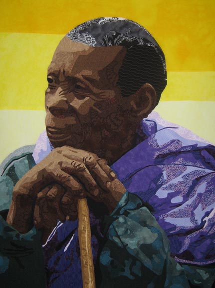
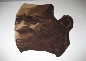
I have finally completed Bukonyan Elder. I was amazed at how long she took me — but I’ve been very busy the last few months with family obligations. It was tough to get her to a certain level of completion and then watch her unattended on my design wall. You can see her new page here.

So I must be busily working away on my next piece, right? No, unfortunately not.

Creative Gridlock

My last string of pieces all fell into place perfectly. As I was working on one, another inspiration would come to me and I knew exactly where to start when one ended. But I was not so lucky this time. That creative wall has risen up in front of me.

Not having my next piece all ready mapped out has left me feeling a little lost. Not that I haven’t been here before. The question is rather — what do I do from here?

Creative Process as a Means of Moving Forward

And I think that the answer is — a study. Something small — probably not my first choice — but I need to do something rather than sitting here staring at my computer screen. Moving past a creative block means doing something — rather than nothing.

The Month of December

1

I always think that I’ll have at least a couple of weeks in December in the studio. Once again I seem to have forgotten that all the details of the holidays must be done in those weeks and studio time is precious little.

So I suppose my target of finishing Bukonyan Elder in December was a little off the mark. I did finish the applique and have her pinned and ready to quilt. Ever wonder what the back looks like?

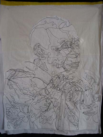
I use a tearaway stabilizer on the back. A few years ago, I found a tearaway that also dissolves — so the part I can’t tear off will dissolve in water when I soak it before blocking it. I like the idea of it all going away. I think that things that last a long time in a quilt — other than thread & fabric — can hurt its longevity. Not scientific I know — but I want my work to last a long time.

When I was done, I took a picture of it and looked at it on the computer. I initially thought that I shouldn’t add pinpoints of light to her eyes — the focus should be on her hands — but looking at it in Photoshop, I can easily add the points of white in her eyes — and it did make the piece look better. So I added them with white thread before pinning her up to ready her for quilting.

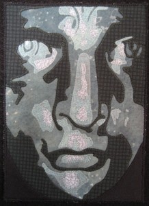
What else have I been doing? Tonight my Fiber Art Fusion group has our 5 x 7 holiday exchange. I played with a picture of the Statue of Liberty’s face — a model that they keep inside & is still copper colored — and came up with Lady Oxidation — which I kept green to show the oxidation that the outside statue of her visage has. To me, her expression is quite fierce, and it reminds me of the passion that our forefathers had when they broke away from England and declared their independence. The exact inspiration for her is unknown although some think that it was the sculptor’s mother, Charlotte Bartholdi, or his wife, Jeanne-Emilie Bartholdi.

I confess that I used several of the greens that I used in Bukonyan Elder. They were on my working table and perfectly suited for what I needed — and all of the threads were all ready matched. In a month of not enough time, it saved me some.

Still Working Away Here

2

So here it is — almost the end of the month — and I’m still working away. I’ve FINALLY finished cutting it all out. I had great momentum last week — and then I had a week of Thanksgiving and other things to attend to.

Today I came back into the studio and added the background. This always takes longer than I think it will. Rather than a whole piece, I went with a small range of yellows. Since the bottom of the piece is so grounded in cool colors, I knew I had to use a hot color to spark interest. The piece just shouted that it wanted yellow. It is interesting to me to see how I have come to understand the color wheel working through fabrics.

Can you see her squinting into the sun?

Now I go into the stitching. It looks done — but there is actually quite a lot left to do. I have three weeks until Christmas break. I should have enough time to finish the applique and quilting — at a dead run — but I’m planning to get it done and start something new in January.

Forget What Lies Behind You

2

“Forget what lies behind you.” Forgetting is an active verb — it requires purposeful action to NOT do something, even when provoked.

The people of Rwandan have to face it every day. Every day, they walk into other people that created a nightmare for them. I am awed at their ability to find redemption and move on. It takes a strong strength of spirit — and a partnership. I wish everyone were as willing to step forward to work on relationship together.

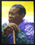
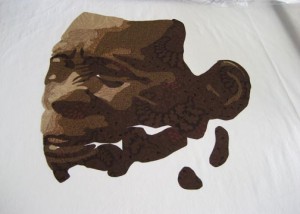
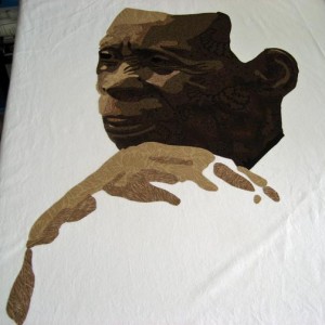
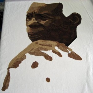
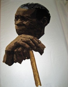
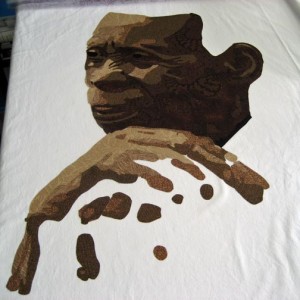
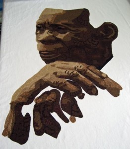
My latest piece is a little larger than the current size that I’ve been working on since I’ll be working on it over November and December with several weeks of down time in between to accommodate the holidays. I picked as inspiration a picture of a Bukonyan elder leaning on her walking stick (with permission by Karen Houghton/Kim Jackson). So often, the focus of a portrait is a person’s mouth or their eyes — but in this one, all of her personality is centered around her hands. I haven’t worked on hands before and found them as engaging as a face.

Although the light is hitting the front of her face, she is looking away from the camera — and there is no pinprick of light hitting her pupils. Even her mouth is closed.

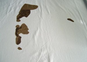
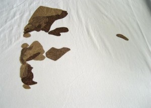
But under her chin lies her hands, resting together. All of the primary light is hitting her top hand — so that is what you see develop first.

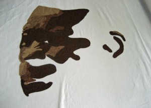
I spent some extra time on the wrinkles in the knuckles — just as I did with the wrinkles in the face. It’s the fine details that show age.

This is her without her hair — just her face and hands.

I have since added her hair — she has white scattered in her black hair — and a golden walking stick.

Her cloak is next. I’m still deciding what to do with that.

Finishing the Little Details

2

I finished my latest piece, Celtic Woman, on Friday, just in time for the end of the month. I had it blocked and drying over the weekend — and thought I could take a quick picture of it today and be done with it and on to the next project.

I took a couple of rounds of pictures, and none of them were right. They were all a little blurry in the middle. I finally decided that the high contrast was causing a problem with the camera. I had a similar problem a few years ago with a piece I made called Ama. It is a very light portrait (my 1st person so judge me kindly) with a very dark background of blacks. The black has very intricate feather quilting using a heavy metallic red thread. I found that I could take a picture that focused on the portrait — and the picture blurred out all of the feather quilting details — or I could focus the camera on the black to get the quilting detail and the portrait would be blurry.

At that time, splicing two photographs together — which is what a professional photographer would do in the dark room and we can now do in Photoshop — was not considered an acceptable practice. Guidelines for the big shows were very explicit that you could not make any digital changes to the original shot — which made it a quilt that I couldn’t enter into a judged show. It also taught me a lot about the boundaries of a camera. I always expected the camera to see something just as I saw it with my eyes — and that is not always the case.

So when I realized that I had a similar problem with Celtic Woman, I started playing with the manual settings on my camera. I finally found that if I used spot metering instead of weighted average, the camera  would give me a clear image of the face but underexpose the cloak. I could compensate for that in Photoshop, however, and that is how I finally got what I believe is a good representation of the quilt.

You can see a bigger picture of it and a detail shot on the website here.

Celtic Woman

4

I lost my blog yesterday — an experience I don’t care to ever repeat. It was running really slow so I added a 5 star add-on called WP Tuner. After I activated it, I learned what the white screen of death is. It’s a little like the blue screen of death you see sometimes in Windows. It means that your blog has disappeared. No error messages — just nothing.

I can say that I learned a lot. I learned how to access phpMyAdmin on my hosting server and change settings in the raw code. I restored all of my database files from a backup, deactivated all of my plugins, and changed to the default theme. Still gone. I finally went back into my history files to find the WordPress page from which I had found WP Tuner — and although it had 5 stars, as I scrolled down, I found that it was considered “broken” in WP3.0. Reading on, I found some discussion that led me to the realization that this plugin had changed my wp_config.php file. I went back upstairs to my clunky PC that I keep just in case & looked at the php files on the server. There was a new wp_configPCTuner.php file (something like that) — so I erased it. There was no mention in the wp_config.php file — but the site still wasn’t working, so I uploaded the copy of the file that I had stored on the PC from my original install. Finally — it worked.

What a nasty plugin. I have to be much more careful in the future. It made me worry about putting the entire website in WP. I’ve loved WP & have wanted to move away from Dreamweaver — but Dreamweaver really saved me yesterday.

On to my original intent for posting . . .

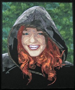
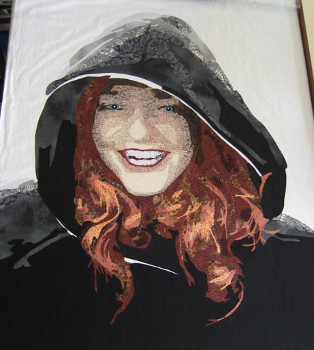
I was scanning prints into my computer recently and found an extraordinary picture of my sister-in-law. It was taken at Christmas almost 10 years ago, and she had just received a beautiful black cloak. She has red flowing hair that is very striking against the black, and the picture of her taken in the side garden of our old house captures her personality in such a striking way.

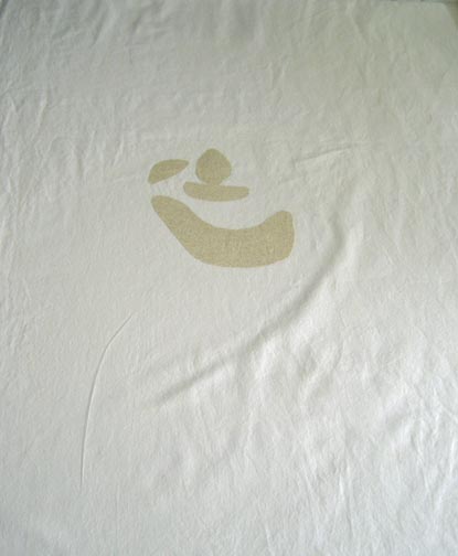
This is the first value layer — not much to see — the white muslin that I use for a base with a few shapes in a light value.

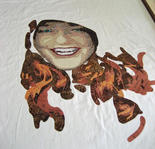
This is the 2nd value layer — you begin to see a little more contour in her face. You’ve got her nose — her chin — suggestion of her cheeks.

Then the 3rd layer — now she really starts to come out.

This one shows the problem I was having with her eyes. She has light green eyes — but that would be lost in this picture of her. Too light and yellow on the left — too dark on the right.

This is her with her teeth and the eye color that I chose. The eyes look really strong up close — but make sense once all of the values are on the wall and you step back. The mouth was fun — this is the first time that I’ve shown the inside of the mouth — just a little peek.

Also eerie about this is that it is just the face — so at this point, knowing the family as well as I do, I can see other people in the family peeking out at me, not just my sister-in-law.

Her face is also shadowed in an interesting way. This will make more sense when the cloak is added around her face.

I started her hair with a very brash orange. The more I looked at her picture, the more I realized that I needed more of this color — and I ended up using this for value 1 & 2 in order to get enough of it. The darker colors are nice — but the bright orange is needed for the highlight. It will make more sense in a minute.

For her, a lot of the effect is the hair.

And then the cloak. The top of the cloak is the lightest as that is where the sun is hitting her. There is still a blank edge around the rim of the cloak. I had to figure out a clever way to show the braid on the edge.

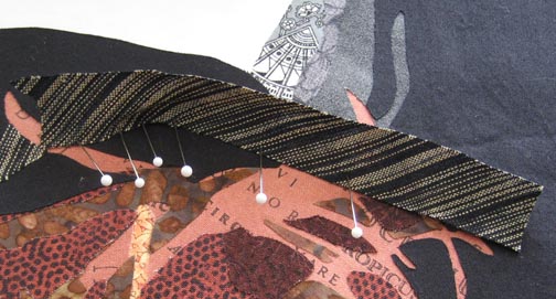
I decided to use a black stripe cut on the bias that I could manually curve around her face. Most of the black stripes I found were black & white — too much contrast — but I found this homespun with black and neutral tan/taupe that seems to work fairly well. I cut it wider than what I needed — and then ironed it down as I curved it to fit the line I needed — but I just ironed it down a little on that one side. Then I went back and cut the opposite side to match the other line. I took artistic license in getting it where I wanted it to be.

In the end, I think you get that feeling of the rolled edge — and the neutral in the stripe doesn’t shout.

I also added a green background which I’ll show later. I’m working on the applique now.

Pushin’ that Bull-Dawg

4

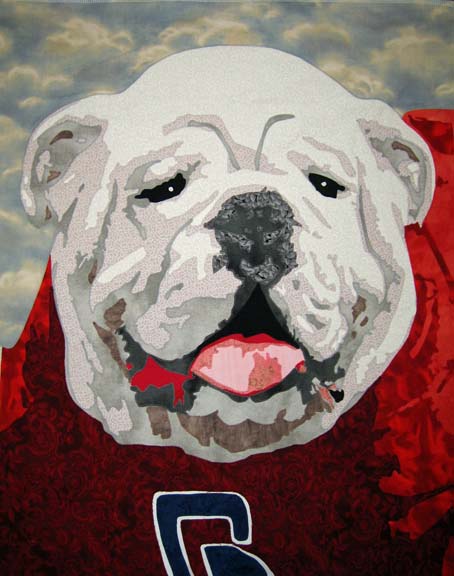
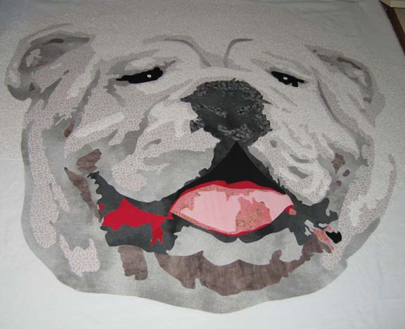
I finally finished the applique on the bulldog. This is what it looks like before I quilt him. I changed his right eye a little, but I think that is the only big change. Finding good thread matches was challenging, but it isn’t very obvious unless you look at it closely — and most people view my quilts from 4 feet away or more. I did re-use a background that I’ve used previously — but it was the only thing that I really liked. It makes it look like he’s standing out on the field on a beautiful sunny day, full of excitement for the players on the field.

I have four days next week to quilt him & bind him — or put him in a frame — before I have to deliver him to the auction chair. Let’s hope I can do it.

I received the news yesterday that my quilt Duodecim will be included in Art Quilts XV: Needleplay to be shown at Visions Gallery in Chandler, AZ. The exhibit will run November 5th through January 15. From looking at the list of those juried into the show, I think it will be a phenomenal show, and I feel blessed to be included.

If you notice a few changes here & there, I have been working on my blog. I recently changed my theme to one that accepts menus, and I’m hoping to re-write my entire website into WordPress. It has been many years since I created my original website in DreamWeaver, and it has everything on it that I’ve done in the last ten or so years. I think it is time to pare it down & bring it into line with the blog so that it is all seamless. I may even write a blog post about how I do it.

Pedal to the Metal

3

I was asked by my husband recently to give a piece to an auction — something I don’t ordinarily consider — but for various reasons, he wore me down & I decided to make something. In deciding on something that would do well at auction, I started thinking about framing it — which I haven’t done before — but I am starting to think that there is a larger art market out there that appreciates the simplicity of hanging a piece on a nail. It has become 2nd nature for me to hang my work on a rod — but when I gave a piece to my mom last year, I started to understand the frustrations that a hanging sleeve will give to an average person.

So it is my intention to frame the piece. I’m being a little noncommittal because I want to be able to change my mind. But in making the piece, I intentionally started with a standard framing size — 20″ x 24″.

And subject matter was another issue. In the great state of Georgia, what would appeal to the masses? That was an easy question to answer — football. And the most beloved symbol of Georgia football is its bulldog, a majestic animal that would make a fine subject for a portrait.

I really sweated the fabric choices on this. The bulldog has white fur — and I could have gone white and then started adding B&W fabrics in different degrees — but the end piece would look more graphic than familiar — so I attempted <gasp> solids. Or almost solids.

Interestingly, I’ve found that I’ve started segregating beyond basic colors — I now look for shades of pink reds — and shades of orange red. I tell myself that it is more about the shade than the color — but if you have 2 different kinds of red in a piece, it makes a difference.

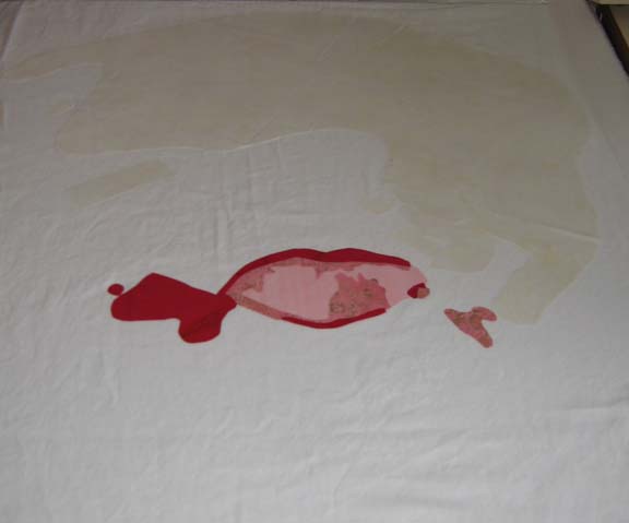
I started with his mouth. Why? I don’t know. I try to start with the lightest colors & move to the darker colors so that I don’t have shadowing problems. Sometimes the muse moves us in mysterious ways. The pink looks like it goes too far to the right and left — but trust me — a bulldog’s mouth opens really wide & parts of it hang out.

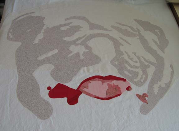
Then the 1st fabric for the white. After I laid it out & started the 2nd value, I realized that the 1st fabric was not right — it was casting a yellow cast that I didn’t like. I needed whites that were more blue — so I tore off what I had done of the 2nd & re-did the 1st — and then re-applied the 2nd.

It looks a lot better — although I don’t know if the camera catches the subtle shift in color. No matter — trust me, it wasn’t working. The 2nd layer adds a lot of character.

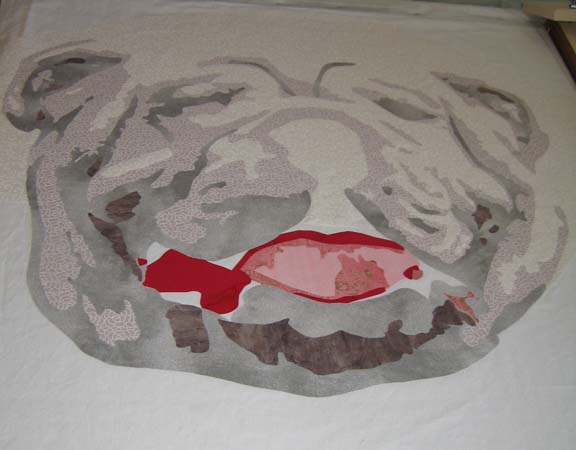
This is after the 3rd & 4th values. I really wondered if this was going to work after the 3rd value — but the 4th helps pull it together I think.

Adding the different shades of black add the spark to his eyes and nose.

There is still a lot to do — I have to be done by the end of the month. I’m considering making a piece a month this year in about this size. That way, I could make 8 instead of 3 or 4 larger ones — and I think that the exposure to more subjects is what I need right now.

Go to Top