The Story of Jack
Jack is the nickname of my father-in-law. I still don’t know why someone would use a nickname for John, but it used to be a very popular thing to do. So even though his name was John, he grew up using the name Jack, and when World War II started, he continued on as usual — as Jack.
But one day, Uncle Sam called him in and accused him of trying to impersonate someone else. They made him change all of his paperwork to John — and from then on, everyone called him John.
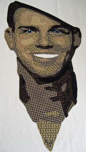
My husband found a picture of his father recently. It looks like an enlistment photo, taken at the very beginning, when he was eighteen. His hat is propped lightly on his head, askew, and his grin reflects the personality within.
The Face
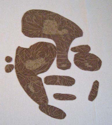
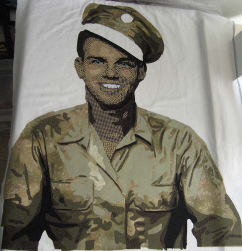
When I start a face, I always start with the lightest values and work up to the darkest (with the exception of the teeth). It’s always hard to see where I’m going when there are only two values to see.
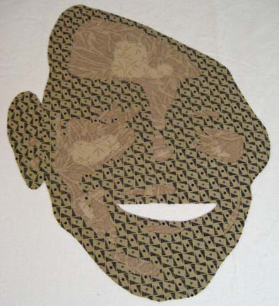
But when I get to the third and fourth value, the face starts to take shape.
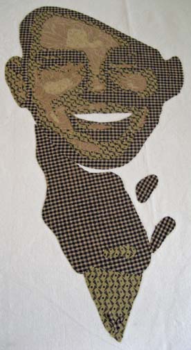
At this point, I realized that I couldn’t do the next value until I went back to do the neck — which I had forgotten.
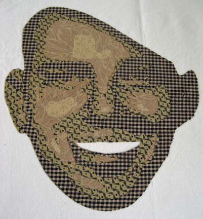
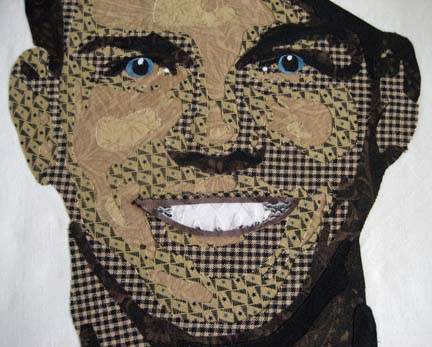
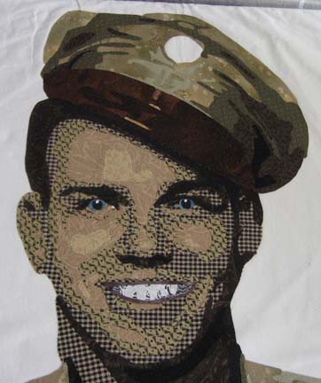
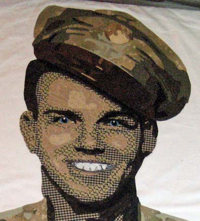
Once you put on the eyes, you can really start to see handsome shining through.
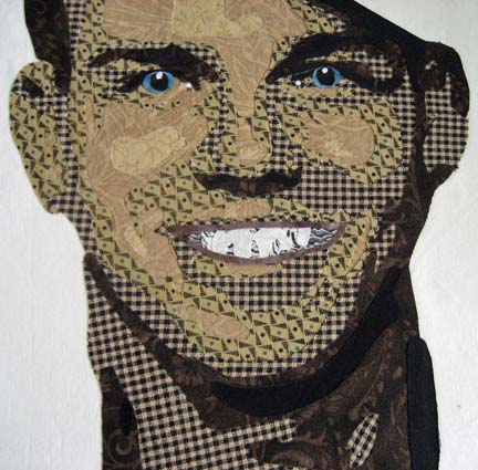
When I started the teeth, I started with the lightest value and worked my way up to the darkest. I completely forgot that this doesn’t work on the teeth — but it gave me a chance to snap a picture of the teeth done this way so you can see why it doesn’t work. When you’re working with the large shapes of the face, you worry about shadowing of one fabric under another — but the pieces of the teeth are so small & everything is in shades of white, shadowing isn’t really an issue. And worse, if you make the teeth this way, they look harsh — not rounded.
These look much better — and will pop even more when I quilt in the individual teeth.
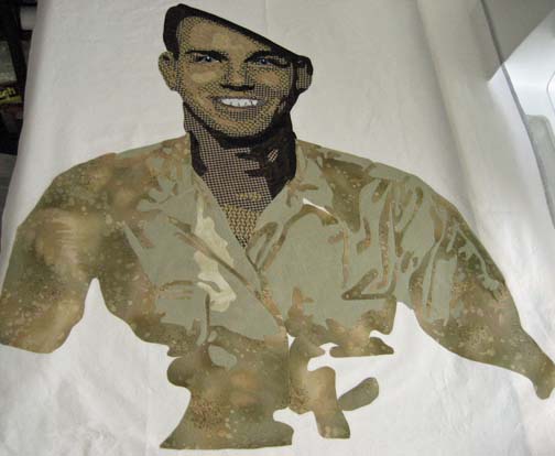
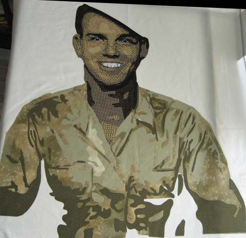
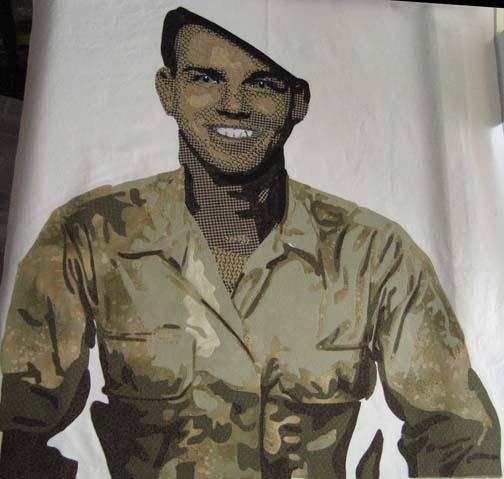
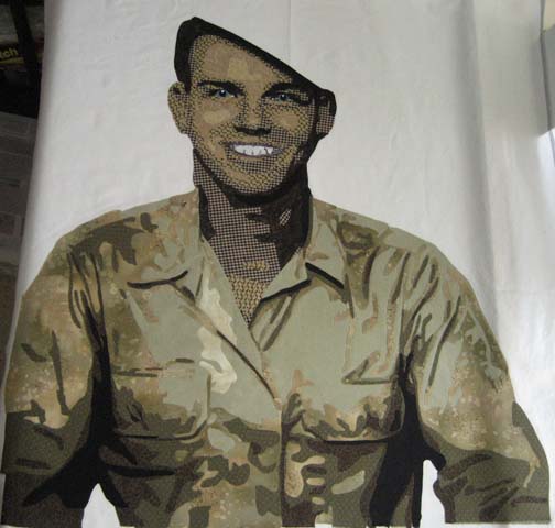
The Shirt
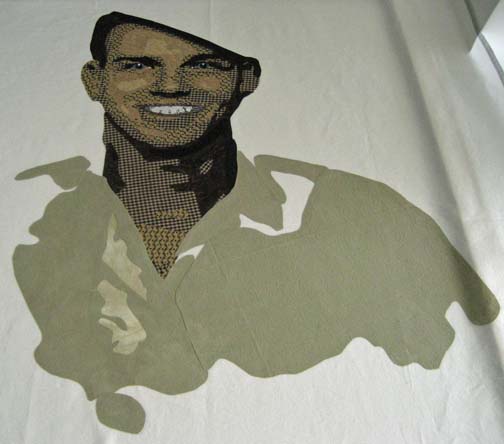
Although the picture I had was sepia toned, I was fairly certain that the shirt was khaki — which I couldn’t do since I used khaki colors in his face — so I leaned more towards a light military green. The main color, the 2nd value, is one that I had dyed years ago & tossed aside, thinking I would never use it — but it was perfect for this.
The next value outlines the wrinkles in the shirt and shows how the shirt fits him.
The darker values always seem to make it come to life.
The Hat
I had no reference for how the hat should look — and the picture didn’t tell me enough. After Google searching for World War II uniforms, I found a similar hat that surprisingly did not completely match the jacket — or in this case, the shirt. The brim was brown leather, and there was a belt just above the brim of brown leather. So I used the shirt colors for the top of the hat . . . .
. . . . and used a rich brown for the brim and belt (the belt will pop out once it is quilted).
The medallion was another issue. I’m fairly certain it was round metal so I used gold toned fabrics. Hopefully, using a metallic thread around it later will help it pop out more.
The Background
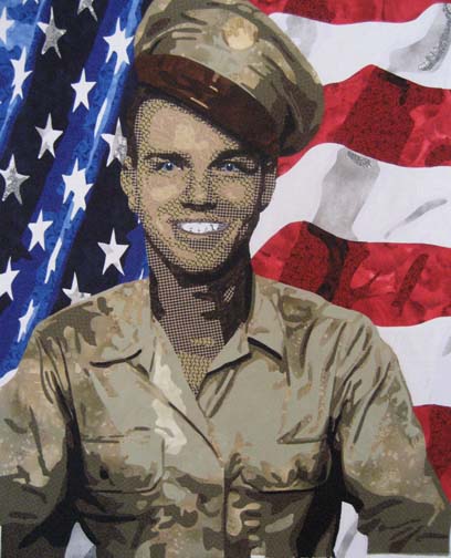
I don’t always know what to do in the background, but in this case, the decision was simple: a waving American flag. I used Photoshop to try out the idea and it was so successful, I knew it would work in fabric. What better tribute for an American soldier?
This is the first time that I’ve made a completely separate design for the background — but it only took me a couple more days.
Now I move into appliqueing and then quilting. Not as exciting as designing the piece, but still needed steps.

Your process is amazing to me. Usually, a John was a Jr., so to differentiate, he would be called Jack. My SIL is James, but goes by Jack because his Dad is James!
Beautiful work Ginny ~ you really captured John’s handsomeness! I’ll share this to my profile since your MIL is not one of your facebook friends!
Virginia…..each time I see your work, I am nearly speechless and this latest piece…well there are few words but I’ll try…
awesome, stunning, well detailed, a masterpiece!
Ginny, this is amazing. And the flag is flying….
My dad is Jack, but it is his real name, not a nickname.