Design
Design

Making a Plate
1After realizing that the “It’s Raining Cats & Dogs” special exhibit at IQF/Houston had added a new virgin rule this year — thereby disqualifying my piece Golden Moment since I had posted LOTS of pics of it on my website and blog — I decided to make a small piece for another one of IQF’s special exhibits. At first I thought about Life Begins At 40 — since I am currently in my 40’s — but what struck my interest more was What’s For Dinner.
I’m friends with Jamie Fingal, one of the curators, on Facebook, and every night she posts the question “what’s for dinner?” I get to hear about what delicious meal she is preparing and it usually makes me hungry.
Keep in mind that at this decision making point, I was at the beginning of May. I don’t typically spend many hours in the studio during the summer, and May itself is full of constant interruptions — so I was looking for a small piece to do. This needed to be an exact size — 24″ x 15″. Perfect.
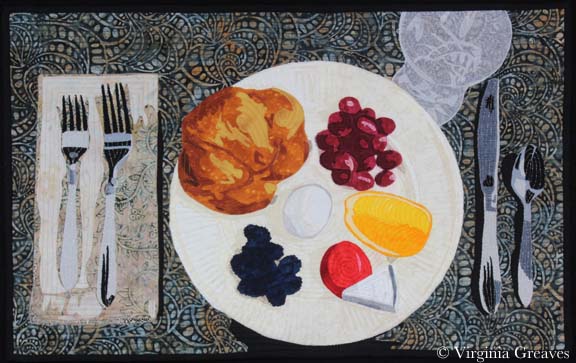
Then I started thinking about what to put on the plate — and I started to get hung up on plate design. Let’s face it — there are people that go to culinary school to learn how to properly plate food. (I know — I’ve watched way too many hours of Food Network.) So I was stuck for a while — until I decided I was making this too difficult. I went to my cabinet, pulled out a plate, knife, fork, spoon, and a crystal glass. Then I pulled some simple things from my kitchen — a croissant, a couple of different kinds of miniature cheeses, a boiled egg, and some fruit.
Simple yet elegant. It reminded me of the plate that Julia Roberts makes in the movie Eat, Pray, Love when she is learning about “dolce far niente” — the sweetness of nothing.
I started with my cream Wedgwood Edme plate. There are shadows all ready added for the different items on the plate.
I put the egg in the middle. Probably not my best choice — a white egg in the middle of a cream plate. And I really struggled with how to make it stand out on that plate. I tried many combinations of white and gray. This is what I ended up with (with one change later).
And then I added the fruit. The blackberries are from one fabric — a dark blue batik. It looks really dark in the pic but that’s the limitation range of a camera. If I want the plate to be sharp, then the darkest dark will be a little blurry. Then I added the grapes — and then the orange. I actually had a print of grapes — perfect size too. I thought about using it — but I wanted an artistic representation — not perfection.
You’ll also noticed that I added a rim of gray around the egg. I think it gives the egg more depth than it had. (The bias of white is a little choppy but it’ll clean up when it’s appliquéd.)
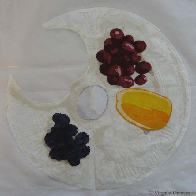
And then I added the croissant in the corner. I was dubious about the fabrics but I think they turned out well. It looks even better quilted.
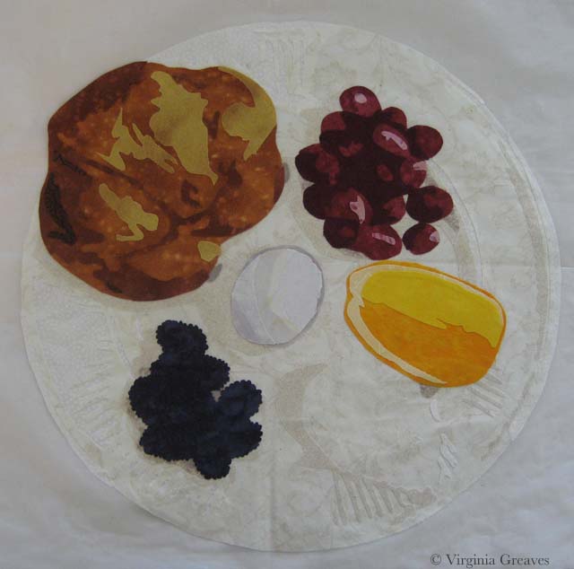
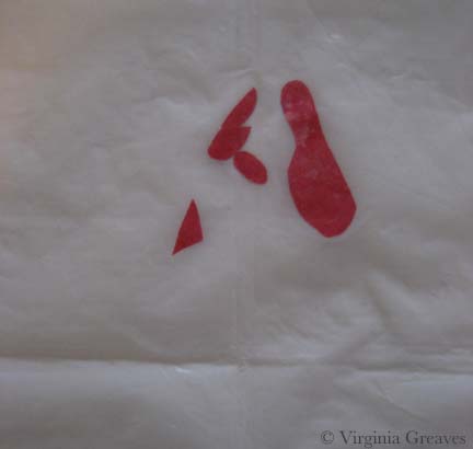
My last food items were miniature cheeses. When I originally photographed them, they were covered in their commercial labels. Those had to go. I redrew them plainer for my plate.
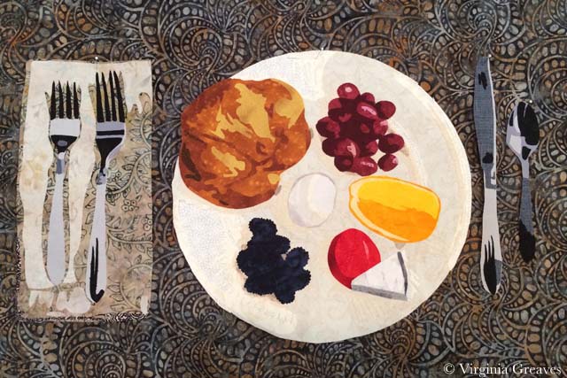
And here you can see the napkin and the silverware. I could tell from last year’s entries that people struggled with the silverware. Using non-metallic grays and black, I took a literal interpretation of the values in the silver. (I did use a metallic thread for quilting them though.)
I chose the background before the napkin. I loved this print and how it worked with the plate. I barely had enough — although I’ll admit at this point that I had it in my mind that the piece had to be 24″ x 18″ — and I wasn’t sure if I would end up with 18″ after quilting. I used it anyway, figuring I could add across the bottom if I had to — and it was just as well since the actual height requirement is 15″.
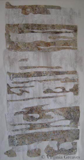
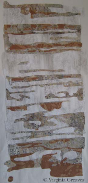
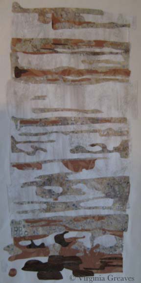
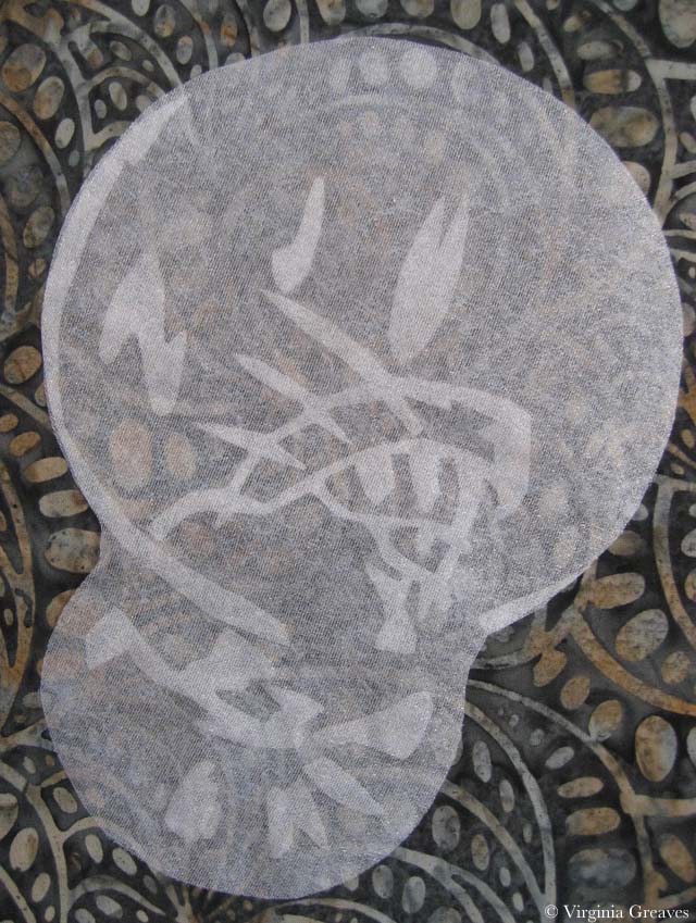
The glass was also something that I think presented a high level of difficulty. I had a nylon sparkly sheer in my stash that I thought might work. I started by experimenting with it and Wonder Under. I wasn’t sure if the heat from the iron needed to bond the Wonder Under would melt the fabric — so I kept the iron low and raised the heat as needed to make it bond. I worked in reverse order. I usually work light to dark — but since I could add depth by layering the fabric on top of itself, I put the pieces that I wanted to be darkest on my pressing sheet first.
Then I laid my largest piece of sheer on top. Not only are the raw edges of the first layer all covered (and there are a LOT of raw edges down there), but the layer on top gives the layer underneath more opacity.
I know — it’s a little hard to see on the white pressing sheet.
This is the glass on the background fabric. Not as sheer as I would have liked — but good enough. (It really looks fabulous wet — you can really see the background coming through then.)
And here is the full appliqué top before quilting.
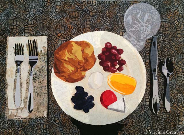
At some point after quilting, I realized that I only needed 15″ in height — which was just as well since my background fabric had shrunk closer to 17″ — but it’s sad because it meant that I would have to cut off the top of my glass. Oh well. No use spending too much time worrying about that. The glass is to scale and shrinking it to make it fit on the 15″ height would have made it look too small for the place setting.

North Carolina Insanity
1For my current piece, I was inspired by another picture by Dorothea Lange. This one was taken in North Carolina — 1936 I believe — and shows a woman, probably a sharecropper, standing in an old wooden shack. It appealed to me.
And as I started to work on the first wall of the cabin — I wondered what I was doing. I do portraits. This piece will have a figure in it, but she is not the main focus of the piece.
At one point, I did come to the realization that she is the house. I saw something online by Alice Walker in which she opined the situation of a slave that didn’t have the opportunity to express herself creatively — and I knew that this was the woman in the picture. She is bereft of herself and as worn down and tattered as the house in which she stands.
This is the first value for the right wall of the cabin. It’s a stand-in for plaster. The light in the pic isn’t great — I was working on this at night and didn’t think to turn on my natural light lamp.
This is the second value. It looks stark against the first value. It’s a batik that I bought to work as the background of my last piece, Worry, but it was too light so it ended up in my stash and works nicely here. Really — it does. Just keep going.
My third value is a rusty brown. I had to search some to find this. I had some rusts in my stash but they were too dark.
It’s a wall — I promise — although I’ll admit that I was getting disheartened. Sometimes you just have to keep going. This wall on the right of the piece is lighter than the rest of the cabin.
The next value is the first true brown — but there isn’t a lot of it here.
And then there is the darkest brown. Still doesn’t look right.
I did realize at this point that I needed to add the door facing — so I went back to the 2nd value.
And the 3rd value.
And the 4th value. Done. OK — it doesn’t look right to me either. The only thing missing is the black. There are many tiny lines of black separating the boards — and I had intended to do this in thread at the end — but at this point, I was disheartened and wondering if I had wasted my time — so I added the black.
Why does that make so much more sense? It just does. Without it, the eye just sees a jumble of shapes.
And then I did her face. I had painted myself into a corner. I couldn’t use the same brown tones I had used in the cabin for her face, so I decided to try the more yellow browns.
Her face is tiny — maybe an inch and a half — and when I first did this, I took this pic and then threw it in the trash. But, looking at it again in my camera with a little more perspective, I thought it might work — so I fished it out and started making her clothes.
I needed a color that would make her stand out but not look expensive. In the end, the blue would look best against her skin. This shows the first (very small) and second values.
The third value shows more of the outline of her dress.
The fourth value brings it even more to life.
This is the fifth value — and at this point, I’m happy with her face.
And then there is a little bit of black to add in there. (Don’t worry about her ear — it won’t be that large once I add her hat.)
Here she is in her hat and shoes. I chose gray which will be similar to the tiles in the roof. The background will be black and will fill in the space between her dress and shoes.
And here she is complete. The tablecloth and table leg are suggested objects. The rest of it falls into shadow.
As of today, I’ve done both the right and left walls of the cabin, the steps, and I’m almost done with the boards above the door and across the entire top.
I have to admit that I must be insane. This is a very complex piece. The applique is taking a very long time to do. And it is a true departure from the kind of work I normally do.
And yet I keep going. When I’m done with the cabin top — there are still a couple of rows of shingles at the top — and then rocks at the bottom. Hopefully all of this will make sense in the end.

Make It Work
0Last week, I finished the cardinal and put it in water to soak.
I had a thoughtless moment where I put synthrapol in the washing machine while the bin was filling with water. I thought to myself — that’s a mistake — I should empty the tub and start over. But then I thought — it’s so small — it shouldn’t matter.
If I had been really thinking, I would have reminded myself that red is bad to bleed — but I wasn’t thinking so I threw the piece in the water with a Color Catcher on top (I wasn’t totally brainless).
But of course, as you can see, the reds bled onto the background. This is what it looked liked after spraying it with Shout and washing it with OxyClean in cold and hot water — many times. I couldn’t get out any more of the red from the background. (I was able, thankfully, to shrink it a little. It was just over 12″ square — and for the exhibit I made it, it needed to be 12″ square — which now it is.)
I have had this happen before — with Beach Guardians. Thankfully, the background wasn’t printed so painting it with fabric paint should work. At this point, it was my only option left.
But I put it off — and worried — and procrastinated. No one wants to ruin something in the final stage with paint. I had spent almost two weeks on this piece — and I wasn’t looking forward to that going down the tubes if it didn’t work.
I took my fabric paint and mixed it on my palette — and got really close to where I needed to be.
I thinned it with water and blended it into the background.
I think it works.
I compared it to my picture of the piece from last week before I put on the binding — and the background looks less green. That is really only a difference in lighting. It’s almost scary how big the color shift is. This time, I used a side light — and last week I didn’t — but I couldn’t go back & re-take the pic with the bleeding — so I just kept it like this so you could compare apples to apples.
You may have noticed that I used a binding that matches the background. I almost always use black for binding — but as I said — I was trying to make this piece a specific size — and my cardinal just barely fit in the space. The best way to give him some breathing space was to use a binding in the same color as the background. If I had used black, he would have looked squeezed on there.
Did I mention I don’t like making something to a specific size requirement?

Setting the Mood
0Today I escaped from my house to the fabric store — the one closest to me — Tiny Stitches. If you remember, this is what I started with — a yellow green. The more I looked at it, the more I didn’t like it. It’s too yellow for me.
This piece really relies on the background to set the mood — and this yellow green takes too much away from the cardinal.
So I went back to my color wheel — and found something strange. I have two color wheels. One says that the opposite of red is green — the other one says that it’s cyan. The plot thickens.
So I pulled this light cyan from my stash. It’s not quite right either.
So I went to the store — the batik section — and started laying bolts on the ground and then laying my appliqué on top. I’m fortunate that it’s so small — I can’t usually carry my appliqué work in a folder.
This is nice but feels urban to me — not what I’m going for. It’s just a little too distracting.
And this is the green that should work — except it doesn’t.
This one is a little better — but it still doesn’t make the bird sing.
And then I pulled out this blue green. I liked it a lot more. It’s a good value change and sets off the cardinal nicely. So I carried this bolt around for a while and started walking through the aisles — because sometimes you can find interesting things in places you wouldn’t think to look — so it helps to go exploring.
Wow. A print. It is also a light blue green.
This is the same pattern in a darker color — too dark for the cardinal.
So at this point, I looked at all of the pics on my phone and I really loved the blue green print — but I thought I should try one more green batik. No — it just doesn’t work for me. It’s the right value and the print is the right proportion — but it isn’t for me.
So I lost a couple of days — but I now have the right background — the light blue green print. Better to change it now than wish I had later.

Cardinal Longing
1After I finished Worry, I had no idea what my next project would be. I get so involved in one project that I don’t tend to think ahead to the next — can’t really split my focus. I concentrate on one thing to the exclusion of other things.
But when I was done, I decided to make a small piece for the SouthEast Fiber Arts Alliance (SEFAA) Square Foot Fiber Art Pin Up Show. No theme — the piece just has to be 12×12 or smaller. I don’t usually work in this small scale — but I needed a rest and working on a small piece seemed like a good way to do that.
I had seen many pictures of cardinals in the snow being posted on Facebook — and I think that this is what I had in my mind’s eye when I began — a piece of hope flying across the frozen tundra (a little melodramatic, but we’re currently iced in for the second time in a couple of weeks and this southern girl is more acclimated to sunshine than snow.)
So I searched through all my reds and picked out a decent range. I wasn’t really happy with my first value — but then, what could I do? The weather was too iffy for me to risk a trip over to Marietta to pick out fabric — so I was limited to what I had on hand.
Just as I was getting ready to iron my WonderUnder templates down, I had the funny realization that I had paid for both sides of my fabric (obvious, I know, but a fact often overlooked) — so I ironed the templates to the front — so the back would show — which was exactly the shade I needed for the first value.
This is the second value — you can begin to see the outline of the cardinal.
The third value gives you even more — although I should have added to the lighting in the room before I took my pics.
The fourth value was all I got done before I heard that the news was telling me (I had the TV on while I was ironing) that I might lose power for several days — and I realized I needed to add a few things to my pantry. It was at this point that I ran out the door with fading daylight before the roads became truly impassable the next day (and they did).
I returned to this yesterday and added values five and six — the sixth one being black. Not bad but I really miss the eye.
Again, other blurry shot. I think the ISO on the camera I was using was way down — but you can see how I built up the eye in a similar way to the eye on The White Raven. I did add a larger highlight than I usually do — this guy has a small eye and the light coming off it gave the impression of the dimension of the eyeball.
Once he was done, I added the branches. I thought about adding a bunch of detail and then decided that it was so small, it made more sense to let the fabric do the work for me — so I found a brown wood batik and fussy cut it so I roughly had highlights and shadows where I wanted them.
And finally, I added his claws. They are really similar in tone to the branch — and I decided to stay with that. I used a purple with a lot of gray in it — but they are obviously the same value as the branch. I’ll define them more with texture in the quilting stage.
The last part is to add a background. This was my first pick. It’s a really bright acid green but it makes the cardinal pop. I tried other greens from my stash — but the greens with more gray in them make the cardinal more sedate — more like it’s a common wildlife scene.
And I could try something other than green — but the color wheel shows the green is the best choice — and holding up colors — it’s the one that makes the most sense visually — even if I did originally imagine more white and gray blues.
I’m not sold on this yet. I would love it if I could go to store and see if I could find something better — or validate my choice here — but there is still too much ice on the roads. I may go ahead for something to do. Sewing is a good antidote for cabin fever.

Worry Completed
0This week I was intent on finishing my latest piece Worry. I quilted the background and then applied the binding. The hand work is getting harder for me to do. I’m a fairly thin skinned person and piercing my fingers with an extremely sharp needle seem masochistic at best — and my eyes are beginning to struggle to see the tiny stitches. I have only machine applied one binding but I may revisit that on my next piece.
You may have noticed that I missed Wordless Wednesday. That’s because I didn’t think about it until Thursday — and at that point, I felt like it was just too late.
Yesterday I finished sewing on the sleeve and blocking it — and today it was dry enough for me to take pictures. I took some for the website — but I’ve about decided it’s time I buy a photographic background stand. I have two design walls made from creosote that have black flannel taped to them which I have used for both blocking and a photography background. I started using them for blocking after I moved here when I discovered that you can’t pin into looped carpet — but sadly, blocking it warps the creosote — which wreaks havoc on the photographs if you’re using the same surface as a back drop. I have learned all the tricks in Photoshop Elements to straighten a pic. Once I realized that water was warping it, I kept one for blocking and the other for photography. Sadly, the one I kept for photography has still warped.
So I intend to order a photography stand this week and re-photograph the pieces I’ve done this year. I probably won’t re-do the images on the website — but I’ll have the proper pics for exhibition entries and publication opportunities.

Stress and Family
2When I started working on this project, I needed a name for this project’s folder on my computer. In the beginning, it was Depression — since it’s based on a Depression era picture. As I worked on the mother, I began to see it has a reflection of the stress of mothers — so I changed the name of the folder to Stress Project — knowing that that wouldn’t be it’s final name. And as I get closer to Christmas and I see the insanity that is family that comes out during the holidays — this has becomes a difficult project for me to work on — much less talk about.
But — I should share my progress from last week. I had finished the mother and her son & began work on the daughter that is on the mother’s other side. This shows her neck, arm, and fingers curled up.
And her hair. I think it turned out well.
I snuggled her up to her mom. You may noticed that I’ve added some darker tones to the son’s hair. I also changed the fabric just under the mom’s hand — they were previously shirt fabrics but they were too close in tone to her skin so I just changed them to coat fabrics so you could see the back of her hand clearer.
The right hand side of the daughter is an extension that I’m creating because the photograph has something obscuring the view here (I think it’s a pole). I decided to lighten the lower shadow.
I like it better here. I also did the babies face. I don’t like how her face comes together but have decided that I’ll work on it after I’ve made her blanket. I’ll probably have the blanket wrap over the top of her head.
The blanket will extend across the bottom of the piece.
I think that I’ll continue as much as I can in the studio to try to black out the insanity of the holidays. It gives me a peace that’s hard to explain.

Tweek!
0This is my weekly Twitter update. It’s been a rough week but I had a lot of time for reading.
If you want to follow my Twitter posts directly, I’m @vsgreaves — or click the Twitter icon in the upper right just above the menu.
This is a very fun video to watch. Brene’ Brown is hugely entertaining — and she gets creatives & what we have to do to produce our work. It’s 22 minutes long, but it’s worth the investment of your time:
Brene’ Brown does an amazing speech on “the sweaty creatives”: 22 minutes that all creatives should invest in: http://tinyurl.com/mwbx8qy
Don’t we all need guidance about how to price our artwork correctly:
A Guide to Pricing Your Artwork – http://buff.ly/19adxuE via @ArtsyShark
I have both an undergraduate & graduate degree in business and I’ve always wondered what you do if you’re starting with nothing. This article tries to answer that:
“The Secret of the Chicken and the Egg” : what to do if you’re starting with nothing http://feedly.com/k/IBfeHv
This is an video interview with a brilliant mathematician about how he approaches impossibility (he died a few days after the interview):
“How to Tackle Impossible Problems” interview with the creator of fractals Benoit Mandlebrot http://feedly.com/k/1ceBKgr
To find that our support of the arts in the US is dwarfed by our support of football is unsettling at best:
“Where’s the Money? US Arts and Culture Economy By the Numbers” does our culture in the US support the arts? http://hyperallergic.com/97423/wheres-the-money-us-arts-and-culture-economy-by-the-numbers/
Let’s face it — as artists, we are our own worst critics — and it’s good to hear that we’re in good company:
“Bruce Springsteen, Woody Allen, and the Long Tradition of Hating Your Own Work” http://feedproxy.google.com/~r/The99Percent/~3/uU23FDGkqcg/bruce-springsteen-woody-allen-and-the-long-tradition-of-hating-your-own-work
This is not art related at all but I found it fascinating because it explained a hole in history that I rarely see discussed — the decisions of the British & French & how they shaped the current state of the Middle East:
How the Middle East was shaped after the Ottoman Empire “The map that caused a century of trouble” http://zite.to/1dyunCQ
This is a photography article but its discussion of using the Golden Mean for composition is applicable to all visual art:
“Beyond Basic Composition: Line, Shape and Form in Photography” http://zite.to/191Of4a
Again, not an art article but a scientist interview about how having widespread technology without widespread understanding of how it works will lead to a controlled society:
“A Science Icon Died 17 Years Ago. In His Last Interview, He Made A Warning That Gives Me Goosebumps.” http://zite.to/19Hnnk7
“British Library uploads one million public domain images to the net for remix and reuse” http://zite.to/1kGOVLU

Mama’s Clothes
0I have a dream to finish cutting out all this entire piece before the Christmas break. It’s ambitious but I’m putting the pedal to the metal and seeing what I can get done in the time that I have.
I started this week with her shirt. It’s hard to see hear since it’s white.
Here I’ve completed her jacket and her shirt shows up better. She’s actually hanging on my design board — that’s why the background is black. When I take a picture of this piece on the ironing board, I can’t get high enough above it to take a pick that doesn’t have some distortion. You can see some of that in the pic above.
The only issue I have is that some of darker values of the shirt are blending into her skin. The two pieces under her hand I can easily swap into jacket fabric. The lower pieces on the left will probably become lighter values.
Although it looks red in this picture, the colors are an orange red — more rust colored. I wanted the mother to have a hot color — and then the children will have cool colors. A bright red would have been too cheery — the rust conveys a more worn feeling.
Then I started on the son leaning on her left shoulder. He is turned away from the viewer so you only see the back of his neck.
I did use the same fabrics that I used for the mother. When I made Beach Guardians, the two sisters have the same fabrics. I think it gives a feeling of relationship between the two — unlike the duet piece A Walk in Twilight when I used different fabrics for the two friends.
And this is his hair. I like that he’s more blond relative to the darkness of his mother. He is, however, tucking himself into her side & behind her so I will at some point have to add some darker tone to the crown of his head where his head leans into his mother’s hair.
I was free to make his jacket any color I chose — but really, the smart thing is to let the color wheel have a say in it. Since I chose an orange red for the mother, I chose a green for her son. On her other side, her daughter will have a blue — probably more on the gray side though.
And the baby in her lap — I just don’t know at this point. Today I’ve finished the daughter’s neck, fist, and arm — but her hair will take some time.

Mothers and Their Children
4I haven’t worked on a person since I made Lincoln a year ago — but given that it was so successful at IQF, I thought maybe I should revisit making people again.
So I found this incredible picture taken by a government official in the 1930’s of a woman surrounded by her children and the lines of worry embedded in her face — and I decided to use this as my inspiration. (Don’t worry — this is a public domain picture.)
At first I chose this because of the parallels between the economy today and that of the Great Depression, but as I worked on it, I began to see it more as a metaphor for motherhood — how mothers worry and how their children are naturally oblivious to her stress.
This is the first value. Not much to see — although I’ve found this to be one of the most important layers. If I’m going to be criticized, it’s usually on the brightness of this first layer.
In the second value, you can see the worry lines in her forehead and the outline of her arm and fingers.
The third value gives you a fuller outline of her face and arm.
The fourth value gives you the deepening of shadows.
She begins to come alive in the fifth value.
And the deepest shadows are in the sixth value. I did not add color to her irises — I intentionally kept them black. I also added a dot of white to her eyes.
Then I went to her hair. I purposefully decided to keep it dark.
The second value is a dark brown.
And the third value is black.
At this point, I need to start her blouse and jacket. I’m considering making her very conspicuous with hot colors in her clothes — and then using coolers colors in the children — to convey the difference in mood between them — but I’m also considering making the children into more literal shadows using tulle and thread and not completely appliquéing them with fabric like I did the mother. It’s something for me to consider for a while.