textile paintings
Outside My Comfort Zone
When I went to the opening reception of Georgia Artists last month, I was so glad to see Lauren Bernazza there. She is the former Curator and Program Director of the Abernathy Arts Center (she’s retired to raise twins — been there, done that).
We did get the chance to talk about the work I had in the show, and at one point, she challenged me to make an abstract piece. I was standing with her and Leisa Rich, a friend of mine that had work hanging next to mine — and I slowly smiled. I challenged myself to make an abstract piece last year — and as whole, I didn’t consider it very successful — which I patiently explained — but neither of them would hear it! Finally Leisa took pity on me and told me that we could collaborate on a piece. I’ve never done that before and I was so excited at the thought of working with such a talented artist as Leisa, I quickly agreed.
The collaboration rules are that I start and then pass the piece to her. We pass it back and forth a few times. The goal is to end up with something different and hopefully better than either of us could create individually.
I purposefully made this small — it’s about 23″ x 17″.
For inspiration, I started with a pic Leisa had taken from inside her car during a car wash. I loved the luminescence of it.
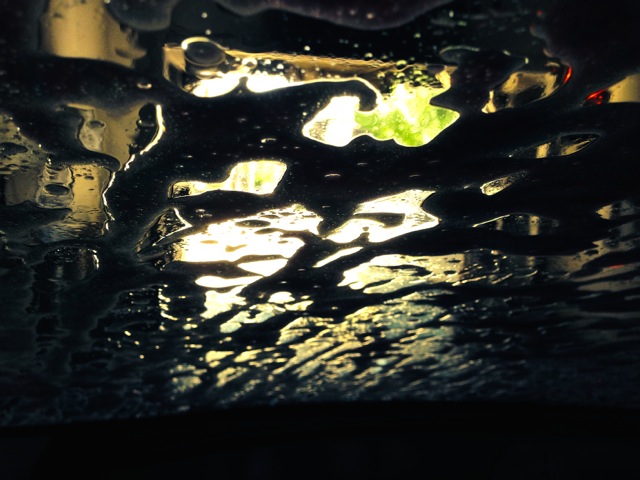
photo courtesy of Leisa Rich
When I printed out the pic, I ran out of black ink halfway through — so I had to go to the store for more. Then I printed it out again — and ran out of colored ink. Such is my lot in life. I sighed and decided to take it as a sign that I could make it whatever I wanted — so I did. I’m supposed to not be so literal with this piece anyway — and I often change colors in my pieces.
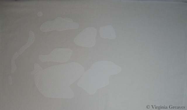
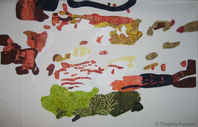
I started with a white piece of muslin as my canvas. Then I added white. I know — but it’s a brighter white than the muslin — so I went to the trouble.
Then I added three values of yellow. I know — just blobs of color.
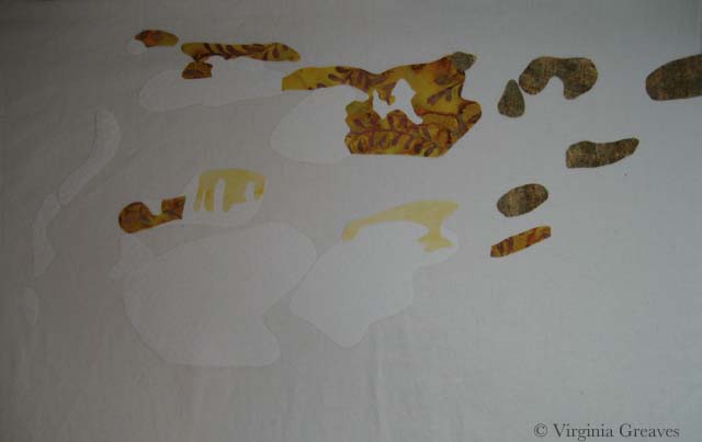
Then I added orange — I think there are five values.
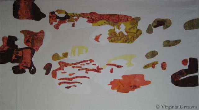
And then I added four values of green at the bottom — and I decided at this point to add some dark blue. It looks black here against the white — but it’s a subtle change from the black that will be placed in the background. (There is also just a little red in the upper right area.)
This is it except for the background. It doesn’t make much sense on the white.
However, once I added the black batik as the background, the entire piece comes together and makes sense. It took hours to cut out all those spaces in the background but worth it in the end.
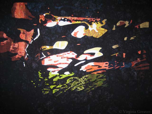 I’m pleased with it. I’ll take it to Leisa today or tomorrow and let her have her way with it.