Last week was International Quilt Festival — one of my favorite events ever. I wrote in my last post about the Winner’s Circle — but I wanted to share some pictures from the next day when we had the Luncheon and Preview Night.
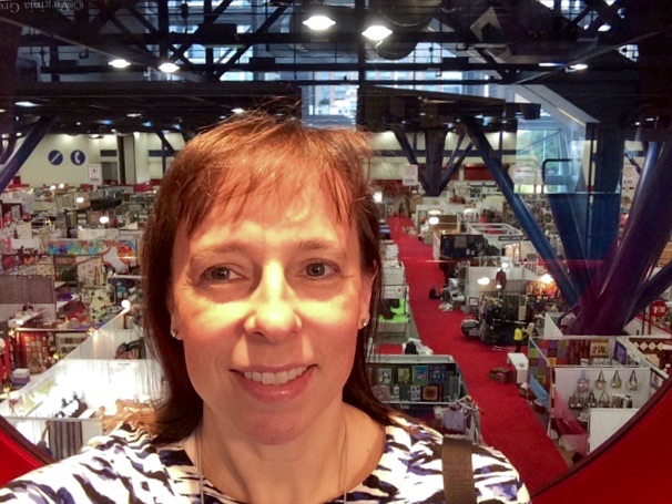
Sadly, the day after Winner’s Circle, the floor with the quilts and the vendors is closed until Preview Night starts at 5pm — but the 2nd floor has these cool portholes that overlook the vendor floor. I wish my arms had been longer so you could see the full porthole. At this point, I’m just in time for the Luncheon.
I didn’t take any pictures at the luncheon. When I arrived, I was the last of the winners to go in — and everyone else was let in soon after — so I was caught in the mad rush to find a seat at a table. The winners have their own tables, but it became clear that the signs on the tables weren’t going to keep anyone else from sitting there. The first table I went to, there were four empty seats and I asked one of the women if a particular seat was taken. At first she said no, and then started screaming at me that she was saving seats and I could take the far one over by the strange man (a spouse, obviously, who had zero interest in being there or being social). I was so surprised. Quilters are always the friendliest people and this is the only time I’ve been confronted by such a rude person at IQF, so I told her that that was fine — I would find somewhere else to sit. There is nothing worse than being with people that don’t appreciate you.
I found another table with an open seat — but just barely. I was luckily seated next to Patty Kennedy-Zafred, and next to her was Sheila Frampton-Cooper. I had a wonderful time talking with them. Patty gave me some ideas about using Lesley Riley’s TAP transfer paper that I’m considering using in one of my abstract pieces. I tried to buy some later in the day, but the only vendor that had it was Artisan Artifacts — and they only had the very large pack. Since TAP has a shelf life, I think I’ll need to start small.
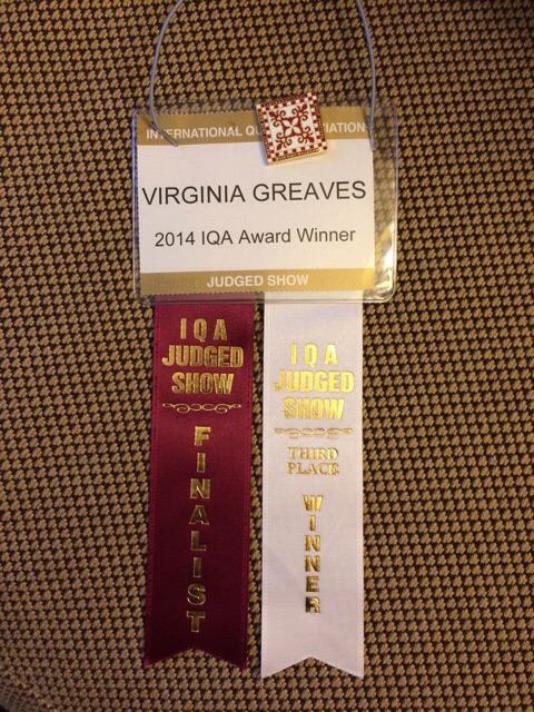
This was my name tag that I received in my packet the night before. I added the show pin to the top for flair, and this is what I used late in the afternoon to get into Preview Night when the show floor finally opens.
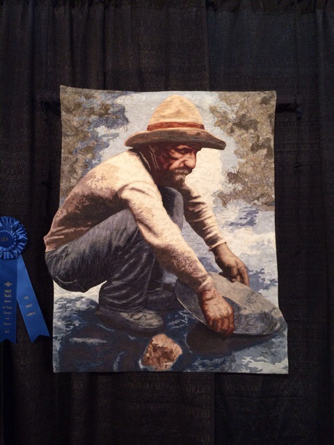
This piece was heavily thread painted and won first place in my category, People & Portraits. The artist, Lea McComas, also won the Master Award for Thread Artistry for her piece Bike Boys.
When I got in line for Winner’s Circle, Masanobu Miyama came and stood with me. I had met him last year when he won the Master Award for Thread Artistry in 2013. This year, his entry Chasing Bubbles was made with his wife and won 2nd place in my category, People & Portraits. Masanobu was so sweet and wanted his wife to receive all of the praise.
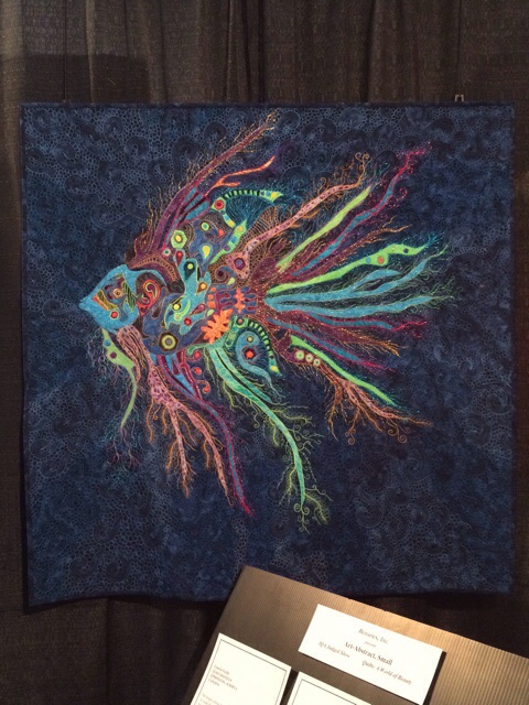
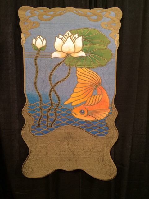
This fish piece by Elizabeth Dillinger was stunning. I’m not sure the picture gives grace to the intensity of the quilting. It was all freeform spirals and swirls.
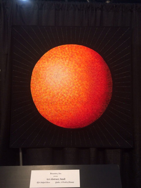
This piece by Sandi Snow won 1st place in Art-Abstract Small. From the color to the shapes to the quilting, it is a striking piece.
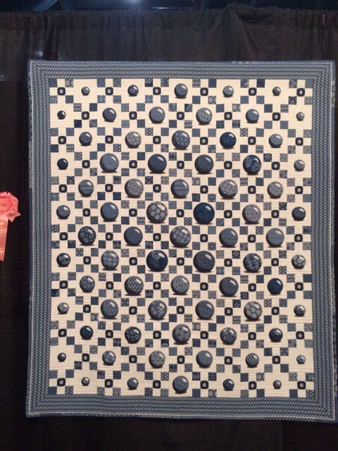
I know my pic doesn’t do this one justice. It was constructed with 3,300 1 1/8th” circles in 8 values of fabric. It has a luminosity that I found impressive.
Another abstract, this one by Sandy Clark. I loved the quilting on it.
I am not normally drawn to traditional quilts, but this one by Colleen Wise was so visually captivating. I found myself staring at it for a while.
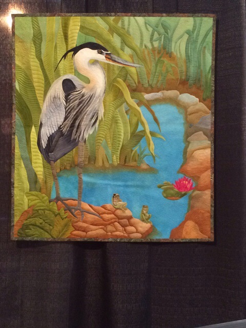
I loved this piece for many reasons. Not only am I partial to animals, but the reflection, all created in threadwork — and the immensity of the dense background quilting was nothing short of glorious. I did wonder why the artist chose to go by only Ferret — no first name. I remember a fiber artist several years ago that made monochromatic nudes with that last name and wondered if it was her. (I found her website — it is her.)

I was so excited to come across this silk piece by Christine Alexiou. I had met her last year when she won one of the Mastery awards. I hope you can see the quilted dragonfly in the bottom portion.
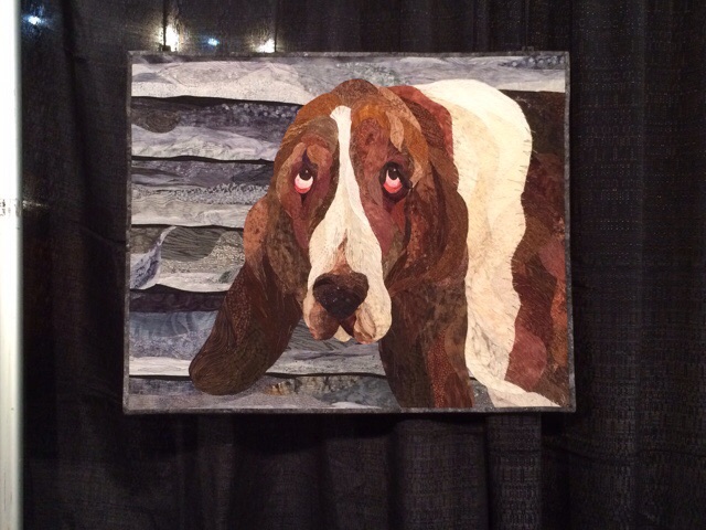
As I said, I’m partial to dogs, and I loved this one by Carol Cote.
This was a huge piece by Helena Scheffer and Marion Perrault. It was too hard to get a straight on picture of it with the crowds, but I loved it.

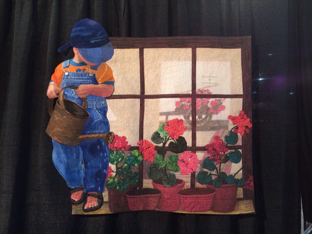
This was a small piece that captured me — I couldn’t figure out how she made the reflection work so perfectly.
This piece was made by Patty Kennedy-Zafred who I sat with at lunch. This is all screen printed and hand dyed fabric. She walked me through the process of making it, which was just fascinating. I love when an artist is willing to talk about her process, and I greatly enjoyed getting to know her.
I knew when I saw this that it was Marilyn Wall’s piece since I had seen her post pics of it in progress.
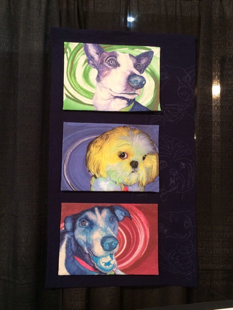
This piece by Shannon Conley just made me smile. I loved the colorized pups and the extension of the faces into the quilting on the right hand side on the black.
Nancy Sterett Martin‘s work is always stunning.
This is another piece that I had to study for a while (by Andrea Brokenshire). It is so realistic and the quilting only added to the life of the piece.
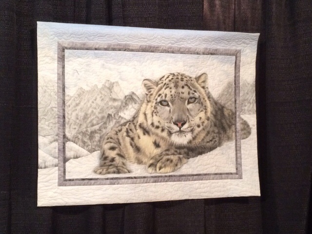
I loved this snow leopard by Jan Reed.
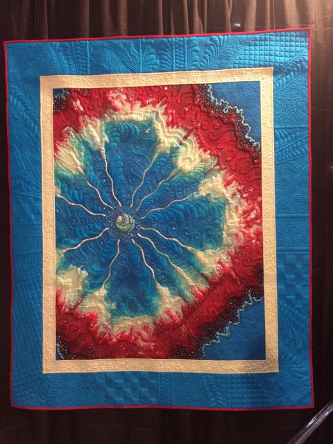
This is a piece that had to be experienced in person. A camera is just not equipped to handle what this woman was able to achieve. It is covered in tiny crystals and metallic thread, so when the light hits the front, it sparkles with a life of its own. It won 1st place in Art-Naturescapes.
I was charmed by this quilt by Sandra Leichner. Though rooted in the tradition of a wholecloth quilt, this one was covered in surprising details. From the quilted flowers to the golden dragonflies, it was truly special. I was surprised that this was Sandra’s piece as it doesn’t look like her usual work, but over the years, I appreciate the fact that we all (should) reinvent ourselves and work in new directions.
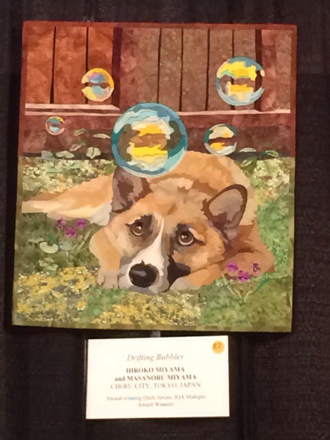
Masanobu & Kiroko Miyama also made this charming small piece Drifting Bubbles for the IQF Silent Auction. I knew when I saw it that it would be one of the most fought for pieces of the night.
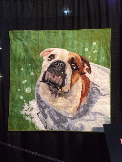
Who couldn’t love this face? Having done a bull dog myself, I couldn’t help but appreciate what went into this one (by Cindy Garcia).
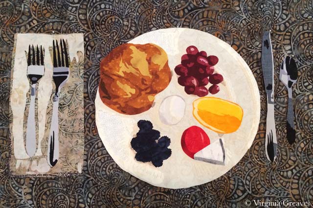
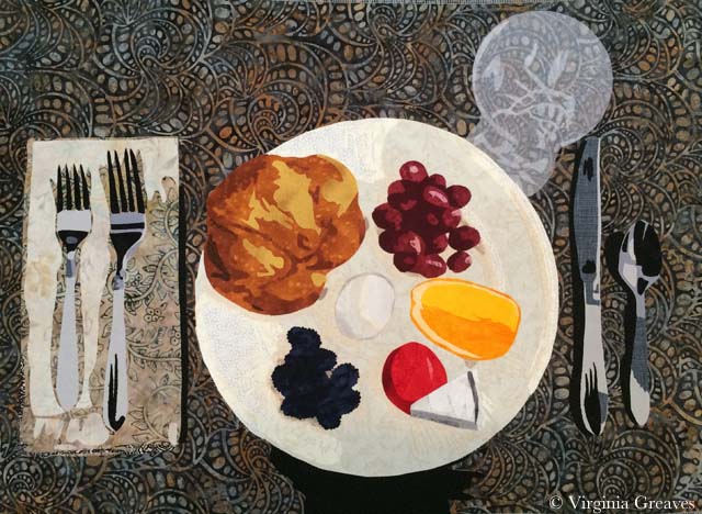
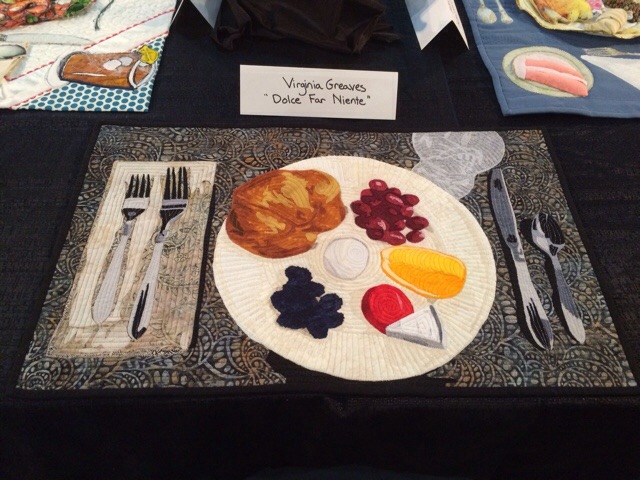
At the back of the hall was the What’s for Dinner? exhibit. I had seen it last year and decided to enter this year. All of the pieces are placed flat on a long table — as if each one is a place setting.
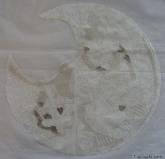
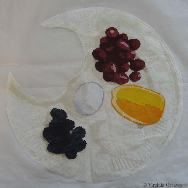
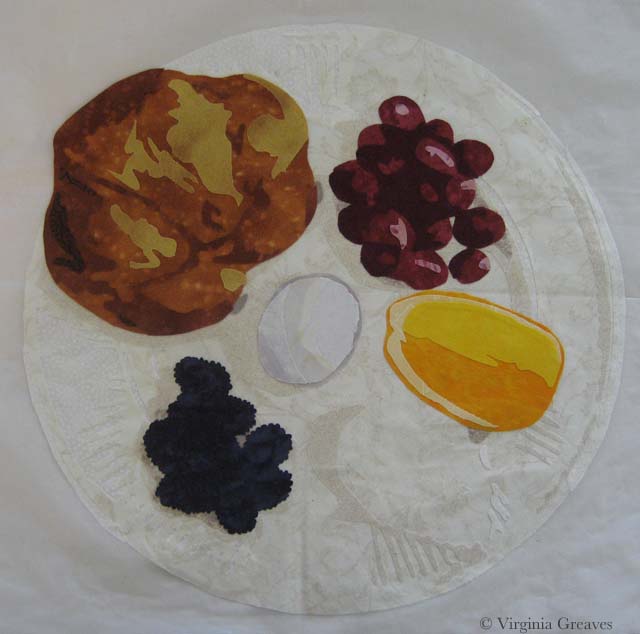
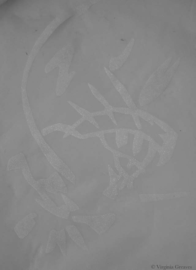
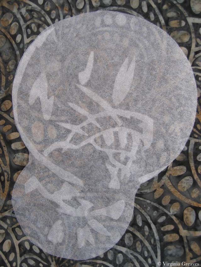
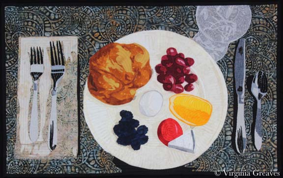
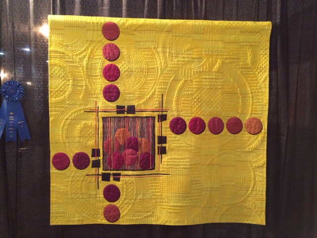
This is my piece Dolce Far Niente (The Sweetness of Nothing).
And this was Karen Ponischil’s — I also met her last year.

I loved this one with the lobster by Jeanelle McCall.

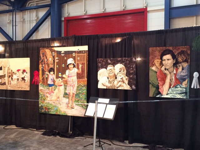
Towards the end of the night, I drifted back to my piece since I had forgotten to take a pic of it with it on the wall with the surrounding work.
I ran into Patty and she took this one of me with my piece. (I know — I was tired at this point.)
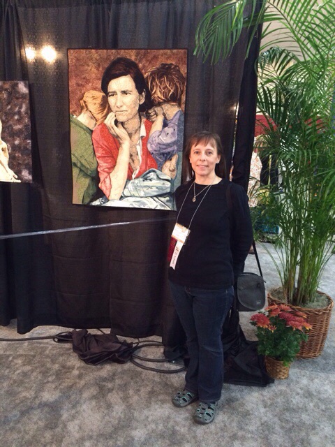
I was wearing sensible shoes. I had debated wearing something cuter, but I was told that at Festival, fashion stops at the knees. I’m glad that I heeded that advice. I was able to go the full five hours and then was still okay waiting in line for the bus back to my hotel.
I sprinted through all of the quilt exhibits. Then I ate and spent some time walking through the vendors. I had a plan of a limited number of booths I wanted to see. I spent too much time talking though and didn’t get to everything. There were only a couple of places I was tempted to spend money though. I am blessed to live in Atlanta, and most of what was available I can find locally. I was fascinated with Artistic Artifacts, though — and am now regretful that I didn’t buy some of the hand carved wooden stamps from India (another day — and they have a website!) And Superior Threads — I love their thread. I only bought a thread stand though. I have an old one that constantly falls over, and Superior has a new one that they’ve designed — I can’t wait to try it out.
I actually ran into a couple of people I know — Diane Schultheiss, who I know from the Fiber Art Fusion group in Atlanta (she was hanging out next to the Artistic Artifacts booth) — and Victoria Rondeau, one of the current reps for SAQA-GA (although she just moved & is stepping down at the end of the year). I had so much fun talking, the clock ran out and it was soon time to go.
This was the point at which I regretted not staying at the Hilton. I knew that they would close the hall at 10pm so I left about 20 minutes so I wouldn’t be in the crush to get on a bus. Even then, I had to wait and the bus went to the Hilton last — so the process was about 45 minutes.
I had such a great time in Houston. I had a mountain of work to do when I got back home, but it was worth it to take the mental break. Ideally, another day would be best — an entire day to cover the exhibits and vendors.