Posts tagged abstract

Third in Abstract Series

0

I met with Leisa over a week ago. As I last mentioned, I had finished quilting our 2nd collaborative piece and I offered it back to her for additional changes. We decided that it was done and that I would bind it — which I started yesterday. Last week, I spent a glorious week of cutting and fusing our 3rd abstract piece. Leisa was out of town and I wanted to have something to give her when she returned this week.

She asked in that meeting if we could extend out the edges on this piece. It was already drafted but after talking about it, we decided to rotate it and extend the two sides — which would become the top and bottom.

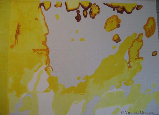
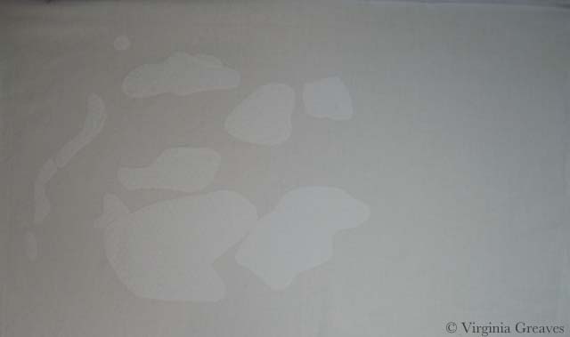
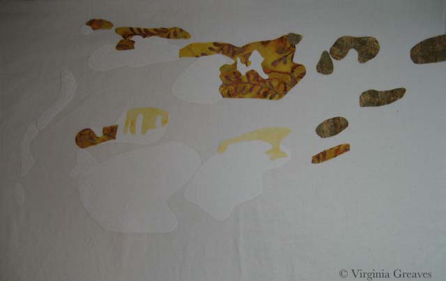
I started with the whites and yellows. In retrospect, this piece has a lot of yellow and I wish I had toned it down. This is its original orientation. It’s on my drafting table that’s covered with an ironing mat. I have to stand on a ladder and hold the camera above the piece to attempt a picture. Moving it to the design wall doesn’t work well for my process.

in process yellow

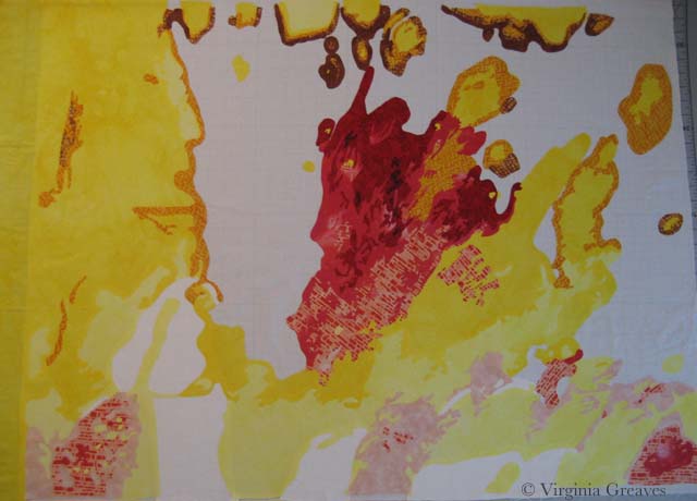
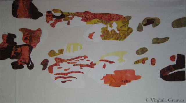
Then I added the reds.

in process red

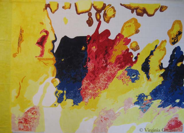
And then the blues. I rather like it at this point.

in process blue

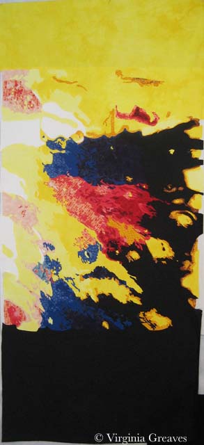
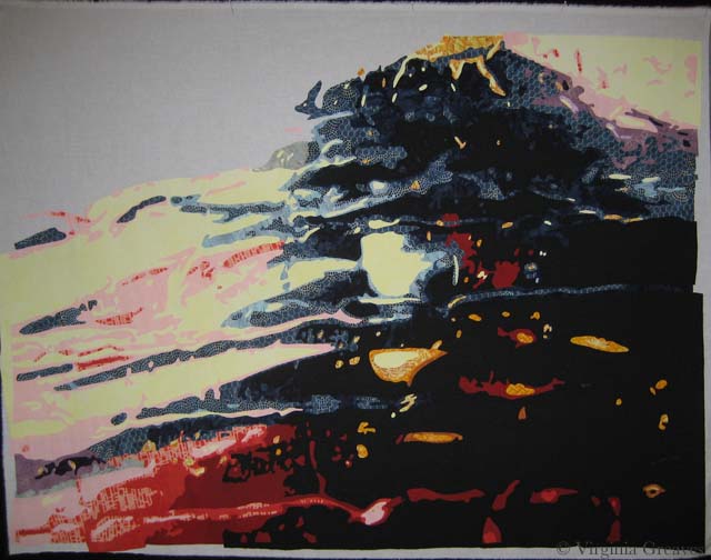
Then I added the black and changed the orientation. I’d be lying if I didn’t say I was completely flummoxed. There are several things that changed in the piece when I changed in the orientation — some of the shapes began to take on new and unintended meanings.

My first reaction was to take off the black and replace it with something else — but Leisa wants it just like this. I hope she paints it. I know she intends to cut strips in the bottom — maybe also the top. It’s just very striking color wise. Maybe that isn’t such a bad thing. It still has a lot of transformation until it becomes its final self.

in process black

ad;lkfja;skdjf

Collaboration

0

Yesterday I met with Leisa. She still has plans for the small piece we did first so I didn’t get it back — but I took her the larger abstract piece that is second in the series — now that it’s quilted — and she liked it! I thought she would want to embellish it but she made an excellent point about restraint and knowing when to stop. We are both happy with it as it is — so I will add a binding and sleeve and consider it done.

quilted abstract #2

I’m strangely drawn to the thought of an almost completely machine stitched binding. I’ve only done this one other time but it seems apropos to the piece — and has the plus of eliminating a large part of the hand sewing.

I have finished drafting a third piece — I picked out fabrics today — and Leisa and I talked about a fourth piece which will be a whole cloth that we will cut into strips and otherwise playfully manipulate. I have learned so much in this collaboration.

I really didn’t know how to work in groups until graduate school — and I was really forced to do it there. We each gave our best to create the best collective effort. Now it’s easy — with the right people that know how to do it too. People with control issues don’t work well in collaborations. It has to be a give and take. You don’t always get your way but you learn from the other person and respect their opinion. You don’t worry about getting your way — you work on finding a solution that works for both of you. It’s a beautiful theory — it’s a shame that governments don’t work this way.

IP3 Carwash #2 Final

Making Friends with Abstract

1

For the last couple of weeks, I’ve been busy working on another piece inspired by a pic taken by Leisa Rich. I know — I haven’t finished the last one — but I wanted something to work on when I handed the other piece off to her. I don’t like to have more than one project open at a time — but in working collaboratively, it just happened.

This one is much bigger — it’s about 42″ wide by 36″ high.

I didn’t take a ton of in process pics. It just doesn’t make as much sense as it does when working in pictorial. I tried to take pics for each color group, but I ran into a problem with that. This piece was pinned on my drafting table with the ironing pad. I pinned it there so it wouldn’t shift around. I couldn’t construct this piece in sections — the entire piece had to fit together like a puzzle. However, it’s so large, if I stood on a chair and took a picture of the top, I couldn’t get the entire piece in the frame and everything would be skewed. Therefore, I took a lot of pics, many of which were terrible — and I got to be friends with the Delete All option on my camera. Unfortunately, in doing that, I inadvertently deleted an all yellow and all red pic that I had taken and planned to use. C’est la vie.

That yellow with the pink is really horrid. I think that this was the worst stage — with all the hot colors and none of the cool colors (there was a little bit of purple and green but not enough to balance the hot).

IP1 Carwash #2 Hot

Then I started adding the blues. It made a world of difference. Adding the cold colors gave life to the hot colors. I also needed the intensity of a deeper value. That comes in the dark blue — and then ultimately in the black.

I took this picture while it was tilted on the table. For the previous picture, I had unpinned it from the table and set it vertically on the design wall for a good pic. Unfortunately, it shifted everything around in my puzzle — so I wasn’t going to do that again until the end.IP2 Carwash #2 Cold

And here is the final pic of the top — vertical on the design wall — with all of that deep black.

I am very fond of this piece. I am using the skills that I learned in making pictorials but applying them to abstract design. IP3 Carwash #2 Final

Collaboration 1 -- full

Struggling with Abstract

0

This week I met Leisa Rich at Abernathy Arts Center. We picked up our work from the Georgia Artists show that closed last week and spent about an hour talking about our abstract piece. She has added a bunch of stitching and it looks amazing.

Collaboration 1 -- full

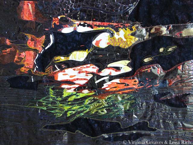
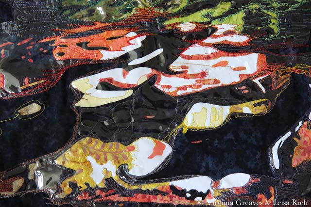
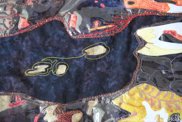
I love the vinyl on the piece — it makes it look a lot like water. She took these pictures. I admit to having a problem photographing it. The vinyl is very reflective and cannot take direct light. But I was so pleased at the different life that it has now taken on.

These are detail pics.

Collaboration 1 -- detail1

Collaboration 1 -- detail2

Collaboration 1 -- detail3


I can’t get over how much its character has changed. I love it so much more than what I would have done with it.

She handed the piece back to me and we talked about what to do next with it. We’re considering making a larger but more realistic piece that this would fit into — but I’m having a problem working out value problems. There is so much huge contrast in this section that it’s difficult to resolve the focal point issue with the entire piece. Obviously the focal point should be the abstract. I’m still working out in my head how to accomplish that in light of this other idea.

And while I was waiting on Leisa to do her part last weekend, I started another abstract piece — a much larger one — and to be honest, I’m struggling. I can’t rely on my usual practice of logic to determine where colors go. I usually have no problems turning my value studies into colors — but that system doesn’t work very well here. It was an issue with the small piece, but I was able to work around it. It’s harder to do in a piece 45″ wide.

I’m telling myself that there are no wrong answers. It can be whatever I want it to be.

Right now I’m marking all of the sections on my pattern with colors. I’ll hopefully finish that later today so I can move on to picking fabrics. Maybe I’ll even come up with an excuse to take a trip to Red Hen!

And let’s face it — it’s summer. There are numerous distractions to take me from something that isn’t holding my attention very well. Even in art we have to slog through difficult tasks sometimes.

One last thing — Leisa has asked if she can be a guest writer on this blog to which I happily agreed. Given that our work is a collaboration, I definitely think that her point of view should be shown as well. I’m looking forward to having her contribution.

5th black

Outside My Comfort Zone

2

When I went to the opening reception of Georgia Artists last month, I was so glad to see Lauren Bernazza there. She is the former Curator and Program Director of the Abernathy Arts Center (she’s retired to raise twins — been there, done that).

We did get the chance to talk about the work I had in the show, and at one point, she challenged me to make an abstract piece. I was standing with her and Leisa Rich, a friend of mine that had work hanging next to mine — and I slowly smiled. I challenged myself to make an abstract piece last year — and as whole, I didn’t consider it very successful — which I patiently explained — but neither of them would hear it! Finally Leisa took pity on me and told me that we could collaborate on a piece. I’ve never done that before and I was so excited at the thought of working with such a talented artist as Leisa, I quickly agreed.

The collaboration rules are that I start and then pass the piece to her. We pass it back and forth a few times. The goal is to end up with something different and hopefully better than either of us could create individually.

I purposefully made this small — it’s about 23″ x 17″.

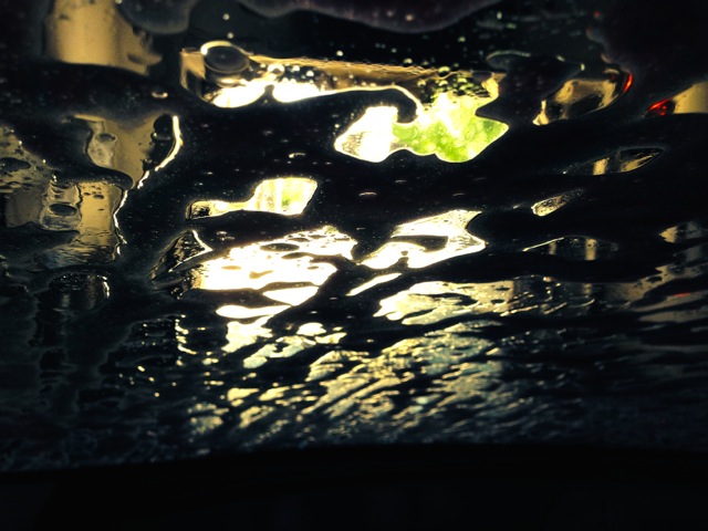
For inspiration, I started with a pic Leisa had taken from inside her car during a car wash. I loved the luminescence of it.

Car Wash pic

photo courtesy of Leisa Rich

When I printed out the pic, I ran out of black ink halfway through — so I had to go to the store for more. Then I printed it out again — and ran out of colored ink. Such is my lot in life. I sighed and decided to take it as a sign that I could make it whatever I wanted — so I did. I’m supposed to not be so literal with this piece anyway — and I often change colors in my pieces.

I started with a white piece of muslin as my canvas. Then I added white. I know — but it’s a brighter white than the muslin — so I went to the trouble.

1st white

Then I added three values of yellow. I know — just blobs of color.

2nd yellow

Then I added orange — I think there are five values.

3rd orange

And then I added four values of green at the bottom — and I decided at this point to add some dark blue. It looks black here against the white — but it’s a subtle change from the black that will be placed in the background. (There is also just a little red in the upper right area.)

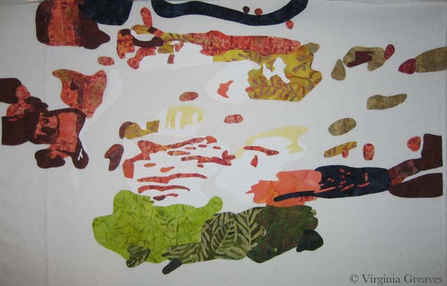
This is it except for the background. It doesn’t make much sense on the white.

4th blue & green

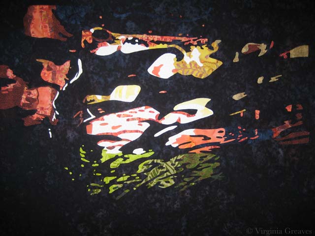
However, once I added the black batik as the background, the entire piece comes together and makes sense. It took hours to cut out all those spaces in the background but worth it in the end.

5th blackI’m pleased with it. I’ll take it to Leisa today or tomorrow and let her have her way with it.


Go to Top