Posts tagged art marketing

Tweek!

0

twitter.jpg

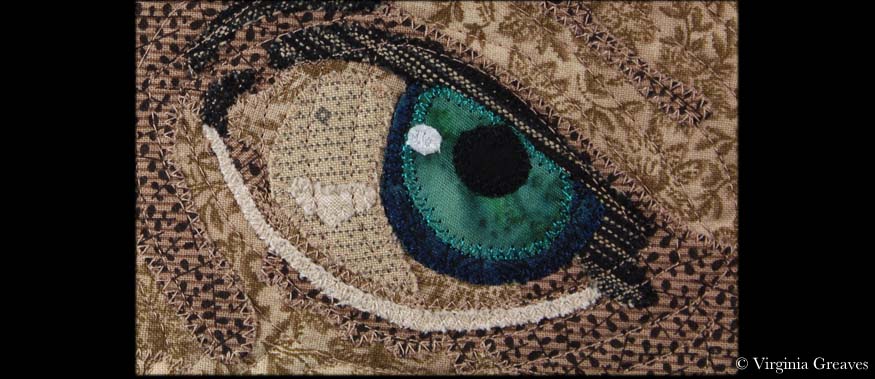
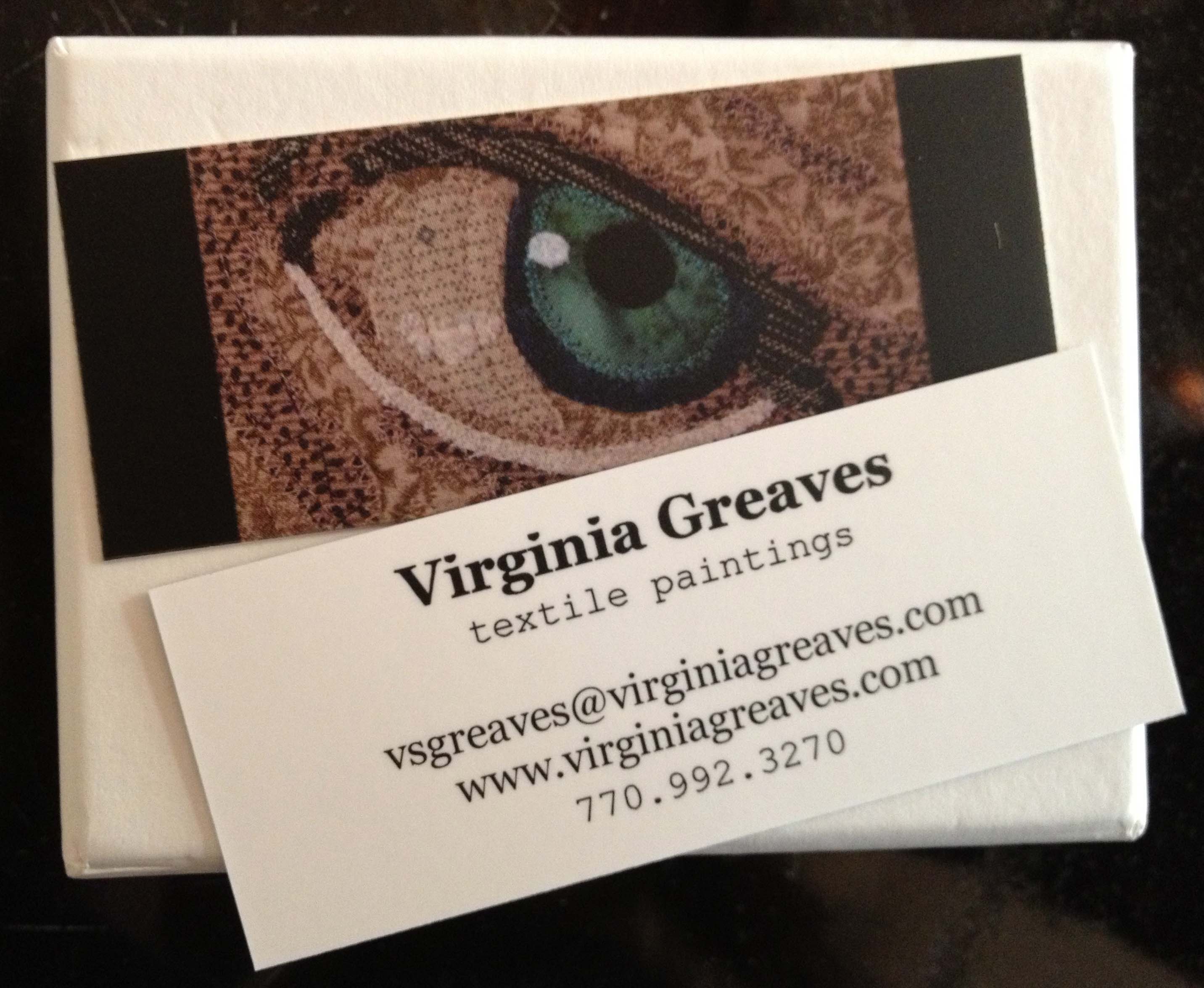
It’s been an exciting week. I started on a new albeit small piece for a special exhibit and I had the opening reception for Georgia Artists here in Atlanta at which I was graced with a first place ribbon. Don’t blink — life can get fast. I just need to remember that while I am isolated in my studio during the week with little human contact except on the computer.

Here I present my weekly Twitter tweets. If you would rather follow me in real time, I’m @vsgreaves. You can find icons for my Facebook Page and Twitter account in the upper right above the menu.

I love Elizabeth Gilbert — she wrote Eat Pray Love — and in this TED talk, she discusses dealing with success and failure and how to recover from both of them.
Home is where you love something more than yourself. Elizabeth Gilbert: Success, failure & the drive to keep creating

It’s hard to tell from the title but Winkleman is asking why people buy art and what they as a consumer gain from that exchange. If we hope to sell them our work, it’s a good idea to know how this question is answered.
Winkleman: What job do people today hire fine art to do? “My Milkshake Brings All the Boys to the Yard”

The High Museum here in the ATL has received several million dollars of donations to use for a permanent collection space dedicated to photography.
“Atlanta’s High Museum of Art receives nearly $4 million for photography « AMA”

Inspirational photography:
RT @mymodernmet: Brooke Shaden dazzles us once again with these beautifully surreal photos

Winkleman writes an interesting argument for equal access to an arts education, and although I take issue with his discussion of income inequality (which reeks of communism), the truth as my capitalist heart knows is that our republic has been devolving into an oligarchy and only the rich will soon be able to pursue a degree in the arts. What great art will we miss if everyone isn’t given the opportunity to create? Will we miss the next Michelangelo?
“Equal Access to an Arts Education” Art education & the economic realities of an oligarchy.

I am a huge proponent for arguing that you should fail — and if you aren’t failing you aren’t trying — and this review of the book Creativity Inc. on Pixar’s cofounder covers a discussion of what kind of strategies managers need to bring risk and ultimately big successes into their companies.
“Pixar Cofounder Ed Catmull on Failure & Why Fostering a Fearless Culture Is the Key to Groundbreaking Creative Work”

This is a quote from the article above — the review of the book on Ed Catmull, Pixar cofounder.
RT @brainpicker: “In a fear-based, failure-averse culture, [people’s] work will be derivative, not innovative.”

This is another book review from Brain Pickings — on Letters to a Young Artist — in which the author discusses the importance of self-esteem in the creation of art.
“Letters to a Young Artist: Anna Deavere Smith on Confidence and What Self-Esteem Really Means”

Designing Business Cards for Artists

1

As I’ve mentioned, I have a couple of openings coming up soon, and one of the goals that I listed for this  year was to produce new business cards. I had made some a couple of years ago — printed them on my inkjet printer using tear-able sheets — and comparing them to the professional ones that several artists have given me & I’ve saved for posterity — they are truly tear-able / terrible.

With literally a week to go, I needed to come up with something fast. I had been toying with the idea of using a non-standard size. I googled best cards for artists and came up with oodles of original ideas. The biggest take away from that was that one of the easiest ways to make your card stand out was to either make it a different size from a standard card — or make it out of non-standard materials. Knowing the enormous amount of time that could go into making cards out of fabric — like mini Artist Trading Cards — I decided that the mini-moo’s were probably the best way to go with my limited time table.

The mini moo’s are from moo.com — they are half the size of a typical business card (in length). I debated using someone local — but in the end, I was able to design a card using their template in a short amount of time, upload it, and still get them back quickly.

I knew that one side would have my information. I debated adding a QR code — I had actually convinced someone else to use one recently & researched how to make one — but it just didn’t make sense in terms of size on the mini-moo.

The other side would essentially be part of my brand — so I had to think carefully about what I would use. It would stand for my work as a whole — but it had to be small enough to look good on a mini-moo.
Minicard MockupIn the end, I went with a small closeup shot from a piece I made a few months ago — an eyeball. I am fairly proud of this eyeball — I love the color and it gives you an idea of the depth that I put into my pieces while still being small enough to fit on the card. I did end up trimming the sides with black to even it up with the template and help make the picture pop.

I’ll concede that I also used an eyeball on my last business cards. The majority of my work in the last few years has been portraits so it makes sense to me to use an eyeball. A full portrait would not have stood out on a mini-moo — the eyeball seems just right.

Business Cards

I used rush printing but regular shipping. I was ordering on a Thursday & moo.com printed them on Friday & shipped them out. I received them, surprisingly, on Monday.

The picture is dark — but I expected that. Monitors use the RGB (red green blue) color model — and printers use CMYK (cyan magenta yellow key or black) — and my Photoshop Elements isn’t advanced enough for me to use professional printing standards. I still think it looks fine.

It is also matte. I wanted gloss — but that isn’t available with rush printing. C’est la vie. I still think they look professional.

Notice I used different fonts. I think that mixing fonts can be an effective way to draw the eye. The font for “textile paintings” is more drawn out than the one above it. My name at the top is in bold & in a larger font. The combination draws the eye to the name.

The email address & website are variations on the name so they’re in the same font as the name at the top. The phone number is in the same font as the subtitle “textile paintings” — I think it makes the numbers easier to read.

For a long time, I had “Fiber Artist” as my subtitle — both on my cards and on my website — but I’ve come to see that that is not as accurate a description as I should have. I work in fiber as a medium — and I am an artist — but my pieces have a strong relation to paintings and I think it’s important to acknowledge that. I am often told by people that glance at my pieces that they think that they ARE paintings. “Textile Paintings” describes my work better.

Go to Top