Posts tagged branding

Tweek!
0 This was the last week of school for my girls so there was a lot of interruption and not a lot of studio time. I did manage to finish my latest small piece — a still life — but blocking it caused some fabric crocking that I will correct tomorrow. I’ll post about how I do that. I also took some in process pics that I’ll share. I admit I’ve been a little stingy with sharing my studio time lately. I think the truth of it is that I’m a little burned out creatively.
I also have not had a lot time for reading — so I only have four Tweets this weeks. Remember that if you want to follow me in real time, I’m @vsgreaves — or hit the social media icons in the upper right above the menu.
I thought it interesting, after writing a recent post Branding Yourself As An Artist, that Winkleman has carried the torch and furthered the discussion. Being a gallerist from NY, he has a lot more wise thoughts on the subject.
“Branding for the Fine Artist : Part I” Wise words of Winkleman. http://feedly.com/e/HWftCphx
Brain Pickings presents yet another thoughtful essay on the secret to creative success as demonstrated by the masters — work ethic.
“The Long Game:Brilliant Visual Essays on the Only Secret to Creative Success, from Leonardo da Vinci to Marie Curie” http://feedly.com/e/pgtauIUC
Although it’s curious enough to follow the bullying ways of WalMart, it’s equally fascinating to ask the question — who own the photograph? Although federal law says that it is the photographer, I have had subjects that are adamant that they are the owners of their own image.
“Walmart Goes After Photographer’s Widow” — who owns the photo — the photographer or the subject? http://feedly.com/e/4cUqyTB3
Harper Lee again takes her hometown to court for copyright infringement as the town continues to capitalize on their claim to fame.
“‘To Kill a Mockingbird’ author Harper Lee heading back to court in fight with hometown museum” http://feedly.com/k/1pkzE7a

Designing Business Cards for Artists
1As I’ve mentioned, I have a couple of openings coming up soon, and one of the goals that I listed for this year was to produce new business cards. I had made some a couple of years ago — printed them on my inkjet printer using tear-able sheets — and comparing them to the professional ones that several artists have given me & I’ve saved for posterity — they are truly tear-able / terrible.
With literally a week to go, I needed to come up with something fast. I had been toying with the idea of using a non-standard size. I googled best cards for artists and came up with oodles of original ideas. The biggest take away from that was that one of the easiest ways to make your card stand out was to either make it a different size from a standard card — or make it out of non-standard materials. Knowing the enormous amount of time that could go into making cards out of fabric — like mini Artist Trading Cards — I decided that the mini-moo’s were probably the best way to go with my limited time table.
The mini moo’s are from moo.com — they are half the size of a typical business card (in length). I debated using someone local — but in the end, I was able to design a card using their template in a short amount of time, upload it, and still get them back quickly.
I knew that one side would have my information. I debated adding a QR code — I had actually convinced someone else to use one recently & researched how to make one — but it just didn’t make sense in terms of size on the mini-moo.
The other side would essentially be part of my brand — so I had to think carefully about what I would use. It would stand for my work as a whole — but it had to be small enough to look good on a mini-moo.
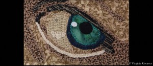
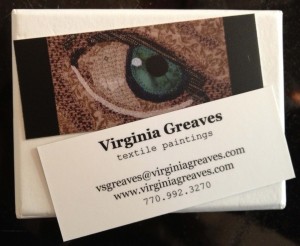
 In the end, I went with a small closeup shot from a piece I made a few months ago — an eyeball. I am fairly proud of this eyeball — I love the color and it gives you an idea of the depth that I put into my pieces while still being small enough to fit on the card. I did end up trimming the sides with black to even it up with the template and help make the picture pop.
I’ll concede that I also used an eyeball on my last business cards. The majority of my work in the last few years has been portraits so it makes sense to me to use an eyeball. A full portrait would not have stood out on a mini-moo — the eyeball seems just right.
I used rush printing but regular shipping. I was ordering on a Thursday & moo.com printed them on Friday & shipped them out. I received them, surprisingly, on Monday.
The picture is dark — but I expected that. Monitors use the RGB (red green blue) color model — and printers use CMYK (cyan magenta yellow key or black) — and my Photoshop Elements isn’t advanced enough for me to use professional printing standards. I still think it looks fine.
It is also matte. I wanted gloss — but that isn’t available with rush printing. C’est la vie. I still think they look professional.
Notice I used different fonts. I think that mixing fonts can be an effective way to draw the eye. The font for “textile paintings” is more drawn out than the one above it. My name at the top is in bold & in a larger font. The combination draws the eye to the name.
The email address & website are variations on the name so they’re in the same font as the name at the top. The phone number is in the same font as the subtitle “textile paintings” — I think it makes the numbers easier to read.
For a long time, I had “Fiber Artist” as my subtitle — both on my cards and on my website — but I’ve come to see that that is not as accurate a description as I should have. I work in fiber as a medium — and I am an artist — but my pieces have a strong relation to paintings and I think it’s important to acknowledge that. I am often told by people that glance at my pieces that they think that they ARE paintings. “Textile Paintings” describes my work better.
