Posts tagged inspiration

The White Raven

Completing the Raven

0

The White Raven
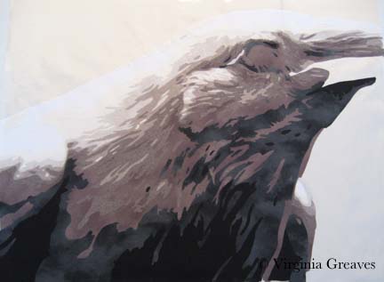
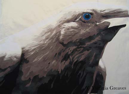
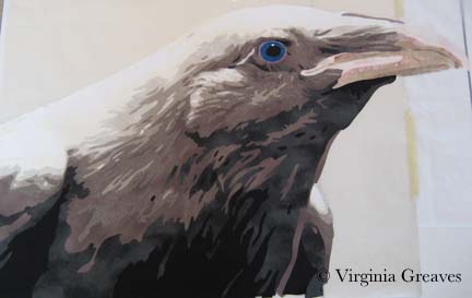
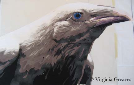
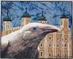
I have finally completed The White Raven. The bird was wonderful — the Tower of London was tedious — but I think in the end that it all came together. It’s ironic that I now have such a creative flow while constructing portraits and my more difficult moments are in the backgrounds.

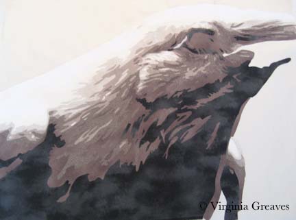
I used a stacking type of stitch while quilting the raven to give the impression of feathers — it was interesting to see how the white thread changed the character of the darker fabric shades. I am becoming completely reliant on Isacord thread for free motion quilting. I can run my machine at a high speed and the thread is less likely to shred. It’s also available in a huge selection of colors. A thread run before I start quilting is almost a must for me at this point.

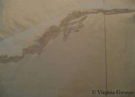
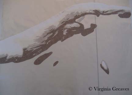
The Tower was not as much continuous line quilting as I would have liked. There was a lot of stopping and starting — so it took much longer to do — but hopefully I’ve created the impression of the Tower in a minimalist way. I still wanted the focus to be on the raven.

The background was also difficult because of the Tower peaks. I started in the middle between two towers and echo stitched a wavy line upwards — but once I reached the top, I attempted to echo stitch back down between another set of towers. Any quilter knows that you have to quilt from the inside out — especially if you’re quilting densely. By quilting from a less dense to a more dense area, I created some ripples that could only be resolved by ripping out all of my quilting and starting over in the correct direction — from the more dense outwards to the less dense area.

The White Raven detail
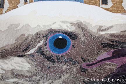
At the end, after I had washed it, blocked it, and added the label, I went back and added more quilting in the raven’s eye. It’s the focus of the piece and it did not have enough quilting relative to what was around it. I didn’t want it to sag over time.

The raven isn’t exactly like the original — I had to take liberties with the beak especially — but I think it is definitely reminiscent of the pictures of Mike Yip. His photographs of the white ravens in the Vancouver Islands are really wonderful.

Adding the Tower of London gave the piece whimsy — a story — which I think adds to the visual interest of the piece.

The White Raven

1

After finishing Firecracker, I did not have another project in mind. I spent a few days doing administrative things — donating my time to do some volunteer work — but then it was time for the rubber to hit the road. If inspiration doesn’t come, you still have to keep creating. So I went looking.

I have had a fascination for years with ravens. I have a newspaper clipping that is probably eight years old on my design wall about the ravens kept at the Tower of London. Legend tells us that if the ravens were to leave the Tower, the Tower and thus the Kingdom of Great Britain would be lost. Charles II declared that at least six be held captive there for the rest of time. Their wings are clipped and they are cared for by a Yeoman Warder.

All of those ravens are common — or black — but there are rare instances of white ravens in British Columbia, Canada. These are not albino ravens with red eyes but rather white ravens with blue eyes.

Which leads me to the inevitable question — what if a white raven were to inhabit the Tower?

There is a wonderful photographer at Qualicum which the white ravens call home — Mike Yip. He very graciously gave me permission to use one of his photographs as inspiration for this piece.

This is the first value — pure white. I started this piece in the late afternoon and the failing light gave me a yellow cast on my design surface.

value1

The second value is almost harder to see as it has a yellow cast to it.

value2

The third value is a little easier to see.

value3

The next day, of course, the light in my studio was better for photography. This is the fourth value and you can really start to see the bird emerge. It is strange to think that a white bird is more than white — but even the majority of the colors in the clouds in the sky are not white. White always has a supporting cast of characters.

value4

This is the fifth value.

value5

And this is the sixth. I had to go outside my stash to find the fabrics for this piece and I had counted on 7 values — but I miscalculated — there are 8. So I took my range of fabrics, tried to figure out where I felt like there was a large enough value jump between two fabrics, and went to my fabric drawer to try to fill it. I was very lucky — I had the perfect fabric that snuggled in perfectly to what I had already set up — and that is the fabric here.

value6

The seventh value goes into gray.

value7

And the eighth and final value is the black.

value8

Then I worked on her eye. I had the perfect blue in my stash. It is actually a little lighter than the blue in the photograph but I think it works well. I’m surprised at how visual I’ve become. I envisioned the exact blue that I wanted and then went to pull it from the drawer.

eye

The beak was tricky. It has a different texture to the feathers and I knew that to make it stand out visually from what I had done previously, I needed to use different fabrics. I liked the range of pink for the top of the beak, but they didn’t work as well for the bottom.

beak1

In the photograph, the plum around her eye is repeated in the lower section of the beak — so I tried a range of plums for the lower beak. This is closer to where I want to be. There is always something in a piece that isn’t clear cut.

beak2

You’ll notice that I had to tape my smaller pressing sheet to my newer one. I never thought I would go beyond the dimensions of my ultra large pressing sheet — but it didn’t take me long to press the boundaries.

I don’t know if I’ll keep the beak the way it is, but I’ve set it aside on my design wall for now. I’m working on the Tower pieces. Once again, I loved the way she looked so much on the black, I considering giving her a plain background — but then she also looks good on the primary Tower fabric that I chose, so I’m going to experiment with that and see where it takes me.


Deep Thoughts

0

I have just finished my latest piece, Arminta Patterson.

She is a straight forward portrait. I’m now looking for something not so straight forward. At this point, I know that I can make a realistic looking portrayal of a person in fabric. What more can I do? What makes a portrait of someone more than just a portrait — what elevates it to art? We all need to spend time growing.

I usually advocate just working on something — keep moving. Now I feel that I need to spend a little time in reflection — deciding what it is I want to say.

I just sold Bull Dawg (yay!) but I think it was because it was a market-able piece. I’m more likely to sell a piece that isn’t so personal. You can argue that you make art for it’s own sake but if you only make art for yourself, you’ll soon run out of storage — unless you start deconstructing  — but I don’t do much of that in my current series.

And yet I have to be inspired. I want to be inspired. I’m waiting for the Muse to come over and start moving things along.

Go to Top