2015 Goals

0

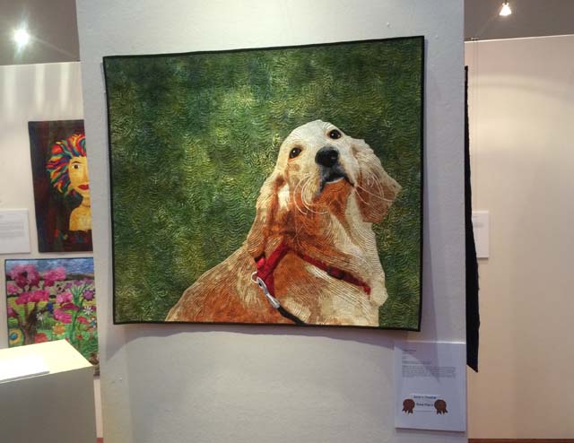
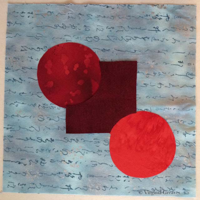
I am late in publishing a post regarding my art goals for the year. The truth is that I have been struggling with them, but this morning, it occurred to me that that’s because 2015 is going to be different. I can’t just copy my goals from last year and have them work again. I am preparing for a two-person show. I can’t share pieces once they’re final, and since they’re abstract, blogging about their creation is not the same. I can’t break the process into manageable portions anymore. Currently, my ironing board is loaded with fabric, and I’m applying pieces as I go, no longer by color alone.

I am also challenged by what I can enter into shows in the coming year if I am dedicating a chunk of work to the two-person show. There’s only so much that I can produce.

I did make a leap and finally a purchased a time keeping app called OfficeTime. I had been using the timer on my phone, then entering it in a Notes app, then transferring it later to a spreadsheet on my desktop. That became unmanageable. Now I have a timer that keeps track of what I’m doing by project & by category. It doesn’t sync with my desktop, but I can export my reports to a spreadsheet. I haven’t decided if I’ll stick with that or purchase the desktop version too. Right now, there’s no backup of my hours which makes me nervous now that I’ve come to rely on this app so much.

Anyway, let’s give this a shot.

Irish Eyes— Make 2015 goals.

— Create spreadsheet to keep track of hours by project and by category — as well as social media goals.

— Print blog books. I didn’t get to that last year. I keep hoping they’ll upgrade Anthologize into a better app — or a better app will come along that turns my blog posts into better publishable material. I’m not thrilled with what I get from Anthologize — it doesn’t give me published dates as a reference on page headings. You can only put them in chronological order by hand. I already have the PDF’s created — I just have to send them to the printer. I’ll commit to printing 3 years worth.

— Create a printed book of work created. This is more easily said than done. I want to create a page for every piece on my website. Ultimately, it would be great to have every piece I’ve ever done. I thought about a scrapbook with prints of my work, but then none of my artist statements or information on sizing would be on there. I’ve reached the point where my inventory is getting away from me. I want a place that I can bring it all together and have even if my website would one day go away.

— Increase web traffic. Last year my goal was 5% — which at this point seems like a bad joke. I innocently thought that the best way to increase your traffic was to write regularly on your blog and post regularly to social media. Silly me. Apparently, all you really need to do is get your name or work published somewhere in mainstream media — OR do something that other people find offensive and talk about endlessly in a social forum. LOL! Well, it seems funny now anyway.

While I have no desire to attract negative attention, I do want to continue to grow the traffic on my website. I cannot, however, use 2014 has a year for comparison — so let’s say a 10% increase over 2013 traffic.

Golden MomentComplete at least 6 large pieces. I will definitely stick with this goal. I have at least 5 large ones to complete for the two-person show.

— Participate in two-person exhibit.

— Enter at least 6 other exhibitions. This is the same as last year’s goal which, given the two-person show I’m working on, sounds like a lot, but I’ve already entered 3 as of today.

— Continue to work on collaboration with Leisa Rich.

— Publish at least 1 blog post per week. Last year this was 2.

I spent a lot of time last year combing through articles about art — which I tend to do anyway — and then tweeted them. They then syndicated to my personal Facebook page — and at the end of the week on Sunday, I would write a weekly Tweek! summarizing all of the tweets I made in the week. I’m not certain how popular those blog posts were though.

And then in a pinch, I could also make a Wordless Wednesday post with a photograph I had taken somewhere for inspiration. Did I tell you that my camera was recently stolen? <sigh> I do intend to replace it and will probably still do some Wordless Wednesday posts.

I would like to write more on my blog, but I’ve been faced with more challenges for my time in the past year. I started doing some freelance work, and when I’m not doing that, I want to be in my studio creating work. I have deadlines I have to meet. So my blog has suffered as a result. If I’m being realistic, though, I don’t see that changing, so I’m only going to commit myself to once a week.

— Write Worryat least 4 FaceBook posts per week on my professional Page. This is the same as last year.

— I don’t think I’m going to continue a Twitter goal. I am going to keep my account, but in the scheme of things, it don’t think it was adding much to me professionally.

— Spend at least 15 hours per week on my art. Last year I said 15 hours in the studio — but in the end, I counted all dedications of time to my work. The truth is that a lot of time is spent entering shows, shopping for supplies, working on my website, curating, etc.

— Sell at least 2 of my pieces. This is the same goal that I had last year, and I’m comfortable continuing it.

— Be a positive and constructive energy within the art world. I’m okay with competition, but I don’t agree with stepping on other people to get ahead. I want to share what I know through speaking to guilds, and I want to share the work of other artists so that others can experience their talent. Be the change you want in the world — I choose the brighter path.

Working From Photographs

0

This morning, I was spending a few minutes on Facebook, and Dorte Jensen, who was accepted in SAQA as a JAM member at the same time I was, posted a picture of a piece she made of Lincoln to the Art Quilts page. Given the recent discussion of the use of historical photographs in your artwork, I couldn’t help but think that comparing her picture of Lincoln to mine makes my argument all too clear — that the use of a photograph as inspiration does not mean that the artist is merely copying the photograph. Obviously, there is immense skill in drafting a pattern from any photograph and rendering it in your own style.

Although the inspirational photograph for her piece is slightly different than the one I used, it is obvious that our styles are completely different.

This is Dorte’s piece.

Dorte_Lincoln

And this is mine.

Lincoln

If our pieces were merely copies, they would look almost identical.  Clearly they do not. They each have their own spirit and life and attributes that make each one special.

Dorte has also recently made a piece of Ben Franklin that is marvelous. I hope you enjoy her website.

As portraitists, it is inevitable that we will turn to historical photographs if we want our work to be marketable. The skill with which they are rendered are no less than if we were to use one of our own photographs. As long as the copyright is clear, they are a wonderful source of inspiration.

2014 Accomplishments

1

At the end of the year, I look at my goals and see how close I came to achieving them. Here is it January 8th — I should have done this at the end of 2013 — but I got the flu after Christmas, and it took all of my energy for a couple of weeks. I’m just now beginning to recover and put together the pieces of everything I have to do in my life. Today was the first time I’ve had to look at my art goals.

2013 was the year that “I finally broke into the sunshine at the International Quilt Festival/Houston” — and 2014 was the year that I created controversy.  But just like I said last year — I’m still here and kicking — and I hope to continue to create in 2015.

Worry— My blog was viewed 21,00 times in 2014 which broke all of my previous records. The highest viewed post was The Use of Someone Else’s Photograph in Your Work, the subject of which was the controversy over my piece Worry at the International Quilt Festival/Houston this year.

Worry and Golden Moment were accepted into Georgia Artists at the Abernathy Arts Center here in Sandy Springs, GA, an exhibit highlighting the work of local Georgia artists from all mediums. Golden Moment won 1st place.

Worry was accepted into International Quilt Festival/Houston: World of Beauty and was awarded 3rd place in the Art-People, Portraits, and Figures category.

Dolce Far Niente was accepted into the special exhibit What’s for Dinner? at Quilt Festival/Houston.

The Cardinal was shown at the Square Foot Fiber Art Pin Up Show at the Southeast Fiber Arts Alliance here in Atlanta and then was donated and auctioned at the International Quilt Festival/Houston Silent Auction.

LincolnLincoln traveled from the 2013 International Quilt Festival/Houston and went to The Texas Quilt Museum, Spring Quilt Market in Pittsburgh, International Quilt Festival/Chicago, and Quilt! Knit! Stitch! in Portland before being purchased.

Beach Guardians traveled from the 2013 Sacred Threads show and went to Sacred Threads West: Art of the Sacred in Seattle, WA.

— Rebecca Reasons-Edwards and myself co-curated another exhibit this year called Fierce Fibers at The Art Place in Marietta, GA. Beach Guardians, Golden Moment, A Walk in Twilight, and Worn were exhibited.

— Golden Moment was accepted into Art Quilts XIX: Permission to Play at the Chandler Center for the Arts in Chandler, AZ and was awarded Juror’s Choice & 3rd Place.

Firecracker was included in the article Pet Portraits Popular With Owners Who Quilt in the Daily Sentinel published in January.

— Heike Hellmann-Brown wrote an article about me and my work that was published in the local publication North Fulton Family Life in August.

— Sold Lincoln to a private collector.

— Sold I Am the Vine, You are the Branches to a private collector.

— Sold Worry to a private collector.

The Cardinal— Sold The Cardinal to a private collector.

— Met goal of selling at least 2 of my pieces.

— I completed 3 large portraits, 1 small animal portrait, 1 small abstract, and 3 large abstracts. (All of the abstract works were made in collaboration with Leisa Rich.) (Goal to make at least 6 large pieces met.)

— I started a collaboration with a local artist, Leisa Rich. We have been working on an abstract series based on car washes and are planning a two person show at the Abernathy Arts Center in October of 2015.

— I applied and was accepted into Studio Art Quilts Associates as a Juried Artist Member.

— I spoke at The Atlanta Modern Quilt Guild in Marietta, GA, The Alpha Arts Guild in Alpharetta, GA, and the Misty Mountain Quilter’s Guild in Blairsville, GA.

— This year I kept a massive spreadsheet and kept track of my hours. I have to find a simpler way to do this. Halfway through the year, I decided that I not only wanted to keep category totals but also totals by project — so I ended up keeping two separate spreadsheets.

— As of the end of the year, I have 115 FaceBook Page followers (increase from 2013 unknown but I think it’s around 50%) and 32 Twitter followers (52% increase but still small).

— I did fairly well on maintaining my social media goals. I posted at least 2 blog posts a week 80% of the time, I posted at least 4 FaceBook page updates 78% of the time, and I posted at least 6 Twitter updates 74% of the time.

— What I didn’t do well with this year was keeping myself to at least 15 hours per week in the studio. I only met that goal 59% of the time. I was on track until I started taking freelance scoping work on the side. The truth of the matter is that my family is a part time job, so freelancing work cut into my art time. I do think I will keep this goal in 2015 however. I just need to work on being smarter with the time that I do have available.

— I didn’t keep my sketching goal at all. I have no problem drafting out a pattern for a particular project, but I can’t seem to make myself stop and fill a page in a sketchbook.

— I easily increased web traffic 5%. Given the controversy over Worry at IQA/Houston, my traffic increased 55.4% over last year.

I am eternally grateful for the support and encouragement of my friends and other people that reached out to me during the controversy over Worn. I am reminded that my place is to hold up others to the light and forward their achievements in a positive way. I leave all the others that still have lessons to learn — behind.

Love me or hate me, I’m still here, and I hope that 2015 is a great year.

Wordless Wednesday

0

Christmas star

Wordless Wednesday

0

brussel sprouts

#winning

1

Although I’m not a big Charlie Sheen fan, I can see him in my mind’s eye, grinning and proclaiming “Winning!” I think that’s a little bit how I felt last week — like I had been through a tremendous storm but come out on top after all.

I got an email last week from Mary Mattimoe with whom I have corresponded with in the past. We both have pieces in Art Quilts XIX in AZ, and she was able to see the exhibit in person and take pictures. Luckily, she took a pic of my piece Golden Moment and sent it to me.

Art Quilts XIX

Photograph courtesy of Mary Mattimoe

It’s a wonderful venue and I love the lighting on the piece. You can even see the background quilting — which on that batik, is impressive (the lighting not the quilting).

And you see that little card down there in the right hand corner? It says “Juror’s Choice” and “Third Place.” Awesome sauce!

I also received my packet from IQF-Houston a couple of days ago. It included a check for the sale of Worry (#winning) and my third place ribbon.

I was hesitant to open the envelope with the judge’s notes. Even on a winning piece, they can create some moments of humble pie. But even there, the judges loved the piece and gave it high marks. After the scathing criticism I received from members on QuiltArt, it was nice to have judges with prominent resumes of their own support what I’m trying to do in my work. (#winning)

Love me or hate me, I’ll be here tomorrow — just doing my thing.

Working with Paper Backed Fusible

0

Last week, I drove up to Blairsville, GA to talk to the Misty Mountain Quilter’s Guild just before Thanksgiving. It was a wonderful group, and even though my wireless connection from the iPad to the projector decided not to work, we made do with the quilts that I had brought and still had a memorable time. I love telling stories about my work and inspiring other quilters to push themselves — to see the possibilities of what they can do with determination in their hearts.

I am always surprised at how many people ask me about how I use fusible in my work. It would be tough to do what I do without fusible. Deidre Scherer free-hand cuts all of her pieces, pins them down, and then machine embroiders them to completion. I marvel at her ability to do this. I typically have everything drawn out in advance, and if adjustments have to be made to the paper copy, I use a pencil to make sure I get it right before I ink it.

For those of you familiar with paper backed fusible, this short tutorial will not be interesting — but for those that are curious or just want to see how I work, I made a couple of small pieces to demonstrate the most basic principles.

First I start with a drawing. For this piece, I drew a square with my ruler and then two conjoining circles with the top of my spray starch can. The circles are considered primary to the square in this pattern — which means that the circles are intended to sit above the square in comparative space.

Each shape is numbered 1,2,3 — these are my value numbers. 1 is always the lightest.

This is the 1st version and the easiest to do because the square is on the bottom and the darker circles are on top. I <almost> always work from light to dark. If you work from dark to light, you run the risk of the darker fabrics showing through the edges of the lighter fabrics.

template2

The first thing you do is trace out your shapes onto paper backed fusible. I use Wonder Under. Trace the shape onto the smooth paper side and then roughly cut out around the shape — just outside the drawn line.

image

You should always use the reverse of your pattern as the template for your fusible templates. I forgot to do this — but in this particular instance, it won’t matter (It does in the 2nd version — so you may notice that I just left both of the final fused pieces in reverse.)

And by the way, reversing a pattern is easy; simply trace over the shapes with an ultra fine point Sharpie. All of the marks will transfer to the back of the paper. Then you use the back of the pattern for tracing your Wonder Under shapes.

Fuse your templates onto the BACK of your fabric with the iron on a cotton setting. (This is a batik so the back is the same as the front.) Roughly cut out around the shape.

fused on fabric

Cut directly on the line you have drawn.

cut fabric on line

Score the back of the paper with something sharp like a pin.

score fabric

Then you can rip the paper off the back of the fabric. The fusible should stay on the back of the fabric. If it sticks to the paper, re-iron the paper back down with a hotter iron and when cool, re-score and rip the paper off.

tear off paper backing

Prepare a backing fabric to fuse to. You could fuse directly to an appliqué pressing sheet. This is a special plastic sheet to which you can fuse and then later peel off and use as a large appliqué later. I do this sometimes, especially with large and complex pieces.

backing

Fuse down the lightest value first. For this template, it’s the square in the middle. Use your iron on the setting BELOW cotton, the one for polyester. If you leave the iron on the cotton setting, you will eventually bake the fused fabric to the point that it will not stick.

Fusibles are temporary. They need to hold long enough for you to stitch over them to hold them more permanently. In complex designs, you will find that things start to move as you scrunch everything around and under the needle, but re-ironing will re-stick them where you want them to stay — for a while. Over-ironing with an iron that is too hot, however, can burn the fusible away and there will be a lot more movement. So although it is difficult to iron the fusible onto the fabric with the cotton and then bring the heat down to fuse the shapes onto the final appliqué, it is worthwhile to remember if at all possible.

template1 iron square

Then fuse the next darker circle — and then the next darker circle.

template1 iron circle2

And it’s finished.

This is the 2nd version which is more difficult because the darkest fabric is in the middle with the lighter fabrics in the two corner circles. Remember that we want to keep the circles primary even though they will be fused before the square.

template1

The two circles are traced onto fusible — but the area that will overlap with the square now has an extra lip added so that it will slip under the square. If this extra wasn’t added, then the background fabric might show in the space between the circles and square. That happens at times and is easily covered with thread, but it should be the exception, not the rule, or you’ll be spending a lot of time covering things that are much more easily handled at this point in the process.

Also note that the square is now no longer a square. If we fuse the 3rd value down last, if we cut out an entire square, then the circles would no longer be on top (which is our goal — for them to be primary).

image

First fuse the lightest value circle and then fuse the 2nd value. Make certain that the overlap flaps will fall under the “square” shape.

template2 with 2 circles

And then add the “square” shape in the darkest value. Since the circles are primary, the square is set behind them. Notice that the square shape covers the flaps that were created on the circle shapes.

templ2_compl

These are the two designs. The one on the right is the first template. The one on the left is the second template. They are identical in final form, but by moving the values, we have changed the construction.

compl

Hopefully this explains the process in its most basic forms. Understanding how values affect how you cut your shapes is essential to working with a paper backed fusible. I always start with my lightest values and work to my darkest values.

The exception to this are the teeth in faces. They never look right done this way. I always make them from dark to light — but the overall pieces are small enough and the pieces are light enough in value that color shadowing isn’t an issue.

Irish Eyes Are Smiling

0

Irish EyesThis morning, I finished photographing my latest piece. As I was writing a web page for her, I decided to call her Irish Eyes. I kept thinking of the song “Irish Eyes Are Smiling” when I’d look at her. Those green eyes are really a giveaway. I don’t actually know if the model is Irish — but it doesn’t matter. Those green eyes and the touch of red in her hair with the pale skin scream Irish.

Now I’m on to putting the binding on #3 Abstract. I met with Leisa last week — and we do intend to give these abstract pieces more meaningful names. We laid out the gallery and a plan to fill it out. I’m feeling more confident about that now. I think that come October, it’s going to be a fabulous show!

Looking Forward

3

I have been neglecting my blog. Instead, I spent the week briefly looking at the vitriol on QuiltArt, and then turning to my studio. The best thing to combat all of the crushing criticism was a deadline.

Although among all the negativity, I received a lot of surprising support. I had some Atlanta friends that stood in the gap for me when I couldn’t, and for that, I am truly grateful. I also had some internet friends stand up and proclaim their support, and I received many emails of support and encouragement. I heard from people I never expected to, and I made some new friends. So out of the fire, there has been some good.

My last blog post has been read, I believe, almost 2,000 times. People have been combing my website, and I’m certain that a good deal of it was in judgment, not support.

There is something about the Migrant Mother photograph — and my use of it — that brought out a lot of strong emotions in people. And in that regard, I think it has been successful. Not all of the PR has been good, but it’s certainly been a topic of discussion.

Regardless of all of that, I have deadlines to meet. I have an entry due at the end of the month and guests coming next week — so this new piece has to be completed this week. I finished the quilting yesterday and am almost done with the handwork. I hope to complete it today and block it.

IMG_1277

And then there are new shows to consider. I have another piece based on a Dorothea Lange photograph that I’m considering entering in AQS — at risk of the ivory tower elitists coming to hunt me down for having the gall to (gasp) use someone else’s photograph as the inspiration for a piece of work. I also have to prepare for Sacred Threads which is coming up as well as the local East Cobb Quilt Guild Show.

Furthermore, all of my studio efforts after finishing my current portrait will go back to the abstract pieces for the two person show I’m debuting with Leisa Rich in October.

One foot in front of the other — moving forward. There are people that don’t like my decisions, but life is too short to spend time worrying about them. They don’t understand me — and I don’t understand them. It’s like the school playground all over again. I think I’ll just go back to my studio. It’s peaceful there.

The Use of Someone Else’s Photograph in Your Work

8

Worry

Worry has been quite the topic of conversation today. The QuiltArt List (an online email list for quilters) has been abuzz since someone brought up the subject of this piece at IQF-Houston — and not in a good way.

Many people are familiar with Dorothea Lange’s iconic photograph from the Great Depression — titled Migrant Mother — from which this piece is inspired. The original poster thought that I had merely printed the picture onto fabric and then thread painted it — therefore saying that it was a gross violation of Dorothea Lange’s copyright.

Well obviously Dorothea Lange’s photograph is in black and white and this is not. My piece is all machine appliquéd from commercial fabrics. It is NOT a colorized version of her photograph that was printed onto one sheet of fabric.

Also, I am clear that this is inspired by Dorothea Lange’s photograph, and if you look it up, you will find that — however famous the photograph is — it is in the public domain and therefore free of copyrights.

I also assure that there was extensive drawing from the original photograph to create this pattern. I make a value painting of all of my pieces that start from a photograph, but photographs rarely ever tell you everything you need to know. There are many details that photographs don’t tell you — like fingers and eyes — and many shadows have to be deepened and highlights have to be brought out. You can obviously and easily posterize any picture in Photoshop, but these patterns will never have the level of detail for which I strive.

Furthermore, since it’s a black and white photograph, the color story is entirely mine.

You can make an argument regarding composition. I understand that. In using Dorothea Lange’s photograph, I used her composition. I did not violate her copyright nor did I break any of the rules of the competitions in which she has been entered.

It’s a decision. A couple of years ago, I researched how to make my work more marketable. One way to do that is to use historical figures as subjects. This means using someone else’s composition — essentially. I don’t always do this, but sometimes I do.

There are people that don’t agree that this should be viewed as art.

It’s interesting. I only find this discussion among quilters. I hung this piece in an art exhibit back in May. Everyone knows its inspiration is a well-known photograph — and no comment was made about whether or not it was art. It was not brought into question whether or not it was eligible for a ribbon. I am sharing this merely to contrast the differences between the two communities.

Is it art? Have I created something that hearkens back to the story Dorothea Lange created — and yet made it my own, using my own medium? Does anyone see the modern era mother who has the same stress as the mother from the Great Depression about caring for her children in times of economic hardship?  I suppose the answer will be a personal one to everyone reading this.

Go to Top