Posts tagged art

Tweek!

0

twitter.jpg
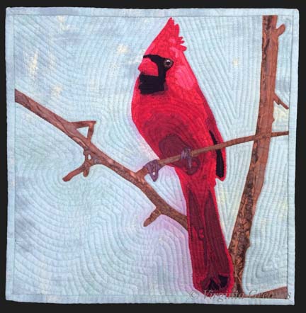
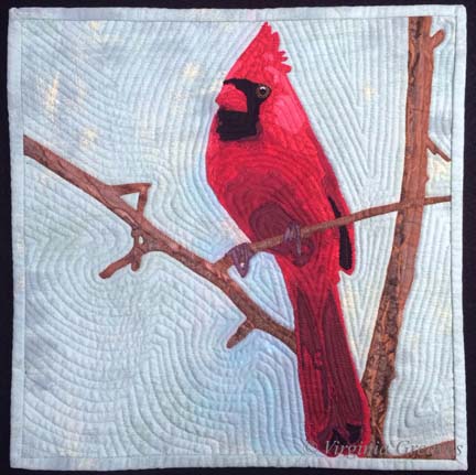
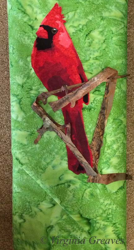
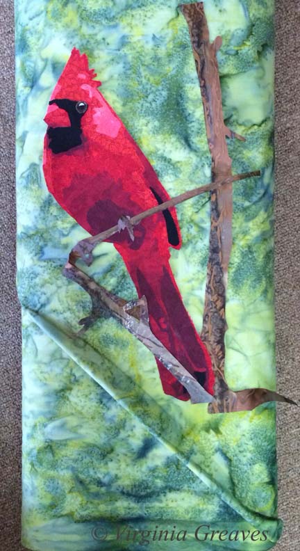
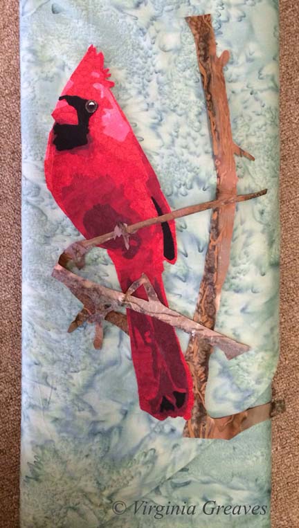
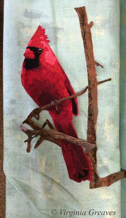
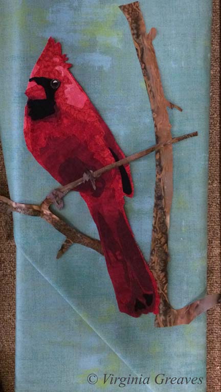
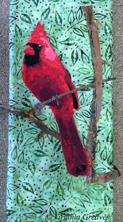
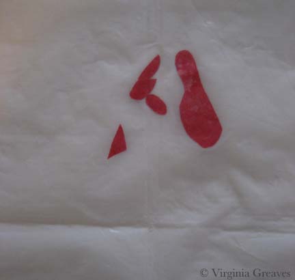
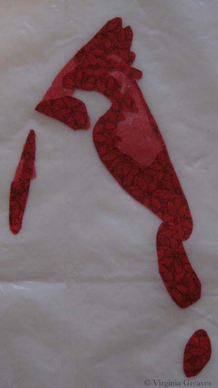
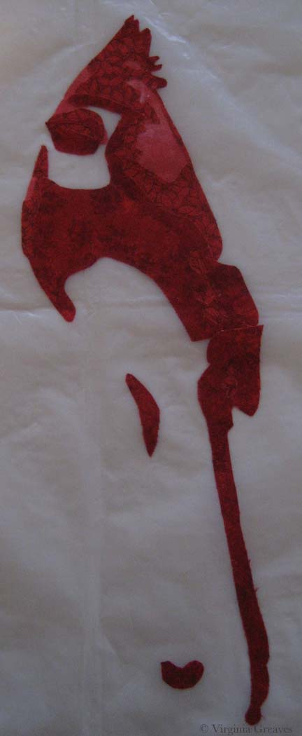
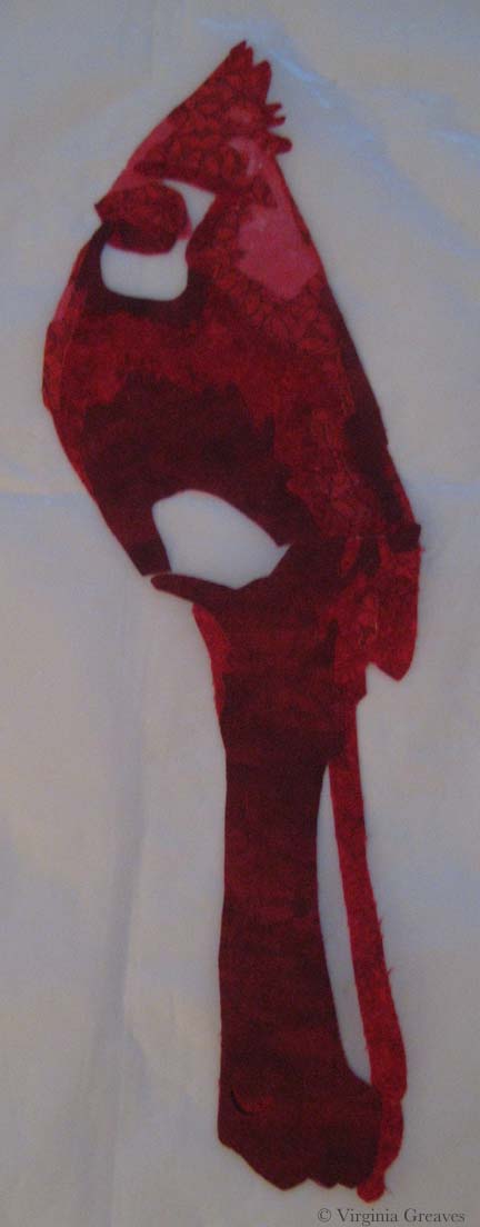
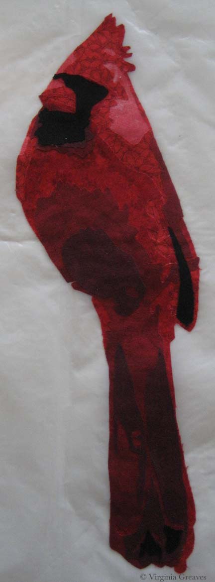
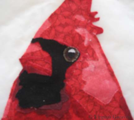
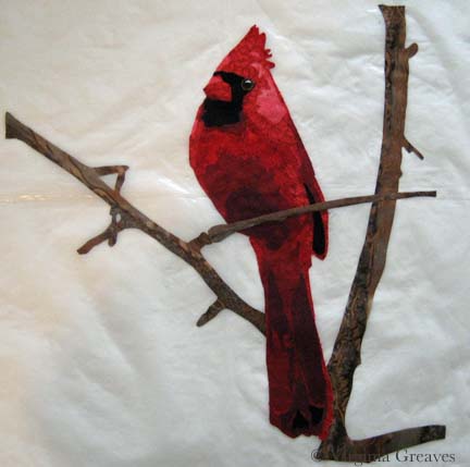
This week has been spent at the computer in design mode. After I finally stepped up to the plate and fixed the bleeding red on the Cardinal — which I’ve just realized I still need to make a Page for — I stepped up and started working on a new pattern. My value study took several days — but it’s ready and with any luck, I’ll finish the drafting tomorrow.

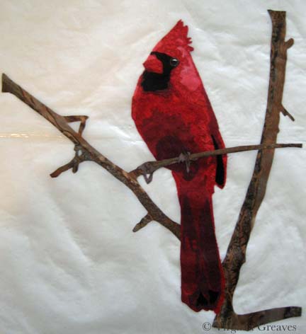
As usual, I’ve kept an eye out for good articles on art and motivation and shared them on my Twitter feed. This is my weekly summary — but if you’d rather follow me in real time, you can find me @vsgreaves — or click the Twitter icon in the upper right hand corner above the menu. The Facebook icon next to it will take you to my Facebook Page where I share pics of work in progress from the studio.

If you didn’t see this article last week about a mother making paper dresses with her 4 year old daughter (nickname Mayhem) — it’s well worth seeing. After the Oscars tonight, I’m sure they’ll have new dresses coming out this week — check out #fashionbymayhem on Twitter. I was blown away by the inspiration of this young girl.
Future fashion designers — watch out! http://tinyurl.com/knwfjdz  @HuffPostParents @2sisters_angie #fashionbymayhem

It’s official — the US Congress is discussing Droit de Suite which would give artists a percentage of profit on the resale of their work (although it has to fall over $5k to be subject to these rules).
“Congressmen Propose National Resale Royalty Act for Artists” http://feedly.com/e/58Xsz6-I 

This discussion of success by astronaut Chris Hadfield doesn’t disappoint: “you need to honor the highs and the peaks in the moments . . . but recognize the fact that the preparation for those moments is your life and, in fact, that’s the richness of your life . . . ”
“Don’t Aim For the Finish Line: Astronaut Chris Hadfield on Success” http://feedly.com/e/Bovgdw3M 

As a textile artist, one of the blogs that I follow is by Terry Grant — and she wrote this amazing article about abstract versus representational art — a subject that my mother (an oil painter) and myself have discussed many times over the years — so I was interested to hear another point of view from an artist that successfully does both:
“Abstraction and Representation” #terrygrant http://feedly.com/e/BGzAEfw8 

This is another hot button issue. I believe a few weeks ago I highlighted an article (by Edward Winkleman I think) discussing how good art may never see the light of day if the artist doesn’t have an MFA — but an artist with an MFA may have a successful career with not very good art because he (or she) has the right contacts in the “art world.” This article doesn’t discuss whether or not the artist has an MFA but does discuss how popularity affects exposure. In this NPR article, Alix Spiegel follows an experiment in which teenagers are exposed to music songs in different virtual worlds to see how much social influence affects their reactions to the music.
Does art rise to the top because it’s good or because it’s popular? A case for the latter http://www.npr.org/2014/02/27/282939233/good-art-is-popular-because-its-good-right … via @MorningEdition RT @abstanfield

This is another self esteem builder — but good reminders for every one of us nonetheless:
15 Things That Emotionally Strong People Don’t Do http://elitedaily.com/life/15-things-that-emotionally-strong-people-dont-do/ … via @EliteDaily

I grew up watching Mr. Rogers on television but I don’t know that I’ve ever considered his positive influence. Reading this article of quotes published on the anniversary of his passing, I realize how truly inspiring he was:
“Discovering the truth about ourselves is a lifetime’s work, but it’s worth the effort.” http://tinyurl.com/l4rogn9  via @RELEVANT

And that’s a wrap!

Reagan's eye

Wordless Wednesday

0

Reagan's eye

fabric paint

Make It Work

0

Last week, I finished the cardinal and put it in water to soak.

I had a thoughtless moment where I put synthrapol in the washing machine while the bin was filling with water. I thought to myself — that’s a mistake — I should empty the tub and start over. But then I thought — it’s so small — it shouldn’t matter.

If I had been really thinking, I would have reminded myself that red is bad to bleed — but I wasn’t thinking so I threw the piece in the water with a Color Catcher on top (I wasn’t totally brainless).

But of course, as you can see, the reds bled onto the background. This is what it looked liked after spraying it with Shout and washing it with OxyClean in cold and hot water — many times. I couldn’t get out any more of the red from the background. (I was able, thankfully, to shrink it a little. It was just over 12″ square — and for the exhibit I made it, it needed to be 12″ square — which now it is.)

cardinal before paint


I have had this happen before — with Beach Guardians. Thankfully, the background wasn’t printed so painting it with fabric paint should work. At this point, it was my only option left.

But I put it off — and worried — and procrastinated. No one wants to ruin something in the final stage with paint. I had spent almost two weeks on this piece — and I wasn’t looking forward to that going down the tubes if it didn’t work.

I took my fabric paint and mixed it on my palette — and got really close to where I needed to be.

fabric paint


I thinned it with water and blended it into the background.

cardinal after paint

I think it works.

I compared it to my picture of the piece from last week before I put on the binding — and the background looks less green. That is really only a difference in lighting. It’s almost scary how big the color shift is. This time, I used a side light — and last week I didn’t — but I couldn’t go back & re-take the pic with the bleeding — so I just kept it like this so you could compare apples to apples.

You may have noticed that I used a binding that matches the background. I almost always use black for binding — but as I said — I was trying to make this piece a specific size — and my cardinal just barely fit in the space. The best way to give him some breathing space was to use a binding in the same color as the background. If I had used black, he would have looked squeezed on there.

Did I mention I don’t like making something to a specific size requirement?


Tweek!

0

twitter.jpgThis has been a frustrating week. I washed my latest small piece — the Cardinal — and the red has crocked onto the background and isn’t coming off. (I’ll have to get brave and paint it.) Possibly because of that frustration, I’ve spent hours trying to find inspiration for my next piece — and I haven’t accomplished anything more than wasting time on the internet. And today we were met with news of the sudden death of an old family friend. Sometimes I’m just happy to still be here — and I let that be enough.

So while I want to be working, I don’t have direction and I’m having a hard time finding my way. It’s not uncommon — I’ve been here before. It’s just frustrating.

I did post some on Twitter this week. If you want to follow me in real time, you can find me @vsgreaves — or hit the Twitter icon in the upper right above the menu. You can also find my Facebook Page link next to it — I post about work in my studio there.

Artists are constantly being asked to donate their time — which only devalues our work:
Time and Skill Cost Money: Don’t Be Cheap Jerks: http://buff.ly/1gK2avF RT @ArtsyShark

This is not about art but it is about perseverance. A South Korean that was in his 30’s aged out of the Korean Olympic Team — so he moved to Russia to compete for them — and came out of last week with a gold medal. If they’re smart, the Koreans are reconsidering their ageism:
The Koreans learned the hard way that you can still win a gold medal even if you’re older. http://tinyurl.com/mzdqvyt  @nytimes

Luke Haynes is a fellow textile portraitist who has aligned with the watch company Fossil — which is a boon to the perception of art quilts in the eyes of the general public:
http://blog.fossil.com/luke-haynes-fossil-a-creative-collaboration/ … #lukehaynes #fossil

With the Ukraine in complete chaos, Orthodox priests have been donning their chasubles and providing prayer between the military and Ukrainian citizens. Stunning photographs.
Orthodox Priests Pray On Kiev Frontline http://huff.to/1eN7Hkg  via @HuffPostRelig

Visualization is important to moving your mind forward (definitely what I need to be doing):
“Stuck? Try Drawing Your Ideas” http://feedly.com/e/hdUzrht1 

In my search for inspiration, I found this artist who makes the most stunningly realistic paintings — in PASTELS no less:
Realistic Pastel Paintings By Spanish Artist Ruben Belloso http://fineartblogger.com/realistic-pastel-paintings-by-spanish-artist-ruben-belloso/ … via @eexploria

This is a little kick in the pants that I need to think about as I try to work myself back into the studio:
Check out my latest post on Lifehack ‘7 Basic Rules of Creativity You Should Know’ http://www.lifehack.org/articles/productivity/7-basic-rules-creativity-you-should-know.html RT @FortheCreators

Tweek!

0

twitter.jpgA frigid week but a good one for reading. Here are all of my tweets for the week.

If you’d rather follow my tweets in real time, I’m @vsgreaves or hit the Twitter icon in upper right above the menu. The Facebook icon is next to it & will take you to my Facebook Page where I post about my studio and what I’m working on.

I’m developing almost a study on what art is more likely to sell. There is not as much published on this subject as I would like:
The Most Popular Subjects For Art That Sells http://artyfax.squidoo.com/popular-art-that-sells 

Another artist had put this pic of a painting on her blog. It was painted by John Baldessari 1966-1968 and looks more like a modern day JPG — but it’s actually a painting — and it offers some suggestions for subject matter:
“Tips for Artists Who Want To Sell” by John Baldessari http://tinyurl.com/lzw53j6 

Is it OK to make work that is not that good? Of course! It takes time for your work to match your taste. You need to make a large volume of work to close the gap.
In Just 2 Minutes, This Video Will Make You Feel Silly For Ever Having Doubted Yourself http://huff.to/1exd3ki  via @HPGoodNews

I am beginning to contemplate my taxes and my successes of last year have some bearing on what I might need to do differently on my taxes. This list gives some helpful tax advice for artists.
Great tax info, checklists, and worksheets for #artists http://www.artstaxinfo.com/artists.shtml RT @abstanfield

It’s hard to miss the coverage of the Winter Olympics going on now in Sochi — and there was an incredible moment last week when Shaun White DIDN’T win a medal — and came out a real winner:
“The greatest test of courage on earth is to bear defeat without losing heart.” RG Ingersoll http://tinyurl.com/laxwsa7

There was also an female snowboarder at the Olympics who used a board with an artist’s work on the back:
“Artist Judith Braun Finds Her Work Part of an Olympic Medal Win” http://feedly.com/e/v8qAvERD 

This was yet another example of a corporation taking an independent’s artist’s work and using it on their products without prior agreement — very similar to what happened to Lisa Congdon. The end of the story, however, is good news — JCPenney has given the artist a contract to pay her for license of her work:
Winnipeg artist’s work taken from website, sold at J.C. Penney http://tinyurl.com/pdvw4md  via @DaleAnnePotter


Cardinal with potential background7

Setting the Mood

0

Today I escaped from my house to the fabric store — the one closest to me — Tiny Stitches. If you remember, this is what I started with — a yellow green. The more I looked at it, the more I didn’t like it. It’s too yellow for me.

cardinal with potential background

This piece really relies on the background to set the mood — and this yellow green takes too much away from the cardinal.

So I went back to my color wheel — and found something strange. I have two color wheels. One says that the opposite of red is green — the other one says that it’s cyan. The plot thickens.

So I pulled this light cyan from my stash. It’s not quite right either.

Cardinal with potential background2

So I went to the store — the batik section — and started laying bolts on the ground and then laying my appliqué on top. I’m fortunate that it’s so small — I can’t usually carry my appliqué work in a folder.

This is nice but feels urban to me — not what I’m going for. It’s just a little too distracting.

Cardinal with potential background3

And this is the green that should work — except it doesn’t.

Cardinal with potential background4

This one is a little better — but it still doesn’t make the bird sing.

Cardinal with potential background5

And then I pulled out this blue green. I liked it a lot more. It’s a good value change and sets off the cardinal nicely. So I carried this bolt around for a while and started walking through the aisles — because sometimes you can find interesting things in places you wouldn’t think to look — so it helps to go exploring.

Cardinal with potential background6

Wow. A print. It is also a light blue green.

Cardinal with potential background7

This is the same pattern in a darker color — too dark for the cardinal.

Cardinal with potential background8

So at this point, I looked at all of the pics on my phone and I really loved the blue green print — but I thought I should try one more green batik. No — it just doesn’t work for me. It’s the right value and the print is the right proportion — but it isn’t for me.

Cardinal with potential background9

So I lost a couple of days — but I now have the right background — the light blue green print. Better to change it now than wish I had later.

cardinal with potential background

Cardinal Longing

1

After I finished Worry, I had no idea what my next project would be. I get so involved in one project that I don’t tend to think ahead to the next — can’t really split my focus. I concentrate on one thing to the exclusion of other things.

But when I was done, I decided to make a small piece for the SouthEast Fiber Arts Alliance (SEFAA) Square Foot Fiber Art Pin Up Show. No theme — the piece just has to be 12×12 or smaller. I don’t usually work in this small scale — but I needed a rest and working on a small piece seemed like a good way to do that.

I had seen many pictures of cardinals in the snow being posted on Facebook — and I think that this is what I had in my mind’s eye when I began — a piece of hope flying across the frozen tundra (a little melodramatic, but we’re currently iced in for the second time in a couple of weeks and this southern girl is more acclimated to sunshine than snow.)

So I searched through all my reds and picked out a decent range. I wasn’t really happy with my first value — but then, what could I do? The weather was too iffy for me to risk a trip over to Marietta to pick out fabric — so I was limited to what I had on hand.

Just as I was getting ready to iron my WonderUnder templates down, I had the funny realization that I had paid for both sides of my fabric (obvious, I know, but a fact often overlooked) — so I ironed the templates to the front — so the back would show — which was exactly the shade I needed for the first value.

cardinal value1

This is the second value — you can begin to see the outline of the cardinal.

cardinal value2

The third value gives you even more — although I should have added to the lighting in the room before I took my pics.

cardinal value3

The fourth value was all I got done before I heard that the news was telling me (I had the TV on while I was ironing) that I might lose power for several days — and I realized I needed to add a few things to my pantry. It was at this point that I ran out the door with fading daylight before the roads became truly impassable the next day (and they did).

cardinal value4

I returned to this yesterday and added values five and six — the sixth one being black. Not bad but I really miss the eye.

cardinal value 5&6

Again, other blurry shot. I think the ISO on the camera I was using was way down — but you can see how I built up the eye in a similar way to the eye on The White Raven. I did add a larger highlight than I usually do — this guy has a small eye and the light coming off it gave the impression of the dimension of the eyeball.

cardinal eye

Once he was done, I added the branches. I thought about adding a bunch of detail and then decided that it was so small, it made more sense to let the fabric do the work for me — so I found a brown wood batik and fussy cut it so I roughly had highlights and shadows where I wanted them.

cardinal with tree

And finally, I added his claws. They are really similar in tone to the branch — and I decided to stay with that. I used a purple with a lot of gray in it — but they are obviously the same value as the branch. I’ll define them more with texture in the quilting stage.

cardinal with claws

The last part is to add a background. This was my first pick. It’s a really bright acid green but it makes the cardinal pop. I tried other greens from my stash — but the greens with more gray in them make the cardinal more sedate — more like it’s a common wildlife scene.

And I could try something other than green — but the color wheel shows the green is the best choice — and holding up colors — it’s the one that makes the most sense visually — even if I did originally imagine more white and gray blues.

cardinal with potential background

I’m not sold on this yet. I would love it if I could go to store and see if I could find something better — or validate my choice here — but there is still too much ice on the roads. I may go ahead for something to do. Sewing is a good antidote for cabin fever.

Tweek!

0

twitter.jpgThere has been a lot going on this week — a lot of great articles for Creatives were written (or recently found) — all of which I shared on my Twitter feed — and I finished my latest piece Worry. Today, I bring you my weekly wrap-up of my Twitter feed.

Remember, if you want to catch my Tweets in real time, you can find me at @vsgreaves — or hit the Twitter icon above the menu in the upper right. Also, if you want to see what’s going on in the studio, check out my Facebook Page by clicking on the Facebook icon next to that Twitter icon.

According to the authors, and I would agree, “we live in a “permissions culture,” which values copyright permissions above all else” and that “permissions have become such an issue that they’re interfering with professionals’ work — the ability to educate, to undertake scholarly studies, to make art.” It’s a different point of view from the endless discussions regarding the protection of copyrights.
“Are Art Professionals Afraid of Fair Use?” http://feedly.com/e/848QPDRN 

“Creativity & Listening” — “What we learn from the creative process is that giving up control … is a necessary path to success.” http://feedly.com/k/1n8VHLD 

I live in Atlanta — I was shocked that it made #1 on this list:
Best cities for artists: http://tinyurl.com/p9zvstx 

This article on the ethics of altering photographs digitally is sure to inspire a lot of debate:
“Nature Photography: Objectivity, Manipulation, and Ethics” http://tinyurl.com/lewysue 

I was so struck by this life-like statue of a man sleep walking in his underwear across the Wellesley campus — and he’s garnered a lot of public discussion — which I appreciate in the same way Banksy brings the discussion of art to the masses:
Tighty whitey’s take a stroll — “Artist Responds to Wellesley College Students’ Concerns With Sculpture: http://tinyurl.com/m37zq5r 

This was just a grand idea — to replace huge sign boards in Paris with classical works of art. It made me realize how cluttered our modern lives are with constant marketing of inane things.
“Parisian Advertisements Replaced with Classical Works of Art” http://tinyurl.com/nykgu3f  @mymodernmet

Bringing to mind the discussion of altering photos, Annie Leibovitz’s photographs (and resulting digital alteration) create the most stunning photos. The fact that she finds inspiration in Disney characters makes the work all the more relatable:
“Annie Leibovitz’s Celebrity Disney Dream Portraits” http://tinyurl.com/k8yuasb  @mymodernmet

I made the point the other day on someone’s Facebook wall that one of the discriminations made in the art world today is towards abstract versus illustrative work — and although I was soundly flamed for such a ridiculous statement, the wonderful Winkleman, an art dealer in NY, wrote a post fairly exactly supporting my argument just this week:
“Just What Is It That Makes Today’s Abstract Paintings so Different, so Lucrative?” Winkleman wise words http://feedly.com/e/GaB3bl95

I didn’t know the the Olympics once had art competitions — did you?
“Back When the Olympics Had Art Competitions” http://feedly.com/e/yz3-cw31 

This is about the importance of visual language, which is not valued in our current education system, and its effect on our brains:
“Why Einstein, JFK, Edison, and Marie Curie All Doodled” http://feedly.com/e/HGcJkmE6 

I loved this article because he talks about making marketable art and going through the thought process of figuring out what will sell:
RT @ArtsyShark: Success for artists is not complicated … http://buff.ly/1dsUIQY  Thoughts from Jack White

I actually went looking for articles on marketing art — and found this helpful piece from July of last year.
Selling Art: Is your artwork marketable? http://tinyurl.com/lpp3odt

A friend of mine posted this article on Facebook and I found it fascinating. I had never heard the controversy over whether Van Gogh committed suicide or was murdered — and I didn’t know that he died two days after being shot:
Van Gogh: murder mystery or straightforward suicide?http://tinyurl.com/jwhg56d  via @maggieinsc

Worry Completed

0

This week I was intent on finishing my latest piece Worry. I quilted the background and then applied the binding. The hand work is getting harder for me to do. I’m a fairly thin skinned person and piercing my fingers with an extremely sharp needle seem masochistic at best — and my eyes are beginning to struggle to see the tiny stitches. I have only machine applied one binding but I may revisit that on my next piece.

You may have noticed that I missed Wordless Wednesday. That’s because I didn’t think about it until Thursday — and at that point, I felt like it was just too late.

WorryYesterday I finished sewing on the sleeve and blocking it — and today it was dry enough for me to take pictures. I took some for the website — but I’ve about decided it’s time I buy a photographic background stand. I have two design walls made from creosote that have black flannel taped to them which I have used for both blocking and a photography background. I started using them for blocking after I moved here when I discovered that you can’t pin into looped carpet — but sadly, blocking it warps the creosote — which wreaks havoc on the photographs if you’re using the same surface as a back drop. I have learned all the tricks in Photoshop Elements to straighten a pic. Once I realized that water was warping it, I kept one for blocking and the other for photography. Sadly, the one I kept for photography has still warped.

So I intend to order a photography stand this week and re-photograph the pieces I’ve done this year. I probably won’t re-do the images on the website — but I’ll have the proper pics for exhibition entries and publication opportunities.

Quilting Gadgets

0

Having finally finished the appliqué for the family portrait I’ve been working on, I pinned the piece with batting and backing — and then began to prepare myself mentally to begin quilting.

This is always the hardest part for me. I will put it off and find a hundred excuses not to get started. I think that the fear stems from the dislike of UN-sewing — an inevitability of the quilting process. I have, however, discovered that a good way to move me through this stage and get back to the machine is to print off the value painting I made earlier and start drawing quilting ideas on it. If I don’t like the direction of a particular area, all I have to do is erase it. Then when I sit at my machine, the drawing sits beside me and tells me where I need to go.

(Forgive the print — it came out in a pinkish hue because I was running out of black ink.)

Quilting Plan

I did have a problem when I sat down at my machine though. I have a Viking Designer 1 — and the truth of the matter is that it has given me problems since year 4 (it’s about 13 years old now). I had taken it in to the dealer for a cleaning — and she kept it for MONTHS (did I mention I didn’t have a backup machine?) — and when I FINALLY got it back, the touch screen menu didn’t always do what it was supposed to do. I could always reset it by turning it off and on — and I certainly didn’t want THAT dealer to touch it again (and Viking wouldn’t let me use anyone else) — so I had to wait until sometime after year 5 after she had gone out of business before I let someone look at it again (I still have trust issues with someone having my machine for any length of time).

I thought when I bought it that it was warranted for 20 years — and I considered it a good 20 year investment piece. However, I learned the hard way that the electronics were only covered for 5 years. And did I mention that the cost of replacing the motherboard is about $1,200?

Anyway, I’ve just lived with it — but when I sat down on Thursday to start quilting, it just wouldn’t behave. However, I have another Designer 1 that a friend gave me years ago (after hearing me complain about mine — she thought hers would be kinder to me) — so I took everything and set it up on that machine. I turned it on — and learned that it had grown unhappy over the last few months — watching me sew away on my other machine. That machine’s screen doesn’t work — at all. Not even a little.

I went back to my original machine and finally got it back in business. (And since then, it’s been working really well. It must know that I’ve been looking at other machines on the internet.)

And why all of this drama? Well — I have to come clean here. The truth is that I’ve been quilting with my feed dogs up for years. I KNOW! Crazy as it sounds, when I was first starting out, I was having problems and someone suggested just leaving them up — so I did and it helped and it’s been that way ever since.

Golden MomentExcept when I was quilting my last piece, Golden Moment, it was sooooo heavy and it was hard to move around — so I was persuaded to try Leah Day‘s Ultimate Quilting Kit — a Supreme Slider, Machinger gloves, and Little Genie teflon bobbin washers.

By the time the set came, I had just finished quilting — but I knew the day would come that I’d really enjoy using them — and that day was Thursday.

Except — in order to use the Supreme Slider, the feed dogs have to be down. You don’t want it to accidentally slide out of position (which the feed dogs might do) and start being quilted to the underside of your piece. That would be REALLY bad.

Hence the sewing machine problems. I had lowered the feed dogs to set up the machine only to realize I had a couple of appliqué fixes to make — so I had to raise the feed dogs — which they didn’t want to do.

The sewing machine argument aside — I enjoyed the gadgets. The teflon washer that you drop in the bobbin case really does cut down on the out of control speed spinning that the bobbin can sometimes do when you’re quilting fast. The Machinger gloves help me hold onto the quilt — but they’re going to take some getting used to. (It’s awkward when I have to start a new line and pull the bottom thread to the top with the gloves on — I end up with a lot more thread pulled than I’m used to.) The Slider also helps move the quilt around easily — although I’ll be able to evaluate the drag on the needle better when I get to the edges of the quilt. (I started quilting in the middle which keeps most of the quilt on the table so there’s not much drag at this  point.)

Quilting with the feed dogs down does feel a lot different — I can tell that I have a higher chance of messing up the intentionality of the line if I’m not extra careful. I might try decreasing the presser foot tension the next time I sit at the machine.

There’s a learning curve in everything new — but I think that these are good things to learn.

Today, I managed to finish quilting the mom in my piece — except for her hair and clothes.

Quilted Mom

I am worried about my sewing machine. I don’t know that I’ll ever want to buy another Viking given the customer service problems I’ve had with them — but nor do I relish the thought of learning an entirely new machine.

My friend Rebecca has a Janome 5500 that I may borrow for a while — so I can try another something new.

Go to Top