Posts tagged portrait

Finishes

1

The Canary
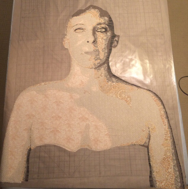
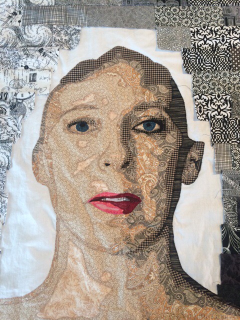
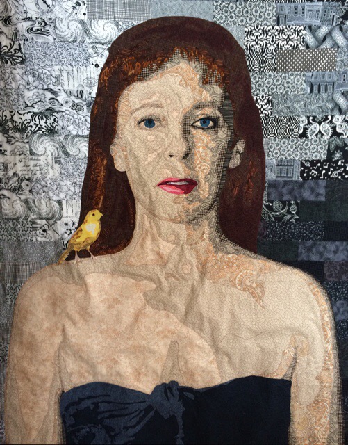
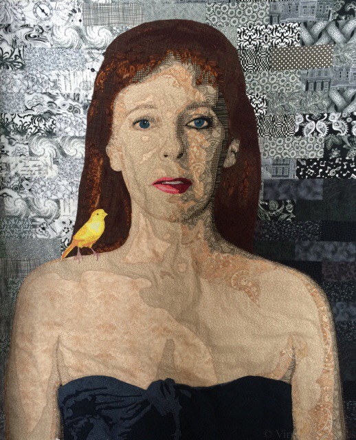
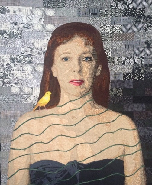
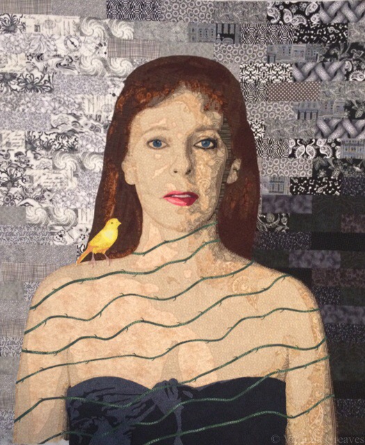
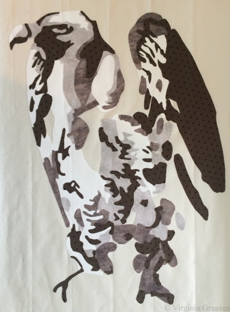
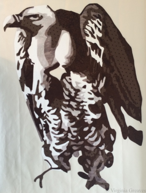
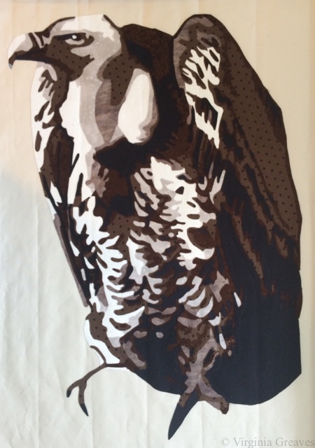
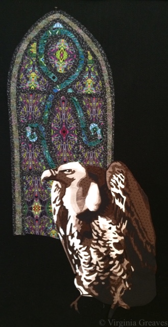
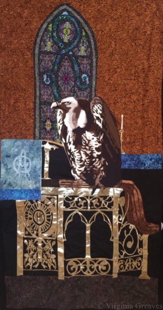
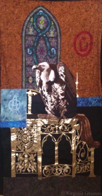
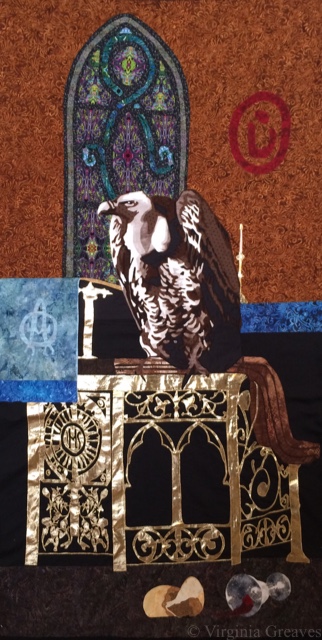
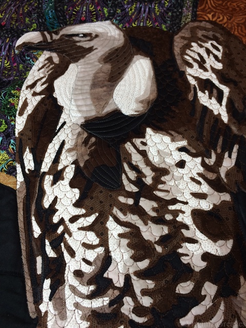
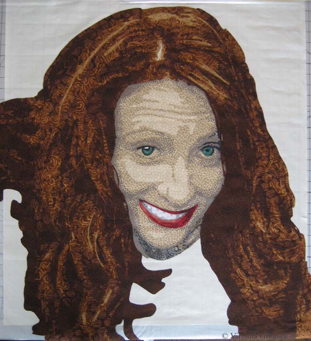
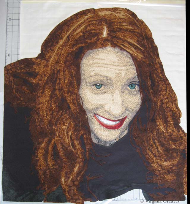
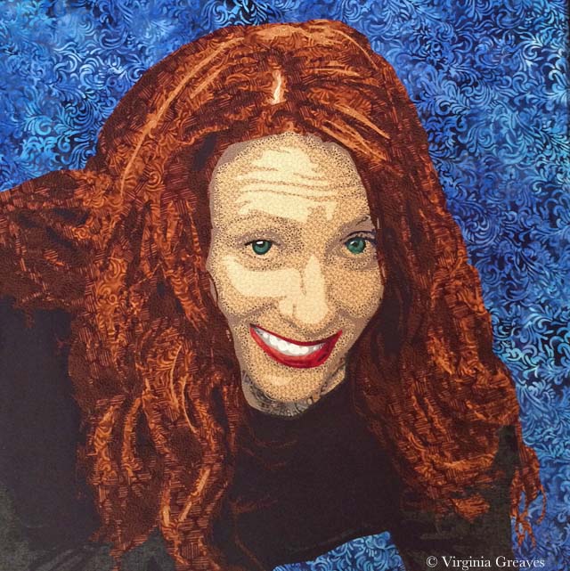
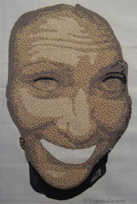
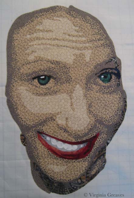
I have been working a blue streak in the studio lately. Not only did I finish The Canary, I also worked with Leisa to make 5 more small pieces for the Micro Bubbles Series (so we’d have 8 total for the JSU show) AND a large triptych for the Wash & Wax show opening at Hammond Gallery at Jacksonville State University on Thursday.

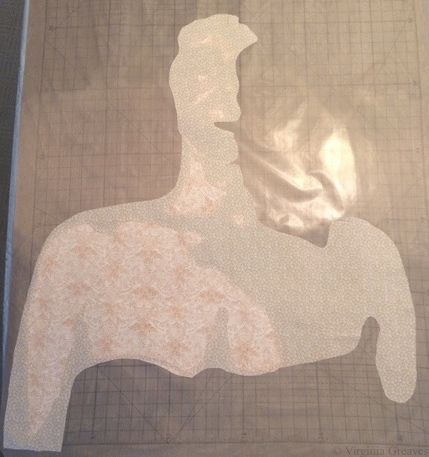
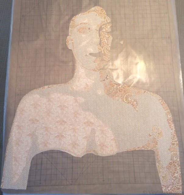
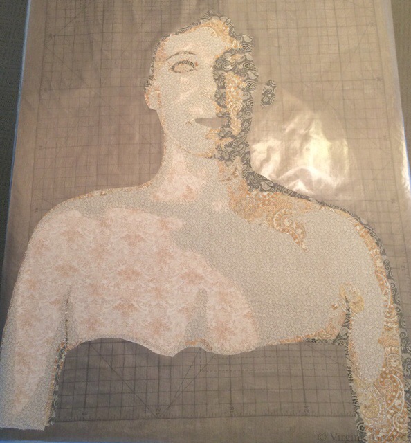
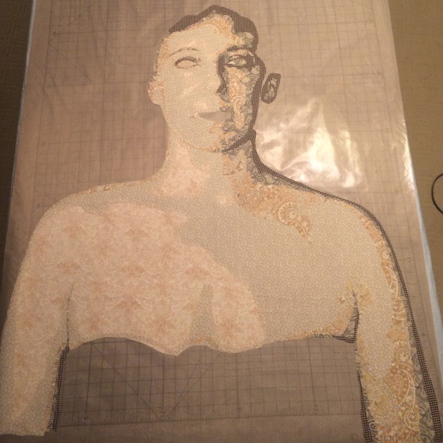
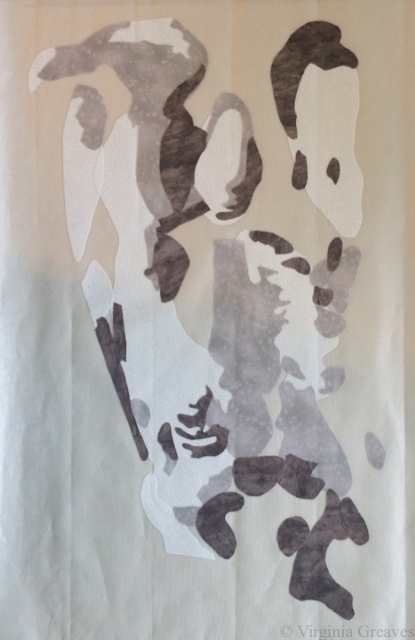
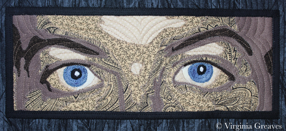
You can see The Canary on its new page here, and you can see the new Micro Bubbles Series II here — scroll down to the bottom to see Series II. I don’t have a pic of Dripped yet. It’s too large for my studio, but I’m planning to take pics of tomorrow once it’s hung at the gallery tomorrow.

The university has unfortunately changed the opening reception to invitation only. They will, however, have a public closing reception on April 7th, and the show will be open the entire month of March (after tomorrow when it’s hung). I have several friends in the area since I used to live near there that I hope will go see the show.

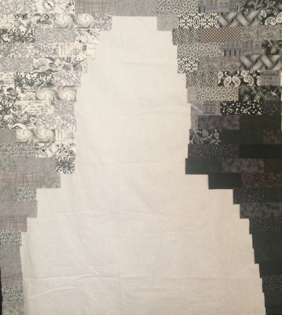
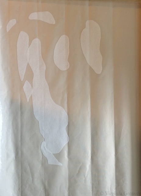
A friend of mine has asked me to explain how I do facings. I took pics and then decided maybe someone else would like to see how they’re done.

I started doing them during the Wash & Wax series. They give a much cleaner look than a binding, and they’re much easier on the fingers since you’re sewing through less layers. It was also the perfect finishing technique for pieces that had a lot of vinyl on them. I couldn’t iron a binding back from off the side of vinyl or it would melt the vinyl, but I had no problem ironing vinyl from the back of the piece while attaching facing.

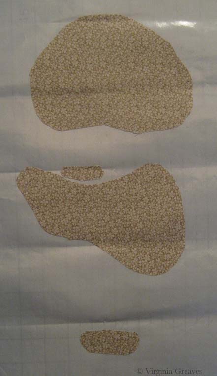
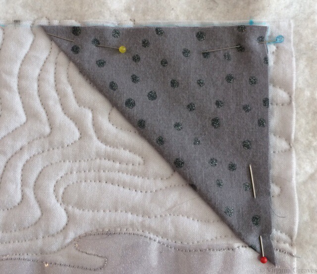
I cut 2″ lengths for the four sides as well as 4 3-3/4 inch squares. The square is used in the corners, and the bias edge is a blessing.

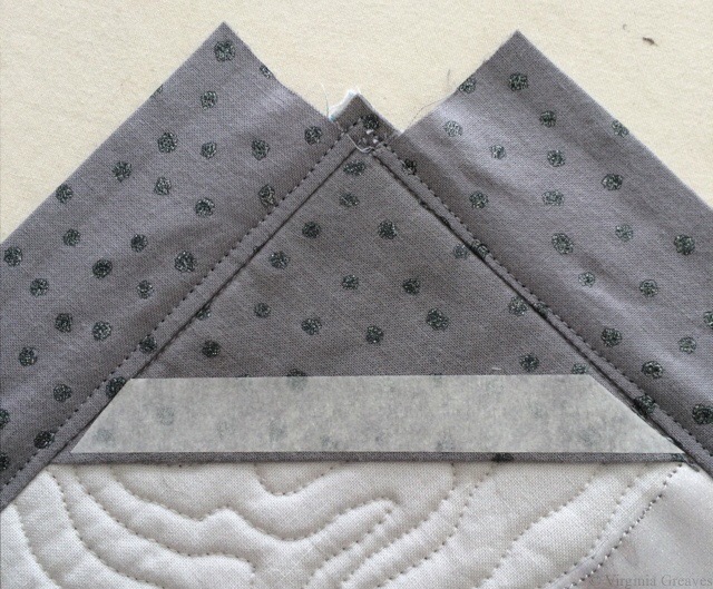
Mark the top of the quilt with the finishing lines. I mark a rectangle with squared up corners (which with a large piece can be more easily said than done). Press each of the four squares in half. Then pin them into the corners that you’ve marked and sew them on with a 1/4″ stitch from the outside edges.


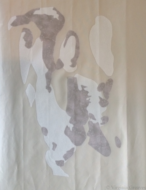
Take the 2″ strips and sew them together to make them long enough for each side (not all the way around). Fold back 1/4″ to the wrong side and press. Then I like to add 1/2″ fusible strips to hold down that 1/4″ that I’ve just folded back. Leave the paper on.

Then pin the facing strip to the sides — but don’t go all the way into the corner. I’m further over here to the left than I need to be. The folded bias square underneath is going to hide the edge anyway. It’s going to be on top after all of this is flipped to the back. After I made this one, I didn’t put the facing strip as far over on my next piece and had less bulk in the corner — which made turning the corner inside out easier.

Sew the 2″ strips to the front of the quilt, right sides together. The folded long side with the fusible will be on the opposite side.


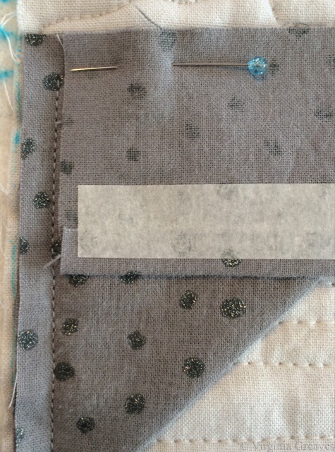
Then press the strips open. Here, you see the top facing pressed open. The right side strip was pressed open and then was stay stitched about 1/8″ from the fold. That’s the next step. Stay stitch all the way around. It makes it easier for the facing to pull to the back. (Lock your stitches at each beginning and ending.)


At this point, I cut a small strip of 1/2″ fusible and press it on to the folded edge of the square in the corner. Again, leave the paper on.


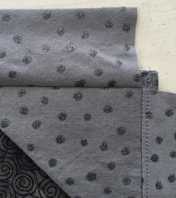
Then turn to the back. Turn the corners inside out.

Then take the paper off the fusible on one strip on one side. Using your iron and steam, pull the facing to the back and fuse down. Don’t worry about the corners until all of the sides are done.

Then take off the paper on the next strip and pull it down. Steam is your friend. The fusible will hold down the edge. If the facing isn’t straight, rip it off, reposition it, and re-steam it in place.


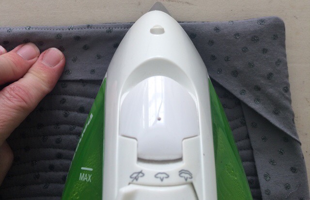
When all four sides are down, work on each corner. Take off the paper strip underneath and fuse it down. The steam will help the bias lay down if it’s a little wavy on that edge.

Notice that I used the same fabric for the backing, the facings, and the corners. I also used the same fabric for the sleeve. It gives it a clean look on the back.

I love using the fusible to hold everything in place until I can hand sew it down — which is the next step. I used to use the clear Elmer’s glue on bindings to hold everything in place before hand sewing, but I found that after a few years of travel, my bindings would begin to wrinkle. I think that even though the glue is water soluble, it wasn’t entirely washing out (even though I would soak my pieces in tubs of water for a while). Over time, it was drawing the fibers together — like a starch would. So it occurred to me to use fusible. It’s all over the front of my work — might as well use it on the back as well. And I know what to expect from it over time.


Then add the sleeve, leaving 1/2″ from the top from the fullness in the sleeve (I always allow 1/2″ of fullness for any thickness in the hanging device).

The first few times I did a facing, I topstitched all the way around from the front to the back. The thread color became an issue as I went around, so I didn’t care for that as much. The stay stitching accomplishes the same thing, and it’s invisible from the front.

Creating the Canary

8

So I haven’t written in a while. I’ve been working on a very personal piece, a self-portrait. I’m a very private person, and I need to remind a few of you of the boundaries here. I write my blog as a teaching tool. This is not intended as a preview into my personal life. If you enjoy reading it, that’s great, but if you know me personally, I don’t intend to answer questions about anything other than process to fellow artists and/or quilters. So please, don’t ask.

My original intention was to make two companion pieces. I intended to make a whole portrait of me (a picture I took of myself with a handy remote control for my camera) and then cut it in half. One piece would be the left half of the realistic me, & the right side would be an artistic interpretation of me inside. The other piece would be the same in reverse. Each piece would focus on two different views of who I am.

But this piece took on a life of its own. It didn’t want to be cut in half, and as I worked on her, she told me what to do.

This is the first flesh value.


This is the second. It’s a full bust and shows my shoulders and a little of my arms.


This is the third value. You can begin to see the outline of my face.


The fourth value shows shadow.


The fifth value.


The sixth value.


My eyes added. Don’t know why I don’t have a pic with the mouth. I used strong colors on the mouth — very red.


I am, by the way, creating these sections on a pressing sheet. In fact, I bought the Holy Cow pressing sheet just for this project.

This is the beginning of the hair.


Second value.


Third value.


Fourth value.


At this point, I pinned the sections up on the design board to see if they were working together. I even added a black sarong around my chest (because I’m just not THAT girl).


And then rather than add a solid background, I started cutting out black and white fabrics. Not sure why. I had a lot of them in my stash, small pieces, and I cut them into strips and arranged them by value.


And then I sewed on the flesh section. It was really humbling to see myself bald. I had a friend years ago who shaved her head in solidarity with another woman who lost her hair due to cancer treatments. I had not really thought about it before, but women invest some of their identity in their hair. I don’t know that I could have done the same & shaved it. What would I look like bald? I guess now I have an idea. It’s not as bad as I expected.


At this point in the appliqué, the interfacing underneath causes some wrinkling on the top. It’s a little unsettling, but when I rip it off the back and iron it, it will be flat again.

And then I pinned this piece on the wall and asked my muse what it needed next.

I considered adding a raven on my shoulder. I like ravens, but I didn’t think it would work well with the background. So after thinking about it for a while, I settled on a little yellow canary. She adds a nice punch of color to my shoulder. Canaries are also the birds that miners used take into the mines with them to judge the air quality. As they went about their work in a dangerous place, the bird kept them safe through their life.
This was my first try. Yellow is hard to do. I decided she was too dark.


So here’s my second try — much better. I also added some white highlights in the iris of the eyes.


Then I decided that I wanted her to be wrapped with vines, so I cut 1/4 strips of a green fabric on the bias and ironed them on in waves.


After appliquéing them down, they looked too plain, so I decided to embroider thorns on the vines.


And at this point, it’s just not quite right. The left eye is too plain compared to the right eye. So I added darker fabric and some black embroidery around the left eye. It’s the light side of the face, but it has to balance the right.


Subtle, but I think it makes a difference.

Did I think of Frida Kahlo’s self-portrait with thorns when I did this? At some point, I did. But this is my interpretation. Me and my canary.

She’s basted now and ready for quilting. The deadline for the exhibit I’m entering her in is still over a month away, but I have a lot to get done between now and then. The first week of March, the Wash & Wax exhibit will be hung at Jacksonville State University, and Leisa Rich and I are making 5 more Microbubbles (small framed pieces) and one more large piece — a triptych.

The Last Supper

From Sting to Sing

2

Back in late July (I had to look this up — I can’t believe how long I’ve been working in this piece), I had an idea for a new piece. I had finished up most of the work for the Wash & Wax exhibit and wanted to get back to realism. A SAQA call for entry created a spark of imagination, and I was off and running on a large ambitious piece.

The central figure in this piece is a vulture. This is the vulture with the first value.

vulture1

The second value.

vulture2

The third value.

vulture3

The fourth value. The bird really starts to come alive here.

vulture4

The fifth value.

vulture5

And the sixth value — all those really dark nooks and crannies.

vulture6

But there’s a lot more to this piece than just the vulture. There’s also a stained glass window. I knew that if I had the right fabric, I could fussy cut sections to give me the stained glass effect. I scoured the local quilt shops, but they just didn’t have what I needed. I ended up finding some Paula Nadelstern prints online, however, that were perfect.

This is the beginning. The drawing is under the pressing sheet so you can see where I’m going with this.

glass1

I originally picked a print in teal, but at the last minute, I also bought it in another color way and ended up using them both. I used the teal for the swirls and the purple/green/red for the main windows.

glass2

I had a very small piece of fabric in my stash that was perfect for the outer border. I had less than a fat quarter, but I had just enough.

glass3

And then I added this black stained glass print for the leading (also a Paula Nadelstern print.)

glass4

I pinned it to my black design wall with the vulture to see how if they were working together.

glass & vulture

And then I kept going. I had a picture I had taken years ago of the brass lectionary podium in a church. I considered drafting out values and using flat cotton fabrics, but really, there’s a lot more choices in that fabric store beyond cottons. I found this metallic gold spandex nylon that has a black shadow to it. It’s stretchy, but what the heck. I figured the Wonder Under would help stabilize it.

I was still able to cut out some fairly complex shapes without it falling apart. This is a part of a screen section.

brass1

And this is part of the larger structure. I didn’t take many pictures of the lectionary as I worked on it. Suffice it to say that I had luckily cut out all of the complex parts before I broke my wrist — my right wrist.

brass2

That was on Labor Day. I was in the middle of curating a show at The Art Place and preparing for the opening of Wash & Wax. Thankfully, the only work I had left for the opening was to hand sew the binding of a 9 foot long piece. With a cast on my right arm, I would insert the needle with the right hand, and then pull it through & out with the left.

This shows the lectionary completed with a wooden railing at the top, the stained glass window, and other elements.

background without vulture

And here is the vulture in his place. I did, by the way, appliqué each piece on to the background as I went. I couldn’t risk the spandex stretching out of control on me, and it didn’t stick as well as I would have liked with the Wonder Under — but working one piece at a time, I worked through it like a large puzzle.

background with vulture

This pic is blurry (the sheen off that metallic fabric was confusing the camera in my iPhone), but it shows the addition of the Arabic symbol for Nazarene spray painted on the back wall.

background with Nazarene

And then of course I had to add the spilled wine and broken bread at the bottom — symbolizing the broken blood and body of Christ — which also symbolizes the broken body and blood of Christians being murdered in the Middle East.

background with wine & bread

And even though I was in a lot of pain, I just kept going. Entries were due October 31, and I had spent too much time on this piece to miss the deadline.

I really worried about quilting this large piece. I still had my cast on, and I knew it would be heavy. I debated renting time on a long arm at the local quilt shop, but I finally realized that that was a new skill for me, and I really didn’t want this to be a practice piece for quilting.

So I moved all of my tables in my studio. In front of my machine, I have a board (which sits on my ironing board), and I put one table on the other side of that. Then I crammed another one just to the left of my chair. (I briefly envisioned creating a sewing table built like a doughnut.)

In the end, it worked. It supported the quilt perfectly, and I was able to quilt this in a week.

In this pic, you can see how the quilting outlines the vulture’s neck and defines his feathers better.

quilted vulture

At about this time, I got my cast off, only to learn that I had lost 50% range of motion in my wrist. But I just kept going. I managed to add the facing and the sleeve to the back. And then I photographed it myself. I bought some more lights since the piece is so large (once again wishing I had a Speedlite flash), but after spending a couple of days on it (and wishing I had someone I could just take it to), I finally got some good, sharp pics for entry.

I entered it a week before the deadline. I was so proud of myself. I loved how the piece turned out, and I felt confident that it would be a great contender for inclusion in the show. You can see the full piece on its page The Last Supper.

The Last Supper

I was wrong. My rejection email came this morning. However, I’m still very proud of this piece, and I was pushed to develop a complex story for my subject. I wouldn’t change a thing.

So I take the sting of rejection, and I move on. I will enter it somewhere else, and it will have a life. It didn’t fit in that show, but it will fit somewhere else. I just have to figure out where next is.

2015 IQA Auction

1

Everyone is getting ready to go to Houston next week, and it makes me sad that I won’t be there. I’ve been there the last two years — but I didn’t have anything new to enter. All of the work I’ve made in the last 18 months has gone into the Wash & Wax exhibit. It was at Abernathy in Sandy Springs, GA through October 18th. Four of the pieces will hang in a private gallery in Buckhead, GA in January. The entire exhibit will show at Hammond Gallery at Jacksonville State University in Jacksonville, AL in March, and then an abbreviated version of the show will travel to TX in the summer.

Where have I been lately? In the melee of curating Formidable Fibers and finishing up Wash & Wax, I fell and broke my right wrist, which is my dominant hand, on Labor Day. I was given a removable cast and told only to take it off to shower. When the cast came off a couple of weeks ago, the wrist was 80% healed, but I had lost 50% mobility. The good news is that I’ve become fairly ambidextrous. The bad news is that typing really hurts. Even now after some physical therapy. So baby steps.

But since everyone is going to Houston next week, I wanted to share the one piece I did make and send — a piece for the IQA Auction. (I did, by the way, complete this just before breaking my wrist.)

I spent a while contemplating what to do. I was close to completing everything for Wash & Wax, but I had started an entry for a SAQA show whose deadline is October 31. I considered making a complete face, but I didn’t really have time to do it justice. However, they asked for something in our signature style, so I felt as if I should do something along the lines of a portrait. Last year I did a cardinal. Small format work is hard for me.

I finally decided that I could do a set of eyes peeking through a slot in a door — rather like the woman peeking through Amy Pond’s reality in Doctor Who. This is the first two skin values.

seen1

This is the third. Still hard to see without the irises of the eyes for reference.

seen2

Four and five give enough definition, but he still looks rather like a zombie.

seen3

The last value gives you the exaggerated curve of the questioning eyebrows.

seen4

And finally, the eyes. For inspiration, I used a picture I took of my husband soon after we were married. I even managed to match his eye color fairly well.

seen5

And here he is peeking through the door.

seen6

I changed how I did this face — subtly, but I like how it turned out. I usually don’t start any part of the eyes until the end. In this instance, I filled in the whites of the eyeballs in the beginning when I laid down the other lightest values in the face. It makes then recede a little bit more.

seen7

So if you get a chance, stop by the Auction Booth at IQA while you’re in Houston next week and make a bid on one of the fabulous pieces they’ll have. And if someone would snap a quick pic of mine on the wall with the other work and then email it to me, I’d be very grateful.

Bountiful Blessings

0

Mercury must be in retrograde because it’s been an exciting couple of days.

WornIt’s been quite some time since I’ve written. In late May, I spoke at the East Cobb Quilt Guild here in Roswell. I took my slideshow that I’ve been building to show a retrospective of my work — and one of the pieces I had in the slideshow I had entered into the the East Cobb show coming up in a couple of weeks. After I verified that the judges would not be in attendance at the meeting, I decided to leave that quilt in the slideshow but not take it to the meeting. I did, however, have someone pointedly ask me at the end of the presentation where that piece was — that they wanted to see it in person and why had I not brought it? So I fessed up that it was sitting at home, but that they could study it more closely at the upcoming show.

It’s a great guild, and I have several friends that are in it, so it was a lot of fun seeing old friends again.

Fast forward to last night, the awards ceremony and opening reception for the show. I went alone as everyone in my family was busy, but I was greeted by friends at the door and was invited to sit with others that were excited at having seen my presentation a couple of weeks ago. The only thing more fun than old friends are making new ones.

As I was sitting there, the art category came up. Well, I didn’t win anything, but at least Judy Alexander won 1st place. I was very happy for her. I enjoyed all of the categories, and it was fun to see the 1st place winners on the overhead screens.

And then they came to Pictorial. Well, maybe I entered in that category. Turns out, I did! And I chuckled. I was thrilled to see Worn come up on the overhead and win 1st place in its category. I got to walk up to the front and hug Lynn Rinehart and have my picture taken with the ribbon. The ribbon was mostly handmade — beautifully done. And then I sat back down.

They finished the categories and then started talking about the Best of Show winner. This is always a traditional quilt. I know this. It’s expected. Except — HOLY COW! It’s my quilt up there on the screen! I covered my mouth and the woman I was sitting next to had to push me into the aisle so I would walk up to the front. I couldn’t believe it!

IMG_0085

photograph by Ben Hollingsworth

So I am overwhelmed. I would do what I do anyway, but it’s ever so nice when people like your work. And to be recognized among your peers is a bountiful blessing.

This morning, I went over to the show to have a quilt appraised — both Worn and Golden Moment will be traveling to Sacred Threads soon and they both require a written appraisal — and my daughter had taken my car since she had been having problems with the Explorer. I had intended to arrive at the show with a half hour before the appraisal so I would have some time to browse the show quilts, but unfortunately, problems with the car took my time and frazzled my nerves. I did make my appraisal appointment on time though, and had just enough time to buy something I’ve wanted for a long time — a thimble from TJ Lane.

IMG_1744I had tried to buy one in Houston last year and couldn’t get near their table, but at this show, there was plenty of room for me to look. My initial choice was one with a jewel, and as much as I loved it, it just didn’t fit my finger. I found another one with a jewel that would work, but again, it didn’t cover my finger as well as this one with the bee — so I went with the bee — because I’m actually buying it to use it, not for jewelry. It’s really all Lynn’s fault. I was trying to talk myself out of it, and she walks up and tells me that I should get it as a reward for myself. It’s a nice present, but really, if it saves me from repeatedly sticking the needle into my finger as I’m sewing on the binding or the facing, I should consider myself pampered and happy. For ages, my thimble has been a cheap brass one that doesn’t fit right, and I think I inherited it from my mom. So now I have quilter’s bling.

Before I left, someone came up to tell me congratulations, that I had won Quilter’s Choice from the vote last night! Wow. So I went to see the new ribbon on my piece, and I was able to spend some time speaking with the docent who was so kindly showing people my work. The First Lady of Georgia, Sandra Deal, wife of Governor Nathan Deal, had come for the ribbon cutting of the show that morning. She loved my piece and wanted to have a picture of me with it, but sadly, that was during the hour that I was dealing with the car, trying to find Lynn, and then having the quilt appraised. Lost opportunity. Oh, well. I was glad to hear that she had enjoyed my piece and that her entourage had taken many pictures of it.

And then I came home to borrow a car, deal with the appliance repair man, and take my other daughter to the doctor (so I was glad that I had borrowed a car because it turned out that I really needed it).

It’s been a long day, I did not sleep well last night, but I’ve taken the ups and the downs and I’m moving forward. Before I left the show today, I converted my entry fee to a multi-day pass, thank goodness, and I hope to go back for some time tomorrow.

Georgia Celebrates Quilts will be open again tomorrow and Saturday 10am-6pm at His Hands Church in Woodstock, GA.

Working From Photographs

0

This morning, I was spending a few minutes on Facebook, and Dorte Jensen, who was accepted in SAQA as a JAM member at the same time I was, posted a picture of a piece she made of Lincoln to the Art Quilts page. Given the recent discussion of the use of historical photographs in your artwork, I couldn’t help but think that comparing her picture of Lincoln to mine makes my argument all too clear — that the use of a photograph as inspiration does not mean that the artist is merely copying the photograph. Obviously, there is immense skill in drafting a pattern from any photograph and rendering it in your own style.

Although the inspirational photograph for her piece is slightly different than the one I used, it is obvious that our styles are completely different.

This is Dorte’s piece.

Dorte_Lincoln

And this is mine.

Lincoln

If our pieces were merely copies, they would look almost identical.  Clearly they do not. They each have their own spirit and life and attributes that make each one special.

Dorte has also recently made a piece of Ben Franklin that is marvelous. I hope you enjoy her website.

As portraitists, it is inevitable that we will turn to historical photographs if we want our work to be marketable. The skill with which they are rendered are no less than if we were to use one of our own photographs. As long as the copyright is clear, they are a wonderful source of inspiration.

Irish Eyes Are Smiling

0

Irish EyesThis morning, I finished photographing my latest piece. As I was writing a web page for her, I decided to call her Irish Eyes. I kept thinking of the song “Irish Eyes Are Smiling” when I’d look at her. Those green eyes are really a giveaway. I don’t actually know if the model is Irish — but it doesn’t matter. Those green eyes and the touch of red in her hair with the pale skin scream Irish.

Now I’m on to putting the binding on #3 Abstract. I met with Leisa last week — and we do intend to give these abstract pieces more meaningful names. We laid out the gallery and a plan to fill it out. I’m feeling more confident about that now. I think that come October, it’s going to be a fabulous show!

The Use of Someone Else’s Photograph in Your Work

8

Worry

Worry has been quite the topic of conversation today. The QuiltArt List (an online email list for quilters) has been abuzz since someone brought up the subject of this piece at IQF-Houston — and not in a good way.

Many people are familiar with Dorothea Lange’s iconic photograph from the Great Depression — titled Migrant Mother — from which this piece is inspired. The original poster thought that I had merely printed the picture onto fabric and then thread painted it — therefore saying that it was a gross violation of Dorothea Lange’s copyright.

Well obviously Dorothea Lange’s photograph is in black and white and this is not. My piece is all machine appliquéd from commercial fabrics. It is NOT a colorized version of her photograph that was printed onto one sheet of fabric.

Also, I am clear that this is inspired by Dorothea Lange’s photograph, and if you look it up, you will find that — however famous the photograph is — it is in the public domain and therefore free of copyrights.

I also assure that there was extensive drawing from the original photograph to create this pattern. I make a value painting of all of my pieces that start from a photograph, but photographs rarely ever tell you everything you need to know. There are many details that photographs don’t tell you — like fingers and eyes — and many shadows have to be deepened and highlights have to be brought out. You can obviously and easily posterize any picture in Photoshop, but these patterns will never have the level of detail for which I strive.

Furthermore, since it’s a black and white photograph, the color story is entirely mine.

You can make an argument regarding composition. I understand that. In using Dorothea Lange’s photograph, I used her composition. I did not violate her copyright nor did I break any of the rules of the competitions in which she has been entered.

It’s a decision. A couple of years ago, I researched how to make my work more marketable. One way to do that is to use historical figures as subjects. This means using someone else’s composition — essentially. I don’t always do this, but sometimes I do.

There are people that don’t agree that this should be viewed as art.

It’s interesting. I only find this discussion among quilters. I hung this piece in an art exhibit back in May. Everyone knows its inspiration is a well-known photograph — and no comment was made about whether or not it was art. It was not brought into question whether or not it was eligible for a ribbon. I am sharing this merely to contrast the differences between the two communities.

Is it art? Have I created something that hearkens back to the story Dorothea Lange created — and yet made it my own, using my own medium? Does anyone see the modern era mother who has the same stress as the mother from the Great Depression about caring for her children in times of economic hardship?  I suppose the answer will be a personal one to everyone reading this.

Having a Good Hair Day

0

Before I left for Houston, I had made some good progress on the hair in this portrait. I always find it hard to leave in the middle of a project, but I had finished most of the hair.

In this pic, here is only one small part of the first value in the part — in the top at the middle. Then the next value is golden.

hair value 1

Although I really wanted to go with brown purples, I just didn’t have them in my stash and I couldn’t find them in the store nearby, so I ended up going from golden into an orange brown — which is really more of a realistic choice for this model’s actual hair.

hair value 2

The next value shows the brown. (I somehow managed to lose one of the highlights in her right eye — didn’t notice it until her hair was done.)

hair value 3

And this shows the darkest browns.

hair value 4

Then I laid in all the blacks, which included her shirt, and the little bit of gray.

shirt

I spent of lot time trying to find a perfect background. I had bought several greens, but in the end, they fell flat. A purple seemed like a striking choice, but I didn’t have anything that worked well. I had a blue that I liked, but I’ve used it as a background before, so I went to the store with the mission of finding one similar. This batik has some deeper shadows that I like. It sets her hair off nicely. I took this pic with my iPhone which makes her hair look more red than it is.

I also replaced the highlight in the right eye and put more gray in her right arm. I had it all brown which was just wrong and caused by blurred lines between her hair and her shirt.

background

This week, I added the background and started the appliqué. Her face is done and I’m about halfway done with her hair. I hope to start quilting her soon. The days are clicking by quickly and my deadline approaches.


Building Character in a Face

3

I have been busy cutting away here recently. This is my favorite part — cutting and fusing. It’s meditative and yet the puzzle is still challenging.

I do have to say, however, that my decision to choose different colors has resulted in an even greater sense of realism than I have had before. Because of this, presenting the face in layers feels more odd than ever before. By the time the face is fully shown at the end of this post, without hair, it feels like looking at a naked face. It’s a little unsettling.

I also confess that, after taking several pictures of my model, I chose not to go with one that you would choose to go on your mantle. I think this is a more playful picture that shows her personality better. She’s actually looking up a little at the viewer.

This is the first layer. I’ve learned the hard way not to go any lighter than this.

face value 1

And this is the second value. I know that my model is screaming at me right now. I promised not to show any wrinkles. The truth is that because she is looking up into the camera, there are lines of personality here. They seem stark in this picture, but bear with me. In the end, especially once all of the hair is fused on, they will only add to her character and will not be seen as age lines.

face value 2

Here is the third value. It’s always important to remember that eyes are set INTO our faces so even if the picture doesn’t give us darker values around the eyes, it’s best to put it there for our rendering to give a sense of depth.

face value 3

Here is the fourth value. I was surprised that this stony gray worked so well in this gradation.

face value 4

This is the sixth value. There isn’t much of it here.

face value 5

This is the seventh value. It’s actually a deep navy blue.

face value 6

The eighth value is black which is mostly in the neck. I’ll revisit that in a minute.

face value 7

These are her lovely green eyes. You can begin to see her peeking out of the fabric.

face with eyes

And these are her teeth. They don’t make a lot of sense yet without her lips. These are the only pieces that I put on in reverse order — dark to light.

face with teeth

And here she is with her mouth. She looks a little stark without her hair — but I’m working on that now.

At this point, I step back and think about how this will work with what I have to do next. Her neck is too dark given that her shirt will be black, so I decide to pull the values back and re-do the neck.

face with mouth

Here they are re-done. You see a lot more of value six, which I prefer, but you still get the sense of the jawline and the recession of the neck.

face with redone neck

Hopefully I’ll finish her hair before I leave for Houston next week.

Go to Top