Posts tagged portrait

Around the World

0

Last year in Houston at Quilt Festival, I had the pleasure of meeting Marilyn Wall. I had admired her work for some time and was excited to meet her. She was attending with an old friend of mine, Denny Webster, who had recently moved from Atlanta to North Carolina.

Marilyn asked me recently if I was interested in participating in the Around the World blog hop. I’ve never done one of these before, but it’s essentially a way for bloggers to promote each other. Marilyn nominated me and another blogger — and I’m supposed to nominate a couple of other bloggers. Hmmmm. Most of the bloggers I know have already participated in this blog hop — and quite frankly, life has been very full around here recently.

BUT — what I CAN do is introduce a few things about me that you might not know.

What quilting/sewing thing am I working on?

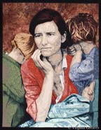
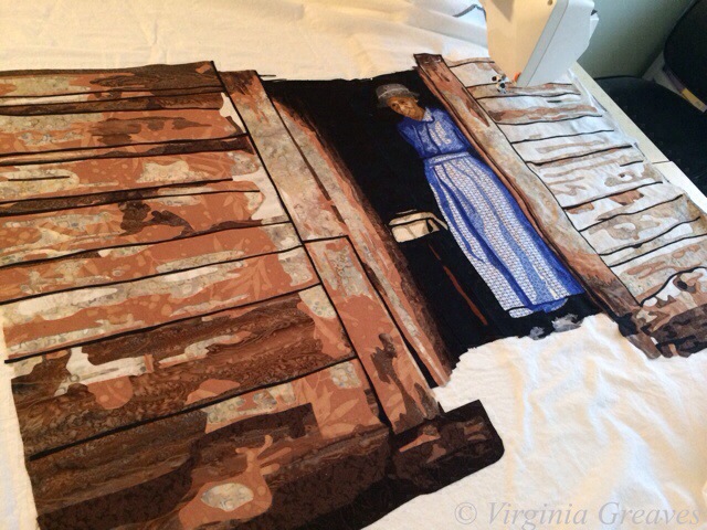
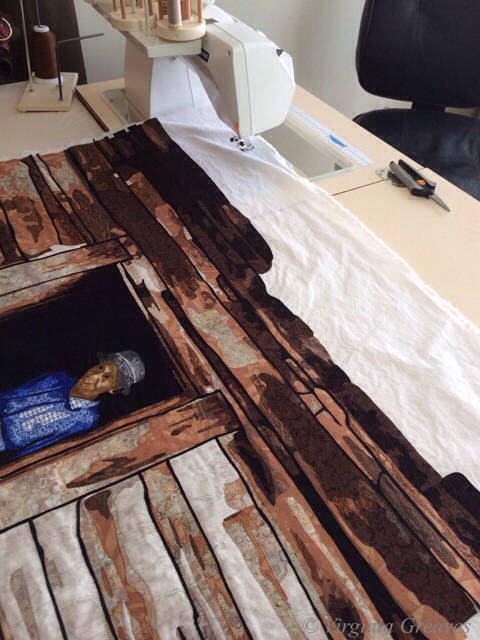
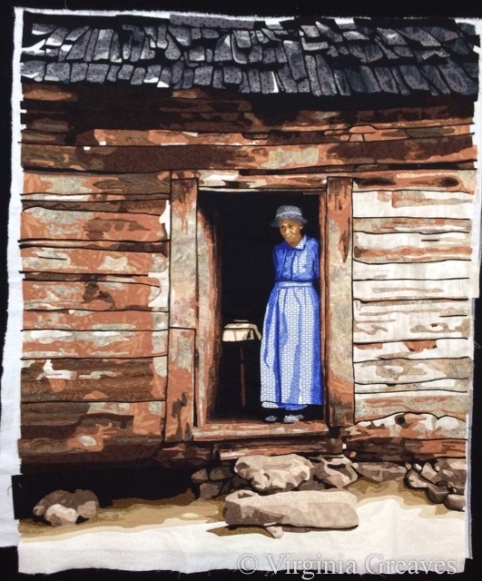
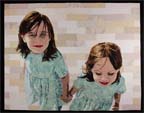
If you follow my blog at all, you see what I’m working on. Right now, in my studio, I’ve been cutting out a portrait — I’m working on the hair right now. I’ll blog post about the face later this week. It’s my intention to enter this one in the National Portrait Gallery competition and hope it at least makes it to the semi-finals. Hope springs eternal. And in a little over a week, I’m traveling to Quilt Festival in Houston to step out in the Winner’s Circle and find out what my prize will be. I’m starting to feel butterflies in my stomach.

How does my work differ from others of its genre?

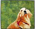
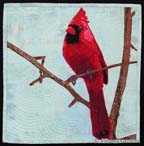
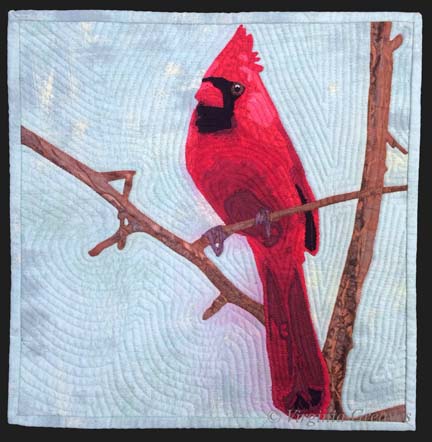
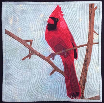
This is an interesting question. I started making representative patterns because I enjoyed the process, and my first series of portraits were all monochromatic color studies. Once I moved to Georgia and no longer had a wet studio, I was forced to begin considering commercial prints in portraits, and in this, I was definitely influenced by Deidre Scherer. I studied how she used patterns to her advantage rather than seeing them as an obstacle. I also studied Charlotte Warr Andersen, although all of her faces were made with solids. In the end, I made what I wanted to make. The norm at the time in fabric portraiture was not detail but rather obscurity — the side of the face or the back of the head, a closed mouth, a limited value range. I challenged myself to do teeth, to suggest the gum line or the tongue, to add the intention of the ear. I also made surprising fabric choices, not shying away from patterns, and learned how to make them work for me.

Why do I write/create what I do?

I create what I do because it makes me happy. It’s challenging, and I enjoy a challenging puzzle. I remember taking a picture of my daughter and making it into a pattern — and I loved to see the light of her eyes shine out at me from the design wall. I loved taking the impossibility of a waving flag and successfully presenting it within the confines of my 2D fabrics and the sculpture of my quilting thread.

How does my writing/creating process work?

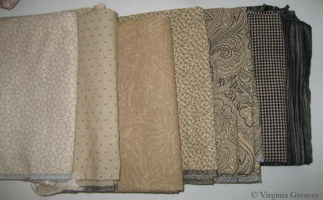
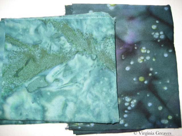
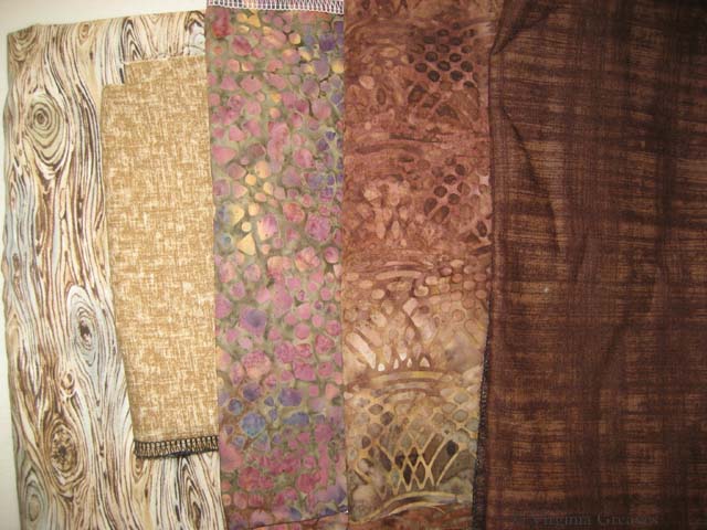
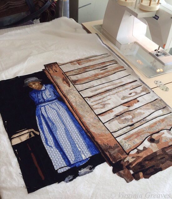
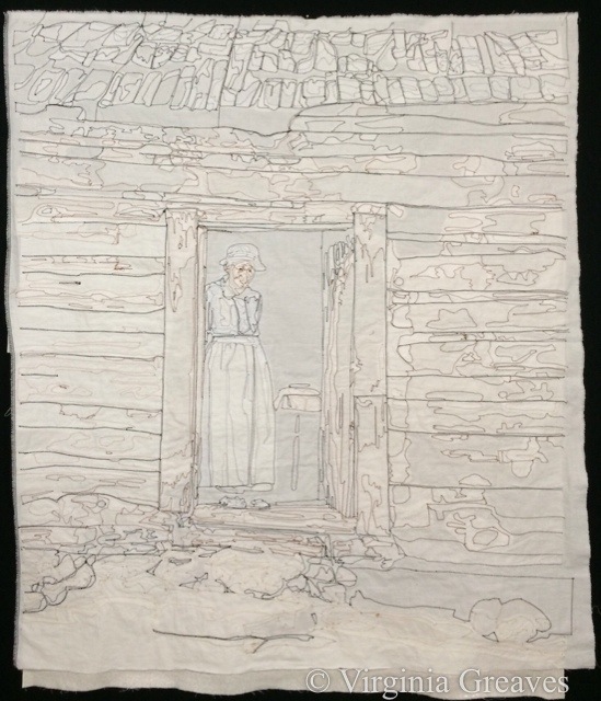
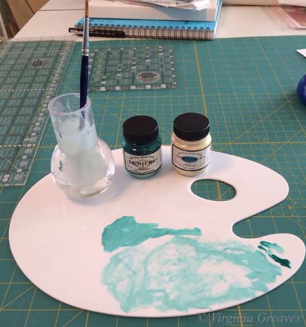
Now this is a really long thing for me to answer succinctly. I have a picture for inspiration (usually one that I’ve taken but sometimes one that I’ve asked permission to use) and from that, I make a value painting in Photoshop (which means that I draw all over it because pictures are only the beginning and will never give you everything that you need because they are not as good as the human eye). From that, I make a pattern. From that pattern, I create fabric templates that I collage together (cutting and fusing — this is secretly my most favorite part). I then stitch it all together through raw edge appliqué, and then I quilt it.

That’s my story. I’ve had my website since April 2005 because I have always enjoyed computers and it was a way for me to stay connected when I lived in a small town in Alabama (particularly when I became a stay-at-home mom), and I started the blog in September 2007. I had been a writer in my youth, and I have enjoyed adding writing as an expression of my creative intentions. I have enjoyed my journey — and I’ve enjoyed sharing it with anyone that has cared to read it and follow it here.

Breathing Soul

0

I have been considering my portrait for entry into the National Portrait Gallery (NPG) competition. It’s always a challenge, artistically, to reverse engineer something — but it also can create a better opportunity for success.

I’ve been studying the work from last year that reached the finals — and I know that whatever I do, my goal is not realism necessarily. There were certainly pieces in last year’s competition that were realistic — and some that were abstract but clearly representative of the human form. I think the greater question is — what can I do that sets my work apart? I can make a piece that looks like a painting from a distance of a couple of feet — but perhaps the better curatorial choice would be one that best represents the materials being used — which in my case is fabric.

So I spent a few days considering the painting of the man with the quilt pulled up to his chin — but in the end, I decided that that’s a poor place for me to start. I don’t make traditional quilts and I have no interest in calling to mind the traditional pieced quilts that grandmothers have created for years.

And then a friend of mine said something on Facebook that struck me. She said — not in regards to me but in general — she felt that representative work in contemporary art was soulless. Wow. And I went back and looked at the fabrics that I was considering for my next portrait (yes there are some value issues here I had not yet resolved) — and I realized that I was following the formula I knew for creating a realistic portrait — and that it was going to feel soulless and boring.

fabrics_face1

I have felt for a long time that the soul of a portrait is found in the eyes — or the hands — and that’s true — but it’s not enough — not nearly enough for the piece to stand out and grab the attention of the viewer.

And then I started thinking in terms of color. Color does not have to be as straight forward as I was making it. A strict gradation from beige into black was perfectly acceptable — but was it exciting?

I’ve been considering the work of Vincent van Gogh a lot recently — and his work is largely arresting because he used color theory so successfully. Forget what color the thing you’re representing really is — make it what it needs to be in the piece to make the piece successful.

So I started over. I started with beige again but then I went into blue, ending with a deep midnight blue. My fifth fabric, the blue and brown batik, is a step out — but it transitions the beige into the blue. The fourth fabric was difficult. I ended up finding this clay color in my brown bin. It’s a transitional neutral fabric and it’s the right value so it works.

fabrics_face2

I usually pick the first color family and then start cutting, but I knew that all of it is in relationship to each other — so I went on to pick the fabrics for the eyes. My model does have green eyes — and for this piece, I think that these two will stand out well.

fabrics_eye

My goal in the hair is to have purplish brown. This is my starting place. The middle one may be too red — but unfortunately, I can’t make it to the fabric store today. (Someone stole my credit card number yesterday and I am stuck waiting on a new one to be delivered.) I think my stash is not complete enough here and I plan to change a couple of these with new fabrics soon — but this gives you an idea of where I’m headed.

fabrics_hair

I have a beautiful mottled green I’ll probably use in the background.

My goal is to create an analogous color harmony — to use what I know about color to breathe soul into her — to make her come alive in cloth — for her spirit to become apparent in the image. Let’s hope that my bold choices in fabric will help me achieve that goal.

As to whether it will be enough to be juried into the NPG — who knows? But hopefully it will help move me further along in my artistic journey.

Opportunities

1

I have been quilting the third abstract in the car wash series — having fun with it. I eschewed my usual contour quilting for feathers, flames, & fronds. I love the way it’s turning out. I’m also using the thread to pull colors across applique boundaries — and playing with thread choices. I even coaxed a metallic thread to free motion into feathers.

But I only worked in the studio a couple of days this week. I have a friend that’s been giving me scoping work. I hope to get back in the studio tomorrow.

I would like to say that I’ve been working on another portrait for the National Portrait Gallery competition — but inspiration hasn’t struck. Right now I am in the flow with abstract and I have not been successful in changing my direction.

WorryIf you read my Facebook Page, you saw me hyperventilating when I was notified that I won a ribbon in Houston again this year. It’s such a huge honor & completely unexpected. I won’t know till the ceremony at the end of October what the prize is exactly. I’m lucky that I’ll get to go to Houston again this year and actually stand in the Winners Circle.

I may even tweet the whole event like I did last year. It was such an exciting time and I loved sharing it.

For those interested in attending, Preview Night for IQF/Houston is October 30. The show is at the George R. Brown Convention Center and runs through November 2.

I did, in fact, come home after winning a ribbon with Lincoln last year and decided — after making animal portraits for a year — that I would make a person portrait again. Worry was the piece that I made from that decision.

Golden MomentI also found at that Golden Moment was accepted into Art Quilts XIX: Permission to Play. This exhibit is at the Chandler Center for the Arts in Chandler, AZ and will show November 7, 2014 – January 17, 2015.

Permission to Play Art Quilts XIX 1 Sheet

Wordless Wednesday

0

20140702-161433-58473955.jpg

Creativity in Motion

0

Today I finally took pics of Worn (and finally decided on a title). It is so much easier to take pics when you have the right equipment and use a level. I no longer rely on my design board that leans against the wall — it was creating a keystone effect that I was having to counteract in Photoshop. I now use a photography support stand so the piece hangs from a bar and there is no distortion. I have also made friends with my level. I level the bar on the photography stand — and now also on my camera. I’ve always wondered by my pics lean to one side — and now I use the level to adjust the camera tripod until it’s level. I just ordered a level for the camera shoe which should make it even easier. You would think that if you opened the stand completely in all directions and the bubble level on the stand was level that you would be fine — and that’s just not true. So having leveled my stand and my camera on my tripod, I came out with perfect pics the first time. The only thing I did in Photoshop was crop — and for the website, I adjusted the size and added watermarks (so if they migrate to Pinterest it might generate some traffic back to my site).

Worn I also drew up a new Page for Worn. There are a few recent changes in WordPress 3.9 that are making the pics act strange but I just worked around it. Overall I think the page looks fine.

I was worried when I finished this piece that I wouldn’t know what to do next — what my next piece should be. I spent a day this week looking at exhibits to enter this year and trying to decide how I wanted that to influence me. In the end, I decided that I wanted to think with my hands. I started working on a small piece for a very specific themed juried exhibit — but it isn’t large and will give me time to think about my next large project.

Tonight have the opening reception for the Georgia Artists show at the Abernathy Arts Center in Sandy Springs, GA. If you’re in the ATL, it’s 6:30-8:30pm. I will take pics and share them soon.

Making Progress

4

I have finally finished the appliqué on my latest piece. This piece was tricky to put together. I made it in sections — middle with figure, right wall, left wall, stairs, top of cabin, roof, and sand and rocks at the bottom. Each piece had it’s own vinyl overlay and as I put each section on to the last, I taped the overlays together using the pattern as a guide — and then used to overlays to align the appliqué sections.

First I appliquéd the middle section to white muslin — and then added the right wall.

20140414-150259.jpg

Then I added the left wall.

20140414-150315.jpg

At this point, I had a small section of stairs — forgot to take a pic at this point. It was a difficult join because it brought together the previous three pieces — but I made it work.

Then I added the wood pieces at the top of the cabin.

20140414-150333.jpg

Then I added the shingles of the roof. This was an easy piece because there was almost all black between the cabin and the roof.

20140414-145233.jpg

And finally I added the sand and rocks at the bottom.

20140414-150346.jpg

All of this appliqué took about twice as long as usual. This is how it finally turned out.

20140414-152033.jpg

And this is the back.

20140414-152046.jpg

It is now pinned and ready to begin quilting. My fingers are sore so I probably won’t start until tomorrow. I still haven’t printed out my value painting & started drawing quilting designs on it, but I think the cabin will be very straightforward. There’s so much detail in the appliqué, I don’t know that there’s much room to show off quilting.

There’s also the issue of machines. I got so mad at my Viking during the appliqué that I wrapped it up and stuck it in a corner — and used a borrowed Janome to finish it. I am not as sure with the Janome to do the free motion quilting though. I may go back to the Viking for that. It doesn’t jam during free motion work — just during appliqué.

Tips for Artists Who Want to Sell

Marketable Subject Matter

0
Inviting Art Marketing into the Studio

Last year, I made a conscientious decision to make more marketable work. Every time someone would see Beach Guardians — I would often hear — “one day I want to commission you to do a piece of my grandchildren/children.”

Beach GuardiansI made Beach Guardians because it was from a picture I had made of my children at the beach. I owned the copyright — and it inspired me. At one point I had a price tag on it — but my husband soon told me that I couldn’t sell a piece of our children. It was going to stay in the family.

Which is fine — but making portraits of friends and family wasn’t taking me where I really wanted to go.

I knew I could make portraits of people — but I also knew that the few pieces I had sold in the past were animals. Anyone that has ever owned a bull dog will look at a bull dog piece of art and say “that looks just like my dog” — and want it. Now.

So after Lincoln, I stopped making portraits of people. I made an angel (arguably a person but a piece that was abstract enough that anyone could relate to it AND it was religious), a dog, a bird, a rabbit, an abstract piece, and then another dog. And then Lincoln won a prize at Houston — and why hadn’t I made any more people?

But the answer was easy — the first dog (Firecracker), the angel (The Bowl Judgments), and the bird (The White Raven) all sold.

WorryAlthough — I did come home from Houston wondering what in the world I was going to do next. I felt like I should make another person — and I became inspired by a photograph by Dorothea Lange of a woman and her three children. It felt natural to make people again and it flowed through my fingers easily. This is where Worry came from.

But I felt anxiety creeping into my mind — was I making a marketable piece? I suppose only time will tell.


The CardinalAnd since I’ve finished Worry, I made a small piece — The Cardinal — for a local square foot challenge. And then I was stuck again — in my head — wondering what to do.

I think I spent a week second guessing myself. In the end, I started a piece — again inspired by a photograph by Dorothea Lange (a great deal of her work is in the public domain). But in my head, I still have this desire to find what is marketable and what is not — because honestly, you spend the same amount of time on the piece — it might as well remain on the wall than be pushed to the back of my closet.

One of my FaceBook Pages that I follow is Humans of New York. A photographer goes out into the city every day and takes pictures of the people that he meets. One day a couple of weeks ago, someone told him that he knew what the art world wanted (although I’m not certain he does but we’ll take his word for it) — and it wasn’t random people on the streets of New York — better to photograph only nudes.

I don’t know many people that will let me take pictures of them with their clothes on — much less off — so I don’t see that as an option for me. I could hire a model, but there wouldn’t be much construction challenge for me in that.

I do see some appeal to taking pics of people on the street in Atlanta — like the photographer  in New York. I do, however, understand that there is a lot of hostility given to random photographers — and I think that this guy has worked hundreds of hours building a reputation so that people are delighted to be included in his project. In most situations, people do not want to be put under the microscope of a random person they don’t even know.

At one time, I made several portraits of friends, and one day, I asked an elderly gentleman at church if he would mind if I used the photograph I had taken of him to make a textile painting. He said yes — but only if he could have it when I was done. It doesn’t work that way. A picture takes seconds — my textile paintings take 100+ hours usually. I can’t work myself to the bone for so little appreciation — let alone for free.

Luke Haynes, a textile artist from NC currently living in LA, does full figures on very traditional backgrounds. He’s done a few friends but also several of himself — and Fossil Watches just contracted with him to make a piece of himself. He has effectively branded himself — which is great if you’re 26. Youthfulness is always marketable. I can’t say that I still resemble that demographic however.

Tips for Artists Who Want to Sell

I came across this painting recently on someone’s blog — yes, it’s a painting, not a modern graphic — by John Baldessari, 1966-1968. More food for thought.

studio

Wordless Wednesday

0

studio

Reagan's eye

Wordless Wednesday

0

Reagan's eye

fabric paint

Make It Work

0

Last week, I finished the cardinal and put it in water to soak.

I had a thoughtless moment where I put synthrapol in the washing machine while the bin was filling with water. I thought to myself — that’s a mistake — I should empty the tub and start over. But then I thought — it’s so small — it shouldn’t matter.

If I had been really thinking, I would have reminded myself that red is bad to bleed — but I wasn’t thinking so I threw the piece in the water with a Color Catcher on top (I wasn’t totally brainless).

But of course, as you can see, the reds bled onto the background. This is what it looked liked after spraying it with Shout and washing it with OxyClean in cold and hot water — many times. I couldn’t get out any more of the red from the background. (I was able, thankfully, to shrink it a little. It was just over 12″ square — and for the exhibit I made it, it needed to be 12″ square — which now it is.)

cardinal before paint


I have had this happen before — with Beach Guardians. Thankfully, the background wasn’t printed so painting it with fabric paint should work. At this point, it was my only option left.

But I put it off — and worried — and procrastinated. No one wants to ruin something in the final stage with paint. I had spent almost two weeks on this piece — and I wasn’t looking forward to that going down the tubes if it didn’t work.

I took my fabric paint and mixed it on my palette — and got really close to where I needed to be.

fabric paint


I thinned it with water and blended it into the background.

cardinal after paint

I think it works.

I compared it to my picture of the piece from last week before I put on the binding — and the background looks less green. That is really only a difference in lighting. It’s almost scary how big the color shift is. This time, I used a side light — and last week I didn’t — but I couldn’t go back & re-take the pic with the bleeding — so I just kept it like this so you could compare apples to apples.

You may have noticed that I used a binding that matches the background. I almost always use black for binding — but as I said — I was trying to make this piece a specific size — and my cardinal just barely fit in the space. The best way to give him some breathing space was to use a binding in the same color as the background. If I had used black, he would have looked squeezed on there.

Did I mention I don’t like making something to a specific size requirement?


Go to Top