Posts tagged portrait

Cardinal with potential background7

Setting the Mood

0

Today I escaped from my house to the fabric store — the one closest to me — Tiny Stitches. If you remember, this is what I started with — a yellow green. The more I looked at it, the more I didn’t like it. It’s too yellow for me.

cardinal with potential background

This piece really relies on the background to set the mood — and this yellow green takes too much away from the cardinal.

So I went back to my color wheel — and found something strange. I have two color wheels. One says that the opposite of red is green — the other one says that it’s cyan. The plot thickens.

So I pulled this light cyan from my stash. It’s not quite right either.

Cardinal with potential background2

So I went to the store — the batik section — and started laying bolts on the ground and then laying my appliqué on top. I’m fortunate that it’s so small — I can’t usually carry my appliqué work in a folder.

This is nice but feels urban to me — not what I’m going for. It’s just a little too distracting.

Cardinal with potential background3

And this is the green that should work — except it doesn’t.

Cardinal with potential background4

This one is a little better — but it still doesn’t make the bird sing.

Cardinal with potential background5

And then I pulled out this blue green. I liked it a lot more. It’s a good value change and sets off the cardinal nicely. So I carried this bolt around for a while and started walking through the aisles — because sometimes you can find interesting things in places you wouldn’t think to look — so it helps to go exploring.

Cardinal with potential background6

Wow. A print. It is also a light blue green.

Cardinal with potential background7

This is the same pattern in a darker color — too dark for the cardinal.

Cardinal with potential background8

So at this point, I looked at all of the pics on my phone and I really loved the blue green print — but I thought I should try one more green batik. No — it just doesn’t work for me. It’s the right value and the print is the right proportion — but it isn’t for me.

Cardinal with potential background9

So I lost a couple of days — but I now have the right background — the light blue green print. Better to change it now than wish I had later.

cardinal with potential background

Cardinal Longing

1

After I finished Worry, I had no idea what my next project would be. I get so involved in one project that I don’t tend to think ahead to the next — can’t really split my focus. I concentrate on one thing to the exclusion of other things.

But when I was done, I decided to make a small piece for the SouthEast Fiber Arts Alliance (SEFAA) Square Foot Fiber Art Pin Up Show. No theme — the piece just has to be 12×12 or smaller. I don’t usually work in this small scale — but I needed a rest and working on a small piece seemed like a good way to do that.

I had seen many pictures of cardinals in the snow being posted on Facebook — and I think that this is what I had in my mind’s eye when I began — a piece of hope flying across the frozen tundra (a little melodramatic, but we’re currently iced in for the second time in a couple of weeks and this southern girl is more acclimated to sunshine than snow.)

So I searched through all my reds and picked out a decent range. I wasn’t really happy with my first value — but then, what could I do? The weather was too iffy for me to risk a trip over to Marietta to pick out fabric — so I was limited to what I had on hand.

Just as I was getting ready to iron my WonderUnder templates down, I had the funny realization that I had paid for both sides of my fabric (obvious, I know, but a fact often overlooked) — so I ironed the templates to the front — so the back would show — which was exactly the shade I needed for the first value.

cardinal value1

This is the second value — you can begin to see the outline of the cardinal.

cardinal value2

The third value gives you even more — although I should have added to the lighting in the room before I took my pics.

cardinal value3

The fourth value was all I got done before I heard that the news was telling me (I had the TV on while I was ironing) that I might lose power for several days — and I realized I needed to add a few things to my pantry. It was at this point that I ran out the door with fading daylight before the roads became truly impassable the next day (and they did).

cardinal value4

I returned to this yesterday and added values five and six — the sixth one being black. Not bad but I really miss the eye.

cardinal value 5&6

Again, other blurry shot. I think the ISO on the camera I was using was way down — but you can see how I built up the eye in a similar way to the eye on The White Raven. I did add a larger highlight than I usually do — this guy has a small eye and the light coming off it gave the impression of the dimension of the eyeball.

cardinal eye

Once he was done, I added the branches. I thought about adding a bunch of detail and then decided that it was so small, it made more sense to let the fabric do the work for me — so I found a brown wood batik and fussy cut it so I roughly had highlights and shadows where I wanted them.

cardinal with tree

And finally, I added his claws. They are really similar in tone to the branch — and I decided to stay with that. I used a purple with a lot of gray in it — but they are obviously the same value as the branch. I’ll define them more with texture in the quilting stage.

cardinal with claws

The last part is to add a background. This was my first pick. It’s a really bright acid green but it makes the cardinal pop. I tried other greens from my stash — but the greens with more gray in them make the cardinal more sedate — more like it’s a common wildlife scene.

And I could try something other than green — but the color wheel shows the green is the best choice — and holding up colors — it’s the one that makes the most sense visually — even if I did originally imagine more white and gray blues.

cardinal with potential background

I’m not sold on this yet. I would love it if I could go to store and see if I could find something better — or validate my choice here — but there is still too much ice on the roads. I may go ahead for something to do. Sewing is a good antidote for cabin fever.

Worry Completed

0

This week I was intent on finishing my latest piece Worry. I quilted the background and then applied the binding. The hand work is getting harder for me to do. I’m a fairly thin skinned person and piercing my fingers with an extremely sharp needle seem masochistic at best — and my eyes are beginning to struggle to see the tiny stitches. I have only machine applied one binding but I may revisit that on my next piece.

You may have noticed that I missed Wordless Wednesday. That’s because I didn’t think about it until Thursday — and at that point, I felt like it was just too late.

WorryYesterday I finished sewing on the sleeve and blocking it — and today it was dry enough for me to take pictures. I took some for the website — but I’ve about decided it’s time I buy a photographic background stand. I have two design walls made from creosote that have black flannel taped to them which I have used for both blocking and a photography background. I started using them for blocking after I moved here when I discovered that you can’t pin into looped carpet — but sadly, blocking it warps the creosote — which wreaks havoc on the photographs if you’re using the same surface as a back drop. I have learned all the tricks in Photoshop Elements to straighten a pic. Once I realized that water was warping it, I kept one for blocking and the other for photography. Sadly, the one I kept for photography has still warped.

So I intend to order a photography stand this week and re-photograph the pieces I’ve done this year. I probably won’t re-do the images on the website — but I’ll have the proper pics for exhibition entries and publication opportunities.

Quilting Gadgets

0

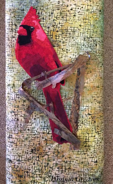
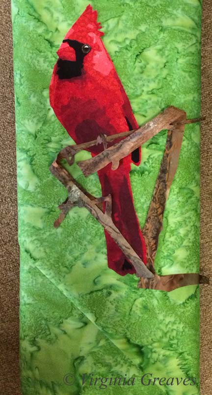
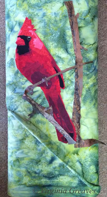
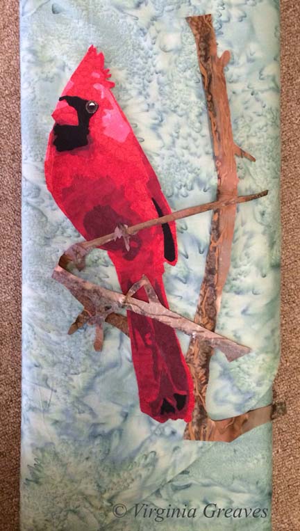
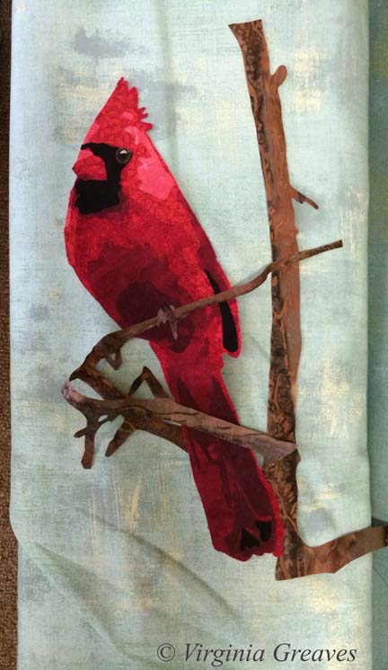
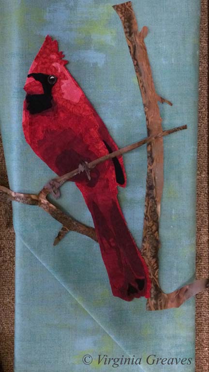
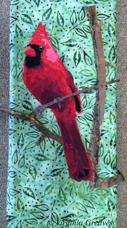
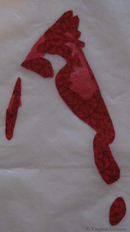
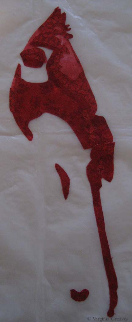
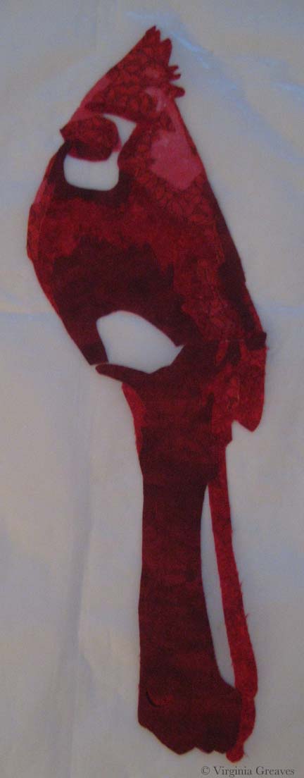
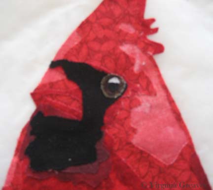
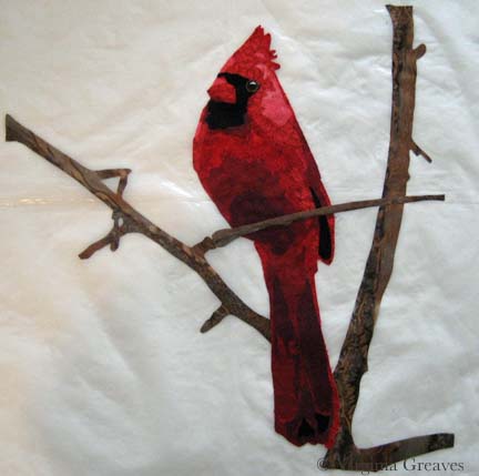
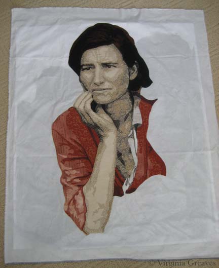
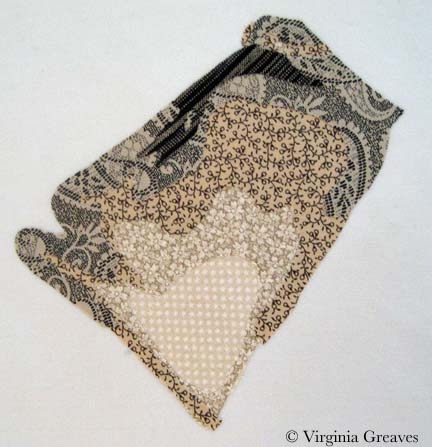
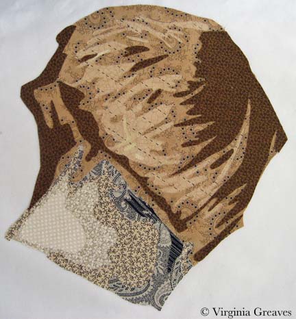
Having finally finished the appliqué for the family portrait I’ve been working on, I pinned the piece with batting and backing — and then began to prepare myself mentally to begin quilting.

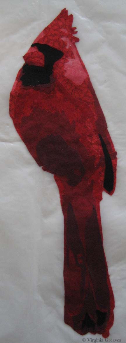
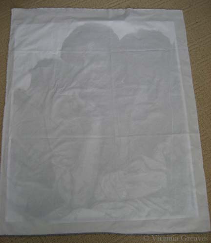
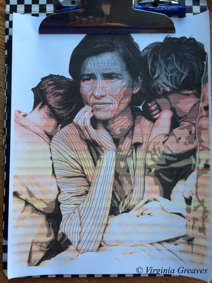
This is always the hardest part for me. I will put it off and find a hundred excuses not to get started. I think that the fear stems from the dislike of UN-sewing — an inevitability of the quilting process. I have, however, discovered that a good way to move me through this stage and get back to the machine is to print off the value painting I made earlier and start drawing quilting ideas on it. If I don’t like the direction of a particular area, all I have to do is erase it. Then when I sit at my machine, the drawing sits beside me and tells me where I need to go.

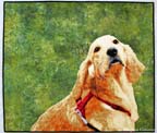
(Forgive the print — it came out in a pinkish hue because I was running out of black ink.)

Quilting Plan

I did have a problem when I sat down at my machine though. I have a Viking Designer 1 — and the truth of the matter is that it has given me problems since year 4 (it’s about 13 years old now). I had taken it in to the dealer for a cleaning — and she kept it for MONTHS (did I mention I didn’t have a backup machine?) — and when I FINALLY got it back, the touch screen menu didn’t always do what it was supposed to do. I could always reset it by turning it off and on — and I certainly didn’t want THAT dealer to touch it again (and Viking wouldn’t let me use anyone else) — so I had to wait until sometime after year 5 after she had gone out of business before I let someone look at it again (I still have trust issues with someone having my machine for any length of time).

I thought when I bought it that it was warranted for 20 years — and I considered it a good 20 year investment piece. However, I learned the hard way that the electronics were only covered for 5 years. And did I mention that the cost of replacing the motherboard is about $1,200?

Anyway, I’ve just lived with it — but when I sat down on Thursday to start quilting, it just wouldn’t behave. However, I have another Designer 1 that a friend gave me years ago (after hearing me complain about mine — she thought hers would be kinder to me) — so I took everything and set it up on that machine. I turned it on — and learned that it had grown unhappy over the last few months — watching me sew away on my other machine. That machine’s screen doesn’t work — at all. Not even a little.

I went back to my original machine and finally got it back in business. (And since then, it’s been working really well. It must know that I’ve been looking at other machines on the internet.)

And why all of this drama? Well — I have to come clean here. The truth is that I’ve been quilting with my feed dogs up for years. I KNOW! Crazy as it sounds, when I was first starting out, I was having problems and someone suggested just leaving them up — so I did and it helped and it’s been that way ever since.

Golden MomentExcept when I was quilting my last piece, Golden Moment, it was sooooo heavy and it was hard to move around — so I was persuaded to try Leah Day‘s Ultimate Quilting Kit — a Supreme Slider, Machinger gloves, and Little Genie teflon bobbin washers.

By the time the set came, I had just finished quilting — but I knew the day would come that I’d really enjoy using them — and that day was Thursday.

Except — in order to use the Supreme Slider, the feed dogs have to be down. You don’t want it to accidentally slide out of position (which the feed dogs might do) and start being quilted to the underside of your piece. That would be REALLY bad.

Hence the sewing machine problems. I had lowered the feed dogs to set up the machine only to realize I had a couple of appliqué fixes to make — so I had to raise the feed dogs — which they didn’t want to do.

The sewing machine argument aside — I enjoyed the gadgets. The teflon washer that you drop in the bobbin case really does cut down on the out of control speed spinning that the bobbin can sometimes do when you’re quilting fast. The Machinger gloves help me hold onto the quilt — but they’re going to take some getting used to. (It’s awkward when I have to start a new line and pull the bottom thread to the top with the gloves on — I end up with a lot more thread pulled than I’m used to.) The Slider also helps move the quilt around easily — although I’ll be able to evaluate the drag on the needle better when I get to the edges of the quilt. (I started quilting in the middle which keeps most of the quilt on the table so there’s not much drag at this  point.)

Quilting with the feed dogs down does feel a lot different — I can tell that I have a higher chance of messing up the intentionality of the line if I’m not extra careful. I might try decreasing the presser foot tension the next time I sit at the machine.

There’s a learning curve in everything new — but I think that these are good things to learn.

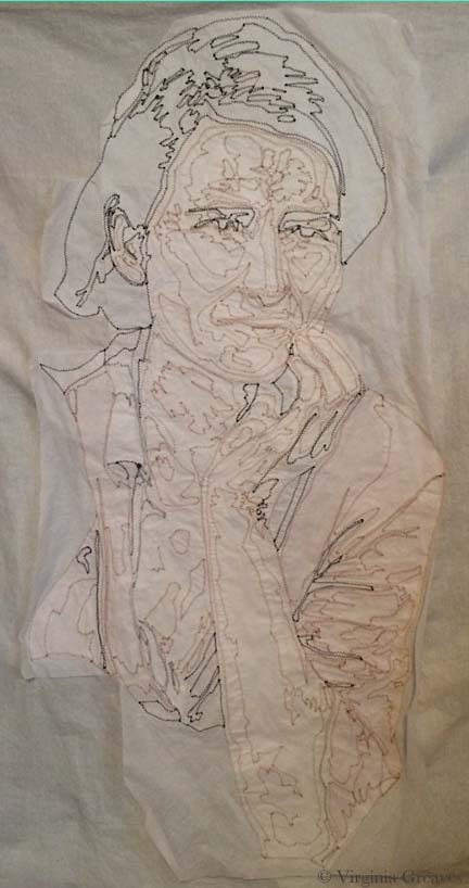
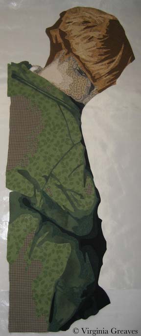
Today, I managed to finish quilting the mom in my piece — except for her hair and clothes.

Quilted Mom

I am worried about my sewing machine. I don’t know that I’ll ever want to buy another Viking given the customer service problems I’ve had with them — but nor do I relish the thought of learning an entirely new machine.

My friend Rebecca has a Janome 5500 that I may borrow for a while — so I can try another something new.

Wordless Wednesday

0

Reagan

Applique Beginnings

1

Once break was over and the girls returned to school on Tuesday morning, I hit the studio and I’ve been working like crazy ever since.

I finished fusing the baby’s blanket — the last fusing section — and then I moved into fusing the larger pieces onto the muslin to begin appliquéing.

I did have a moment when I was working on the mom that I thought I should have kept her in smaller pieces — her face, her hair, her lower body, her jacket — but I fused whole people together and I was just going to have to live with everything trying to fall off as I started the appliqué process.

I laid my value study on the floor and covered it with muslin, cutting it to fit.

fuse1

Using the drawing behind as a guide, I laid down the mother and fused her right down onto the muslin on the floor.

fuse2

I started with her arm but quickly moved into whatever fabric didn’t want to hold onto the fusible the most. I can iron as I go — but squinching (new word?) the fabric under the harp of the machine can wreak havoc on your relationship with your fusible. Bottom line — fusible is a temporary relationship. Everything has to be sewn down.

I do use Wonder Under — and they’ve obviously recently changed the formula. Everyone raves about Misty Fuse — I’m not sure I could get used to something I can’t easily buy and that isn’t already paper backed — but one day I may give it a try. My feelings about Wonder Under vary with the complexity of the project.

Also — I made a command decision on this piece. After having gone to IQF/Houston & realized that I’m one of the few remaining artists that feels the need to cover raw edges — I’ve changed my strategy. A little, anyway. I couldn’t bring myself to get rid of it altogether. As I said, given the size & complexity of my appliqué shapes — if I fused the entire thing down & started to free motion quilt — I would have chaos on my hands. I did, however, compromise with a free motion zigzag. This is my first time with this stitch but given that I free motion quilt with the feed dogs up — it wasn’t much different — it gave me a little more control. And it’s faster — which is the biggest thing.

This is the woman after I finished appliquéing her this morning — from the back.

 back of mom appliquéd

Once she was done, I fused her son to her left. He is also a complete fused piece. I started appliquéing him this morning — and will probably finish him in my next studio time (since it’s Friday, there’s no telling when that will be.)

fuse3

2014 Goals

1

The girls finally went back to school today & I’ve pulled together my goals for the year. I reserve the right to alter these as the year progresses — but hopefully I can get close to my goals.

Lincoln

Lincoln

– Make 2014 goals.

– Refine spreadsheet to monitor goals and progress (create one for 2014).

– Print blog books: 2009, 2010, 2011. One day I’ll catch up. I have all books through 2012 ready to print — it’s really just a matter of sending them to the printer.

– Change all icon references to eye on business card. Years ago, I made a small card with the blue eye of a pic I took — which I then used as my online icon — but last year I made business cards with a different eye. I need to change all of the online references.

– Update personal FB Page with new banner from business page.

– Increase web traffic 5%. Experience has shown me that this is a really hard stat to move. The biggest jump I’ve had in the site was from having my blog listed in the top 55 blogs by Quilter’s Home Magazine in 2011. Last year, I had work in two books and a magazine and traffic only increased just under 6%.

– Complete at least 6 large pieces.

– Participate in Journal52 with at least 40 journal entries. I have several journals lying around the studio but I’ve never participated in a regular one with a group so I thought I’d try it. My work is very different from the paper collage artists though — I may just show my pages on the Facebook Page or in blog posts.

– Enter at least 6 exhibitions. This is really a function of funding. I would love to enter everything under the sun but I can’t.

– Learn how to use the camera lucida. I bought one of these in a Kickstarter campaign and gave it to myself for Christmas. I haven’t had time to play with it yet though.

– Apply for SAQA Professional membership.

– Publish at least 2 blog posts per week. This is a big one for me. I think I may start another weekly concept post — maybe Wordless Wednesday. I think it would motivate me to work on my photography skills.

– Write at least 4 FaceBook posts per week (professional Page). Last year my goal was 3 per week — much easier than I thought it would be.

– Write at least 6 Twitter posts per week. My Twitter persona is about passing along information to other Creatives. In my reading, I find a lot of articles and encouragements that I think are helpful to others.

– Spend at least 15 hours per week in the studio. I thought about making this 20 — but the truth is that life gets in the way. Some weeks I can make 20 easy — some weeks I won’t come close to 15.

– Sell at least 2 of my pieces. I really debated whether or not to put this one on here — but I consider last year very successful in terms of making marketable work. I sold 3 of the 6 pieces I made — and I think that 2 of them will also be sold but just haven’t been exhibited enough yet. Time will tell. Concentrating on making work that I know is marketable subject matter is something I plan to continue.

I don’t have a goal to win anything or be published but I accept any of those opportunities fate throws my way. Maybe I should consider those more aspirations than goals. I also accept speaking engagements & lead workshops if they aren’t too far from home.

Here’s to a prosperous year! Let’s go forth with hope in our hearts and the wind of determination beneath our wings!

Stress and Family

2

When I started working on this project, I needed a name for this project’s folder on my computer. In the beginning, it was Depression — since it’s based on a Depression era picture. As I worked on the mother, I began to see it has a reflection of the stress of mothers — so I changed the name of the folder to Stress Project — knowing that that wouldn’t be it’s final name. And as I get closer to Christmas and I see the insanity that is family that comes out during the holidays — this has becomes a difficult project for me to work on — much less talk about.

But — I should share my progress from last week. I had finished the mother and her son & began work on the daughter that is on the mother’s other side. This shows her neck, arm, and fingers curled up.

sister1

And her hair. I think it turned out well.

sister3

I snuggled her up to her mom. You may noticed that I’ve added some darker tones to the son’s hair. I also changed the fabric just under the mom’s hand — they were previously shirt fabrics but they were too close in tone to her skin so I just changed them to coat fabrics so you could see the back of her hand clearer.

The right hand side of the daughter is an extension that I’m creating because the photograph has something obscuring the view here (I think it’s a pole). I decided to lighten the lower shadow.

family1

I like it better here. I also did the babies face. I don’t like how her face comes together but have decided that I’ll work on it after I’ve made her blanket. I’ll probably have the blanket wrap over the top of her head.

family2

The blanket will extend across the bottom of the piece.

I think that I’ll continue as much as I can in the studio to try to black out the insanity of the holidays. It gives me a peace that’s hard to explain.

Mama’s Clothes

0

I have a dream to finish cutting out all this entire piece before the Christmas break. It’s ambitious but I’m putting the pedal to the metal and seeing what I can get done in the time that I have.

I started this week with her shirt. It’s hard to see hear since it’s white.

shirt

Here I’ve completed her jacket and her shirt shows up better. She’s actually hanging on my design board — that’s why the background is black. When I take a picture of this piece on the ironing board, I can’t get high enough above it to take a pick that doesn’t have some distortion. You can see some of that in the pic above.

The only issue I have is that some of darker values of the shirt are blending into her skin. The two pieces under her hand I can easily swap into jacket fabric. The lower pieces on the left will probably become lighter values.

Although it looks red in this picture, the colors are an orange red — more rust colored. I wanted the mother to have a hot color — and then the children will have cool colors. A bright red would have been too cheery — the rust conveys a more worn feeling.

jacket

Then I started on the son leaning on her left shoulder. He is turned away from the viewer so you only see the back of his neck.

I did use the same fabrics that I used for the mother. When I made Beach Guardians, the two sisters have the same fabrics. I think it gives a feeling of relationship between the two — unlike the duet piece A Walk in Twilight when I used different fabrics for the two friends.

boy's neck

And this is his hair. I like that he’s more blond relative to the darkness of his mother. He is, however, tucking himself into her side & behind her so I will at some point have to add some darker tone to the crown of his head where his head leans into his mother’s hair.

boy with hair

I was free to make his jacket any color I chose — but really, the smart thing is to let the color wheel have a say in it. Since I chose an orange red for the mother, I chose a green for her son. On her other side, her daughter will have a blue — probably more on the gray side though.

boy with clothes

And the baby in her lap — I just don’t know at this point. Today I’ve finished the daughter’s neck, fist, and arm — but her hair will take some time.

Tweek!

0

twitter.jpgI haven’t been a very good twitter-er this week. I’m currently reading the most recent book by Donna Tartt — The Goldfinch — and it’s taking all of the time that I would usually be reading about the art world. I loved Donna Tartt’s last two books — and she took a ten year break before publishing her third — so this novel has been much anticipated by more than just little old me.

If you would like to follow my twittering — my handle is @vsgreaves — or click the Twitter icon above the menu.

Why Strategic Planning is So Hard for Creative People http://www.productiveflourishing.com/strategic-planning-hard-creative-people/ via @charliegilkey via @abstanfield

What Neuroscience Says About The Link Between Creativity And Madness By Eric Jaffe http://buff.ly/1811h1h  via @FastCoDesign via @ArtsyShark

Photographer Tapes a $50 Lens To His P&S Camera To Take Stunning Macro Snowflake Photos | DeMilked http://www.demilked.com/macro-snowflakes-diy-camera-alexey-kljatov/ via @demilked

Remember the unfortunate portrait of Kate Middleton? This one depicted the Danish royal family.
“Another Royal Portrait Disaster” http://hyperallergic.com/95046/another-royal-portrait-disaster/
Go to Top