Posts tagged textile art

2015 IQA Auction

1

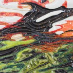
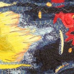
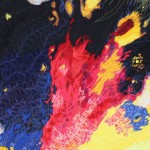
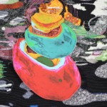
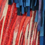
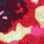
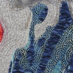
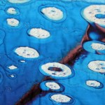
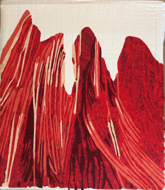
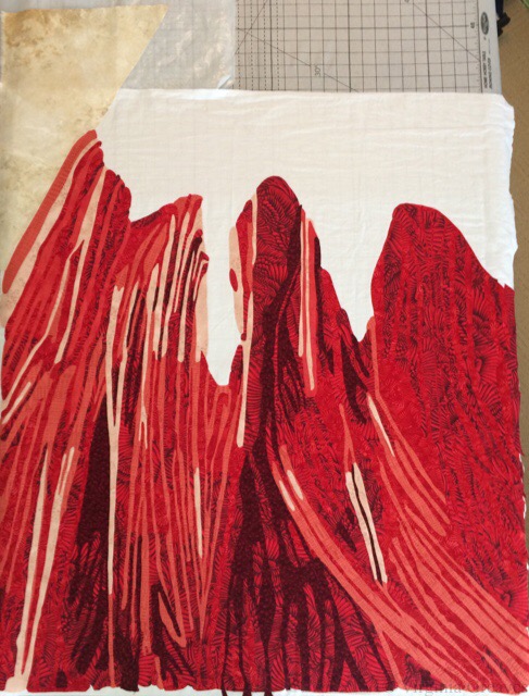
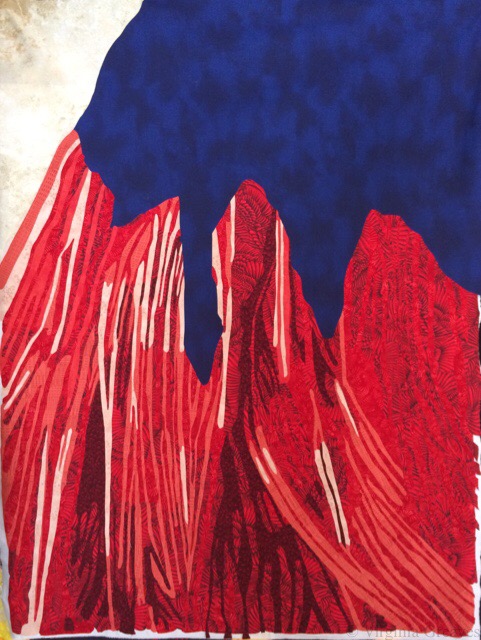
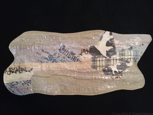
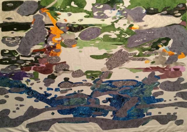
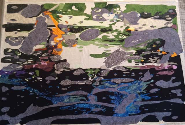
Everyone is getting ready to go to Houston next week, and it makes me sad that I won’t be there. I’ve been there the last two years — but I didn’t have anything new to enter. All of the work I’ve made in the last 18 months has gone into the Wash & Wax exhibit. It was at Abernathy in Sandy Springs, GA through October 18th. Four of the pieces will hang in a private gallery in Buckhead, GA in January. The entire exhibit will show at Hammond Gallery at Jacksonville State University in Jacksonville, AL in March, and then an abbreviated version of the show will travel to TX in the summer.

Where have I been lately? In the melee of curating Formidable Fibers and finishing up Wash & Wax, I fell and broke my right wrist, which is my dominant hand, on Labor Day. I was given a removable cast and told only to take it off to shower. When the cast came off a couple of weeks ago, the wrist was 80% healed, but I had lost 50% mobility. The good news is that I’ve become fairly ambidextrous. The bad news is that typing really hurts. Even now after some physical therapy. So baby steps.

But since everyone is going to Houston next week, I wanted to share the one piece I did make and send — a piece for the IQA Auction. (I did, by the way, complete this just before breaking my wrist.)

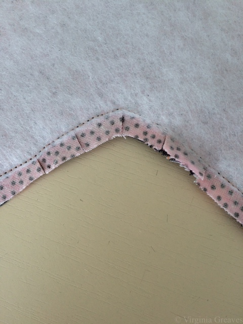
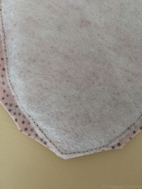
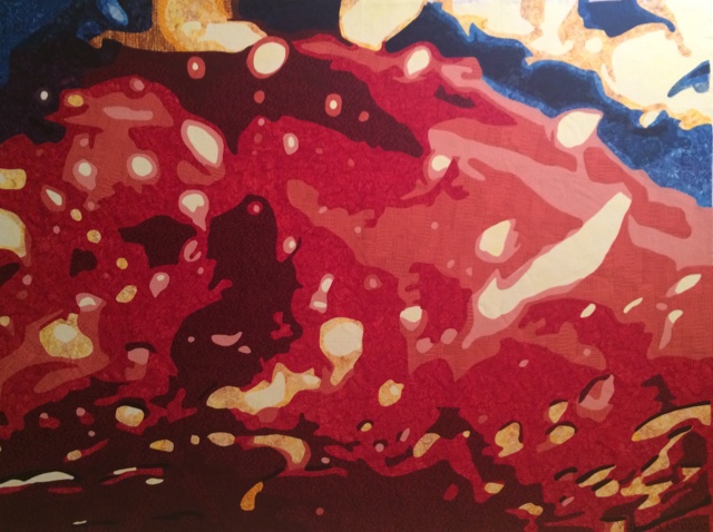
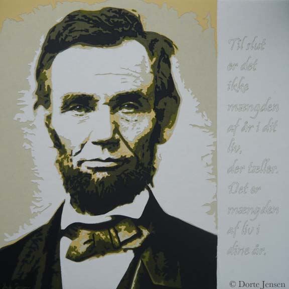
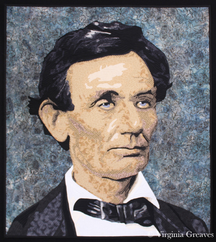
I spent a while contemplating what to do. I was close to completing everything for Wash & Wax, but I had started an entry for a SAQA show whose deadline is October 31. I considered making a complete face, but I didn’t really have time to do it justice. However, they asked for something in our signature style, so I felt as if I should do something along the lines of a portrait. Last year I did a cardinal. Small format work is hard for me.

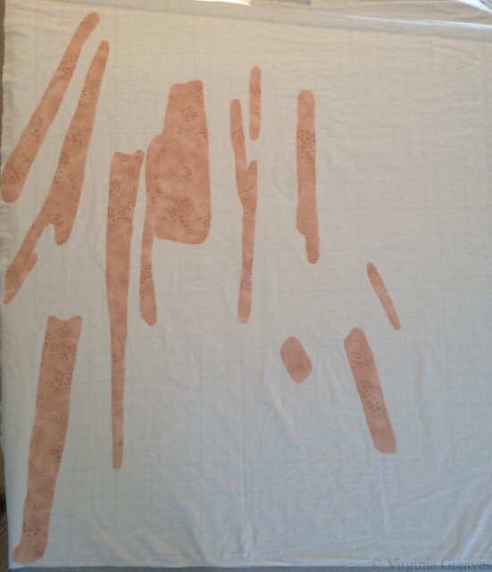
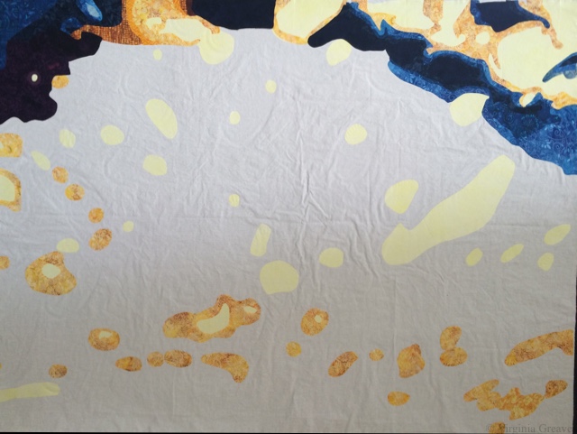
I finally decided that I could do a set of eyes peeking through a slot in a door — rather like the woman peeking through Amy Pond’s reality in Doctor Who. This is the first two skin values.

seen1

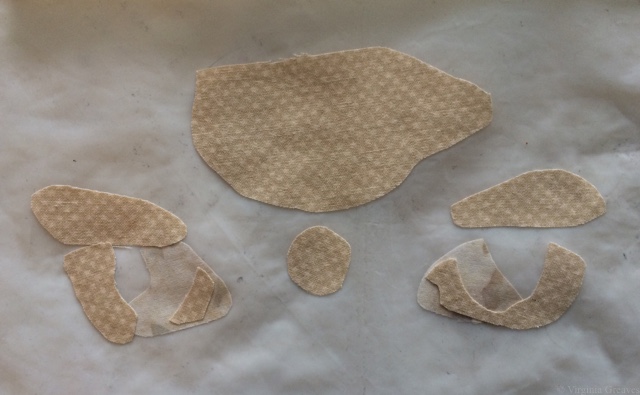
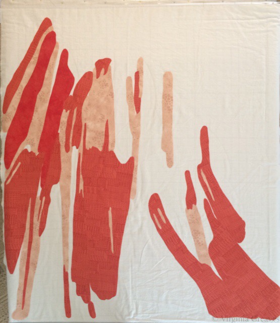
This is the third. Still hard to see without the irises of the eyes for reference.

seen2

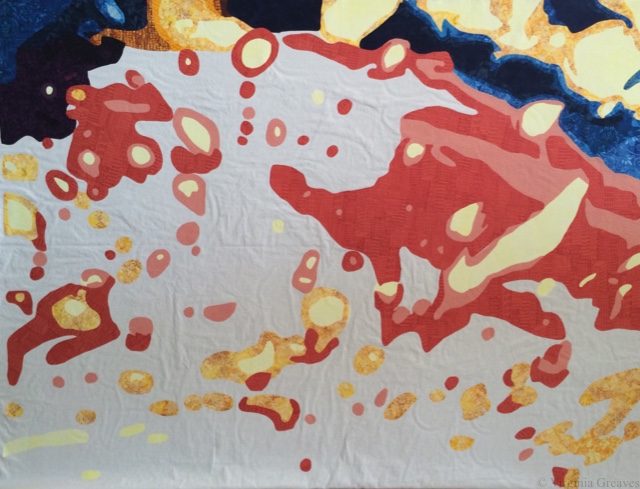
Four and five give enough definition, but he still looks rather like a zombie.

seen3

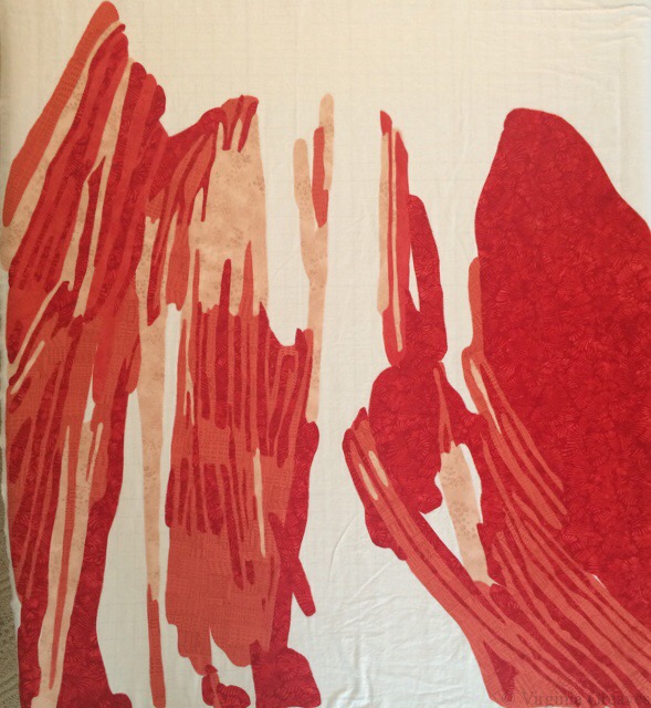
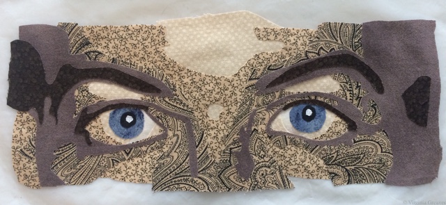
The last value gives you the exaggerated curve of the questioning eyebrows.

seen4

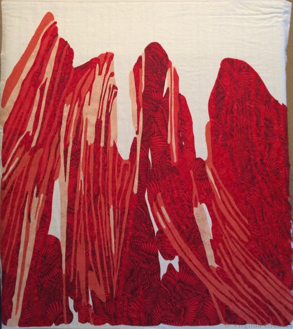
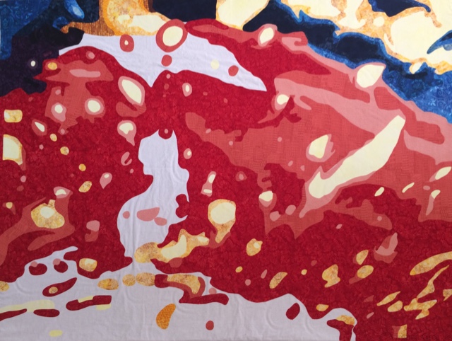
And finally, the eyes. For inspiration, I used a picture I took of my husband soon after we were married. I even managed to match his eye color fairly well.

seen5

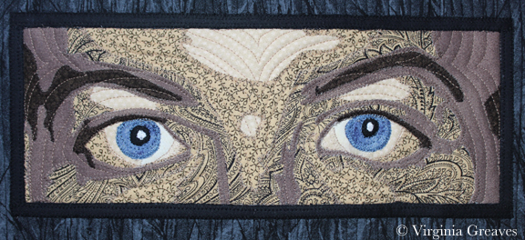
And here he is peeking through the door.

seen6

I changed how I did this face — subtly, but I like how it turned out. I usually don’t start any part of the eyes until the end. In this instance, I filled in the whites of the eyeballs in the beginning when I laid down the other lightest values in the face. It makes then recede a little bit more.

seen7

So if you get a chance, stop by the Auction Booth at IQA while you’re in Houston next week and make a bid on one of the fabulous pieces they’ll have. And if someone would snap a quick pic of mine on the wall with the other work and then email it to me, I’d be very grateful.

Show Prep

0

So we are closing in on opening for the Wash & Wax exhibit at Abernathy in September, the collaboration I’ve been creating Leisa Rich for over a year. My, how time flies. There are so many last minute details to take care. I still have to add labels to all the pieces — and I have figure out how to put a sleeve on a piece that’s 9 feet long.

I spent a great deal of time yesterday photographing work. I’m realizing that Leisa is a lot more particular about photography since she’s had experience working with a professional photographer. I see now that I don’t have enough even lighting, although I’ve gotten a lot better at taking a really sharp pic. Eventually, we’ll have them professionally photographed, but for now it’s me.

And now that we’re about a month out from opening, it’s time to start showing some details of what we’ve been doing. We have named all of the pieces, and I’ve upgraded their pages with detail shots. Closer to the opening, I’ll share full shots with pricing.

Wash & Wax: Entry Point

Wash & Wax: Entry Point


Wash & Wax: Blurred Vision

Wash & Wax: Blurred Vision


Wash & Wax: Skitter

Wash & Wax: Skitter


Wash & Wax: Bubble Bath

Wash & Wax: Bubble Bath


Wash & Wax: Agitated

Wash & Wax: Agitated


Wash & Wax: Sparkle and Shine

Wash & Wax: Sparkle and Shine


Wash & Wax: Polish

Wash & Wax: Polish


Wash & Wax: Emerging Viewpoint

Wash & Wax: Emerging Viewpoint

I don’t have pics yet of the small pieces that we’ve done. They’re 10″x8″ and framed under glass — known as The Micro Bubble Series. Also, the 25 foot by 7 foot piece that we’ve named Industrial Car Wash will have to be photographed in the gallery. (It only fits in my studio in a stack.) And there’s one last piece made with actual car wash strips, Drive Through Slowly. Oh yes — and there will also be some 10″x8″ framed photographs of Leisa’s inspirations.

I have written an article about the collaboration that will be coming out in the next SAQA Journal, and ArtsATL will have an interview with us published closer to the time of the show.

The show at Abernathy Arts Center will open September 18 and will run through October 16. The opening reception is Sept. 18th 6:30-8:30.

Then we will have a few pieces hang in Signature Gallery in Atlanta in January, and the entire show will be exhibited again at Hammond Gallery at Jacksonville State University for the month of February.

The Creative Soul

0

The creative soul is a delicate thing. I’ve been working mine tirelessly. Between freelance editing work and getting ready for the Wash & Wax exhibit with Leisa, I haven’t stopped to take a breath in a while. But today I finally had to.

I made a fabric chatelaine. I had seen the one that Pam Holland made on her blog a few months ago, and it got me thinking. It would be nice to have something to hold the tools of my trade so I wasn’t constantly losing them or leaving them on the opposite side of the room from where I needed them.

I even found several patterns online, but all of them were not what I was looking for. Pam doesn’t have a pattern that she followed, but I went back to her blog so I could look at her additions — how she attached the pin cushion, for example — and try as I might, I can’t find her blog post anymore. She didn’t call it a chatelain, and all of my searching has been fruitless.

So I gave up today and took out my priest’s stole pattern — Simplicity 7950. (By the way, I remember having to go to some trouble to locate this pattern many years ago when I made a stole for a friend. I’m fairly certain it’s been discontinued but can sometimes be found on eBay.) I shortened it so it would fall a little below my waist. (In all honestly, there was a fold in the pattern about where I wanted it to be and I went with that.) Then I pulled black and white remnants and cut it out. I used a scroll pattern for the top, a black with a subtle bubble texture on the back. I cut out four pockets from scraps, making sure the bottom pockets were tall enough to hold Sharpies (I may stitch lines to separate them and make them stand up later) and the top pockets were tall enough to hold my cell phone. There’s still a lot of space at the top. Later, I’ll add a ring to hold my new TJ Lane thimble (I still have to make the beaded holder), a ring for an extendable wire to hold light scissors, and then maybe a small pin cushion. I consider it a work in progress.

Chatelain

And then for dinner, I bought whole canned tomatoes, a basil plant, and fresh zucchini and squash and have made the best sauce for dinner. Between generous amounts of olive oil, garlic, red pepper flakes, fresh basil, tomatoes, and roasted zucchini and squash, my whole house smells delicious. (I did add ground turkey for my husband so he wouldn’t think I had gone completely granola on him and start raiding the fridge a half hour after dinner.)

Leisa and I met a week or so ago with Lauren Bernazza, our curator, to look over what we have so far. The piece that’s going to cover the big wall is massive, but we decided that we needed some large solid pieces to pull everything together, so I’ve made about 20 more of those — and these are all very large. I just have to quilt them. They’re sitting on the floor in my studio. They’ll have to wait for now.

I also received #7 back from Leisa. This was the one that I had intended to cut up into mini framed pieces — but once it was done, I knew that it wouldn’t work, so it’s become an extra piece in our exhibit. We have room. I spray basted it yesterday, and it’s all ready for quilting, too.

I also spent a week or so ago cutting up 8 mini’s from the fabrics I used in #7. I used all the same background fabrics and then freehand cut shapes in blue, red, and yellow. Leisa has already transformed them, and we’ve bought frames for them.

#8 is a piece that we’ve been talking about for a long time. It is the only piece not appliquéd — it is a photo transferred directly on to fabric. I used Spoonflower, and although the print is a little dark, it will work fine. Our original intention was to hang it lengthwise so that it would be taller than the wall and spill out onto the gallery floor towards the viewer, but once we had the fabric in hand, we preferred it lengthwise. Leisa has it now. She’s been adding sparkly fabric and embroidery. I’m not sure when I’ll get it back. She’s much more possessive with this one — but I’m really okay with that. I have my hands full finishing #7 and those 20 more free form pieces.

I sat down last night and updated the website for the series. Although I’ve shown a lot of in process pics on my website, we’ve decided not to share the final pics on the website until the opening of the exhibition. I have updated all of the pages with the exhibit name “Wash & Wax” — I should have done that ages ago — and I added an announcement with a closeup pic of one of the pieces and details on the opening and our workshop on every page.

As of this month, pieces #1 through #6 are completed. #7 and #8 are still in progress, as is the large wall installation piece. Leisa is also planning an interactive piece using actual car wash strips and has framed her inspiration photographs. It’s going to be a fantastic show, and we’re all ready starting to plan other venues for it to travel to.

Update: And the reason I didn’t find the chatelaine on Pam Holland’s website is because what I was looking for was on Jenny Bowker’s website. It’s here — much more colorful than mine. I’ll definitely be adding a pin cushion like hers.

Bountiful Blessings

0

Mercury must be in retrograde because it’s been an exciting couple of days.

WornIt’s been quite some time since I’ve written. In late May, I spoke at the East Cobb Quilt Guild here in Roswell. I took my slideshow that I’ve been building to show a retrospective of my work — and one of the pieces I had in the slideshow I had entered into the the East Cobb show coming up in a couple of weeks. After I verified that the judges would not be in attendance at the meeting, I decided to leave that quilt in the slideshow but not take it to the meeting. I did, however, have someone pointedly ask me at the end of the presentation where that piece was — that they wanted to see it in person and why had I not brought it? So I fessed up that it was sitting at home, but that they could study it more closely at the upcoming show.

It’s a great guild, and I have several friends that are in it, so it was a lot of fun seeing old friends again.

Fast forward to last night, the awards ceremony and opening reception for the show. I went alone as everyone in my family was busy, but I was greeted by friends at the door and was invited to sit with others that were excited at having seen my presentation a couple of weeks ago. The only thing more fun than old friends are making new ones.

As I was sitting there, the art category came up. Well, I didn’t win anything, but at least Judy Alexander won 1st place. I was very happy for her. I enjoyed all of the categories, and it was fun to see the 1st place winners on the overhead screens.

And then they came to Pictorial. Well, maybe I entered in that category. Turns out, I did! And I chuckled. I was thrilled to see Worn come up on the overhead and win 1st place in its category. I got to walk up to the front and hug Lynn Rinehart and have my picture taken with the ribbon. The ribbon was mostly handmade — beautifully done. And then I sat back down.

They finished the categories and then started talking about the Best of Show winner. This is always a traditional quilt. I know this. It’s expected. Except — HOLY COW! It’s my quilt up there on the screen! I covered my mouth and the woman I was sitting next to had to push me into the aisle so I would walk up to the front. I couldn’t believe it!

IMG_0085

photograph by Ben Hollingsworth

So I am overwhelmed. I would do what I do anyway, but it’s ever so nice when people like your work. And to be recognized among your peers is a bountiful blessing.

This morning, I went over to the show to have a quilt appraised — both Worn and Golden Moment will be traveling to Sacred Threads soon and they both require a written appraisal — and my daughter had taken my car since she had been having problems with the Explorer. I had intended to arrive at the show with a half hour before the appraisal so I would have some time to browse the show quilts, but unfortunately, problems with the car took my time and frazzled my nerves. I did make my appraisal appointment on time though, and had just enough time to buy something I’ve wanted for a long time — a thimble from TJ Lane.

IMG_1744I had tried to buy one in Houston last year and couldn’t get near their table, but at this show, there was plenty of room for me to look. My initial choice was one with a jewel, and as much as I loved it, it just didn’t fit my finger. I found another one with a jewel that would work, but again, it didn’t cover my finger as well as this one with the bee — so I went with the bee — because I’m actually buying it to use it, not for jewelry. It’s really all Lynn’s fault. I was trying to talk myself out of it, and she walks up and tells me that I should get it as a reward for myself. It’s a nice present, but really, if it saves me from repeatedly sticking the needle into my finger as I’m sewing on the binding or the facing, I should consider myself pampered and happy. For ages, my thimble has been a cheap brass one that doesn’t fit right, and I think I inherited it from my mom. So now I have quilter’s bling.

Before I left, someone came up to tell me congratulations, that I had won Quilter’s Choice from the vote last night! Wow. So I went to see the new ribbon on my piece, and I was able to spend some time speaking with the docent who was so kindly showing people my work. The First Lady of Georgia, Sandra Deal, wife of Governor Nathan Deal, had come for the ribbon cutting of the show that morning. She loved my piece and wanted to have a picture of me with it, but sadly, that was during the hour that I was dealing with the car, trying to find Lynn, and then having the quilt appraised. Lost opportunity. Oh, well. I was glad to hear that she had enjoyed my piece and that her entourage had taken many pictures of it.

And then I came home to borrow a car, deal with the appliance repair man, and take my other daughter to the doctor (so I was glad that I had borrowed a car because it turned out that I really needed it).

It’s been a long day, I did not sleep well last night, but I’ve taken the ups and the downs and I’m moving forward. Before I left the show today, I converted my entry fee to a multi-day pass, thank goodness, and I hope to go back for some time tomorrow.

Georgia Celebrates Quilts will be open again tomorrow and Saturday 10am-6pm at His Hands Church in Woodstock, GA.

Abstract #6 Cut 

0

You may not realize it, but I work on deadlines — by the ones laid out by exhibitions and shows and the ones I set for myself. I have a calendar that I mark with all important dates for shows I’m interested in entering. If I’m not diligent in keeping track, I would be guilty of promising a piece of work at more than one place at the same time, and because I’m a professional, I work hard to make sure that doesn’t happen.

However, at least twice in the past year, I’ve had shows that I’ve entered change their dates mid-stream. I’ve entered the show knowing that I’ll have until X date to be notified as to whether it will be included or not in the show, and after that date, if it isn’t accepted, I can enter it somewhere else.

Friday, I spent the afternoon looking at my inbox. Finally, at 5 o’clock, I went to the website for the show and found that they had changed their notification date. Today (4 days later), I received an email with an apology and announcement of the new notification date. <sigh> <shakes head> This show was a long shot for me, and quite frankly, I had another show I was going to enter it into, but now I can’t do that. I suppose if I win the lottery and get in, I won’t mind a bit, but chances are good that notification day will be a bit more bitter than if they had just given notification on time. <grumble grumble>

I have been cruising through #6 in the abstract series.  This collaboration with Leisa Rich is called Wash & Wax and will premiere at The Abernathy Arts Center in Sandy Springs this coming September.

We met a couple of weeks ago and planned on it having the appliqué in one section and embellishment after quilting from Leisa in another section that would overlap mine.

The majority of the appliqué is red. I started with a new fabric for the first value, something peachy pink, a little hard to find in my local quilt shop. (It’s hard to find a pink that will work as a first value for red without screaming PINK.)

I then used up the secondary red color from #5 as my secondary value here as well. I planned out all of the pieces on my remaining fabric, and after it was all fused down, I found two pieces that didn’t make it to the ironing board, and I didn’t have enough of the building print to accommodate them. Rather than panic, I found a solid hand-dyed fabric that I had made several years ago. It isn’t textured, but it makes a decent substitution. Once all of the other fabrics are on there, I don’t think it’ll be noticeable at all.

The third value is also from #5, and I used up almost all of it. I only have a few very small scraps left.

I changed my fourth value for this one. I didn’t think that there was enough contrast between the red pinecones and the 5th value in #5, so this time, I found a red print of wings in my stash that’s been there at least 10 years. I like the movement it adds here.

And my fifth value is the same as what I used in #5, but it shows up better with the wing fabric.

I hope it’s obvious by now that this piece is less about color interpreted through water and more about the machinery that washes the car with strips of fabric. I have done all of the red in appliqué. The majority of the blue will be embellishment attached to the top after it’s quilted.

There’s a little yellow in the corner to show where the light is coming from.

And then this is a blotch of blue where all of the blue embellishment will go. I just wanted to put a dark fabric here that would be a background for the strips put on top, a better choice than the white.

I’m meeting with Leisa again later this week. She’s done embroidering #5 so I can start quilting it, and I’ll give her #6 to start on. If you remember, #5 is very large — 60″ x 48″ — so I suspect quilting it will be a bear. I had to order more batting for it.

Right now I’m quilting some of the smaller pieces for the wall installation piece. So much to do — so little time.

Construction of Free Floating Abstract Pieces

1

I haven’t written much about the free floating piece that will cover one long wall of the gallery in our two-person show, partly because it has been an exercise in experimentation to see what would work. I think I’ve gotten better as I’ve gone along and thought that I would share some of my wisdom.

In these examples, Leisa has constructed the main pieces — the fronts. She has used either the skeleton or the brown polka dot fabric as a stabilizer (since she has all ready embroidered them at this point). The pink fabric will be the actual backing of each piece.

Here, I have placed the actual piece face down on the pink backing fabric (right sides together) — and I have taped down the backing fabric to keep it flat. I have merely rough cut it so that it is big enough for each particular piece. I pinned them together, checked the back to make sure it was smooth (making adjustments as needed), and then sewed them together at the 1/4″ mark with a basting stitch — leaving, of course, an unstitched area about 6″ long through which I can turn (or pillowcase) this later. Remember, I’ve sewn right sides together, so at this point, I have wrong sides facing out.  I will later turn them right sides out. (Backstitch a few times at the beginning and ending — there’s a lot of tugging on these to turn them right sides out.)

abstract_wall_1

When I first started doing these, I did not do this basting step. I merely layered the batting (2 layers of fluffy polyester), the backing, and the front. I didn’t worry too much because of the thickness of the batting. It was my goal to lightly quilt them so that each piece would be more sculptural than a flat quilt.

The economics finally won out, however, and at some point, we realized that there were so many of these, we would have to be content with one layer of batting. Well, that changes the game. At that point, I have to worry about puckering on the back.

After basting, I cut the pink backing even with the front.

abstract_wall_2

Then I rough cut out a piece of batting, placing it underneath the backing, and pin all of those layers together.

abstract_wall_3

I sewed a smaller stitch length on top of the previous one. In this example, the basting is white thread, the tighter stitch is black thread. Again, I leave the opening for turning.

abstract_wall_4

Afterward, cut the batting (only) as close to the stitched line as possible. Also cut the batting from the section where there is no stitching, guess-timating where the stitching would be.

abstract_wall_5


Before turning these right side out, you need to clip corners. (And yes, I forgot a few times and had to turn them back to clip them.) Clip the inside corners as close to the stitching as possible without clipping the stitching line. No worries if you do — just re-sew the line where you cut it before continuing.

abstract_wall_6

On the outside corners, trim all of the layers close to the the stitches. You want to minimize the bulk in the corners so they will lay as flat as possible after turning.

abstract_wall_7

At this point, you turn the piece right sides out. On one of these, since I have three layers, I turned it right sides with batting on the outside. I was on the phone and not thinking about what I was doing. Turn it so the backing and the front are facing right sides out.

And then, another step I added after several problems, the end result is much better if you take the time to steam the edges flat. Although the long edges are fairly tame swooping curves, I have some sharper shapes on the ends, and ironing them flat (from the back since I have some plastic pieces on the front) ensured that the back behaved.

Also iron down the unsewn edge through which you pulled the piece right sides out, folding along the seam allowance — being very careful to make sure that the end result pulls taut from the opposite corner on the back. If you don’t check, you will invariably end up with a little extra on the back. Pin that section to keep it in place (pin on the front).

abstract_wall_8

Then flip back to the front side and sew a topstitch 1/4″ from the edge all the way around. This will also close the opening that we used for turning.

abstract_wall_8.5

Then quilt. Although I generally quilt my pieces to death, these are meant to be more sculptural. That’s partly why we chose to use the polyester instead of the flatter cotton batting. I quilted them in sections so that some areas rise up.

This is one of the turned pieces.

abstract_wall_9

The intention is to hang them on the wall independently, meaning that its presentation will be specific to the individual exhibition.

I toyed with the idea of using this same technique on abstract #4 — which is sitting on my design wall, ready to be quilted — since we’ve discussed making its edges irregular as well. The abstract wall pieces are small and I could get away without pin basting them. However, turning abstract #4 would require basting — and I can’t pin baste many of these because of the added plastics. I also know that intense quilting stretches the fabric, and not having a place for it to go could be problematic.

After research, I’ve decided that I will spray baste it, as I’ve done several of the others, and then after quilting, I’ll add large strips to the front which I’ll use as facing and turn to the back. Of course, I will then have to hand sew the facing down on the back, and we know I don’t love hand sewing — but I think it’s the best solution. I’ll add a sleeve after the facing is done.

Where there’s a will, there’s a way.

Abstract #5 Comes Together

0

All of my studio time nowadays is dedicated to completing the projects for the two-person show I’m collaborating on with Leisa Rich to be debuted in October. Last week, while she was working on #4, I drafted #5 and started cutting it out.

Leisa asked me to go big on this one — so that is what I did. I went to the limits of what I could currently handle in my studio for this kind of project — 48″ x 60″. I had to have a surface large enough to fuse the shapes onto my canvas. Since my table wasn’t large enough, I ended up laying one of my design walls flat on the floor — it was exactly 48″ wide.

And for the pattern, for the first time in years, I used the services of a blueprint company and a vector program. My copy of CorelDraw was woefully out of date, and I don’t have a PC anymore, so I ended up purchasing iDraw which worked perfectly for my purposes. (Even after 15 or so years, my Wacom Graphire 4 tablet continues to be a workhorse for me.) I created the pattern and emailed it to the local shop. I did spend some time talking to them about what I wanted though because a print of this size can cost upwards of $80. I had it printed out on inexpensive paper on their 36″ wide printer and then taped the two pieces together (the final cost was under $10).

I also had to buy some rather large pieces of red fabric for this. I didn’t have anything in my stash nearly large enough.

Here you see it with all the yellows, blues, and dark purples.

abstract5_1


And here you see the beginnings of the red.

abstract5_2

Lots and lots of red. For this particular value, I had to buy 2 yards, and the largest piece still had to be spliced in one place because it was wider than 42″ (the width of the fabric).

abstract5_3

And this is the final piece. I don’t know that my iPhone did the best job in the world, but it’s fine for an in-process shot. I think that this one is the most evocative of the car wash theme that we’ve done so far.

abstract5_4

To be honest, I was surprised at the huge leap between value 4 and 5 — and that 6 didn’t stand out very well against value 5– but after cutting out almost 2 yards of value 5, I wasn’t willing to start over. It still accomplishes what I wanted it to. There is a lot of room for Leisa to go wild on the embroidery — can’t wait to see what she does with this one.

The last time we met, she gave me some more pieces to work on for the large wall piece, and I still have #4 to quilt. Lots to do.

Art, Work, & Life

0

I didn’t post on my blog last week. There was a tide of work and life that consumed me and overtook my time. I stole some hours here and there, but I didn’t meet my weekly art goals.

I think everyone struggles with balance. I have work that helps pay the bills, I have a family to take care of, and I have my art that I need — just for me. All three constantly pulling.

I had recently finished cutting out and fusing the 4th abstract piece in the series I’m collaborating on with Leisa Rich. This is what it looked like when I gave it to her.

abstract4_6

And she spent a couple of weeks on it. There is a tremendous amount of embroidery stitching on it now — and these very cool things cut from canvas that she printed images on through her printer (have to make a note to try that) as well as vinyl (some in blue!). There is also this cool fabric that’s blue and orange that adds the hot colors more along the bottom.

abstract4_7LR

I love it!

Leisa suggested that I finish this as an irregular shape — not a rectangle. The technical person in me started immediately thinking about how I could do that. We’re also doing some free-form shapes and I pillowcase them — which means I sew the backing onto the front (right sides together) with an opening on the side — and then turn it right side out and topstitch the sides down. That would work here — but I wouldn’t want the edge topstitched on such a large piece. I would just need to hold down that seam while I quilt it — so I’m thinking maybe a water soluble thread. However, if I do this, I can’t quilt it heavily — there would be no place for any stretching to go.

I’ll think on that for a while. For now, I’m still cutting and fusing #5. I should have been done by now, but life keeps getting in the way. Hopefully, I can make a lot more progress this week.

I forgot to take pics of the free floating pieces. These are smaller pieces that Leisa is constructing — and then I’m quilting them and doing the finishing work (or rather in this case, I’m pillowcasing and topstitching the edges of them, which is the finishing, and then quilting them.) Each of these will hang independently on a very large wall and can be moved around depending on the exhibit space. They are less like quilts and are more sculptural in design.

We’re making great progress. I have at least 3 more pieces to plan, but we have until October when the show opens here in Atlanta.

Studio Frenzy

0

Last week, I finished cutting the 4th abstract in the Car Wash series that I’m working on with Leisa Rich.

Like my other pieces, I approached it with the intent of cutting it out in color order starting with the yellows, then the purples, then the blues — but as I went on, the entire thing became unwieldy. Breaking it down into meaningful pieces became really hard. I became best friends with my colored highlighters — and I bought more of them. I rued the day that I had drafted this thing. I think I may have pulled some hair out.

I ended up with all of my fabrics on the cutting board and the master pattern on top of the piece I was constructing.

This was my first picture.

abstract4_1

I started working on the blues at the bottom, then adding in the grays.

abstract4_2

Then I started working on the top but was coming to the realization that the only way I could approach this monster was to finish whole sections as I came to them.

abstract4_3

This is just insanity. I did realize that  I was almost out of that medium gray and I was going to need more. I was very pragmatic about it, though. I put all of the gray that I did have along the outer edges. Then I planned a search mission to the fabric store and luckily found something in the same color and value. It has a lot more texture, but I think that that’s fine.

abstract4_4

Here, I can see the light at the end of the tunnel. Literally, everything is done but the part in the very middle. At this point, I highlighted that section in the middle on my pattern so I’d know where I was. I kept getting lost.

abstract4_5

And here it is before I gave it to Leisa — a quick shot on my wall before I whisked it away. She is embroidering it. So many edges.

abstract4_6

On my new time keeping app, I can easily see how much time I’ve spent doing something. I spent 39 1/2 hours cutting this out. Holy cow.

So my next piece is going to be much simpler. It has to be. I have at least 4 more large pieces to do for the show and I want to have them completed by the end of May.

Since I handed this last abstract piece off to Leisa, I’ve been working on the abstract piece that will cover the largest wall in the gallery. It will be made up of a lot of smaller pieces that will be hung individually.  Leisa is making the tops of these pieces — and she gave me a bunch to work on. I pillowcase turned them — no easy feat — topstitched them, and am now adding some quilting. They’re meant to be very textural on the wall so they aren’t heavy with quilting. I’ll share some pics later.

I also wanted to share this picture of my daughter in the Dominican Republic. She went after Christmas on a mission trip with her school and her father.

camera


I let her take my camera — my DSLR Canon T3i. I was looking forward to seeing all of the pictures of the DR, but alas, the only pictures I will see are the ones they took with their cell phones. This is the last known sighting of my camera — it was stolen at the airport on her return trip home.

It made me very sad, but I have all ready replaced it. The camera body came last week — and I’m waiting on the lens. It should be here today or tomorrow. Instead of the 18-55mm kit lens, this time I opted for the “nifty fifty” — the prime 50mm lens. It has no image stabilization or zoom — but it’s “faster glass” with an f-stop of 1.8 compare to the f-stop of 3.5-5.6 on the kit lens. It’s a less expensive lens, but I’m told that it’s a far superior lens. Can’t wait for it to get here!


Working From Photographs

0

This morning, I was spending a few minutes on Facebook, and Dorte Jensen, who was accepted in SAQA as a JAM member at the same time I was, posted a picture of a piece she made of Lincoln to the Art Quilts page. Given the recent discussion of the use of historical photographs in your artwork, I couldn’t help but think that comparing her picture of Lincoln to mine makes my argument all too clear — that the use of a photograph as inspiration does not mean that the artist is merely copying the photograph. Obviously, there is immense skill in drafting a pattern from any photograph and rendering it in your own style.

Although the inspirational photograph for her piece is slightly different than the one I used, it is obvious that our styles are completely different.

This is Dorte’s piece.

Dorte_Lincoln

And this is mine.

Lincoln

If our pieces were merely copies, they would look almost identical.  Clearly they do not. They each have their own spirit and life and attributes that make each one special.

Dorte has also recently made a piece of Ben Franklin that is marvelous. I hope you enjoy her website.

As portraitists, it is inevitable that we will turn to historical photographs if we want our work to be marketable. The skill with which they are rendered are no less than if we were to use one of our own photographs. As long as the copyright is clear, they are a wonderful source of inspiration.

Go to Top