Posts tagged textiles

Construction of Free Floating Abstract Pieces
1I haven’t written much about the free floating piece that will cover one long wall of the gallery in our two-person show, partly because it has been an exercise in experimentation to see what would work. I think I’ve gotten better as I’ve gone along and thought that I would share some of my wisdom.
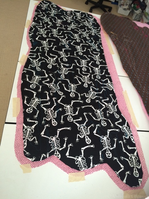
In these examples, Leisa has constructed the main pieces — the fronts. She has used either the skeleton or the brown polka dot fabric as a stabilizer (since she has all ready embroidered them at this point). The pink fabric will be the actual backing of each piece.
Here, I have placed the actual piece face down on the pink backing fabric (right sides together) — and I have taped down the backing fabric to keep it flat. I have merely rough cut it so that it is big enough for each particular piece. I pinned them together, checked the back to make sure it was smooth (making adjustments as needed), and then sewed them together at the 1/4″ mark with a basting stitch — leaving, of course, an unstitched area about 6″ long through which I can turn (or pillowcase) this later. Remember, I’ve sewn right sides together, so at this point, I have wrong sides facing out. I will later turn them right sides out. (Backstitch a few times at the beginning and ending — there’s a lot of tugging on these to turn them right sides out.)
When I first started doing these, I did not do this basting step. I merely layered the batting (2 layers of fluffy polyester), the backing, and the front. I didn’t worry too much because of the thickness of the batting. It was my goal to lightly quilt them so that each piece would be more sculptural than a flat quilt.
The economics finally won out, however, and at some point, we realized that there were so many of these, we would have to be content with one layer of batting. Well, that changes the game. At that point, I have to worry about puckering on the back.
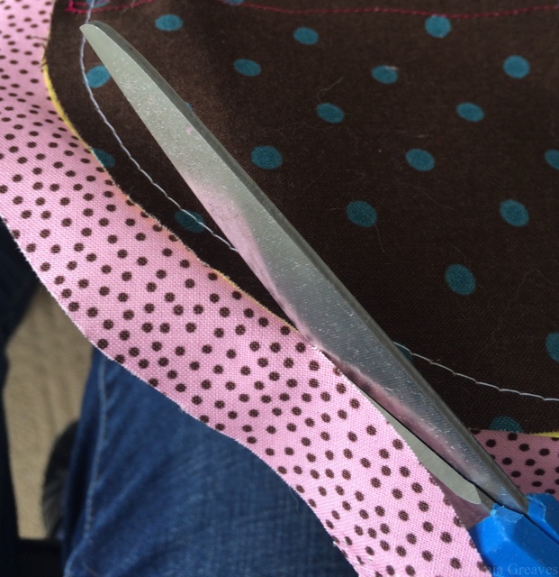
After basting, I cut the pink backing even with the front.
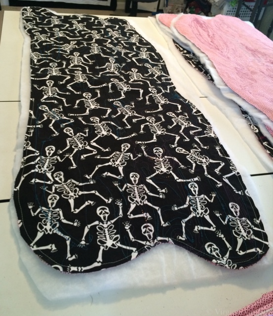
Then I rough cut out a piece of batting, placing it underneath the backing, and pin all of those layers together.
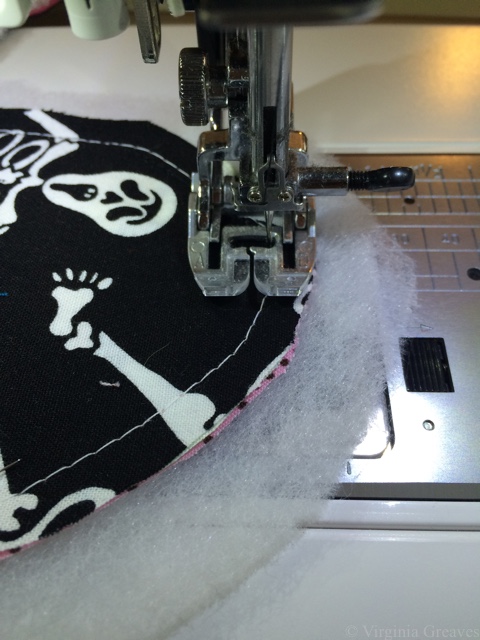
I sewed a smaller stitch length on top of the previous one. In this example, the basting is white thread, the tighter stitch is black thread. Again, I leave the opening for turning.
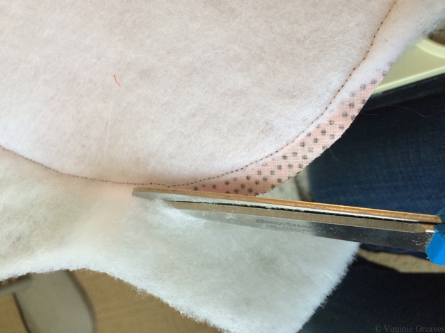
Afterward, cut the batting (only) as close to the stitched line as possible. Also cut the batting from the section where there is no stitching, guess-timating where the stitching would be.
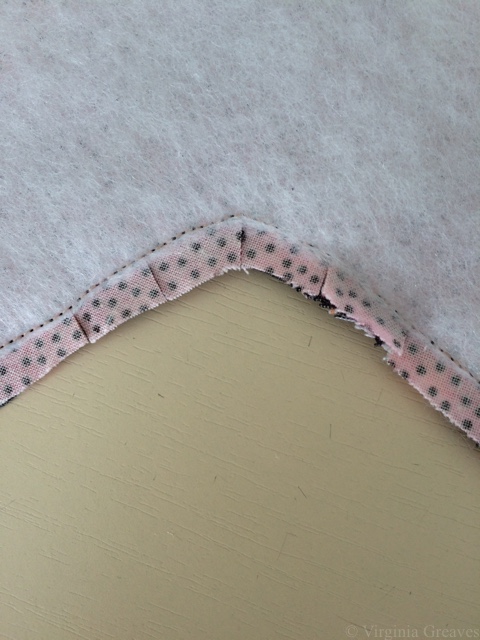
Before turning these right side out, you need to clip corners. (And yes, I forgot a few times and had to turn them back to clip them.) Clip the inside corners as close to the stitching as possible without clipping the stitching line. No worries if you do — just re-sew the line where you cut it before continuing.
On the outside corners, trim all of the layers close to the the stitches. You want to minimize the bulk in the corners so they will lay as flat as possible after turning.
At this point, you turn the piece right sides out. On one of these, since I have three layers, I turned it right sides with batting on the outside. I was on the phone and not thinking about what I was doing. Turn it so the backing and the front are facing right sides out.
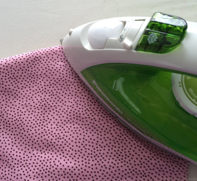
And then, another step I added after several problems, the end result is much better if you take the time to steam the edges flat. Although the long edges are fairly tame swooping curves, I have some sharper shapes on the ends, and ironing them flat (from the back since I have some plastic pieces on the front) ensured that the back behaved.
Also iron down the unsewn edge through which you pulled the piece right sides out, folding along the seam allowance — being very careful to make sure that the end result pulls taut from the opposite corner on the back. If you don’t check, you will invariably end up with a little extra on the back. Pin that section to keep it in place (pin on the front).
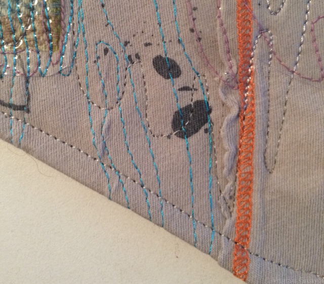
Then flip back to the front side and sew a topstitch 1/4″ from the edge all the way around. This will also close the opening that we used for turning.
Then quilt. Although I generally quilt my pieces to death, these are meant to be more sculptural. That’s partly why we chose to use the polyester instead of the flatter cotton batting. I quilted them in sections so that some areas rise up.
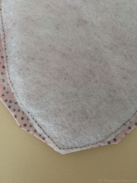
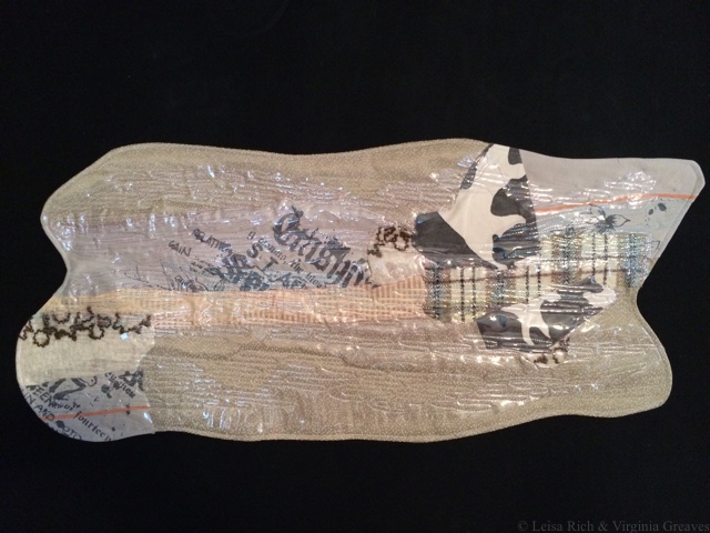
This is one of the turned pieces.
The intention is to hang them on the wall independently, meaning that its presentation will be specific to the individual exhibition.
I toyed with the idea of using this same technique on abstract #4 — which is sitting on my design wall, ready to be quilted — since we’ve discussed making its edges irregular as well. The abstract wall pieces are small and I could get away without pin basting them. However, turning abstract #4 would require basting — and I can’t pin baste many of these because of the added plastics. I also know that intense quilting stretches the fabric, and not having a place for it to go could be problematic.
After research, I’ve decided that I will spray baste it, as I’ve done several of the others, and then after quilting, I’ll add large strips to the front which I’ll use as facing and turn to the back. Of course, I will then have to hand sew the facing down on the back, and we know I don’t love hand sewing — but I think it’s the best solution. I’ll add a sleeve after the facing is done.
Where there’s a will, there’s a way.

Abstract #5 Comes Together
0All of my studio time nowadays is dedicated to completing the projects for the two-person show I’m collaborating on with Leisa Rich to be debuted in October. Last week, while she was working on #4, I drafted #5 and started cutting it out.
Leisa asked me to go big on this one — so that is what I did. I went to the limits of what I could currently handle in my studio for this kind of project — 48″ x 60″. I had to have a surface large enough to fuse the shapes onto my canvas. Since my table wasn’t large enough, I ended up laying one of my design walls flat on the floor — it was exactly 48″ wide.
And for the pattern, for the first time in years, I used the services of a blueprint company and a vector program. My copy of CorelDraw was woefully out of date, and I don’t have a PC anymore, so I ended up purchasing iDraw which worked perfectly for my purposes. (Even after 15 or so years, my Wacom Graphire 4 tablet continues to be a workhorse for me.) I created the pattern and emailed it to the local shop. I did spend some time talking to them about what I wanted though because a print of this size can cost upwards of $80. I had it printed out on inexpensive paper on their 36″ wide printer and then taped the two pieces together (the final cost was under $10).
I also had to buy some rather large pieces of red fabric for this. I didn’t have anything in my stash nearly large enough.
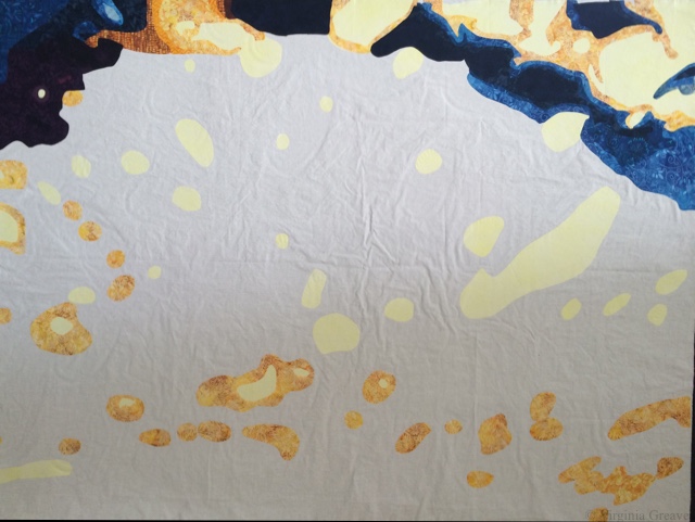
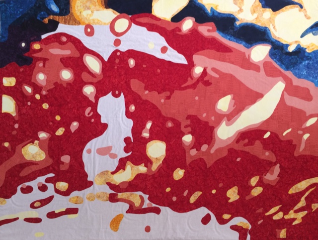
Here you see it with all the yellows, blues, and dark purples.
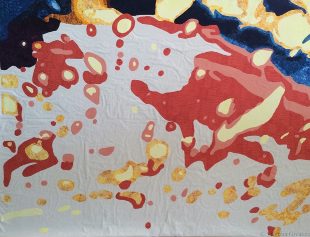
And here you see the beginnings of the red.
Lots and lots of red. For this particular value, I had to buy 2 yards, and the largest piece still had to be spliced in one place because it was wider than 42″ (the width of the fabric).
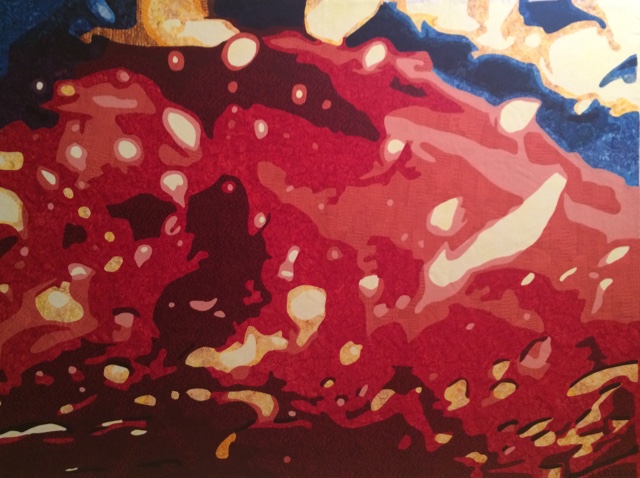
And this is the final piece. I don’t know that my iPhone did the best job in the world, but it’s fine for an in-process shot. I think that this one is the most evocative of the car wash theme that we’ve done so far.
To be honest, I was surprised at the huge leap between value 4 and 5 — and that 6 didn’t stand out very well against value 5– but after cutting out almost 2 yards of value 5, I wasn’t willing to start over. It still accomplishes what I wanted it to. There is a lot of room for Leisa to go wild on the embroidery — can’t wait to see what she does with this one.
The last time we met, she gave me some more pieces to work on for the large wall piece, and I still have #4 to quilt. Lots to do.

Art, Work, & Life
0I didn’t post on my blog last week. There was a tide of work and life that consumed me and overtook my time. I stole some hours here and there, but I didn’t meet my weekly art goals.
I think everyone struggles with balance. I have work that helps pay the bills, I have a family to take care of, and I have my art that I need — just for me. All three constantly pulling.
I had recently finished cutting out and fusing the 4th abstract piece in the series I’m collaborating on with Leisa Rich. This is what it looked like when I gave it to her.
And she spent a couple of weeks on it. There is a tremendous amount of embroidery stitching on it now — and these very cool things cut from canvas that she printed images on through her printer (have to make a note to try that) as well as vinyl (some in blue!). There is also this cool fabric that’s blue and orange that adds the hot colors more along the bottom.
I love it!
Leisa suggested that I finish this as an irregular shape — not a rectangle. The technical person in me started immediately thinking about how I could do that. We’re also doing some free-form shapes and I pillowcase them — which means I sew the backing onto the front (right sides together) with an opening on the side — and then turn it right side out and topstitch the sides down. That would work here — but I wouldn’t want the edge topstitched on such a large piece. I would just need to hold down that seam while I quilt it — so I’m thinking maybe a water soluble thread. However, if I do this, I can’t quilt it heavily — there would be no place for any stretching to go.
I’ll think on that for a while. For now, I’m still cutting and fusing #5. I should have been done by now, but life keeps getting in the way. Hopefully, I can make a lot more progress this week.
I forgot to take pics of the free floating pieces. These are smaller pieces that Leisa is constructing — and then I’m quilting them and doing the finishing work (or rather in this case, I’m pillowcasing and topstitching the edges of them, which is the finishing, and then quilting them.) Each of these will hang independently on a very large wall and can be moved around depending on the exhibit space. They are less like quilts and are more sculptural in design.
We’re making great progress. I have at least 3 more pieces to plan, but we have until October when the show opens here in Atlanta.

Working From Photographs
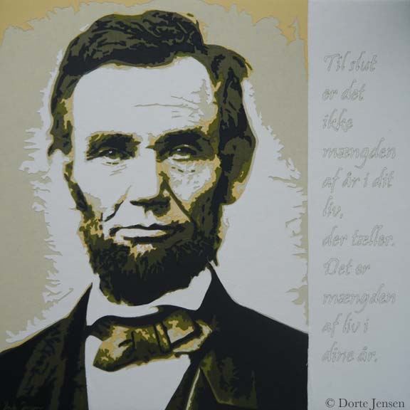
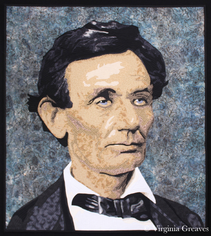
0This morning, I was spending a few minutes on Facebook, and Dorte Jensen, who was accepted in SAQA as a JAM member at the same time I was, posted a picture of a piece she made of Lincoln to the Art Quilts page. Given the recent discussion of the use of historical photographs in your artwork, I couldn’t help but think that comparing her picture of Lincoln to mine makes my argument all too clear — that the use of a photograph as inspiration does not mean that the artist is merely copying the photograph. Obviously, there is immense skill in drafting a pattern from any photograph and rendering it in your own style.
Although the inspirational photograph for her piece is slightly different than the one I used, it is obvious that our styles are completely different.
This is Dorte’s piece.
And this is mine.
If our pieces were merely copies, they would look almost identical. Clearly they do not. They each have their own spirit and life and attributes that make each one special.
Dorte has also recently made a piece of Ben Franklin that is marvelous. I hope you enjoy her website.
As portraitists, it is inevitable that we will turn to historical photographs if we want our work to be marketable. The skill with which they are rendered are no less than if we were to use one of our own photographs. As long as the copyright is clear, they are a wonderful source of inspiration.

Having a Good Hair Day
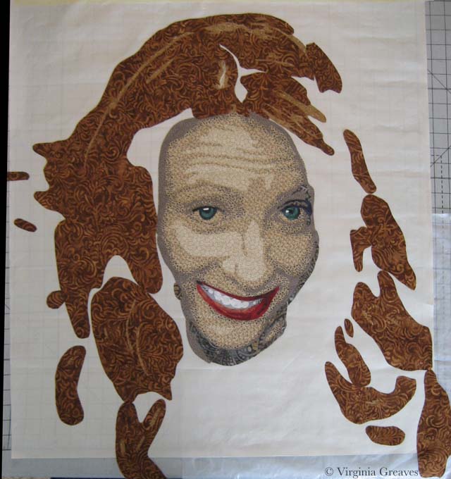
0Before I left for Houston, I had made some good progress on the hair in this portrait. I always find it hard to leave in the middle of a project, but I had finished most of the hair.
In this pic, here is only one small part of the first value in the part — in the top at the middle. Then the next value is golden.
Although I really wanted to go with brown purples, I just didn’t have them in my stash and I couldn’t find them in the store nearby, so I ended up going from golden into an orange brown — which is really more of a realistic choice for this model’s actual hair.
The next value shows the brown. (I somehow managed to lose one of the highlights in her right eye — didn’t notice it until her hair was done.)
And this shows the darkest browns.
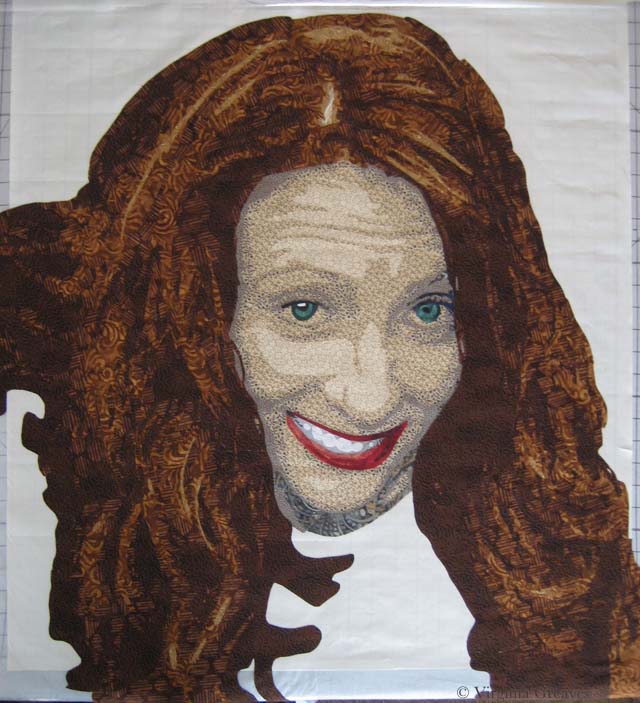
Then I laid in all the blacks, which included her shirt, and the little bit of gray.
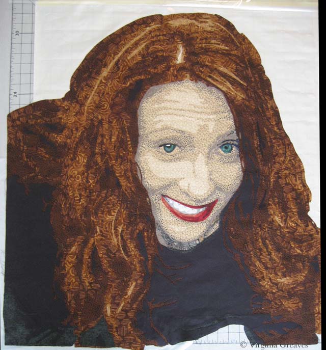
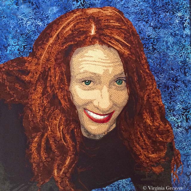
I spent of lot time trying to find a perfect background. I had bought several greens, but in the end, they fell flat. A purple seemed like a striking choice, but I didn’t have anything that worked well. I had a blue that I liked, but I’ve used it as a background before, so I went to the store with the mission of finding one similar. This batik has some deeper shadows that I like. It sets her hair off nicely. I took this pic with my iPhone which makes her hair look more red than it is.
I also replaced the highlight in the right eye and put more gray in her right arm. I had it all brown which was just wrong and caused by blurred lines between her hair and her shirt.
This week, I added the background and started the appliqué. Her face is done and I’m about halfway done with her hair. I hope to start quilting her soon. The days are clicking by quickly and my deadline approaches.

Building Character in a Face
3I have been busy cutting away here recently. This is my favorite part — cutting and fusing. It’s meditative and yet the puzzle is still challenging.
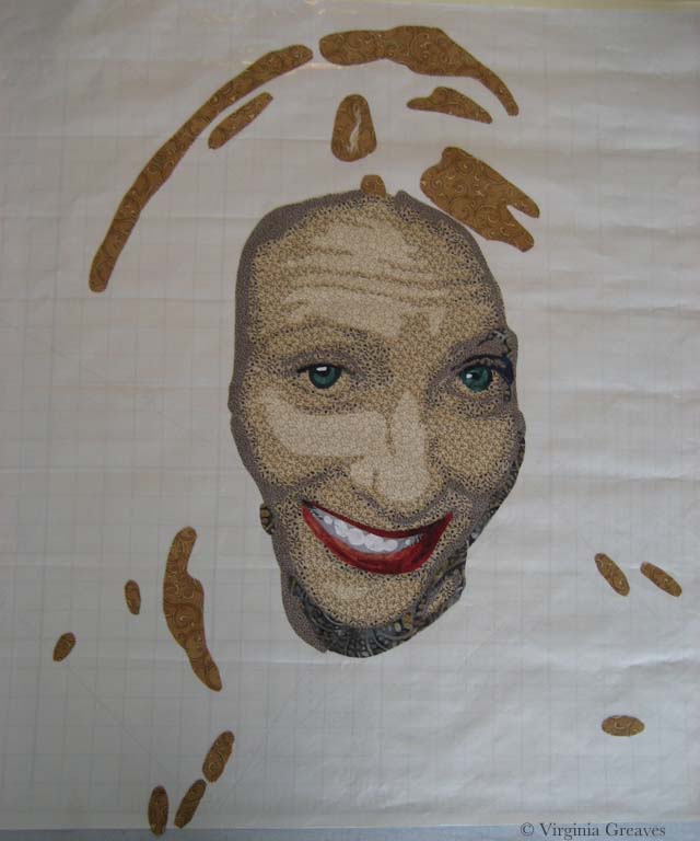
I do have to say, however, that my decision to choose different colors has resulted in an even greater sense of realism than I have had before. Because of this, presenting the face in layers feels more odd than ever before. By the time the face is fully shown at the end of this post, without hair, it feels like looking at a naked face. It’s a little unsettling.
I also confess that, after taking several pictures of my model, I chose not to go with one that you would choose to go on your mantle. I think this is a more playful picture that shows her personality better. She’s actually looking up a little at the viewer.
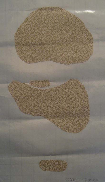
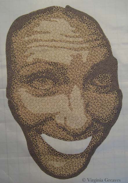
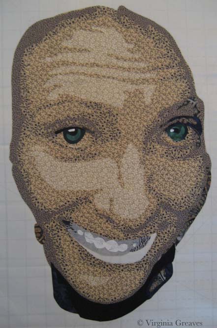
This is the first layer. I’ve learned the hard way not to go any lighter than this.
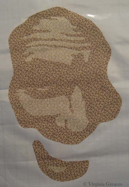
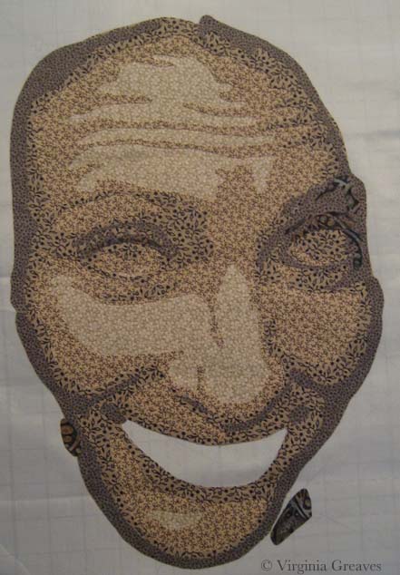
And this is the second value. I know that my model is screaming at me right now. I promised not to show any wrinkles. The truth is that because she is looking up into the camera, there are lines of personality here. They seem stark in this picture, but bear with me. In the end, especially once all of the hair is fused on, they will only add to her character and will not be seen as age lines.
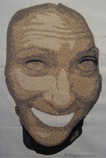
Here is the third value. It’s always important to remember that eyes are set INTO our faces so even if the picture doesn’t give us darker values around the eyes, it’s best to put it there for our rendering to give a sense of depth.
Here is the fourth value. I was surprised that this stony gray worked so well in this gradation.
This is the sixth value. There isn’t much of it here.
This is the seventh value. It’s actually a deep navy blue.
The eighth value is black which is mostly in the neck. I’ll revisit that in a minute.
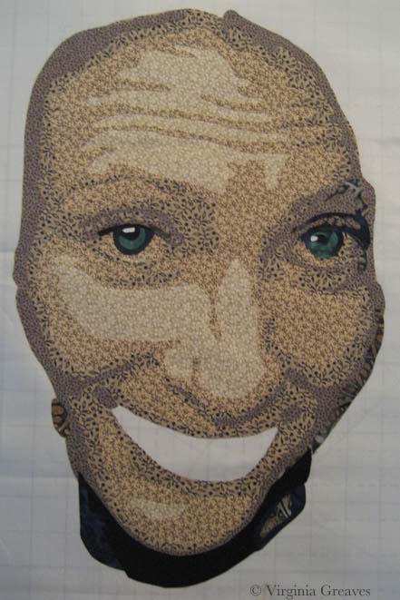
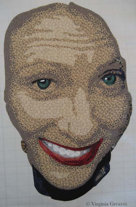
These are her lovely green eyes. You can begin to see her peeking out of the fabric.
And these are her teeth. They don’t make a lot of sense yet without her lips. These are the only pieces that I put on in reverse order — dark to light.
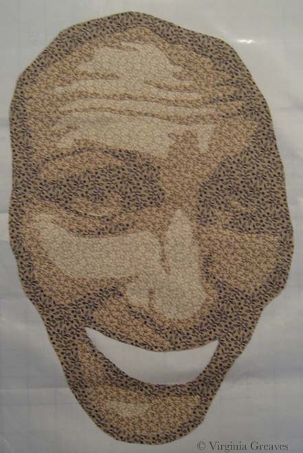
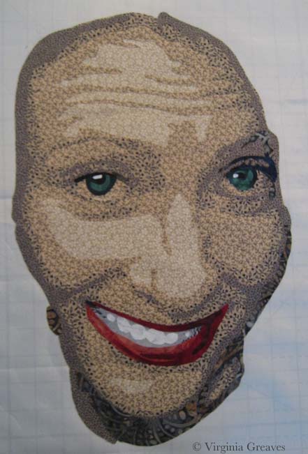
And here she is with her mouth. She looks a little stark without her hair — but I’m working on that now.
At this point, I step back and think about how this will work with what I have to do next. Her neck is too dark given that her shirt will be black, so I decide to pull the values back and re-do the neck.
Here they are re-done. You see a lot more of value six, which I prefer, but you still get the sense of the jawline and the recession of the neck.
Hopefully I’ll finish her hair before I leave for Houston next week.

Breathing Soul
0I have been considering my portrait for entry into the National Portrait Gallery (NPG) competition. It’s always a challenge, artistically, to reverse engineer something — but it also can create a better opportunity for success.
I’ve been studying the work from last year that reached the finals — and I know that whatever I do, my goal is not realism necessarily. There were certainly pieces in last year’s competition that were realistic — and some that were abstract but clearly representative of the human form. I think the greater question is — what can I do that sets my work apart? I can make a piece that looks like a painting from a distance of a couple of feet — but perhaps the better curatorial choice would be one that best represents the materials being used — which in my case is fabric.
So I spent a few days considering the painting of the man with the quilt pulled up to his chin — but in the end, I decided that that’s a poor place for me to start. I don’t make traditional quilts and I have no interest in calling to mind the traditional pieced quilts that grandmothers have created for years.
And then a friend of mine said something on Facebook that struck me. She said — not in regards to me but in general — she felt that representative work in contemporary art was soulless. Wow. And I went back and looked at the fabrics that I was considering for my next portrait (yes there are some value issues here I had not yet resolved) — and I realized that I was following the formula I knew for creating a realistic portrait — and that it was going to feel soulless and boring.
I have felt for a long time that the soul of a portrait is found in the eyes — or the hands — and that’s true — but it’s not enough — not nearly enough for the piece to stand out and grab the attention of the viewer.
And then I started thinking in terms of color. Color does not have to be as straight forward as I was making it. A strict gradation from beige into black was perfectly acceptable — but was it exciting?
I’ve been considering the work of Vincent van Gogh a lot recently — and his work is largely arresting because he used color theory so successfully. Forget what color the thing you’re representing really is — make it what it needs to be in the piece to make the piece successful.
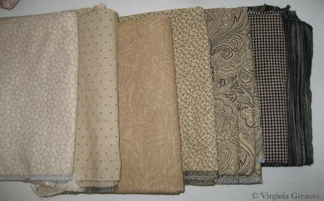
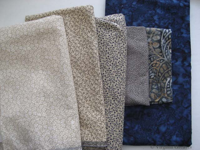
So I started over. I started with beige again but then I went into blue, ending with a deep midnight blue. My fifth fabric, the blue and brown batik, is a step out — but it transitions the beige into the blue. The fourth fabric was difficult. I ended up finding this clay color in my brown bin. It’s a transitional neutral fabric and it’s the right value so it works.
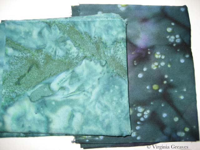
I usually pick the first color family and then start cutting, but I knew that all of it is in relationship to each other — so I went on to pick the fabrics for the eyes. My model does have green eyes — and for this piece, I think that these two will stand out well.
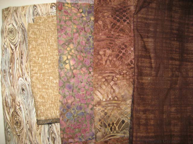
My goal in the hair is to have purplish brown. This is my starting place. The middle one may be too red — but unfortunately, I can’t make it to the fabric store today. (Someone stole my credit card number yesterday and I am stuck waiting on a new one to be delivered.) I think my stash is not complete enough here and I plan to change a couple of these with new fabrics soon — but this gives you an idea of where I’m headed.
I have a beautiful mottled green I’ll probably use in the background.
My goal is to create an analogous color harmony — to use what I know about color to breathe soul into her — to make her come alive in cloth — for her spirit to become apparent in the image. Let’s hope that my bold choices in fabric will help me achieve that goal.
As to whether it will be enough to be juried into the NPG — who knows? But hopefully it will help move me further along in my artistic journey.

Quilting as Another Dimension
1Yesterday I finally finished quilting the 3rd abstract piece that I’ve been working on collaboratively with Leisa Rich. I have to admit that I let my mind run away with this one.
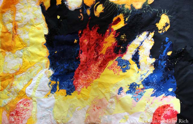
This is a pic that Leisa took of it after she had added embroidery.
And this is the same piece after I have quilted it.
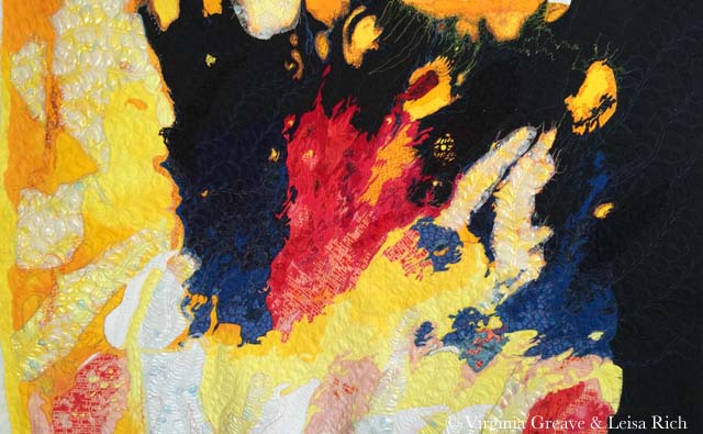
I started with free motion quilted feathers — in metallic thread. CRAZY if you’ve ever sewn with metallic copper thread — but I had the wind at my back that day and it flowed like water onto the surface of the piece. I graduated through copper, purple, blue, and then a gray for the deepest part of the black fabric. I then moved over to the red and brought a flame stitch out of my bag of tricks. Then I moved down into the yellows and whites. I did change to more of a wavy frond for the white — I liked the difference in texture — and some of the yellow blobs were awarded with scallops. I did revisit the copper thread on the lighter blue fabric over on the right hand side — but I was not lucky on those days and struggled with a lot of broken thread. I moved back into blue thread as soon as the piece was ready for a change.
I love free motion quilting on my Janome. Even sewing on the plastic overlay didn’t cause many problems. My Viking would have given me fits.
I hope Leisa forgives me for putting traditional feathers all over it. It called out for that organic feeling. I’ve never used so many free flowing feathers on a piece in my life. It felt good to step out of contour quilting.
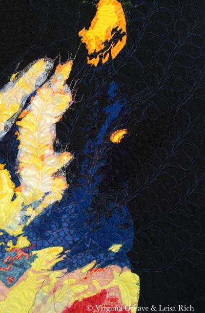 I am giving this back to Leisa next week — I think she’s planning some hand embellishment.
We have a curator that approached a local Atlanta gallery about having a two person show of our work — and it looks like we have reached an agreement and the show will go on in late 2015. Time to get busy — I have a lot to do to get ready!

Crocked Dye in a Finished Piece
0What is crocking? It’s when you wash something and the dye particles that haven’t bonded completely with the fabric (usually cotton) float free and bond to something else. It is commonly seen when someone washes a new article of red clothing that then turns all of their other clothes pink after a trip through the washing machine.
How can you avoid this happening in a quilt? The easiest way is to prewash your fabrics. After you bring them home, wash them in synthrapol (a squirt of blue Dawn dishwashing detergent — as long as you have an older washer that can handle high sudsing detergents — works just as well) and a dye catcher sheet. This will hopefully take out all excess dye particles that were not rinsed before the fabric was sold.
That’s usually more than enough — but not always. I had a green commercial hand dye I bought once in Florida that would never stop running dye. I finally threw it away.
Reds are notorious for this. I have this problem with even commercially printed cottons. It’s especially heartbreaking when it happens in a finished piece. You don’t want to throw all of your hours of hard work into the garbage.
Fear not. It’s not worth the tears. If you can’t fix it with hot water, Shout, or any other stain remover (short of bleach of course) — they make something that works just as well. It’s called fabric paint.
Admittedly, this works better on some prints than others. There are some textures that cannot be replicated — but then you just need to reframe your expectations and accept it as it is. This is art and I can use fabric paint if I want to.
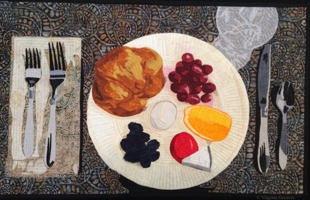
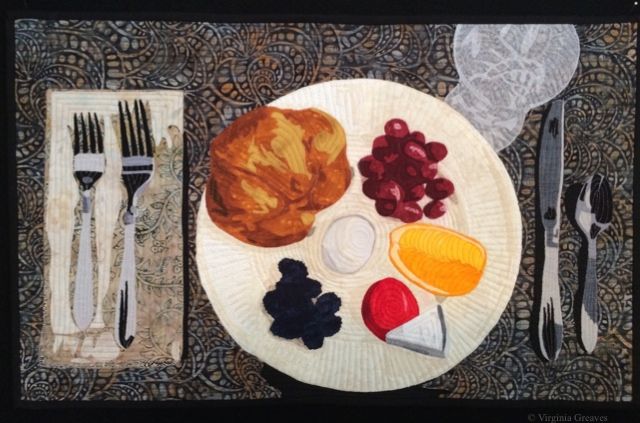
This is my latest piece.
I sighed when I pulled it out of the washer. (I typically run my pieces in water when they’re done to take out the water soluble glue I use to help me in the binding process — and to prepare the piece for blocking.) I sprayed it with Shout, turned the water to hot, and threw it back in.
No luck. There was still red all around the grapes on the plate. So I spun out the water and pinned it up to dry.
Once it was blocked and dry — I waited a few days. You have to be patient. You don’t want to have any anxiety when you do this.
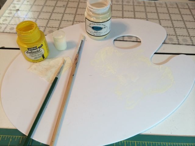
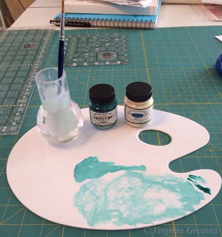
I pulled out my palette and put a pinch of yellow on it — and by a pinch, I mean a very small amount. Then I added a large amount of white and mixed it together on my palette. I tried it out on a piece of my cream fabric — the same that I will paint on the quilt — and it was too white — so I added another very small amount of yellow and mixed it in. This was a closer match on my swatch. So I grabbed a paintbrush and painted it onto the affected areas of the quilt. I used a light hand — and added water to thin it out so it wouldn’t look gloppy — went to another section — went back after it had dried a little and added a little more paint. I ended up pulling out a smaller brush to get that very small section between grapes.
And voila’! Much better. I believe it now qualifies as show worthy. I’ll give it shot anyway.

Make It Work
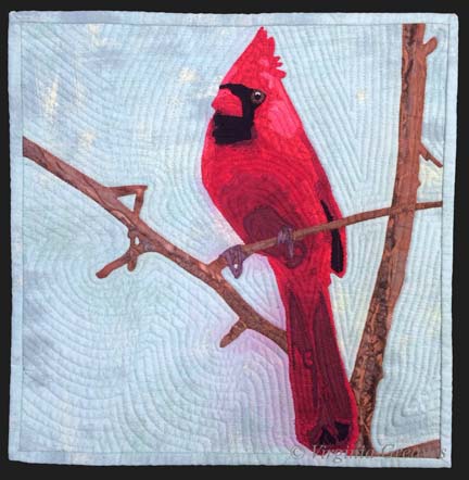
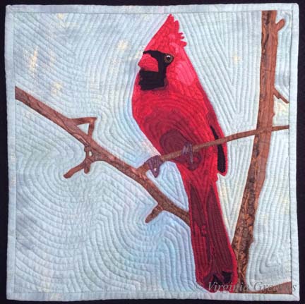
0Last week, I finished the cardinal and put it in water to soak.
I had a thoughtless moment where I put synthrapol in the washing machine while the bin was filling with water. I thought to myself — that’s a mistake — I should empty the tub and start over. But then I thought — it’s so small — it shouldn’t matter.
If I had been really thinking, I would have reminded myself that red is bad to bleed — but I wasn’t thinking so I threw the piece in the water with a Color Catcher on top (I wasn’t totally brainless).
But of course, as you can see, the reds bled onto the background. This is what it looked liked after spraying it with Shout and washing it with OxyClean in cold and hot water — many times. I couldn’t get out any more of the red from the background. (I was able, thankfully, to shrink it a little. It was just over 12″ square — and for the exhibit I made it, it needed to be 12″ square — which now it is.)
I have had this happen before — with Beach Guardians. Thankfully, the background wasn’t printed so painting it with fabric paint should work. At this point, it was my only option left.
But I put it off — and worried — and procrastinated. No one wants to ruin something in the final stage with paint. I had spent almost two weeks on this piece — and I wasn’t looking forward to that going down the tubes if it didn’t work.
I took my fabric paint and mixed it on my palette — and got really close to where I needed to be.
I thinned it with water and blended it into the background.
I think it works.
I compared it to my picture of the piece from last week before I put on the binding — and the background looks less green. That is really only a difference in lighting. It’s almost scary how big the color shift is. This time, I used a side light — and last week I didn’t — but I couldn’t go back & re-take the pic with the bleeding — so I just kept it like this so you could compare apples to apples.
You may have noticed that I used a binding that matches the background. I almost always use black for binding — but as I said — I was trying to make this piece a specific size — and my cardinal just barely fit in the space. The best way to give him some breathing space was to use a binding in the same color as the background. If I had used black, he would have looked squeezed on there.
Did I mention I don’t like making something to a specific size requirement?
