Posts tagged textiles

Cardinal with potential background7

Setting the Mood

0

Today I escaped from my house to the fabric store — the one closest to me — Tiny Stitches. If you remember, this is what I started with — a yellow green. The more I looked at it, the more I didn’t like it. It’s too yellow for me.

cardinal with potential background

This piece really relies on the background to set the mood — and this yellow green takes too much away from the cardinal.

So I went back to my color wheel — and found something strange. I have two color wheels. One says that the opposite of red is green — the other one says that it’s cyan. The plot thickens.

So I pulled this light cyan from my stash. It’s not quite right either.

Cardinal with potential background2

So I went to the store — the batik section — and started laying bolts on the ground and then laying my appliqué on top. I’m fortunate that it’s so small — I can’t usually carry my appliqué work in a folder.

This is nice but feels urban to me — not what I’m going for. It’s just a little too distracting.

Cardinal with potential background3

And this is the green that should work — except it doesn’t.

Cardinal with potential background4

This one is a little better — but it still doesn’t make the bird sing.

Cardinal with potential background5

And then I pulled out this blue green. I liked it a lot more. It’s a good value change and sets off the cardinal nicely. So I carried this bolt around for a while and started walking through the aisles — because sometimes you can find interesting things in places you wouldn’t think to look — so it helps to go exploring.

Cardinal with potential background6

Wow. A print. It is also a light blue green.

Cardinal with potential background7

This is the same pattern in a darker color — too dark for the cardinal.

Cardinal with potential background8

So at this point, I looked at all of the pics on my phone and I really loved the blue green print — but I thought I should try one more green batik. No — it just doesn’t work for me. It’s the right value and the print is the right proportion — but it isn’t for me.

Cardinal with potential background9

So I lost a couple of days — but I now have the right background — the light blue green print. Better to change it now than wish I had later.

cardinal with potential background

Cardinal Longing

1

After I finished Worry, I had no idea what my next project would be. I get so involved in one project that I don’t tend to think ahead to the next — can’t really split my focus. I concentrate on one thing to the exclusion of other things.

But when I was done, I decided to make a small piece for the SouthEast Fiber Arts Alliance (SEFAA) Square Foot Fiber Art Pin Up Show. No theme — the piece just has to be 12×12 or smaller. I don’t usually work in this small scale — but I needed a rest and working on a small piece seemed like a good way to do that.

I had seen many pictures of cardinals in the snow being posted on Facebook — and I think that this is what I had in my mind’s eye when I began — a piece of hope flying across the frozen tundra (a little melodramatic, but we’re currently iced in for the second time in a couple of weeks and this southern girl is more acclimated to sunshine than snow.)

So I searched through all my reds and picked out a decent range. I wasn’t really happy with my first value — but then, what could I do? The weather was too iffy for me to risk a trip over to Marietta to pick out fabric — so I was limited to what I had on hand.

Just as I was getting ready to iron my WonderUnder templates down, I had the funny realization that I had paid for both sides of my fabric (obvious, I know, but a fact often overlooked) — so I ironed the templates to the front — so the back would show — which was exactly the shade I needed for the first value.

cardinal value1

This is the second value — you can begin to see the outline of the cardinal.

cardinal value2

The third value gives you even more — although I should have added to the lighting in the room before I took my pics.

cardinal value3

The fourth value was all I got done before I heard that the news was telling me (I had the TV on while I was ironing) that I might lose power for several days — and I realized I needed to add a few things to my pantry. It was at this point that I ran out the door with fading daylight before the roads became truly impassable the next day (and they did).

cardinal value4

I returned to this yesterday and added values five and six — the sixth one being black. Not bad but I really miss the eye.

cardinal value 5&6

Again, other blurry shot. I think the ISO on the camera I was using was way down — but you can see how I built up the eye in a similar way to the eye on The White Raven. I did add a larger highlight than I usually do — this guy has a small eye and the light coming off it gave the impression of the dimension of the eyeball.

cardinal eye

Once he was done, I added the branches. I thought about adding a bunch of detail and then decided that it was so small, it made more sense to let the fabric do the work for me — so I found a brown wood batik and fussy cut it so I roughly had highlights and shadows where I wanted them.

cardinal with tree

And finally, I added his claws. They are really similar in tone to the branch — and I decided to stay with that. I used a purple with a lot of gray in it — but they are obviously the same value as the branch. I’ll define them more with texture in the quilting stage.

cardinal with claws

The last part is to add a background. This was my first pick. It’s a really bright acid green but it makes the cardinal pop. I tried other greens from my stash — but the greens with more gray in them make the cardinal more sedate — more like it’s a common wildlife scene.

And I could try something other than green — but the color wheel shows the green is the best choice — and holding up colors — it’s the one that makes the most sense visually — even if I did originally imagine more white and gray blues.

cardinal with potential background

I’m not sold on this yet. I would love it if I could go to store and see if I could find something better — or validate my choice here — but there is still too much ice on the roads. I may go ahead for something to do. Sewing is a good antidote for cabin fever.

Quilting Gadgets

0

Having finally finished the appliqué for the family portrait I’ve been working on, I pinned the piece with batting and backing — and then began to prepare myself mentally to begin quilting.

This is always the hardest part for me. I will put it off and find a hundred excuses not to get started. I think that the fear stems from the dislike of UN-sewing — an inevitability of the quilting process. I have, however, discovered that a good way to move me through this stage and get back to the machine is to print off the value painting I made earlier and start drawing quilting ideas on it. If I don’t like the direction of a particular area, all I have to do is erase it. Then when I sit at my machine, the drawing sits beside me and tells me where I need to go.

(Forgive the print — it came out in a pinkish hue because I was running out of black ink.)

Quilting Plan

I did have a problem when I sat down at my machine though. I have a Viking Designer 1 — and the truth of the matter is that it has given me problems since year 4 (it’s about 13 years old now). I had taken it in to the dealer for a cleaning — and she kept it for MONTHS (did I mention I didn’t have a backup machine?) — and when I FINALLY got it back, the touch screen menu didn’t always do what it was supposed to do. I could always reset it by turning it off and on — and I certainly didn’t want THAT dealer to touch it again (and Viking wouldn’t let me use anyone else) — so I had to wait until sometime after year 5 after she had gone out of business before I let someone look at it again (I still have trust issues with someone having my machine for any length of time).

I thought when I bought it that it was warranted for 20 years — and I considered it a good 20 year investment piece. However, I learned the hard way that the electronics were only covered for 5 years. And did I mention that the cost of replacing the motherboard is about $1,200?

Anyway, I’ve just lived with it — but when I sat down on Thursday to start quilting, it just wouldn’t behave. However, I have another Designer 1 that a friend gave me years ago (after hearing me complain about mine — she thought hers would be kinder to me) — so I took everything and set it up on that machine. I turned it on — and learned that it had grown unhappy over the last few months — watching me sew away on my other machine. That machine’s screen doesn’t work — at all. Not even a little.

I went back to my original machine and finally got it back in business. (And since then, it’s been working really well. It must know that I’ve been looking at other machines on the internet.)

And why all of this drama? Well — I have to come clean here. The truth is that I’ve been quilting with my feed dogs up for years. I KNOW! Crazy as it sounds, when I was first starting out, I was having problems and someone suggested just leaving them up — so I did and it helped and it’s been that way ever since.

Golden MomentExcept when I was quilting my last piece, Golden Moment, it was sooooo heavy and it was hard to move around — so I was persuaded to try Leah Day‘s Ultimate Quilting Kit — a Supreme Slider, Machinger gloves, and Little Genie teflon bobbin washers.

By the time the set came, I had just finished quilting — but I knew the day would come that I’d really enjoy using them — and that day was Thursday.

Except — in order to use the Supreme Slider, the feed dogs have to be down. You don’t want it to accidentally slide out of position (which the feed dogs might do) and start being quilted to the underside of your piece. That would be REALLY bad.

Hence the sewing machine problems. I had lowered the feed dogs to set up the machine only to realize I had a couple of appliqué fixes to make — so I had to raise the feed dogs — which they didn’t want to do.

The sewing machine argument aside — I enjoyed the gadgets. The teflon washer that you drop in the bobbin case really does cut down on the out of control speed spinning that the bobbin can sometimes do when you’re quilting fast. The Machinger gloves help me hold onto the quilt — but they’re going to take some getting used to. (It’s awkward when I have to start a new line and pull the bottom thread to the top with the gloves on — I end up with a lot more thread pulled than I’m used to.) The Slider also helps move the quilt around easily — although I’ll be able to evaluate the drag on the needle better when I get to the edges of the quilt. (I started quilting in the middle which keeps most of the quilt on the table so there’s not much drag at this  point.)

Quilting with the feed dogs down does feel a lot different — I can tell that I have a higher chance of messing up the intentionality of the line if I’m not extra careful. I might try decreasing the presser foot tension the next time I sit at the machine.

There’s a learning curve in everything new — but I think that these are good things to learn.

Today, I managed to finish quilting the mom in my piece — except for her hair and clothes.

Quilted Mom

I am worried about my sewing machine. I don’t know that I’ll ever want to buy another Viking given the customer service problems I’ve had with them — but nor do I relish the thought of learning an entirely new machine.

My friend Rebecca has a Janome 5500 that I may borrow for a while — so I can try another something new.

Applique Beginnings

1

Once break was over and the girls returned to school on Tuesday morning, I hit the studio and I’ve been working like crazy ever since.

I finished fusing the baby’s blanket — the last fusing section — and then I moved into fusing the larger pieces onto the muslin to begin appliquéing.

I did have a moment when I was working on the mom that I thought I should have kept her in smaller pieces — her face, her hair, her lower body, her jacket — but I fused whole people together and I was just going to have to live with everything trying to fall off as I started the appliqué process.

I laid my value study on the floor and covered it with muslin, cutting it to fit.

fuse1

Using the drawing behind as a guide, I laid down the mother and fused her right down onto the muslin on the floor.

fuse2

I started with her arm but quickly moved into whatever fabric didn’t want to hold onto the fusible the most. I can iron as I go — but squinching (new word?) the fabric under the harp of the machine can wreak havoc on your relationship with your fusible. Bottom line — fusible is a temporary relationship. Everything has to be sewn down.

I do use Wonder Under — and they’ve obviously recently changed the formula. Everyone raves about Misty Fuse — I’m not sure I could get used to something I can’t easily buy and that isn’t already paper backed — but one day I may give it a try. My feelings about Wonder Under vary with the complexity of the project.

Also — I made a command decision on this piece. After having gone to IQF/Houston & realized that I’m one of the few remaining artists that feels the need to cover raw edges — I’ve changed my strategy. A little, anyway. I couldn’t bring myself to get rid of it altogether. As I said, given the size & complexity of my appliqué shapes — if I fused the entire thing down & started to free motion quilt — I would have chaos on my hands. I did, however, compromise with a free motion zigzag. This is my first time with this stitch but given that I free motion quilt with the feed dogs up — it wasn’t much different — it gave me a little more control. And it’s faster — which is the biggest thing.

This is the woman after I finished appliquéing her this morning — from the back.

 back of mom appliquéd

Once she was done, I fused her son to her left. He is also a complete fused piece. I started appliquéing him this morning — and will probably finish him in my next studio time (since it’s Friday, there’s no telling when that will be.)

fuse3

Mothers and Their Children

4

I haven’t worked on a person since I made Lincoln a year ago — but given that it was so successful at IQF, I thought maybe I should revisit making people again.

So I found this incredible picture taken by a government official in the 1930’s of a woman surrounded by her children and the lines of worry embedded in her face — and I decided to use this as my inspiration. (Don’t worry — this is a public domain picture.)

At first I chose this because of the parallels between the economy today and that of the Great Depression, but as I worked on it, I began to see it more as a metaphor for motherhood — how mothers worry and how their children are naturally oblivious to her stress.

This is the first value. Not much to see — although I’ve found this to be one of the most important layers. If I’m going to be criticized, it’s usually on the brightness of this first layer.

face1

In the second value, you can see the worry lines in her forehead and the outline of her arm and fingers.

face2

The third value gives you a fuller outline of her face and arm.

face3

The fourth value gives you the deepening of shadows.

face4

She begins to come alive in the fifth value.

face5

And the deepest shadows are in the sixth value. I did not add color to her irises — I intentionally kept them black. I also added a dot of white to her eyes.

face6

Then I went to her hair. I purposefully decided to keep it dark.

hair1

The second value is a dark brown.

hair2

And the third value is black.

hair3

At this point, I need to start her blouse and jacket. I’m considering making her very conspicuous with hot colors in her clothes — and then using coolers colors in the children — to convey the difference in mood between them — but I’m also considering making the children into more literal shadows using tulle and thread and not completely appliquéing them with fabric like I did the mother. It’s something for me to consider for a while.


It’s All In The Cards 2013

0

A couple of years ago, I started helping my friend Rebecca Reasons Edwards curate an annual show at The Art Place in Marietta, GA. This year’s show opened last Thursday night.

We asked the artists to make a piece 24″ x 36″ using a playing card as inspiration. Our artists came from the group Fiber Art Fusion and some invitational artists.

Curating is a funny thing. When a show isn’t juried, not all of the artists follow the rules — in fact, most of them don’t. Sadly, some artists hold the curators responsible. In the end, we had a responsibility to fill the gallery walls. Not everything fit the theme and not everyone followed the size restrictions. In the end, I still think that the show hangs well and shows how fiber art is progressing in North Atlanta.

Here is my co-curator Rebecca in front of her wonderful Cubist piece.

Love Song by Rebecca Reasons Edwards $900

Love Song
by Rebecca Reasons Edwards
$900

Sharon, on the left, made this wonderful piece, thread-painted and mounted on paper and canvas. Diane Shultheiss stands to her right.

Fairy Queen by Sharon Ahmed $1200

Fairy Queen
by Sharon Ahmed
$1200

This is my piece, Jacks are Wild, next to Susan Big’s piece I Felt Happy.

I Felt Happy by Susan Big $350 Jacks Are Wild by Virginia Greaves $1200

I Felt Happy by Susan Big
$350
Jacks Are Wild by Virginia Greaves
$1200

Debbie Smith made this whimsical piece.

Venus Midnight Bloom by Debbie Smith $350

Venus Midnight Bloom
by Debbie Smith
$450

Maggie Gershon from SEFAA joined us for the show and created this silk piece based on the Joker’s Wild card.

Joker's Wild by Maggie Gershon NFS

Joker’s Wild
by Maggie Gershon
NFS

We managed to convince our old friend Heidi Miracle to make this marvelous (and HUGE) piece for the Queen of Hearts. She looked lovely in the center of our back wall. Heidi used to make more textile pieces but now concentrates mostly on paintings.

Queen of Hearts by Heidi Miracle NFS

Queen of Hearts
by Heidi Miracle
NFS

She also made this smaller piece we put in one of our niches.

Queen Bee by Heidi Miracle NFS

Hellenne contributed this luminous piece created from silk. The colors in this are truly amazing — I don’t know that my camera was up to the task of truly capturing its magical sense of light.

Tree With Moon by Hellenne Vermillion $500

Tree With Moon
by Hellenne Vermillion
$500

And finally, Hellenne also contributed this silk piece with trapunto and hand stitching.

Koi Fish With Plants by Hellenne Vermillion $600

Koi Fish With Plants
by Hellenne Vermillion
$600

This is only a sampling of the wonderful pieces hanging. The exhibit will be available to the public at The Art Place through October 3rd. Then the majority of the collection will be available for viewing at the SEFAA Center October 8 – 26 with a reception October 10 10am-2pm.

Golden

0

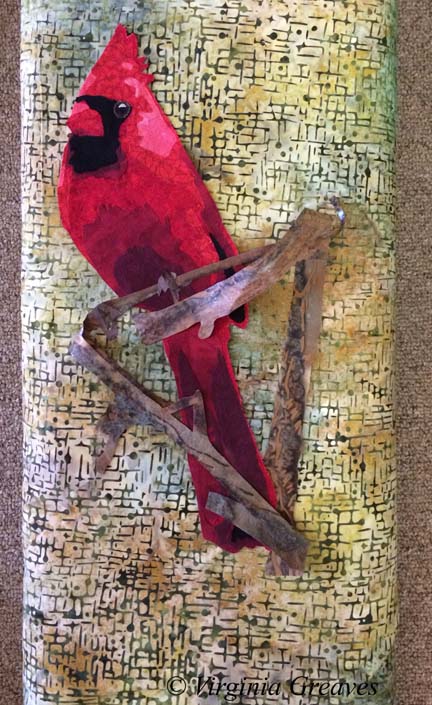
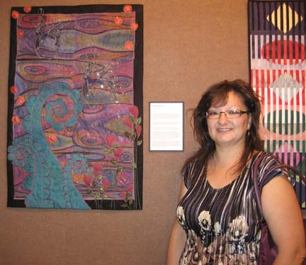
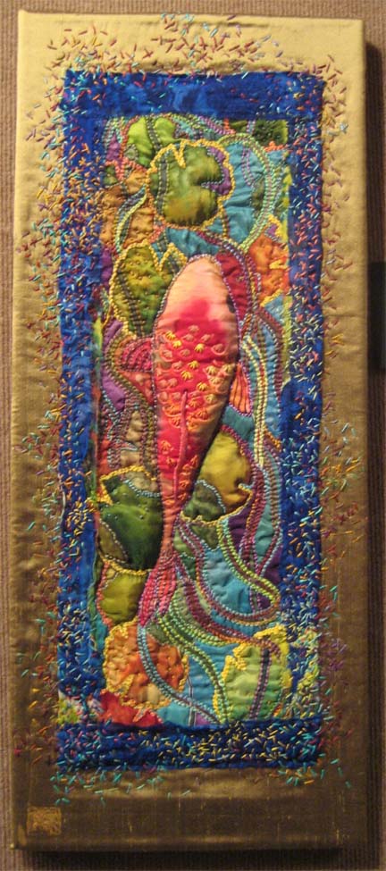
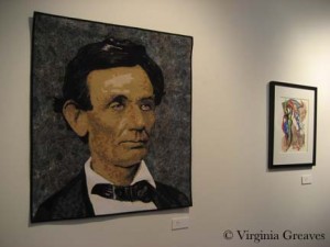
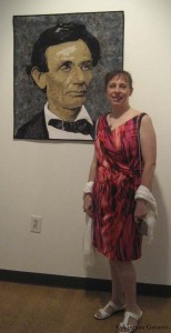
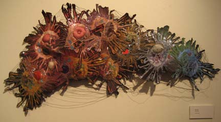
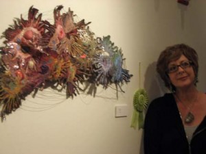
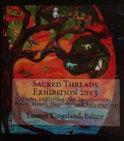
As I’ve mentioned before, I was lucky enough to have two pieces in the recent Sacred Threads show in Herndon, VA — Beach Guardians and The Bowl Judgments. It’s a biannual show and I haven’t participated in about four years — so I was delighted to find that the show published a book with all of the pieces from the show. Not having the ability to see the show in person, it gave me the chance to enjoy the exhibit from home and read all of the artist’s statements with time to study them alongside the work. You can order a copy of the book here.

Sacred Threads book

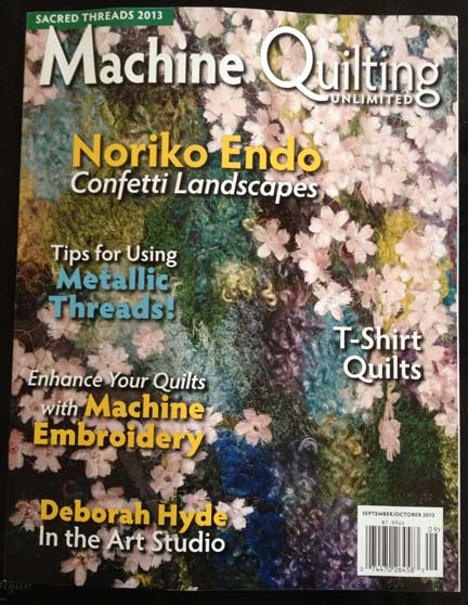
Then a couple of weeks ago, I received a manila envelope in the mail. Inside was this new copy of Machine Quilting Unlimited and nothing else. I don’t have a subscription (although I might have to get one now — it’s really well done) — so I was confused until I saw the little strip at the top that said “Sacred Threads 2013.” I flipped to the article for the exhibit — and Beach Guardians was one of the highlighted pieces.

I was really stunned. I have never had my work included in a magazine before. I felt like I had reached a milestone. My 15 minutes anyway.

Machine Quilting magazine

I have not been writing much on the blog lately. Part of me thinks that to have a blog, you need to write at least weekly. Another part of me really despises blog writers that fall off subject or write about nothing just to get a post out. I try to prepare something interesting and present it in a large enough piece that you can see progress. If I just showed you one day at a time, the blog would show everything in reverse order and it wouldn’t be nearly as interesting — to me anyway.

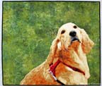
Once I had the girls back in school in August, I started thinking about my next piece. I really had no idea what I wanted to do. I started sifting through pics I took in the Spring and came across one that I really liked of a golden retriever. She is looking over her shoulder at her owner and has such a look of love in her eyes. If I found it captivating, maybe someone else would too.

I spent about a week drafting her. I typically bring the pic into Photoshop and reduce it to values only, adding lines of separation between differing objects — like the dog from her harness — or even her eyes and her nose from her fur. Then I spend a lot of time drawing in Photoshop using my Wacom tablet pen. Not only do I clean up the light scatter, I deepen shadows, add shadows to create definition, redraw the eyes, and simplify shapes.

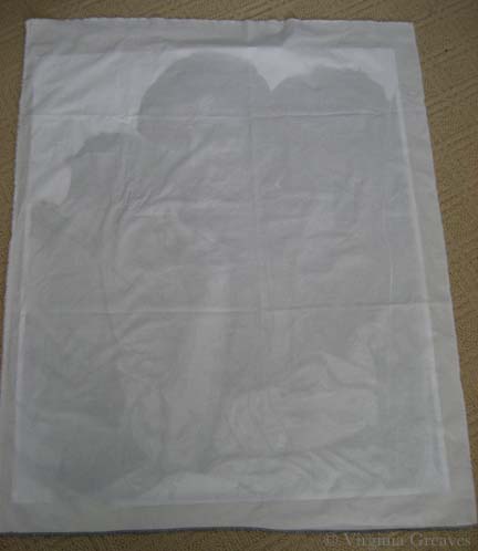
From there, I continue the drafting process by pulling the final pattern into PosteRazor as a BMP file & scaling it to what I wanted. In this program, I can then tile print. Then I take the puzzle pieces, cut off the margins, and tape it back together. Now my pattern is back together — but larger.

Then I outline everything with an ultra thin black Sharpie. It bleeds through to the back giving me the reverse image that I’ll need for WonderUnder templates. I’ll have to go back & re-draw the lines on paper overlap — but it’s otherwise done. And FINALLY, I place a layer of see-through vinyl over the top of the pattern, tape it down, and trace it. I can then sew the vinyl to a piece of muslin (using a teflon foot that won’t stick) to use as my guide when I fuse the pieces down — or I can work on a very large fusing sheet and tape the vinyl pattern over that.

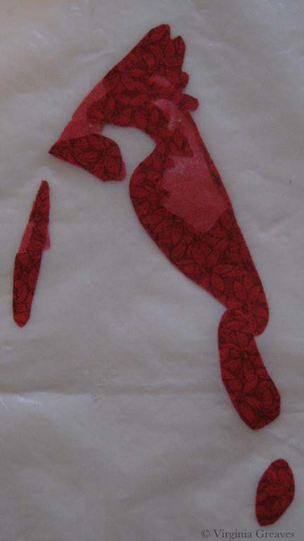
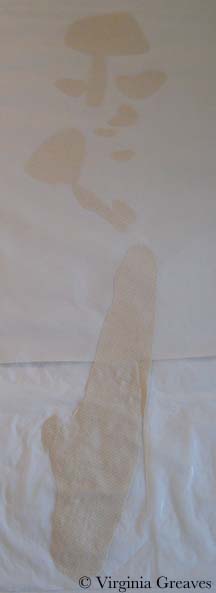
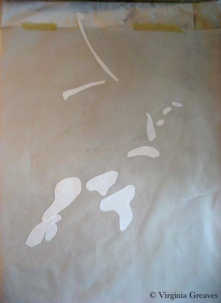
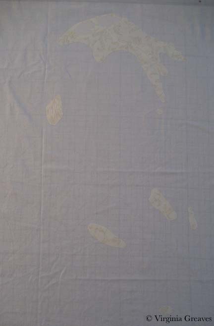
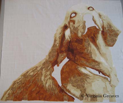
This is the beginning  showing the first & second value. The first value is almost impossible to see as it’s white like the muslin background.

Value 1 & 2

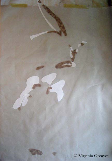
The third value gives you a better idea of the face.

Value 3

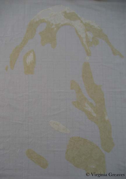
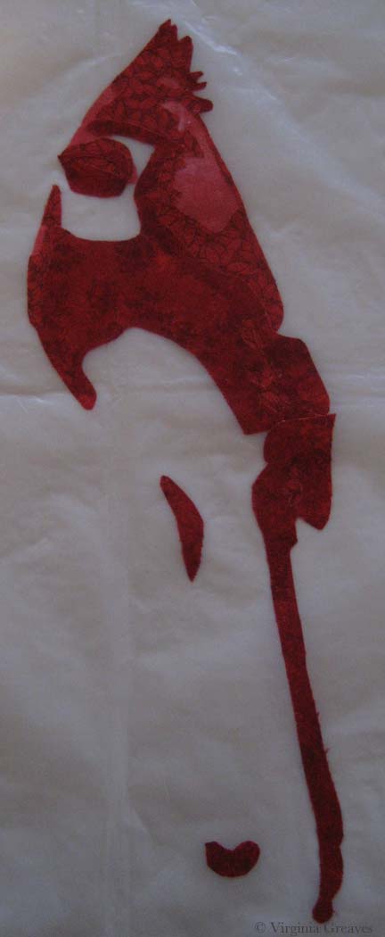
The fourth value shows the outline of the entire dog.

Value 4

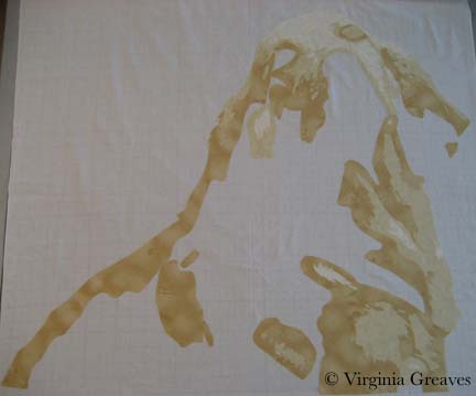
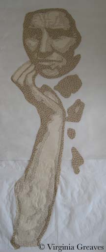
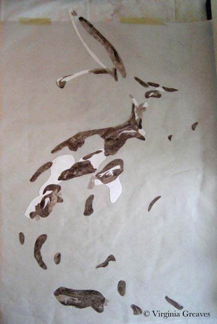
The fifth value begins to give shadows and therefore definition to shapes.

Value 5

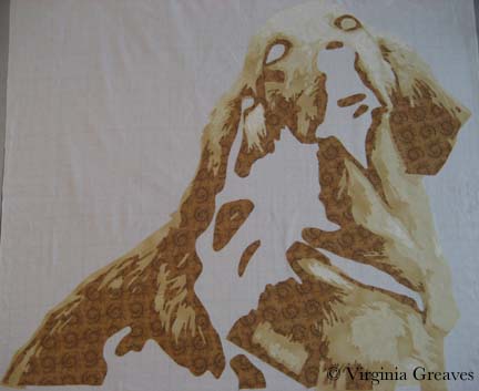
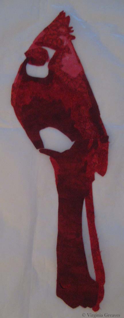
The sixth value goes into an orange. There is only so far you can go with yellow — even cream. The color that shows for this value will depend largely on what is placed next to it. In the pic, it looks a lot more orange than it actually is.

Value 6

The seventh value gives more depth and tones down the orange.

Value 7

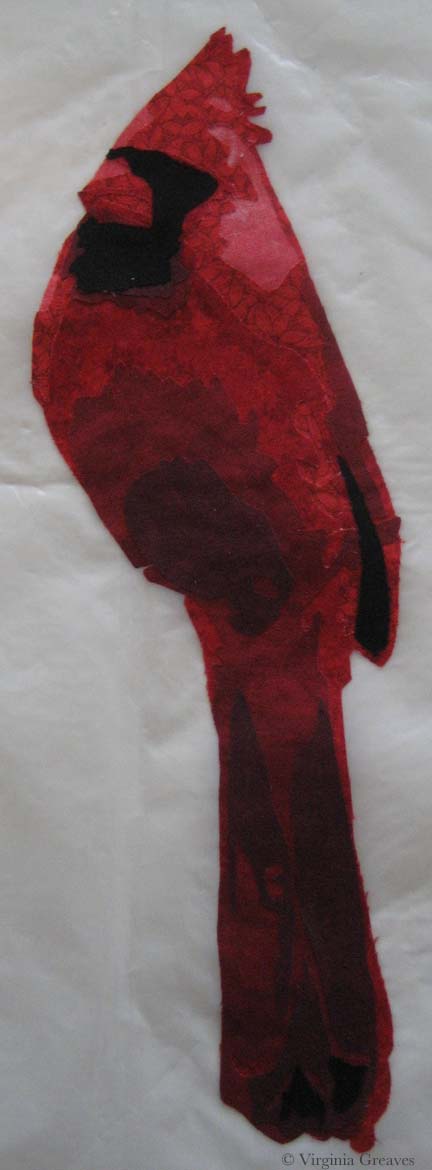
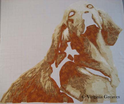
I debated having an eighth value — I though about just making it black — but between yellow and orange, I had room to move into a dark brown cinnamon. There isn’t a lot of it anyway.

Value 8

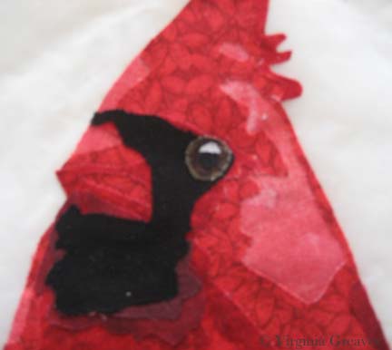
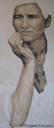
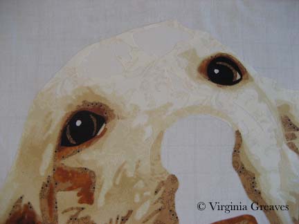
Now the eyes. The pic normally gives me useless information here. I’ve found it best to draw them myself. The pupils are wide — and the irises are brown but has more gray in it than the brown tones in her fur. The outline of her eyes is black. You have to have a deep contrast here to feel the depth of the eye and most dogs can easily take the rich black for that function.

Eyes

The nose is an experiment — although I’m leaning towards keeping it. You would think that all the fur around the mouth would match her other fur — but it doesn’t. It’s shades of back and gray.

Nose

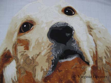
Seeing a full picture of her, I think the nose makes sense. The gray and the black have to work together to give the impression of a snout — which I think they do.

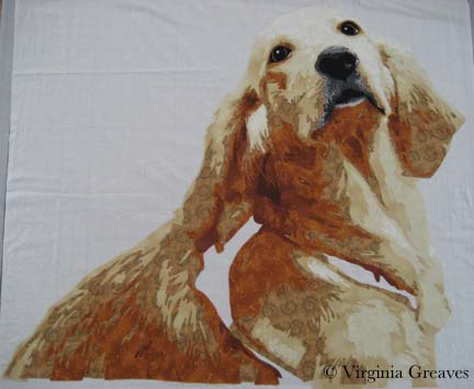
The open patches around her shoulder are for a harness — which I’ll work on today.

Without Harness

I ripped off the orange under her left eye — I found it distracting.

I’m not sure about the light gray at the bottom of the mouth — I’m still considering it.

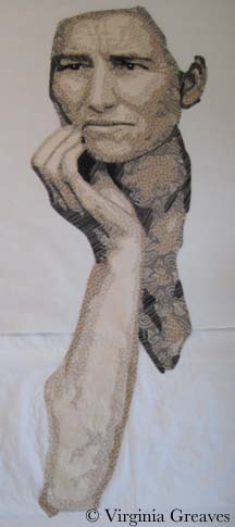
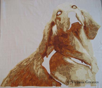
I made the entire piece without extra around the edges — which I should have done since I put her right on the muslin. Making her this way, I should have fused her to a fusing sheet where I could detach her & place her on a background. I wasn’t thinking through it — I was too excited to get to my favorite part — the cutting! I love the meditative process of fusing the shapes, cutting them out, and layering them until I start to see recognizable shapes.

I’ll have to think around what to do to correct this.

Silk To Dye For Exhibit

2

The Silk Painter’s of Atlanta are exhibiting right now at the South East Fiber Arts Alliance space downtown. My friend Hellenne Vermillion had several pieces in the show so I took one of my daughters with me to see it today.

Silk To Dye For Exhibit Card

Many people think of wearables when they think of silk, and this piece called Luna by Margaret Agner is a wonderful example. (It’s also laid out on the exhibit card above where you can see how it fans out beautifully at the ends.)

Luna by Margaret Agner $150

Luna
by Margaret Agner
$150

There were also many pieces by Martha Andreatos. I loved the colors of the silk in this piece and how they are tiled together like a roof.

Colors by Martha Andreatos $225

Colors
by Martha Andreatos
$225

This is another stunning piece from Martha.

Double Pears by Martha Andreatos $450

Double Pears
by Martha Andreatos
$450

And this is a piece from Hellenne Vermillion. She has added a lot of hand stitching in this piece. I fear that the reflectiveness of the silk combined with the broad value range were too much for the camera on my iPhone — it doesn’t do the piece justice.

Koi Fish and Lotus Leaves by Hellenne Vermillion $450

Koi Fish and Lotus Leaves
by Hellenne Vermillion
$450

This is one of Hellenne’s silk masks. She forms a clay mask and covers it with silk. This was my daughter’s favorite piece.

Tattoo Mask by Hellenne Vermillion $350

Tattoo Mask
by Hellenne Vermillion
$350

This is another one of Hellenne’s pieces displayed on a canvas. I just love the heat coming off this one.

Fertility by Hellenne Vermillion $350

Fertility
by Hellenne Vermillion
$350

This is another piece by Martha, also painted silk on a canvas. It has a very luminous feel to it.

Contemplative Figure by Martha Andreatos $450

Contemplative Figure
by Martha Andreatos
$450

And finally, another piece from Margaret. I love the playfulness of this one. It is a silk wrap hung vertically on the wall with pins. It would be stunning draped on someone’s shoulders.

Octopus Smiles by Margaret Agner $150

Octopus Smiles
by Margaret Agner
$150

All of the work included in the exhibit was beautiful. Silk is such a vibrant medium and holds the color so well.

Please contact the artist individually if you are interested in their work.

Jacks Are Wild

0

I am currently working on a piece for an invitational show — my third animal portrait in a row. It’s not that I’m done making portraits of people, but I’m acknowledging the marketability of an animal piece over one of a specific person. People typically see one of my portraits and say “I’d love to have you make one of my grandchildren” — which is great, but moving people from the inspiration of a commission to the commitment of one is much more difficult than them finding inspiration in a piece you’ve already made and then committing to buying it. I’ve found that if I make a piece centered around a particular breed, everyone that has had that breed as a pet can see their cute little snuggly in it.

What I’m considering here is an antelope jackrabbit. This is a very large and muscular rabbit with huge ears. This pic shows the highlights — the beginning.

I’m using my new large pressing sheet — but it still wasn’t big enough to capture the tip of the ear — so I have taped my old pressing sheet behind it to catch the space at the top.

Jack value 1

This pic shows the second value.

Jack value 2 & 3

This shows the third value.

Once I cut the pieces small, I realized there wasn’t as much contrast between the second and third values as I saw in the comparison of larger pieces of fabric — but that’s ok. It happens sometimes. There isn’t enough of two or three to matter much.

Jack value 4

The fourth value definitely shows the creature emerging.

Jack value 4

The fifth value is a fun brown I found with creatures leaping across it — rabbits as well as deer. It’s a fun detail for someone that looks close enough to find it.

Jack value 6

Then I finished with the sixth value of brown and then black. I completed him with an orange eyeball. This is him on my black design wall. I brightened up the pic so you could see the prints better.

Jack value 6 & 7

He looks at home there.

Jack on design wall

Tomorrow I’ll start thinking about where he’s going to live.


2013 Georgia Artists Reception

0

Last Friday was the Georgia Artists reception at the Abernathy Arts Center in Sandy Springs. I was excited to go. This is my 3rd year to be included in this exhibit and it’s always a great way to meet other Atlanta artists.

So this year, I prepared myself. I designed business cards & had them rush printed. I even went so far as to buy a new dress — something I never do. I came prepared as the professional artist.

I’m still glad that I did that — I should always do that — but this year was different. The artists didn’t mingle. I didn’t have the opportunity to meet one other artist other than the one that I already knew — and I pushed my card on her so I could at least have given one away. In retrospect, we didn’t have name tags like we have in previous years. Maybe that made the difference. Also, there was only one artist in the show that had been included previously. I wonder what damage the economy has inflicted on its community of artists.

Lincoln was beautifully hung. I always love to see my work hanging in a professional gallery.

Lincoln

This is me with my Lincoln.

Lincoln & me

And this is SPLAT! created by Leisa Rich. I’ve known her for a few years although we have mostly conversed on Facebook. I was blown away by this piece. It looks more like sculpture than fiber given the way it undulates from the wall. It’s mostly stitching on a vinyl material but there are holes filled with what I think is fine silk.

SPLAT!

SPLAT! by Leisa Rich

And here is Leisa with an Honorable Mention! Well deserved. Probably my favorite piece in the show.

SPLAT! with Leisa Rich

SPLAT! with creator Leisa Rich


Go to Top