Posts tagged fabric

Having a Good Hair Day

0

Before I left for Houston, I had made some good progress on the hair in this portrait. I always find it hard to leave in the middle of a project, but I had finished most of the hair.

In this pic, here is only one small part of the first value in the part — in the top at the middle. Then the next value is golden.

hair value 1

Although I really wanted to go with brown purples, I just didn’t have them in my stash and I couldn’t find them in the store nearby, so I ended up going from golden into an orange brown — which is really more of a realistic choice for this model’s actual hair.

hair value 2

The next value shows the brown. (I somehow managed to lose one of the highlights in her right eye — didn’t notice it until her hair was done.)

hair value 3

And this shows the darkest browns.

hair value 4

Then I laid in all the blacks, which included her shirt, and the little bit of gray.

shirt

I spent of lot time trying to find a perfect background. I had bought several greens, but in the end, they fell flat. A purple seemed like a striking choice, but I didn’t have anything that worked well. I had a blue that I liked, but I’ve used it as a background before, so I went to the store with the mission of finding one similar. This batik has some deeper shadows that I like. It sets her hair off nicely. I took this pic with my iPhone which makes her hair look more red than it is.

I also replaced the highlight in the right eye and put more gray in her right arm. I had it all brown which was just wrong and caused by blurred lines between her hair and her shirt.

background

This week, I added the background and started the appliqué. Her face is done and I’m about halfway done with her hair. I hope to start quilting her soon. The days are clicking by quickly and my deadline approaches.


Building Character in a Face

3

I have been busy cutting away here recently. This is my favorite part — cutting and fusing. It’s meditative and yet the puzzle is still challenging.

I do have to say, however, that my decision to choose different colors has resulted in an even greater sense of realism than I have had before. Because of this, presenting the face in layers feels more odd than ever before. By the time the face is fully shown at the end of this post, without hair, it feels like looking at a naked face. It’s a little unsettling.

I also confess that, after taking several pictures of my model, I chose not to go with one that you would choose to go on your mantle. I think this is a more playful picture that shows her personality better. She’s actually looking up a little at the viewer.

This is the first layer. I’ve learned the hard way not to go any lighter than this.

face value 1

And this is the second value. I know that my model is screaming at me right now. I promised not to show any wrinkles. The truth is that because she is looking up into the camera, there are lines of personality here. They seem stark in this picture, but bear with me. In the end, especially once all of the hair is fused on, they will only add to her character and will not be seen as age lines.

face value 2

Here is the third value. It’s always important to remember that eyes are set INTO our faces so even if the picture doesn’t give us darker values around the eyes, it’s best to put it there for our rendering to give a sense of depth.

face value 3

Here is the fourth value. I was surprised that this stony gray worked so well in this gradation.

face value 4

This is the sixth value. There isn’t much of it here.

face value 5

This is the seventh value. It’s actually a deep navy blue.

face value 6

The eighth value is black which is mostly in the neck. I’ll revisit that in a minute.

face value 7

These are her lovely green eyes. You can begin to see her peeking out of the fabric.

face with eyes

And these are her teeth. They don’t make a lot of sense yet without her lips. These are the only pieces that I put on in reverse order — dark to light.

face with teeth

And here she is with her mouth. She looks a little stark without her hair — but I’m working on that now.

At this point, I step back and think about how this will work with what I have to do next. Her neck is too dark given that her shirt will be black, so I decide to pull the values back and re-do the neck.

face with mouth

Here they are re-done. You see a lot more of value six, which I prefer, but you still get the sense of the jawline and the recession of the neck.

face with redone neck

Hopefully I’ll finish her hair before I leave for Houston next week.

Breathing Soul

0

I have been considering my portrait for entry into the National Portrait Gallery (NPG) competition. It’s always a challenge, artistically, to reverse engineer something — but it also can create a better opportunity for success.

I’ve been studying the work from last year that reached the finals — and I know that whatever I do, my goal is not realism necessarily. There were certainly pieces in last year’s competition that were realistic — and some that were abstract but clearly representative of the human form. I think the greater question is — what can I do that sets my work apart? I can make a piece that looks like a painting from a distance of a couple of feet — but perhaps the better curatorial choice would be one that best represents the materials being used — which in my case is fabric.

So I spent a few days considering the painting of the man with the quilt pulled up to his chin — but in the end, I decided that that’s a poor place for me to start. I don’t make traditional quilts and I have no interest in calling to mind the traditional pieced quilts that grandmothers have created for years.

And then a friend of mine said something on Facebook that struck me. She said — not in regards to me but in general — she felt that representative work in contemporary art was soulless. Wow. And I went back and looked at the fabrics that I was considering for my next portrait (yes there are some value issues here I had not yet resolved) — and I realized that I was following the formula I knew for creating a realistic portrait — and that it was going to feel soulless and boring.

fabrics_face1

I have felt for a long time that the soul of a portrait is found in the eyes — or the hands — and that’s true — but it’s not enough — not nearly enough for the piece to stand out and grab the attention of the viewer.

And then I started thinking in terms of color. Color does not have to be as straight forward as I was making it. A strict gradation from beige into black was perfectly acceptable — but was it exciting?

I’ve been considering the work of Vincent van Gogh a lot recently — and his work is largely arresting because he used color theory so successfully. Forget what color the thing you’re representing really is — make it what it needs to be in the piece to make the piece successful.

So I started over. I started with beige again but then I went into blue, ending with a deep midnight blue. My fifth fabric, the blue and brown batik, is a step out — but it transitions the beige into the blue. The fourth fabric was difficult. I ended up finding this clay color in my brown bin. It’s a transitional neutral fabric and it’s the right value so it works.

fabrics_face2

I usually pick the first color family and then start cutting, but I knew that all of it is in relationship to each other — so I went on to pick the fabrics for the eyes. My model does have green eyes — and for this piece, I think that these two will stand out well.

fabrics_eye

My goal in the hair is to have purplish brown. This is my starting place. The middle one may be too red — but unfortunately, I can’t make it to the fabric store today. (Someone stole my credit card number yesterday and I am stuck waiting on a new one to be delivered.) I think my stash is not complete enough here and I plan to change a couple of these with new fabrics soon — but this gives you an idea of where I’m headed.

fabrics_hair

I have a beautiful mottled green I’ll probably use in the background.

My goal is to create an analogous color harmony — to use what I know about color to breathe soul into her — to make her come alive in cloth — for her spirit to become apparent in the image. Let’s hope that my bold choices in fabric will help me achieve that goal.

As to whether it will be enough to be juried into the NPG — who knows? But hopefully it will help move me further along in my artistic journey.

Leisa’s Turn with Abstract #3

0

Leisa and I are having a such an exciting time with this series. It is so much fun to see what the other is going to do with the work. This is the 3rd one that we’ve done and we’re already planning #4 and #5.

I was wrong — this is not the one Leisa plans to cut into strips. In fact, she cut off all the extra yellow and black that I had added at the top and bottom and returned it to its horizontal orientation. I just chuckled. I liked it better that way too but it was her prerogative.

She free motion embroidered it like crazy, added black lace, painted it, added vinyl, and painted some of the vinyl (on the inward facing side) with nail polish. It gives it the coolest effect. (I’ll have to be careful about quilting those sections lightly though. I’m a little worried if you can needle through nail polish.)

Leisa's in process #3

And this is a detail shot — you can see the wandering embroidery lines a little bit better here.Leisa's in process #3 detail


It’s interesting to see the unintended forms that come out of this process. I love where this one is going. I’m going to quilt it and then let Leisa have another crack at it — she is thinking about adding handwork after the quilting.

I have finished the binding on #2 — and I’m almost done with adding the sleeve. I do think I’ll have to add another one though. It’s not straight across at the top so figuring out how to sleeve this one has been a challenge. I added a short sleeve at the very top where it is straight — I think I’ll have to add another one lower down on the other side. I couldn’t work it into the binding edge thought because it isn’t straight.

And then I need to bind and sleeve #1, the first small one that we did. I’m having to use different techniques on these. For instance, I couldn’t pin baste #1 because of the vinyl — I had to spray baste. I’ll have to do the same with #3. #1 also has a lot of vinyl on it around the edges — so it occurs to me that can’t use my usual water soluble glue trick to help me bind the edges (which thankfully are at least straight on this one).

And because of this issue, I realized that I probably shouldn’t use my usual blocking technique on these — particularly the ones with vinyl. If I soak them in water, the vinyl may inhibit evaporation and could lead to molding — a distinct possibility as I live in the Deep South — so I’m going to forego that as well. I haven’t had a waviness problem on any of them — yet — but if it becomes an issue, I’ll block them with spritzes of water — not a full soaking.

I need to make myself stop. It’s September and I would like to have a piece to enter in the Outwin Boochever Portrait Competition sponsored by the National Portrait Gallery. I need to start photographing inspiration for that one. I entered a few years ago and wasn’t juried in so I just assumed that it was a bias against alternative mediums. Completely untrue. Be careful not to create obstacles for yourself that don’t exist. Last year, the People’s Choice award winner was a sculpture made from rice, rice noodles, and glue by Saeri Kiritani — and there was a fiber finalist — Lia Cook. I can’t be accepted if I don’t enter. You can see last year’s winners here.

Third in Abstract Series

0

I met with Leisa over a week ago. As I last mentioned, I had finished quilting our 2nd collaborative piece and I offered it back to her for additional changes. We decided that it was done and that I would bind it — which I started yesterday. Last week, I spent a glorious week of cutting and fusing our 3rd abstract piece. Leisa was out of town and I wanted to have something to give her when she returned this week.

She asked in that meeting if we could extend out the edges on this piece. It was already drafted but after talking about it, we decided to rotate it and extend the two sides — which would become the top and bottom.

I started with the whites and yellows. In retrospect, this piece has a lot of yellow and I wish I had toned it down. This is its original orientation. It’s on my drafting table that’s covered with an ironing mat. I have to stand on a ladder and hold the camera above the piece to attempt a picture. Moving it to the design wall doesn’t work well for my process.

in process yellow

Then I added the reds.

in process red

And then the blues. I rather like it at this point.

in process blue

Then I added the black and changed the orientation. I’d be lying if I didn’t say I was completely flummoxed. There are several things that changed in the piece when I changed in the orientation — some of the shapes began to take on new and unintended meanings.

My first reaction was to take off the black and replace it with something else — but Leisa wants it just like this. I hope she paints it. I know she intends to cut strips in the bottom — maybe also the top. It’s just very striking color wise. Maybe that isn’t such a bad thing. It still has a lot of transformation until it becomes its final self.

in process black

ad;lkfja;skdjf

Lessons Learned with Bleeding Fabrics

0

This week I pulled out the huge enameled pot that someone gave me to dye polyester fabric in some time ago (someone gave me bolts of the stuff — still don’t know what to do with it) — and I started an experiment on some of my reds. I knew that several of them have been crocking in my finished quilts and I was on a mission to stop it.

I should start by saying that I pre-wash — I bring my fabric home and throw them in the washing machine, set it to hot water, and add blue Dawn which has synthrapol in it — which will pull out excess dye molecules that may be present in the cloth but that haven’t bonded with the cotton.

So all of these reds, at one time or another, had gone through the pre-washing with hot water and synthrapol — but I had read a blog saying that you could take a crocked quilt and soak it in boiling water to fix it so I decided to try this with the fabric.

I pulled the darker reds for the piece I’m currently working on. (At this point in the week, I was still cutting yellows.) I boiled water in my massive pot and then added some blue Dawn. Once it was at a roiling boil, I added my first suspect. Immediately, the water turned wine red.

Boiling Reds


This was definitely the guilty party in several of my pieces. I boiled it for a few minutes and then set it aside to cool. When it was room temperature, I poured out the water and rinsed the fabric.

Here was the surprise — it almost immediately ran clear. I rinsed it thoroughly — even put it in more water to sit for a while — but all of the excess dye was now gone.

I did this same process with two other reds. One of them wasn’t bad — it ran a little in the beginning — the other ran a lot. Not surprisingly, the two that ran a lot were ones that I had dyed myself years ago — although in my defense, I definitely have some commercial prints in my stash that are also bleeding.

The result of this batch was the same as the first. After boiling and then cooling, the water ran clear.

The only difference between this process and what I’m doing in the washing machine is the temperature of the water. I could jack up the temperature on the water heater — but I risk boiling an innocent victim in the house. I don’t think that all fabrics need this extreme care, but there are definitely some that do. I’ll have to think on how to best identify which is which when I bring them home — maybe put a swatch in water after the washing machine cycle.

I also found the infamous bleeding green fabric in my stash this week. I thought I had thrown it away. I had bought it years ago in Florida and it runs like crazy so I vowed to never use. At the time, I washed it many times, and although the color faded, it never stopped bleeding. Now I’ll just boil it. I’m sure that’ll fix it.


Dolce Far Niente

Making a Plate

1

After realizing that the “It’s Raining Cats & Dogs” special exhibit at IQF/Houston had added a new virgin rule this year — thereby disqualifying my piece Golden Moment since I had posted LOTS of pics of it on my website and blog — I decided to make a small piece for another one of IQF’s special exhibits. At first I thought about Life Begins At 40 — since I am currently in my 40’s — but what struck my interest more was What’s For Dinner.

I’m friends with Jamie Fingal, one of the curators, on Facebook, and every night she posts the question “what’s for dinner?” I get to hear about what delicious meal she is preparing and it usually makes me hungry.

Keep in mind that at this decision making point, I was at the beginning of May. I don’t typically spend many hours in the studio during the summer, and May itself is full of constant interruptions — so I was looking for a small piece to do. This needed to be an exact size — 24″ x 15″. Perfect.

Then I started thinking about what to put on the plate — and I started to get hung up on plate design. Let’s face it — there are people that go to culinary school to learn how to properly plate food. (I know — I’ve watched way too many hours of Food Network.) So I was stuck for a while — until I decided I was making this too difficult. I went to my cabinet, pulled out a plate, knife, fork, spoon, and a crystal glass. Then I pulled some simple things from my kitchen — a croissant, a couple of different kinds of miniature cheeses, a boiled egg, and some fruit.

Simple yet elegant. It reminded me of the plate that Julia Roberts makes in the movie Eat, Pray, Love when she is learning about “dolce far niente” — the sweetness of nothing.

I started with my cream Wedgwood Edme plate. There are shadows all ready added for the different items on the plate.

Plate Empty

I put the egg in the middle. Probably not my best choice — a white egg in the middle of a cream plate. And I really struggled with how to make it stand out on that plate. I tried many combinations of white and gray. This is what I ended up with (with one change later).

Plate with Egg

And then I added the fruit. The blackberries are from one fabric — a dark blue batik. It looks really dark in the pic but that’s the limitation range of a camera. If I want the plate to be sharp, then the darkest dark will be a little blurry. Then I added the grapes — and then the orange. I actually had a print of grapes — perfect size too. I thought about using it — but I wanted an artistic representation — not perfection.

You’ll also noticed that I added a rim of gray around the egg. I think it gives the egg more depth than it had. (The bias of white is a little choppy but it’ll clean up when it’s appliquéd.)

Plate with Fruit

And then I added the croissant in the corner. I was dubious about the fabrics but I think they turned out well. It looks even better quilted.

Plate with Croissant

My last food items were miniature cheeses. When I originally photographed them, they were covered in their commercial labels. Those had to go. I redrew them plainer for my plate.

Plate with Cheese

And here you can see the napkin and the silverware. I could tell from last year’s entries that people struggled with the silverware. Using non-metallic grays and black, I took a literal interpretation of the values in the silver. (I did use a metallic thread for quilting them though.)

I chose the background before the napkin. I loved this print and how it worked with the plate. I barely had enough — although I’ll admit at this point that I had it in my mind that the piece had to be 24″ x 18″ — and I wasn’t sure if I would end up with 18″ after quilting. I used it anyway, figuring I could add across the bottom if I had to — and it was just as well since the actual height requirement is 15″.

Plate with Silver

The glass was also something that I think presented a high level of difficulty. I had a nylon sparkly sheer in my stash that I thought might work. I started by experimenting with it and Wonder Under. I wasn’t sure if the heat from the iron needed to bond the Wonder Under would melt the fabric — so I kept the iron low and raised the heat as needed to make it bond. I worked in reverse order. I usually work light to dark — but since I could add depth by layering the fabric on top of itself, I put the pieces that I wanted to be darkest on my pressing sheet first.

Glass stage 1

Then I laid my largest piece of sheer on top. Not only are the raw edges of the first layer all covered (and there are a LOT of raw edges down there), but the layer on top gives the layer underneath more opacity.

I know — it’s a little hard to see on the white pressing sheet.

Glass stage 2

This is the glass on the background fabric. Not as sheer as I would have liked — but good enough. (It really looks fabulous wet — you can really see the background coming through then.)

Glass on background

And here is the full appliqué top before quilting.

Dinner Before Quilting

At some point after quilting, I realized that I only needed 15″ in height — which was just as well since my background fabric had shrunk closer to 17″ — but it’s sad because it meant that I would have to cut off the top of my glass. Oh well. No use spending too much time worrying about that. The glass is to scale and shrinking it to make it fit on the 15″ height would have made it look too small for the place setting.

Dolce Far Niente

Dolce Far Niente

fabric paint

Crocked Dye in a Finished Piece

0

What is crocking? It’s when you wash something and the dye particles that haven’t bonded completely with the fabric (usually cotton) float free and bond to something else. It is commonly seen when someone washes a new article of red clothing that then turns all of their other clothes pink after a trip through the washing machine.

How can you avoid this happening in a quilt? The easiest way is to prewash your fabrics. After you bring them home, wash them in synthrapol (a squirt of blue Dawn dishwashing detergent — as long as you have an older washer that can handle high sudsing detergents — works just as well) and a dye catcher sheet. This will hopefully take out all excess dye particles that were not rinsed before the fabric was sold.

That’s usually more than enough — but not always. I had a green commercial hand dye I bought once in Florida that would never stop running dye. I finally threw it away.

Reds are notorious for this. I have this problem with even commercially printed cottons. It’s especially heartbreaking when it happens in a finished piece. You don’t want to throw all of your hours of hard work into the garbage.

Fear not. It’s not worth the tears. If you can’t fix it with hot water, Shout, or any other stain remover (short of bleach of course) — they make something that works just as well. It’s called fabric paint.

Admittedly, this works better on some prints than others. There are some textures that cannot be replicated — but then you just need to reframe your expectations and accept it as it is. This is art and I can use fabric paint if I want to.

This is my latest piece.

Crocked

I sighed when I pulled it out of the washer. (I typically run my pieces in water when they’re done to take out the water soluble glue I use to help me in the binding process — and to prepare the piece for blocking.) I sprayed it with Shout, turned the water to hot, and threw it back in.

No luck. There was still red all around the grapes on the plate. So I spun out the water and pinned it up to dry.

Once it was blocked and dry — I waited a few days. You have to be patient. You don’t want to have any anxiety when you do this.

fabric paint

I pulled out my palette and put a pinch of yellow on it — and by a pinch, I mean a very small amount. Then I added a large amount of white and mixed it together on my palette. I tried it out on a piece of my cream fabric — the same that I will paint on the quilt — and it was too white — so I added another very small amount of yellow and mixed it in. This was a closer match on my swatch. So I grabbed a paintbrush and painted it onto the affected areas of the quilt. I used a light hand — and added water to thin it out so it wouldn’t look gloppy — went to another section — went back after it had dried a little and added a little more paint. I ended up pulling out a smaller brush to get that very small section between grapes.

painted

And voila’! Much better. I believe it now qualifies as show worthy. I’ll give it shot anyway.

Complete Figure

North Carolina Insanity

1

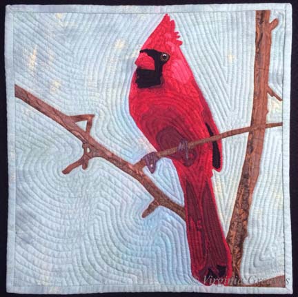
For my current piece, I was inspired by another picture by Dorothea Lange. This one was taken in North Carolina — 1936 I believe — and shows a woman, probably a sharecropper, standing in an old wooden shack. It appealed to me.

And as I started to work on the first wall of the cabin — I wondered what I was doing. I do portraits. This piece will have a figure in it, but she is not the main focus of the piece.

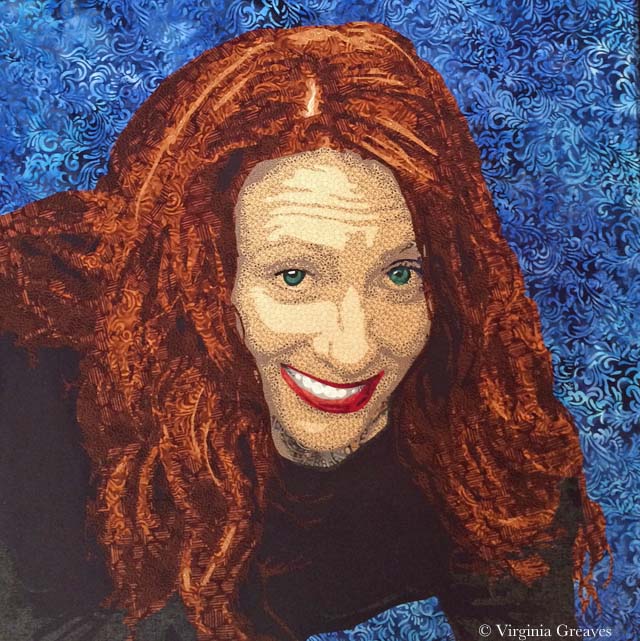
At one point, I did come to the realization that she is the house. I saw something online by Alice Walker in which she opined the situation of a slave that didn’t have the opportunity to express herself creatively — and I knew that this was the woman in the picture. She is bereft of herself and as worn down and tattered as the house in which she stands.

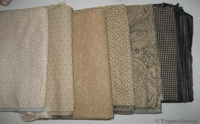
This is the first value for the right wall of the cabin. It’s a stand-in for plaster. The light in the pic isn’t great — I was working on this at night and didn’t think to turn on my natural light lamp.

Right Wall value 1

This is the second value. It looks stark against the first value. It’s a batik that I bought to work as the background of my last piece, Worry, but it was too light so it ended up in my stash and works nicely here. Really — it does. Just keep going.

Right Wall value 2

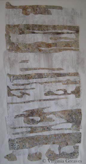
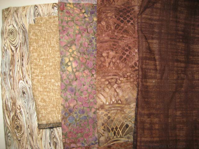
My third value is a rusty brown. I had to search some to find this. I had some rusts in my stash but they were too dark.

Right Wall value 3

It’s a wall — I promise — although I’ll admit that I was getting disheartened. Sometimes you just have to keep going. This wall on the right of the piece is lighter than the rest of the cabin.

The next value is the first true brown — but there isn’t a lot of it here.

Right Wall value 4

And then there is the darkest brown. Still doesn’t look right.

Right Wall value 5 & 6

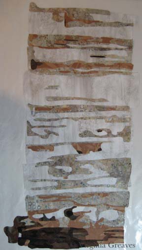
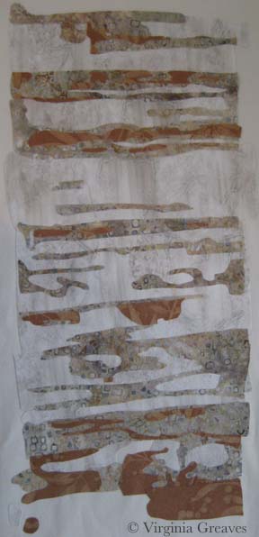
I did realize at this point that I needed to add the door facing — so I went back to the 2nd value.
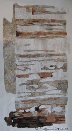
Right Doorframe 2

And the 3rd value.

Right Doorframe 3

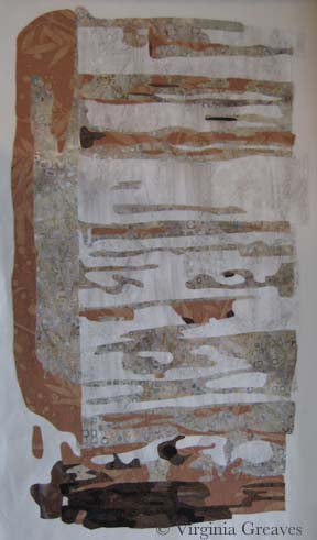
And the 4th value. Done. OK — it doesn’t look right to me either. The only thing missing is the black. There are many tiny lines of black separating the boards — and I had intended to do this in thread at the end — but at this point, I was disheartened and wondering if I had wasted my time — so I added the black.

Right Doorframe 4

Why does that make so much more sense? It just does. Without it, the eye just sees a jumble of shapes.

Right Side Final

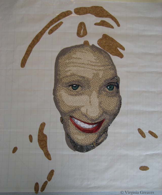
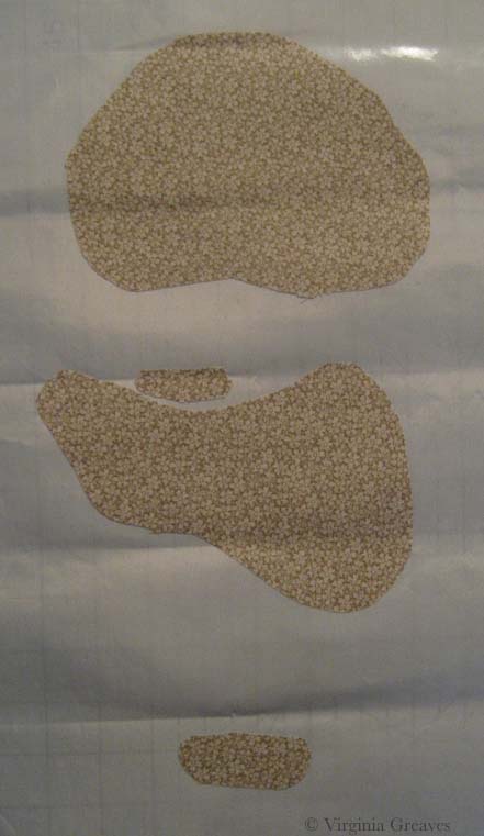
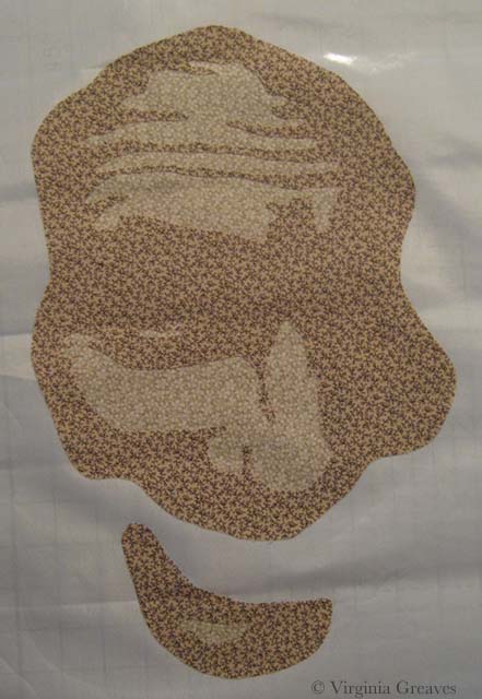
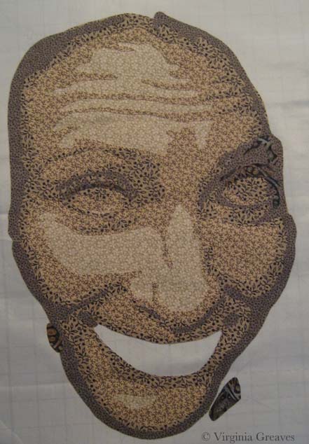
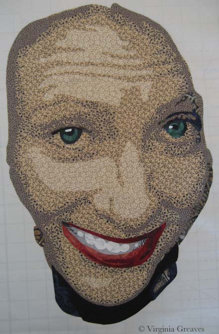
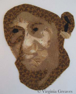
And then I did her face. I had painted myself into a corner. I couldn’t use the same brown tones I had used in the cabin for her face, so I decided to try the more yellow browns.

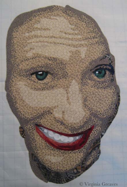
Her face is tiny — maybe an inch and a half — and when I first did this, I took this pic and then threw it in the trash. But, looking at it again in my camera with a little more perspective, I thought it might work — so I fished it out and started making her clothes.

Woman's Face

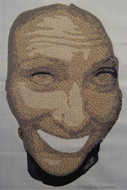
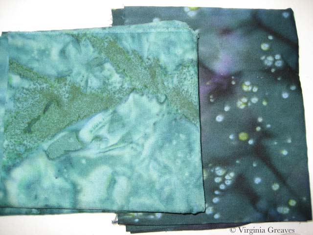
I needed a color that would make her stand out but not look expensive. In the end, the blue would look best against her skin. This shows the first (very small) and second values.

Dress value 1


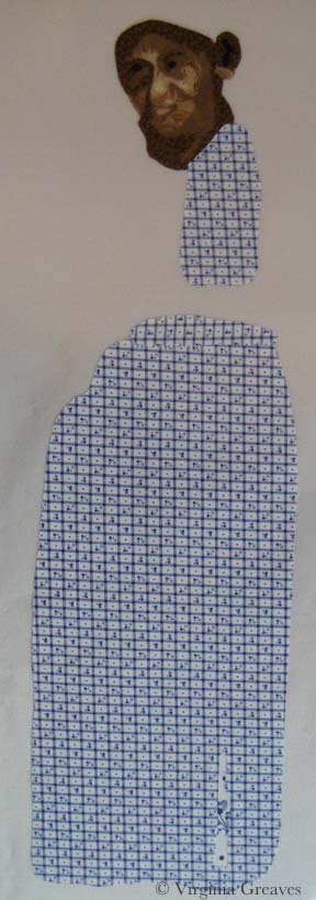
The third value shows more of the outline of her dress.

dress2

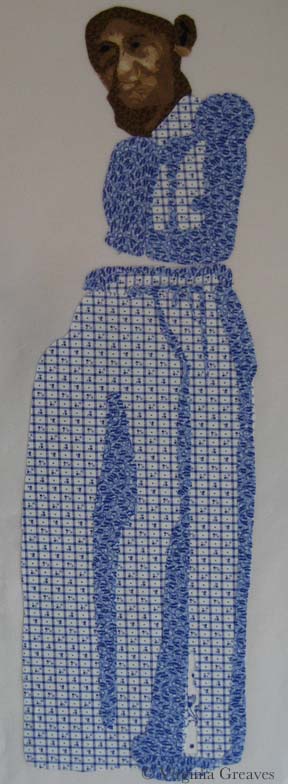
The fourth value brings it even more to life.

dress3

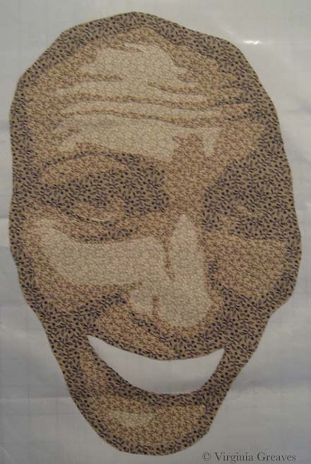
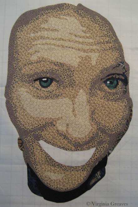
This is the fifth value — and at this point, I’m happy with her face.

dress4

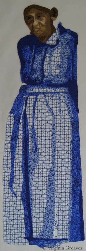
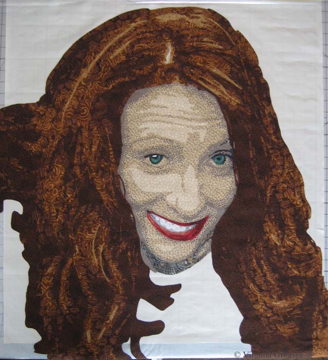
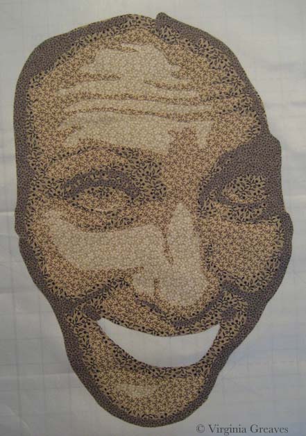
And then there is a little bit of black to add in there. (Don’t worry about her ear — it won’t be that large once I add her hat.)

Dress value 5

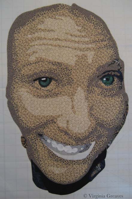
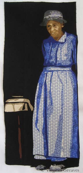
Here she is in her hat and shoes. I chose gray which will be similar to the tiles in the roof. The background will be black and will fill in the space between her dress and shoes.

Woman with hat and shoes

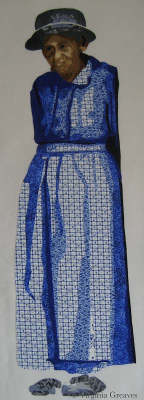
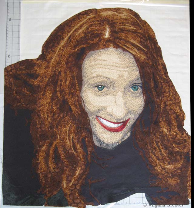
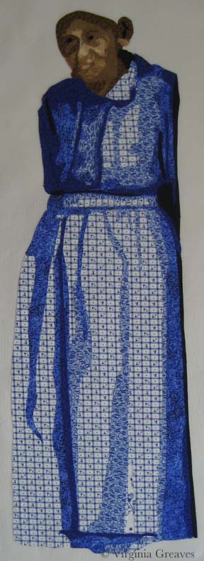
And here she is complete. The tablecloth and table leg are suggested objects. The rest of it falls into shadow.

Complete Figure

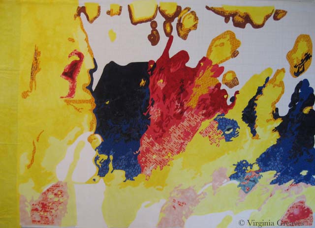
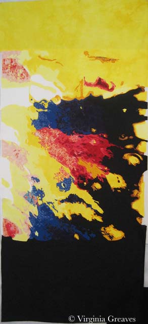
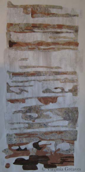
As of today, I’ve done both the right and left walls of the cabin, the steps, and I’m almost done with the boards above the door and across the entire top.

I have to admit that I must be insane. This is a very complex piece. The applique is taking a very long time to do. And it is a true departure from the kind of work I normally do.

And yet I keep going. When I’m done with the cabin top — there are still a couple of rows of shingles at the top — and then rocks at the bottom. Hopefully all of this will make sense in the end.

fabric paint

Make It Work

0

Last week, I finished the cardinal and put it in water to soak.

I had a thoughtless moment where I put synthrapol in the washing machine while the bin was filling with water. I thought to myself — that’s a mistake — I should empty the tub and start over. But then I thought — it’s so small — it shouldn’t matter.

If I had been really thinking, I would have reminded myself that red is bad to bleed — but I wasn’t thinking so I threw the piece in the water with a Color Catcher on top (I wasn’t totally brainless).

But of course, as you can see, the reds bled onto the background. This is what it looked liked after spraying it with Shout and washing it with OxyClean in cold and hot water — many times. I couldn’t get out any more of the red from the background. (I was able, thankfully, to shrink it a little. It was just over 12″ square — and for the exhibit I made it, it needed to be 12″ square — which now it is.)

cardinal before paint


I have had this happen before — with Beach Guardians. Thankfully, the background wasn’t printed so painting it with fabric paint should work. At this point, it was my only option left.

But I put it off — and worried — and procrastinated. No one wants to ruin something in the final stage with paint. I had spent almost two weeks on this piece — and I wasn’t looking forward to that going down the tubes if it didn’t work.

I took my fabric paint and mixed it on my palette — and got really close to where I needed to be.

fabric paint


I thinned it with water and blended it into the background.

cardinal after paint

I think it works.

I compared it to my picture of the piece from last week before I put on the binding — and the background looks less green. That is really only a difference in lighting. It’s almost scary how big the color shift is. This time, I used a side light — and last week I didn’t — but I couldn’t go back & re-take the pic with the bleeding — so I just kept it like this so you could compare apples to apples.

You may have noticed that I used a binding that matches the background. I almost always use black for binding — but as I said — I was trying to make this piece a specific size — and my cardinal just barely fit in the space. The best way to give him some breathing space was to use a binding in the same color as the background. If I had used black, he would have looked squeezed on there.

Did I mention I don’t like making something to a specific size requirement?


Go to Top