Posts tagged art

Jacks Are Wild

0

I am currently working on a piece for an invitational show — my third animal portrait in a row. It’s not that I’m done making portraits of people, but I’m acknowledging the marketability of an animal piece over one of a specific person. People typically see one of my portraits and say “I’d love to have you make one of my grandchildren” — which is great, but moving people from the inspiration of a commission to the commitment of one is much more difficult than them finding inspiration in a piece you’ve already made and then committing to buying it. I’ve found that if I make a piece centered around a particular breed, everyone that has had that breed as a pet can see their cute little snuggly in it.

What I’m considering here is an antelope jackrabbit. This is a very large and muscular rabbit with huge ears. This pic shows the highlights — the beginning.

I’m using my new large pressing sheet — but it still wasn’t big enough to capture the tip of the ear — so I have taped my old pressing sheet behind it to catch the space at the top.

Jack value 1

This pic shows the second value.

Jack value 2 & 3

This shows the third value.

Once I cut the pieces small, I realized there wasn’t as much contrast between the second and third values as I saw in the comparison of larger pieces of fabric — but that’s ok. It happens sometimes. There isn’t enough of two or three to matter much.

Jack value 4

The fourth value definitely shows the creature emerging.

Jack value 4

The fifth value is a fun brown I found with creatures leaping across it — rabbits as well as deer. It’s a fun detail for someone that looks close enough to find it.

Jack value 6

Then I finished with the sixth value of brown and then black. I completed him with an orange eyeball. This is him on my black design wall. I brightened up the pic so you could see the prints better.

Jack value 6 & 7

He looks at home there.

Jack on design wall

Tomorrow I’ll start thinking about where he’s going to live.


2013 Georgia Artists Reception

0

Last Friday was the Georgia Artists reception at the Abernathy Arts Center in Sandy Springs. I was excited to go. This is my 3rd year to be included in this exhibit and it’s always a great way to meet other Atlanta artists.

So this year, I prepared myself. I designed business cards & had them rush printed. I even went so far as to buy a new dress — something I never do. I came prepared as the professional artist.

I’m still glad that I did that — I should always do that — but this year was different. The artists didn’t mingle. I didn’t have the opportunity to meet one other artist other than the one that I already knew — and I pushed my card on her so I could at least have given one away. In retrospect, we didn’t have name tags like we have in previous years. Maybe that made the difference. Also, there was only one artist in the show that had been included previously. I wonder what damage the economy has inflicted on its community of artists.

Lincoln was beautifully hung. I always love to see my work hanging in a professional gallery.

Lincoln

This is me with my Lincoln.

Lincoln & me

And this is SPLAT! created by Leisa Rich. I’ve known her for a few years although we have mostly conversed on Facebook. I was blown away by this piece. It looks more like sculpture than fiber given the way it undulates from the wall. It’s mostly stitching on a vinyl material but there are holes filled with what I think is fine silk.

SPLAT!

SPLAT! by Leisa Rich

And here is Leisa with an Honorable Mention! Well deserved. Probably my favorite piece in the show.

SPLAT! with Leisa Rich

SPLAT! with creator Leisa Rich


The White Raven

Completing the Raven

0

The White RavenI have finally completed The White Raven. The bird was wonderful — the Tower of London was tedious — but I think in the end that it all came together. It’s ironic that I now have such a creative flow while constructing portraits and my more difficult moments are in the backgrounds.

I used a stacking type of stitch while quilting the raven to give the impression of feathers — it was interesting to see how the white thread changed the character of the darker fabric shades. I am becoming completely reliant on Isacord thread for free motion quilting. I can run my machine at a high speed and the thread is less likely to shred. It’s also available in a huge selection of colors. A thread run before I start quilting is almost a must for me at this point.

The Tower was not as much continuous line quilting as I would have liked. There was a lot of stopping and starting — so it took much longer to do — but hopefully I’ve created the impression of the Tower in a minimalist way. I still wanted the focus to be on the raven.

The background was also difficult because of the Tower peaks. I started in the middle between two towers and echo stitched a wavy line upwards — but once I reached the top, I attempted to echo stitch back down between another set of towers. Any quilter knows that you have to quilt from the inside out — especially if you’re quilting densely. By quilting from a less dense to a more dense area, I created some ripples that could only be resolved by ripping out all of my quilting and starting over in the correct direction — from the more dense outwards to the less dense area.

The White Raven detailAt the end, after I had washed it, blocked it, and added the label, I went back and added more quilting in the raven’s eye. It’s the focus of the piece and it did not have enough quilting relative to what was around it. I didn’t want it to sag over time.

The raven isn’t exactly like the original — I had to take liberties with the beak especially — but I think it is definitely reminiscent of the pictures of Mike Yip. His photographs of the white ravens in the Vancouver Islands are really wonderful.

Adding the Tower of London gave the piece whimsy — a story — which I think adds to the visual interest of the piece.

New Exhibitions

0

I have been blessed with several exhibition opportunities lately that I wanted to share.

Bukonyan Elder


Bukonyan Elder was chosen as one of two pieces to represent my Fiber Art Fusion group in our sister organization Southeast Fiber Arts Alliance show Fiber ARTlanta. The opening reception will be May 3rd at the Unitarian Universalist Congregation of Atlanta 6:30 – 8:30pm. The show will run through May 27th.


Lincoln


Lincoln has been juried into the Georgia Artist exhibit opening at the Abernathy Arts Center in Sandy Springs, GA also on May 3rd 6:30 – 8:30pm. The show will run through June 14.


The BowlJudgments smbeachguardians_sm


Both The Bowl Judgments & Beach Guardians have been juried into Sacred Threads 2013. Show dates are July 10 – 28 at Floris United Methodist Church in Herndon, VA. The artists reception is July 13 1 – 4 pm.

Applique and the Stabilizer Snob

0

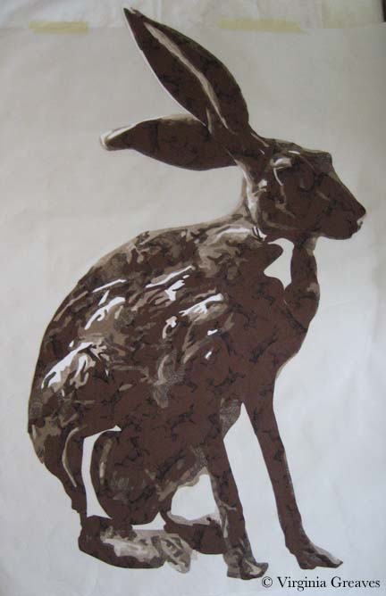
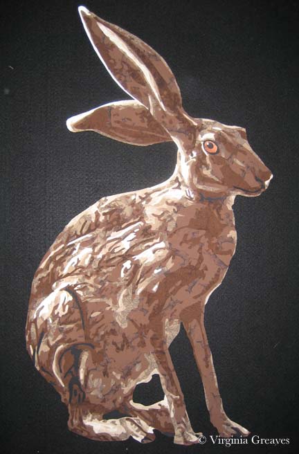
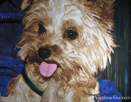
I’ve never really addressed applique on my blog. I’ve stated that I do it — I may have even specified that I use a tight zip-zag — but I’ve never really talked about it or why — which seems a great omission given how often I’m asked about it from other quilters.

Some people fuse and then go directly to quilting. I’ve considered this, especially recently. Applique is tedious and is probably the least creative process I do. However, it gives a very neat finish. Raw edge applique without it can get rather messy over time, and I like the completeness that I get with a secured edge. I’ve used a blanket stitch and a satin stitch, but I prefer a tight zigzag — 1.0 mm length & 2.0 mm width (although I vary the width in tight spaces).

Why use stabilizer? I had someone ask me that recently. Years ago, I started using stabilizer and haven’t really questioned why in a long time. The answer is that it gives a professional finish. Yes, there are many layers of fabric which can stabilize the stitch, but in some areas, only two fabrics of cotton are too flimsy. The stitch will look much better if you use a stabilizer.

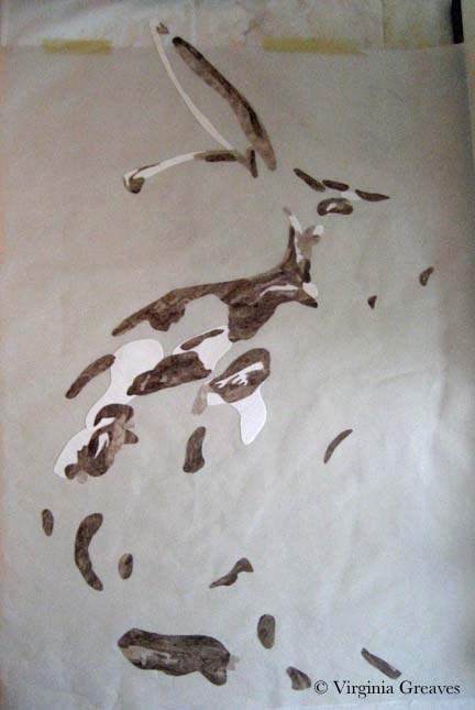
For years, I’ve been using tearaway stabilizer from embroidery shops. I had one that was soluble for a while but paper-y like a tearway that I really l liked but eventually couldn’t find anymore. When I was making the raven, I used the scraps of all of my old stabilizer. They were all good — except one. We’ll get to that in a minute.

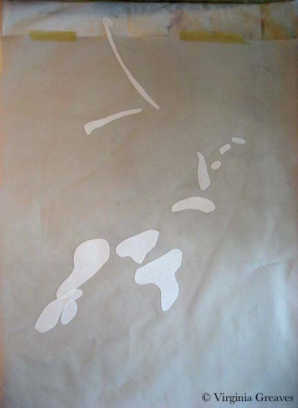
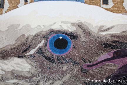
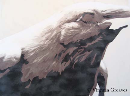
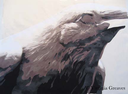
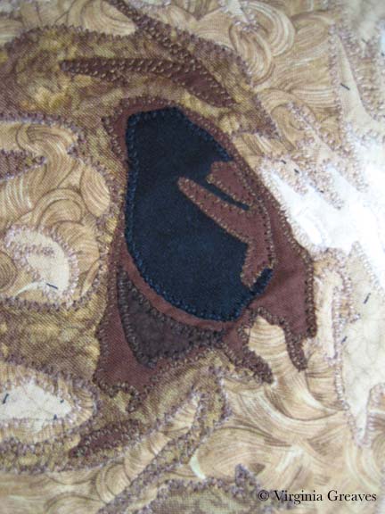
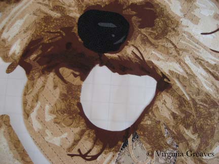
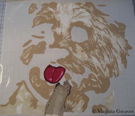
This, by the way, is the beak on my raven as I showed it in my last post. It wasn’t right.

1st Beak

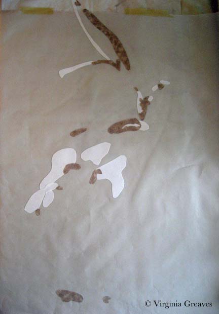
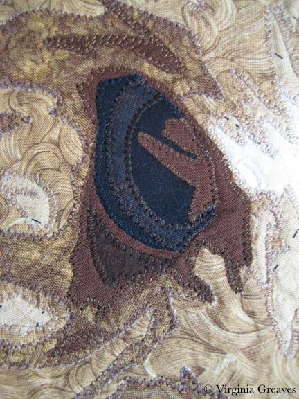
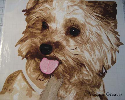
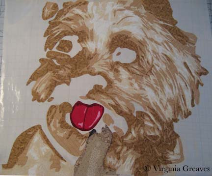
This picture, although taken when my studio was growing dark for the evening, shows how I changed the colors a little.

2nd Beak

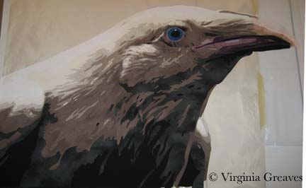
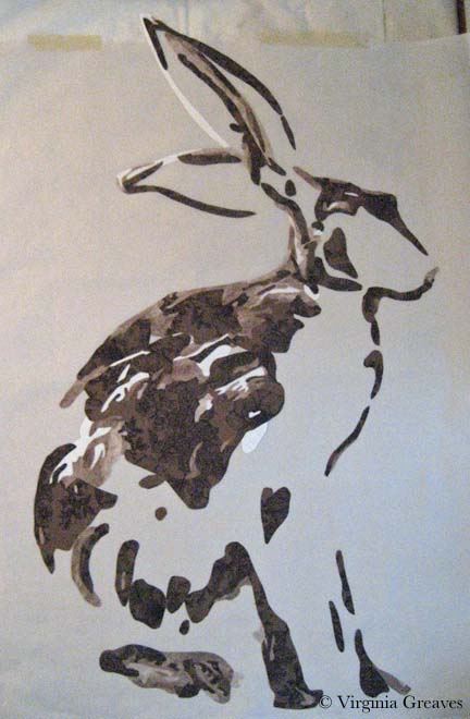
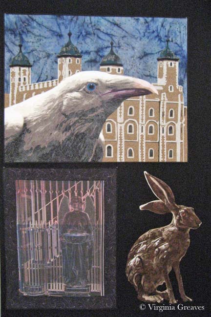
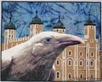
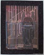
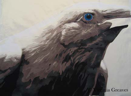
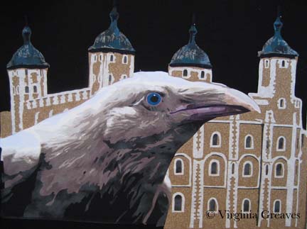
The raven shows up a little better on my design wall. Whenever I lay something on my design wall, I’m tempted to just lay it on black fabric and call it a day. BUT, my intention in making this piece is part of a story — and I had plans to work on the Tower of London.

Final Raven

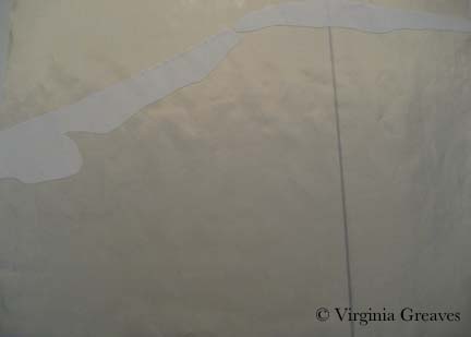
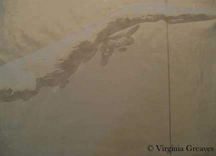
I drew a stylized version of the towers and hoped that my fabric choices would get me where I wanted to go. I had no idea if it would work — but I took a leap of faith. This shows the two right towers with the brown decorated with the white architectural details. It was almost like frosting a cake. I was careful to use a white print that wouldn’t show the brown behind it. I would usually put the lighter value down first to avoid shadowing, but this design was more structurally sound to have the full brown background with the white fabric carefully cut and laid on top.

Right Tower 1

Then I added the black details.

Right Tower 2

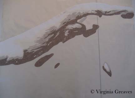
And finally the rusted copper turrets.

Right Tower 3

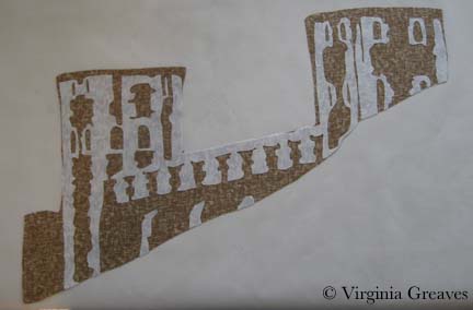
The left towers were constructed in the same way.

Left Tower 1

With the darker details and turrets added, they make more sense.

Left Tower 2

I put the towers on my design wall — and you can clearly see where the raven will sit. I posted this image to my FB Page and was surprised to find EVERYONE wanted me to finish the piece just like this. It does have a fascinating quality to it — but it isn’t the direction that I was working on. I will certainly consider it for another piece.

Completed Towers

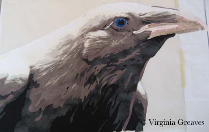
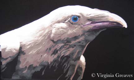
This shows the raven sitting on the design wall with the towers. Again, the black background makes everything look good.

Towers with Raven

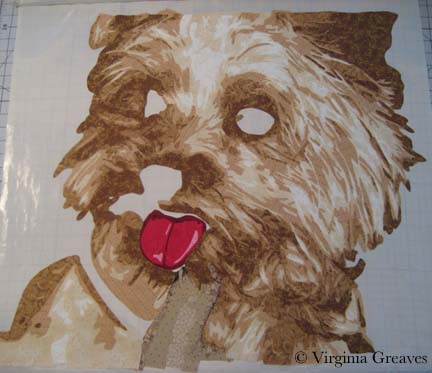
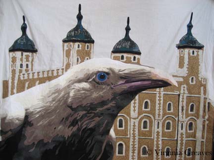
This next photo shows the raven and towers once they were appliqued to muslin. Keep in mind that I had run out of my stash of stabilizer. The fabric stores only carried Pellon, and unwilling to take the time to traipse over to an embroidery store, I decided to try it. I use Pellon’s Wonder-Under all the time — how bad could their stabilizer be?

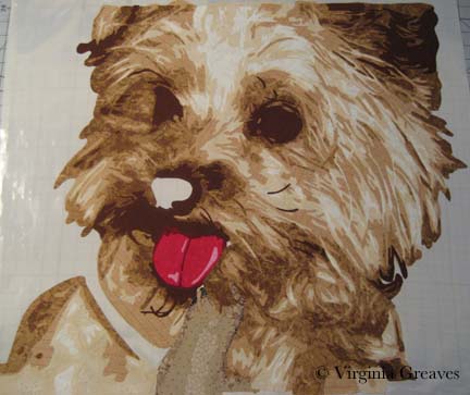
It was AWFUL. It is much thicker than any other stabilizer I’ve ever had, and it often interfered with my ability to move the fabric nimbly under the needle and get the thread where I intended it to go. It is my hope to never have to use it again. So there — I suppose I’m a stabilizer snob.

Applique Before Sky

Certain in the belief that I had nothing in my stash that would do for the sky, I went to the fabric store and picked out a beautiful blue-gray — only to bring it home and find, in the bright natural light of my studio, that the fluorescents of the store had deceived me. The color was more powdery blue than what I wanted. So I searched my stash and found this funky batik. I love its contribution to the story of the piece. It’s a strange choice, but I’m happy with it. This is what the piece now looks like, fully appliqued and ready to be pinned for quilting.

Before Quilting

Next week is Spring Break. I may not be able to begin quilting for a while, but I hope to at least get it pinned tomorrow.

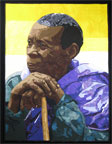
One last thing — Martha Sielman has written a second book in her Art Quilt Portfolio series — People & Portraits. My piece, Celtic Woman, is on page 32. I feel privileged to be included — although I’m not overly happy with the photograph. I’ve always prided myself in taking my own pictures — but I’m missing something in terms of color. The printed picture is not anywhere near as good as what I see on my monitor. I need to start using a white balance card when photographing and re-calibrate my monitor.

I received my complimentary copy a couple of weeks ago. Beyond the thrill of having one of my pieces in publication, it’s a nice compilation of work. Several of my FB friends are included and it’s been fun to read more about their work.

The White Raven

1

After finishing Firecracker, I did not have another project in mind. I spent a few days doing administrative things — donating my time to do some volunteer work — but then it was time for the rubber to hit the road. If inspiration doesn’t come, you still have to keep creating. So I went looking.

I have had a fascination for years with ravens. I have a newspaper clipping that is probably eight years old on my design wall about the ravens kept at the Tower of London. Legend tells us that if the ravens were to leave the Tower, the Tower and thus the Kingdom of Great Britain would be lost. Charles II declared that at least six be held captive there for the rest of time. Their wings are clipped and they are cared for by a Yeoman Warder.

All of those ravens are common — or black — but there are rare instances of white ravens in British Columbia, Canada. These are not albino ravens with red eyes but rather white ravens with blue eyes.

Which leads me to the inevitable question — what if a white raven were to inhabit the Tower?

There is a wonderful photographer at Qualicum which the white ravens call home — Mike Yip. He very graciously gave me permission to use one of his photographs as inspiration for this piece.

This is the first value — pure white. I started this piece in the late afternoon and the failing light gave me a yellow cast on my design surface.

value1

The second value is almost harder to see as it has a yellow cast to it.

value2

The third value is a little easier to see.

value3

The next day, of course, the light in my studio was better for photography. This is the fourth value and you can really start to see the bird emerge. It is strange to think that a white bird is more than white — but even the majority of the colors in the clouds in the sky are not white. White always has a supporting cast of characters.

value4

This is the fifth value.

value5

And this is the sixth. I had to go outside my stash to find the fabrics for this piece and I had counted on 7 values — but I miscalculated — there are 8. So I took my range of fabrics, tried to figure out where I felt like there was a large enough value jump between two fabrics, and went to my fabric drawer to try to fill it. I was very lucky — I had the perfect fabric that snuggled in perfectly to what I had already set up — and that is the fabric here.

value6

The seventh value goes into gray.

value7

And the eighth and final value is the black.

value8

Then I worked on her eye. I had the perfect blue in my stash. It is actually a little lighter than the blue in the photograph but I think it works well. I’m surprised at how visual I’ve become. I envisioned the exact blue that I wanted and then went to pull it from the drawer.

eye

The beak was tricky. It has a different texture to the feathers and I knew that to make it stand out visually from what I had done previously, I needed to use different fabrics. I liked the range of pink for the top of the beak, but they didn’t work as well for the bottom.

beak1

In the photograph, the plum around her eye is repeated in the lower section of the beak — so I tried a range of plums for the lower beak. This is closer to where I want to be. There is always something in a piece that isn’t clear cut.

beak2

You’ll notice that I had to tape my smaller pressing sheet to my newer one. I never thought I would go beyond the dimensions of my ultra large pressing sheet — but it didn’t take me long to press the boundaries.

I don’t know if I’ll keep the beak the way it is, but I’ve set it aside on my design wall for now. I’m working on the Tower pieces. Once again, I loved the way she looked so much on the black, I considering giving her a plain background — but then she also looks good on the primary Tower fabric that I chose, so I’m going to experiment with that and see where it takes me.


Finishing Firecracker

2

Firecracker smI finished the Yorkie piece on the last day of February — which is great so now I can put February on the label. I know it seems silly but it validates that I worked really hard in February. I had it blocked and drying by the end of the day but didn’t attempt to photograph it until today. It took me a while to get it just right. I even used white as a background so I could align the edges just so. I think I’ve been using a black background as a crutch. Using the white makes it much easier to see whether everything is lined up correctly before I go open the file on the computer. It’s best to go ahead & do it right the first time than have to re-photograph it later for an exhibit application. I know I can always fix camera distortion in Photoshop, but most shows won’t let you make those kinds of digital corrections.

I decided to call this piece Firecracker. This Yorkie has such an explosive personality, it seemed only fitting. Her page can be found here. And in case anyone wants to know — yes it really is an applique piece. This is NOT a photograph — this is NOT an inkjet printed piece. It was insanely difficult but I feel like I’ve solved a difficult puzzle.

How To Make Lemonade

1

Last week I finished fusing the Yorkie. I put her up on my black design wall for a quick pic. Most things look so stunning on black.

Fusing Completed

And then I started the tedious process of appliquing all of those raw edges. I use a tiny zigzag. There is so much thread in this piece from applique, I doubt there will be much stabilizer that I can tear off the back.

I did applique the piece onto white muslin. I knew that my background was going to have its own applique elements — so it was easiest to use the muslin as my canvas.

Just as I was finishing the applique on the Yorkie, Pokey Bolton announced the exhibit It’s Raining Cats & Dogs at the IQA-Houston show in the Fall. I had known about it earlier because there was an invitational exhibit that included my piece Unconditional last year — and I was told that the following year, it would be juried. So I did have this in mind as I started this piece — and I also think that animals are much more marketable than people in terms of selling my work.

However, Pokey threw me a curve ball. The minimum on any side must be 25″ — the shortest side of mine was 24″. Clearly, I was going to have to make the best of things. I threw on my creative thinking cap and starting working. I considered a border — the easiest solution — but I don’t think that that would add anything to the design. I finally decided to extend the bottom. I freeform cut it too — I felt very brave. There is more here than I’ll need but there will be some shrinkage in quilting.

Applique Completed

I also decided that the left eye just wasn’t cutting it. There is a sprig of hair obstructing our view of the eye, but I still felt like it needed more of the detail of the iris.

Left Eye Before

Now it makes more sense to me.

Left Eye After

This is the final top. I have added the details of a jacket around her and the background behind the two figures.

To Be Quilted

I taught a class last week to my Fiber Art Fusion group about Color/Value & Picking Fabrics. It made me realize how dependent I’ve become on my color wheel. Can you see the tetradic color scheme (or double complement) I used? I think it works — although this is technically the hardest color combination to do successfully. I actually had no idea what to put in the background on the right — but figured out that pulling the green over from the collar but in a value deeper than the coat would work best.

So now I will start quilting. I just wanted to share with you how this little piece was coming along.


Little Dog Personality

2

The hard work done, I began last week to add the final dark values to my Yorkie. This shows the fifth value.

Value 5

And this shows the sixth value. She really comes alive once the deeper values have been established.

Value 6

And here I’ve added her black nose.

Nose

I actually had marked some black spots around the mouth, but they didn’t make sense at all — so I added a seventh value. It’s subtle but it’s still nice to have. I also ripped off that red mouth. Now that I had the dark values laid out, I knew it was a mistake.

Value 7

This is my newest take on the tongue. I took what was previously my lightest value & made it my darkest one. It seemed odd to me — but her tongue is really a light pink — a blush with a lot of white on top of it. I even managed to stay within my stash at home — which I didn’t originally think I could do (I don’t have much pink fabric on hand).

Tongue

After that, I worked on the detail in the eyes. The left one is not really visible — she’s turned to the side and it’s obstructed by her hair curling out over it — but the right eye is detailed. Her iris is yet another really dark brown. It’s not much different from the black in value — but it needs the break to define the eye.

Eyes

Today I’m studying my color wheel and thinking about what to use for her collar and the background.


Yorkie

0

For Christmas, I received this wonderful large applique pressing sheet. My old one is 18″x18″ — and I’ve done some larger pieces that made it difficult to do it off of a base like muslin.

Applique Pressing Sheet

To be honest, I don’t love it. I taped my vinyl overlay on top of it — placed it on my work table with the ironing cover — but when I iron the pressing sheet, it holds the heat a long time. If I place the vinyl overlay back on top too soon, it melts and shrinks the vinyl. (Ask me how I know.) My old sheet is made from a different material and I never had this issue.

Anyway, I started working on my Yorkie last week. I know — it’s a complex pattern. The only way I could begin to keep track of it was to cover it with Sharpie in different colors.

This shows the finger in front of the dog. It will be surrounded by fur.

Finger

And this shows her tongue. I have reservations about the tongue — but because it’s all constructed on the pressing sheet, I can always rip it off later.

Tongue

This shows the first value of the Yorkie. Not a lot to see yet.

Value 1

The second value shows more definition.

Value 2

And the third value really brings out her personality. This layer was painful to do. Can you tell? There was a lot to keep track of.

Value 3

And this is the fourth layer. Also difficult. I like the way the fabrics are working together though.

Value 4

I’ve just finished the fifth layer today and have started on the sixth — then I’ll go back & add the black, the eyes, the collar around her neck, and finally the background.

I have been working on only fabrics in my stash. In some cases, I had little fabric to work with. The third layer I actually ran out of — but I remembered where I bought it a year ago and took a scrap back in the hopes that they still had some. The fabric angels were smiling on me that day — the woman at Tiny Stitches went into the back and came back with a very small bolt. She said she couldn’t sell me much because it was on hold for their embroidery group, but I only needed a small amount.

The fourth layer was also close — I made all of my patterns and placed them on the fabric before I started for fear that I would run out of it.

Next week, I’m speaking at my Fiber Art Fusion group on Color/Value & Choosing Fabrics. I’ve been writing out some notes but need to pull out fabrics to take with me. It’s hard for me to pull out of a project once I’ve sunken into it. It’s like becoming a hermit and it’s difficult to focus on other things.

Go to Top